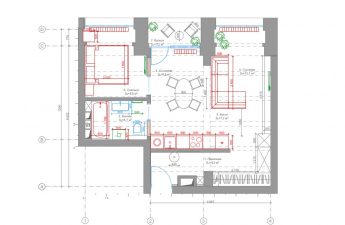
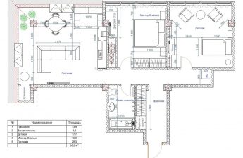
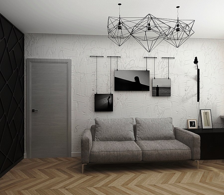
What interior style is most suitable?a modern bachelor? A loft, of course! It has it all: brutal elements, designer finds and cozy natural materials. The owner of the apartment is a young man with diverse interests, the main ones being photography and sports. He contacted the studio with a request to decorate the apartment in a loft style, the interior of which would be modern, cozy and, most importantly, reflect the owner's hobbies. The founder and head of the studio, designer Victoria Zolina, took on the work on the project. Victoria Zolina, designer Graduate of the British Higher School of Design, specializing in Interior Design. For several years, she honed her professional skills in various architectural studios in Moscow, and in 2012 she founded her own studio. She considers individuality, functionality, harmony and comfort to be the components of an ideal interior. www.zi-design.ru As already mentioned, the owner of the apartment is seriously interested in photography. He does it professionally, constantly improving his skills, and this activity could not help but be reflected in the interior of the apartment. For example, in the hallway, a brick wall was set aside for a gallery of the customer's photographs, with metal brackets with adjustable cables running under the ceiling, on which photographs can be hung. Such a system allows you to hang photographs of any format and at different levels, chaotically or in an orderly manner, and also easily change the exposure.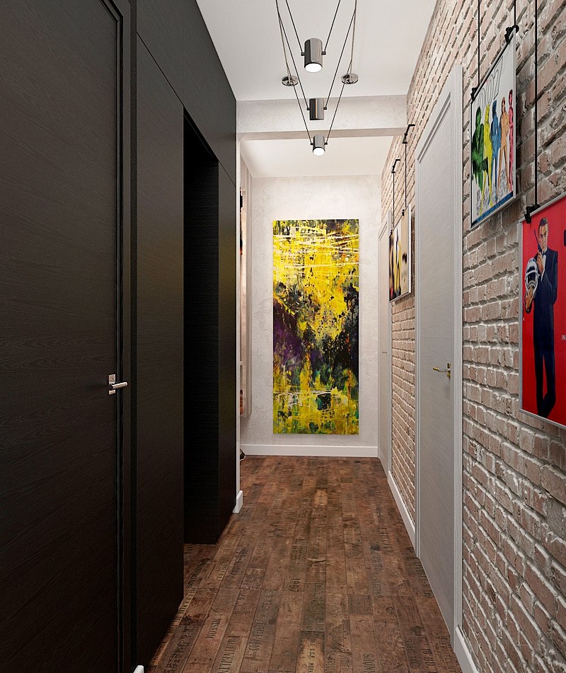
 Victoria decided to take into account the fact that the customertakes monochrome photographs, reflecting their color scheme in the interior palette: the color of wood, white and black were taken as a basis and diluted with local color accents, such as the upholstery of the chair and the paintings in the hallway. The owner's love for wood and all kinds of natural materials was also not ignored - they were used in the interior to the maximum.
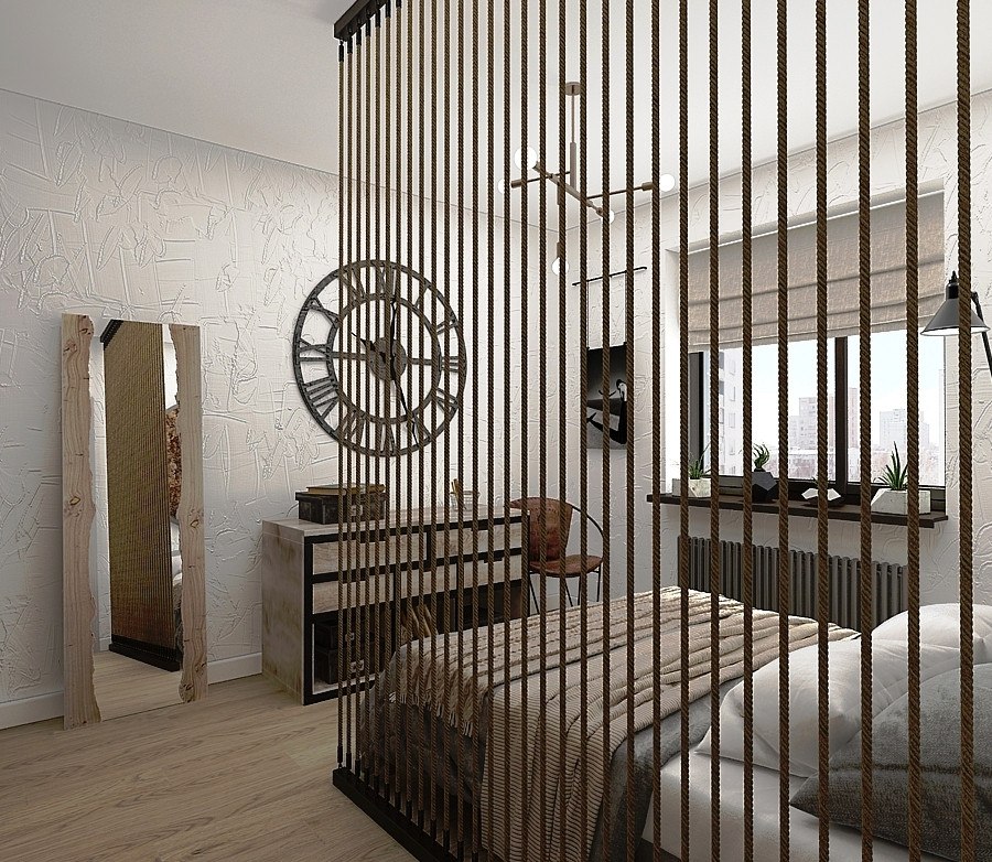
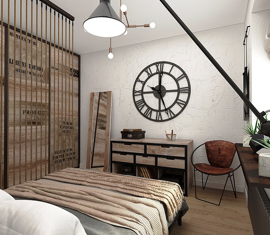
 Bedroom The bedroom walls are covered with clayplaster. It was not a coincidence that they chose it: firstly, it is a natural material, as the customer wanted, and secondly, clay has a number of useful properties (it is hypoallergenic, provides good sound insulation, and from a design point of view it is good because various natural additives can be used to create an interesting design). The design of the sliding wardrobe was invented by the team — it looks as if it was knocked together from old pallets. A partition made of ropes was chosen as an interesting decorative element and also a zoning tool. The story behind the appearance of the round cork panel above the bed is also interesting — a piece of cork bark was found completely by accident, and the idea was subsequently born from it. The loft-style nightstand opposite the bed was ordered from Woodmorning.
 Another serious hobby of the apartment owner— mountaineering. Like photography, he is a professional in this sport and has already conquered many famous peaks: Elbrus, Lenin Peak, Mont Blanc, Olympus in Greece and others. That is why an object appeared above the door that can be mistaken for an air conditioner, a stand for a cold weapon, and, for example, a lamp. In fact, this is a special fingerboard trainer for rock climbers, which the customer chose himself. It serves to strengthen the fingers and muscles of the upper shoulder girdle and allows you to stay in shape between hikes.
 Victoria Zolina, designer:— We always pay special attention to lighting in our projects, so light sources are often art objects. To dilute the monochrome of this interior, we used a combination of different textures and shapes, including in the lamps. Thus, the Cliff Suspension chandelier from Canadians Lambert & Fils appeared in the bedroom. Since the original is very expensive, we made a similar model from Alexander Klochkov from Ironlamp based on our sketches.
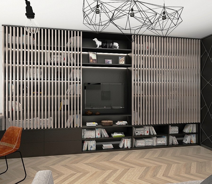
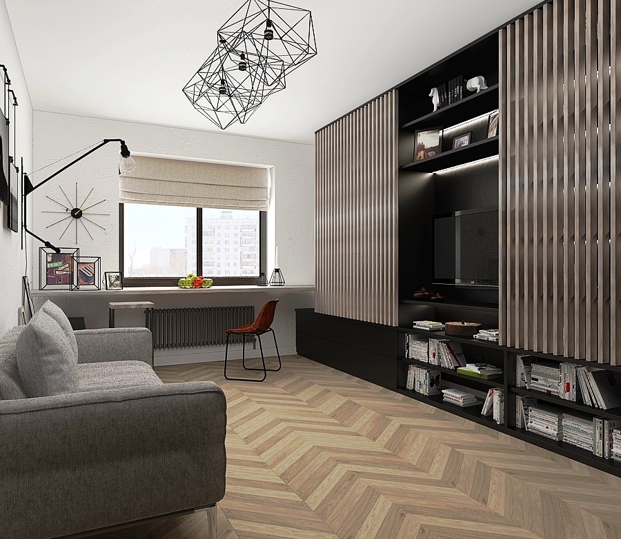
 Living room For the decoration of the walls in the living room we chosethe same clay plaster as in the bedroom. First of all, the attention in this room is drawn to the textured doors of the wardrobe with a geometric cutout - it is not immediately clear that this is not a decorative panel and in fact there is a full-fledged wardrobe along the entire wall behind them. As a prototype for the chandelier, they took the Prism model by Belgian designer Nathalie Dewez, which was also made by Alexander Klochkov from Ironlamp according to the sketches of the studio's designers.
 Victoria Zolina, designer:— Another striking design element of the living room is a shelving unit, the doors of which were replaced with light wood planks that match the parquet. Many may wonder how practical this is, since the shelves remain open. We answer: it is primarily a matter of taste. For example, our customer initially asked to make an open shelving unit, but we decided to decorate it with hanging slatted doors. The design turned out to be original and easy to use.
 The window area was not left unused either:The windowsill was extended and turned into a small but comfortable workspace with plenty of natural light. And for working in the evening, a Potence pendant light from Vitra is provided.
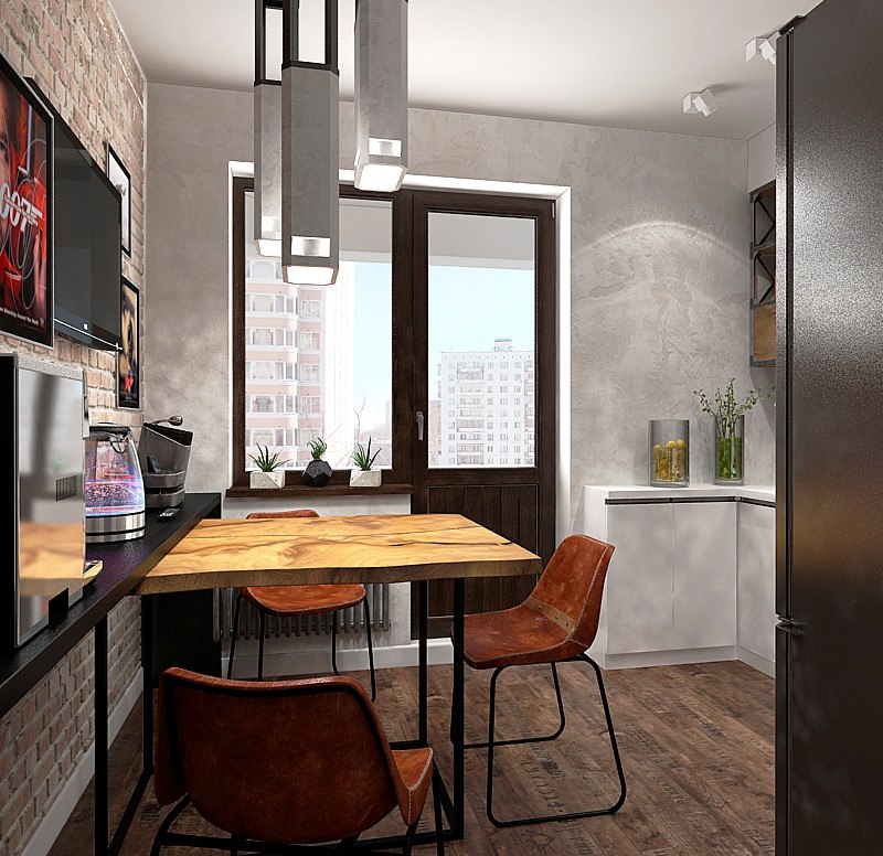
 Kitchen The phrase "The kitchen is a special place in the house"more often heard from women, but in this case it is no less relevant, since the owner of the apartment loves to cook. This hobby of the owner was also taken into account - many spacious drawers and shelves appeared in the kitchen. The upper drawers were ordered from the craftsmen from Woodmorning and stylistically echo the loft elements in other rooms.
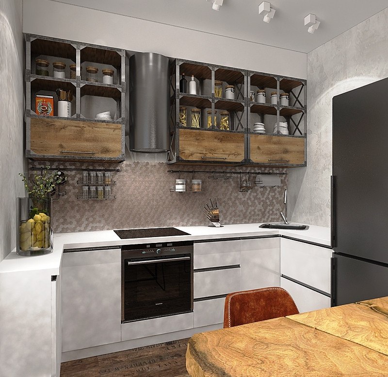 Victoria Zolina, designer:— We decided to decorate the walls with artificial stone and for this purpose we chose clinker bricks from KAMROCK. This Russian company has been on the market since 1997, all products are manufactured using an original technology developed taking into account operation in various climatic conditions. And the lamps above the table are made of concrete enclosed in a metal frame.
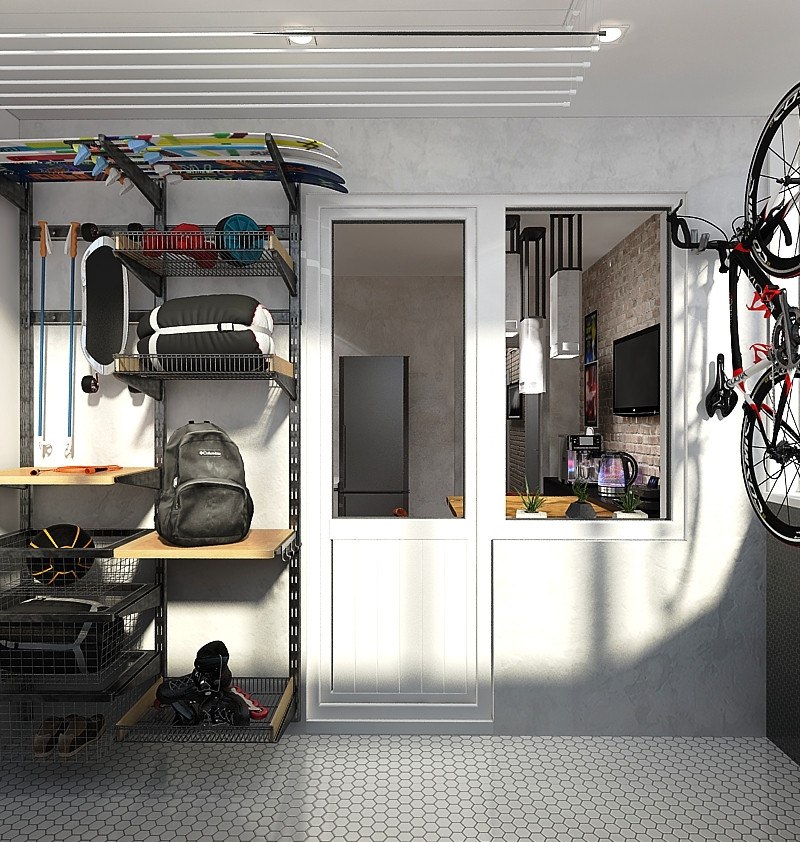
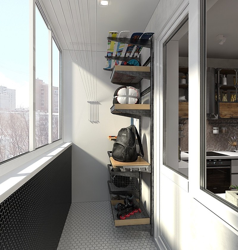
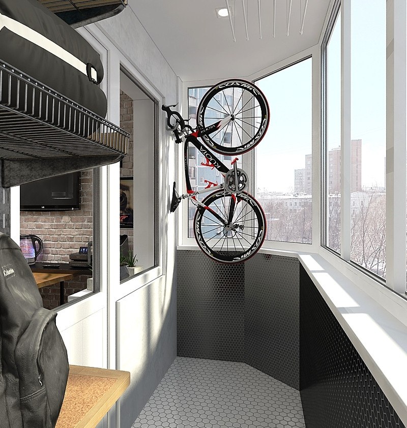
 Balcony Despite its modest area, the balconyturned out to be very functional - the designers designed a special rack for storing various sports equipment and a huge amount of the customer's climbing equipment. Small hexagonal tiles were chosen for the interior finishing of the floor and the lower part of the balcony.
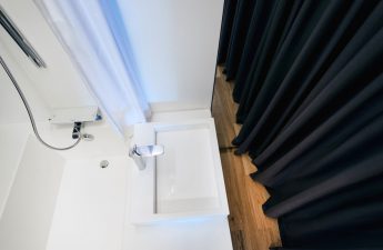
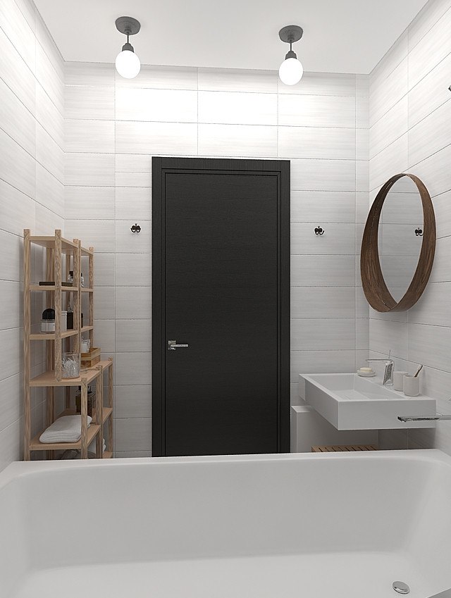
 Bathroom In the bathroom they usedtwo types of finishing: one wall was decorated with natural stone (Sekitei stone mosaic), the other three with neutral tiles from the Indian Kerama Marazzi collection. Wooden shelves for towels and small items and a cabinet under the sink were taken from IKEA.
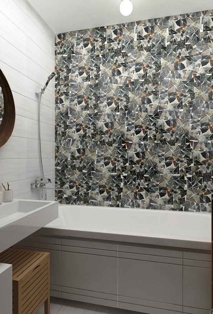
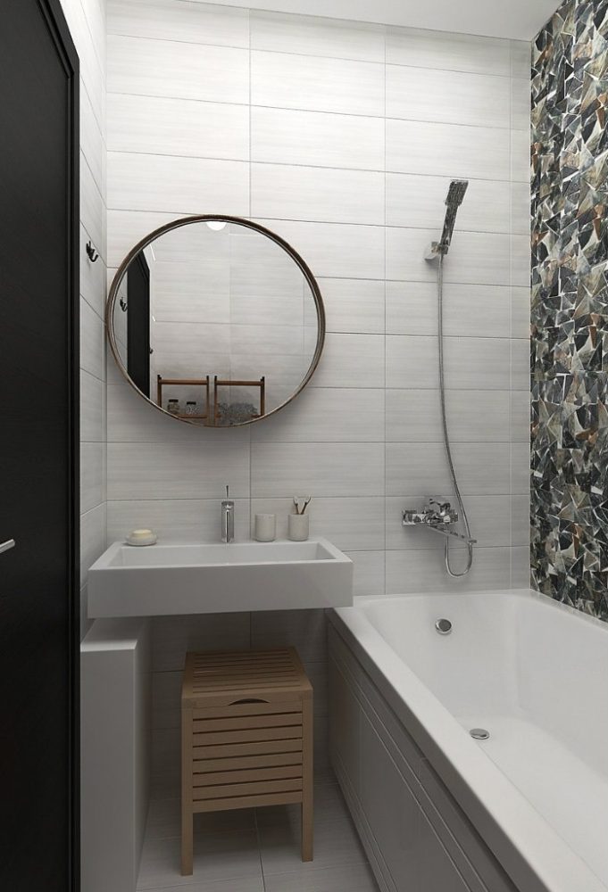
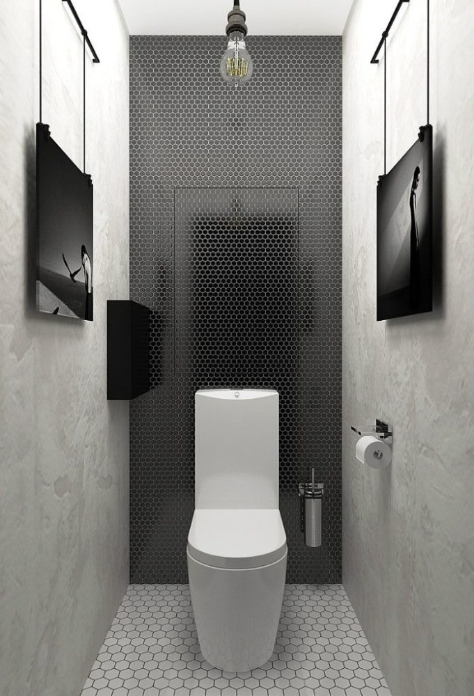
 Bathroom The interior of the bathroom was decided to be kept inmonochrome palette. The wall above the toilet was decorated with black glossy mosaics from the Porcelain series, resembling honeycombs. The floor was laid with mosaics from the same series, only larger and milky in color. The two remaining walls were decorated with clay plaster and adorned with photographs.
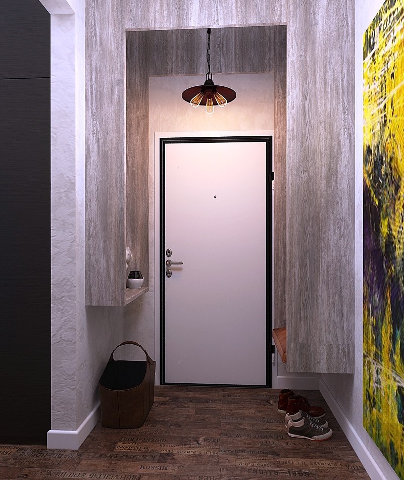
 Corridor In addition to the photo gallery, in the corridorAn unusual bracket-shaped wooden structure settled in. On one side it is a pouf, on the other - a console. It turned out very convenient, besides, such a structure does not overload the small hallway. And the resulting niche was lined with mirrors, thereby obtaining the effect of a tunnel and the opportunity to examine yourself from all sides.
 Victoria Zolina, designer:— Such interiors are usually called bachelor interiors, but we think that this is not a completely correct question to ask. The fact is that today a man is single or a woman is in free search, and tomorrow everything can change, so creating an interior based on marital status is wrong. For us, when creating an interior, the main thing is the customer's personality. In each project, we try to find out in detail about his hobbies and preferences and create a concept for the future interior based on these features. In this interior, the following were used: Bedroom:
- the cabinet was made according to the designers’ sketches in the Woodmorning workshop (Russia);
- the rope partition was made according to the designers’ sketches in the Woodmorning workshop (Russia);
- the chandelier was made according to the sketches of designers Alexander Klochkov from Ironlamp (Russia);
- sconces — Lampe Gras (France), model Cone;
- bed - Hoff (Russia);
- the chest of drawers was made according to the designers’ sketches in the Woodmorning workshop (Russia);
- mirror - Loftdesign (Russia);
- clay plaster - Art Deco (Russia);
- laminate (bleached oak) - Parador (Germany), Click in collection.
Living room:
- sofa - "Greenwich" (Russia);
- chandelier - designer Nathalie Dewez (Belgium), model Prism;
- the worktop by the window was made according to the designers’ sketches in the Woodmorning workshop (Russia);
- the cabinet is made in the carpentry workshop of the studio;
- the TV stand was made in the studio's carpentry workshop;
- chair - Loftdesign (Russia);
- a hanging lamp near the table - Vitra (Switzerland), model Potence;
- ceiling lights above the table - Lampe Gras (France);
- clay plaster - Art Deco (Russia);
- laminate (bleached oak) - Parador (Germany), series Click in.
Kitchen:
- chairs - Loftdesign (Russia);
- table top of a dining table - Loftdesign (Russia);
- metal dining table legs - Woodmorning (Russia);
- concrete lamp - Romatti (Russia), model Simple cement;
- the top drawers were made according to the designers’ sketches in the Woodmorning workshop (Russia);
- the bottom boxes - "Kitchen yard" (Russia);
- decorative brick — KAMROCK (Russia);
- laminate - Parador (Germany), Trendtime 2 collection, Wine and Fruit model.
Bathroom:
- plumbing was ordered from Santekhnika-online.ru;
- vanity unit - IKEA (Sweden);
- shelving units - IKEA (Sweden);
- tiles - Kerama Marazzi (Russia);
- mosaic tiles - Sekitei (China), article MS-TRI.
Bathroom:
- plumbing was ordered from Santehnika-online.ru;
- mosaic on the wall and on the floor - NS-Mosaic (Russia).
