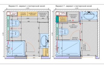
Have you ever seen how tightkitchen-dining room transformed into a comfortable place for the whole family by the efforts of a designer? Hot on the heels of the TV show "Fazenda", etk-fashion.com publishes an amazing story of home transformation by Russian designer-decorator Anastasia Muravyova. Read while it's still hot! Today, Channel One aired the TV show "Fazenda", which presented a project by designer-decorator Anastasia Muravyova. Anastasia created an interior for a family that contacted the TV show with a request to redesign a cramped and inconvenient kitchen-dining room in a house near Moscow. The designer faced a difficult task: to place a full-fledged kitchen, dining room and hallway in a small room, with an unfortunate layout of communications and many door and window openings. Anastasia Muravyova, designer and decorator Designer and decorator Anastasia Muravyova graduated from the Faculty of Economics of Lomonosov Moscow State University and the Higher School of Environmental Design at MArchI, received an MBA degree from the University of Bristol. Now she works mainly with the interiors of private houses and apartments, and also has experience in decorating public spaces. She is engaged in painting and photography, is fond of contemporary art and successfully uses all these skills in her interiors. She took part in art exhibitions, where she demonstrated her paintings. The designer and decorator sees her mission in creating a harmonious, stylish and comfortable space that takes into account the tastes, preferences and budget of the customer. She is ready to work in any of the known interior styles, without copying samples and bringing a unique individuality to each project. anastasia-muravyeva.name The difficulty was also that the owner of the house did not leave any wishes regarding the style and color scheme, so Anastasia had to come up with everything from scratch. The designer was especially concerned about the functionality issues, since before the redevelopment, the kitchen area consisted of literally one stove and sink, located on a small "patch" near the stairs, next to the gas boiler. As a result, Anastasia developed a room redevelopment project and completely updated the furnishings.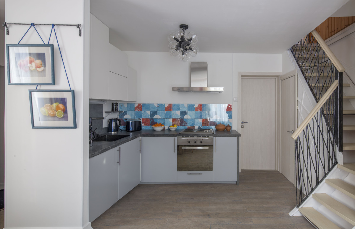 The kitchen was so inconvenient that the hostessI even had to unfold the ironing board to put the dishes on it while cooking! Anastasia Muravyova, designer-decorator First of all, the partition separating the main room from the entrance area was moved, and the passage to the kitchen from the hallway was positioned slightly differently. This way, it was possible to allocate enough space for a kitchen with a full-fledged work area and leave room for a compact hallway. In addition, an additional partition was erected, separating the pantry with a gas boiler. The refrigerator was placed there.
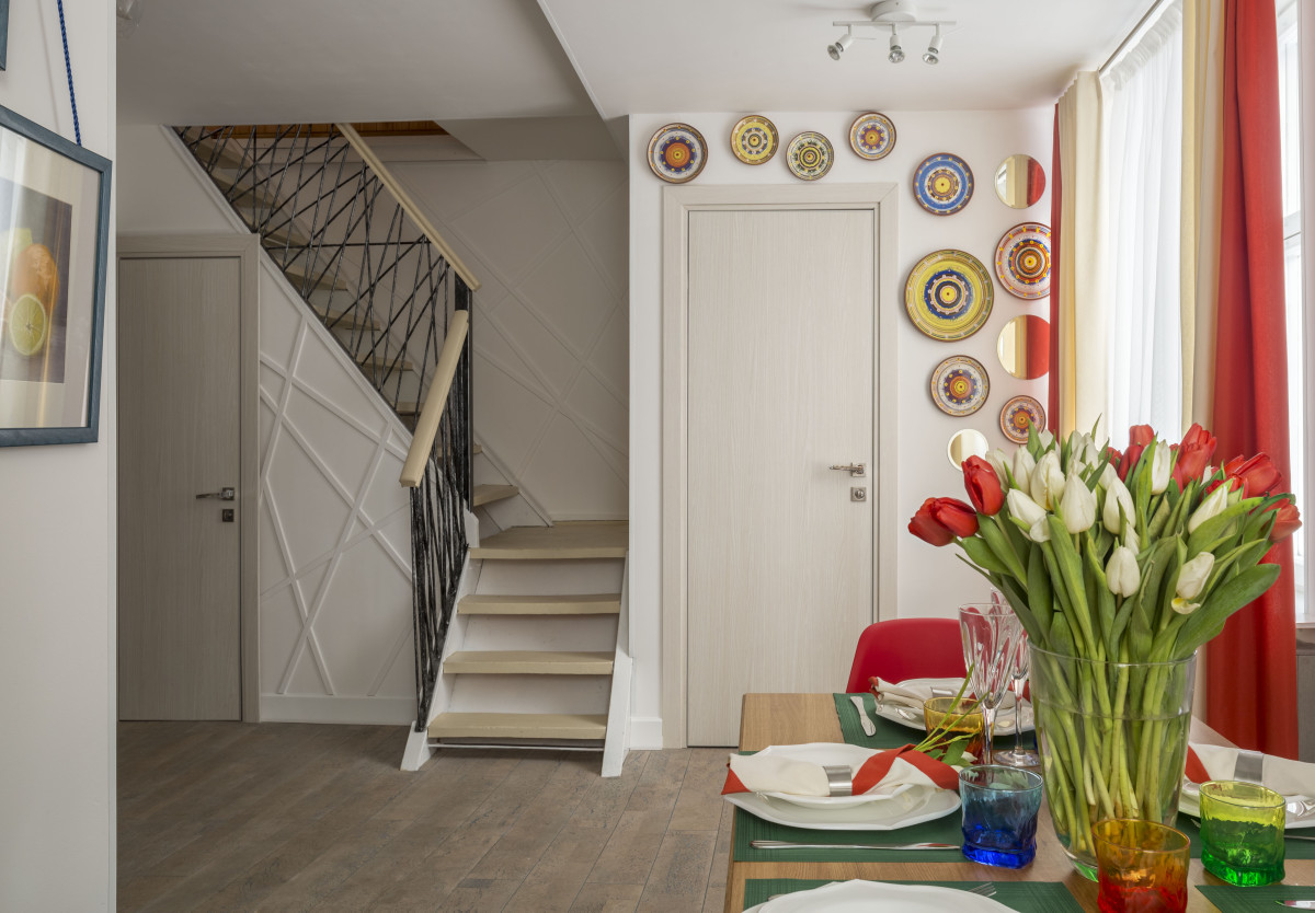
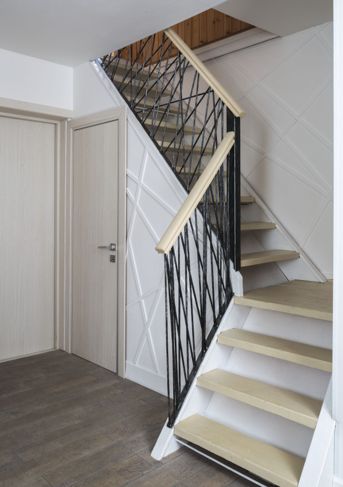 The designer chose a contrasting color scheme:bright accents on a white background. The chaotically arranged broken lines gave the background texture. They repeat the pattern of the forged stair railings. The steel rods from which the railings are made were also given texture and then painted black with a silver patina effect. The abstract motif is repeated in the form of the chandelier hanging above the dining table.
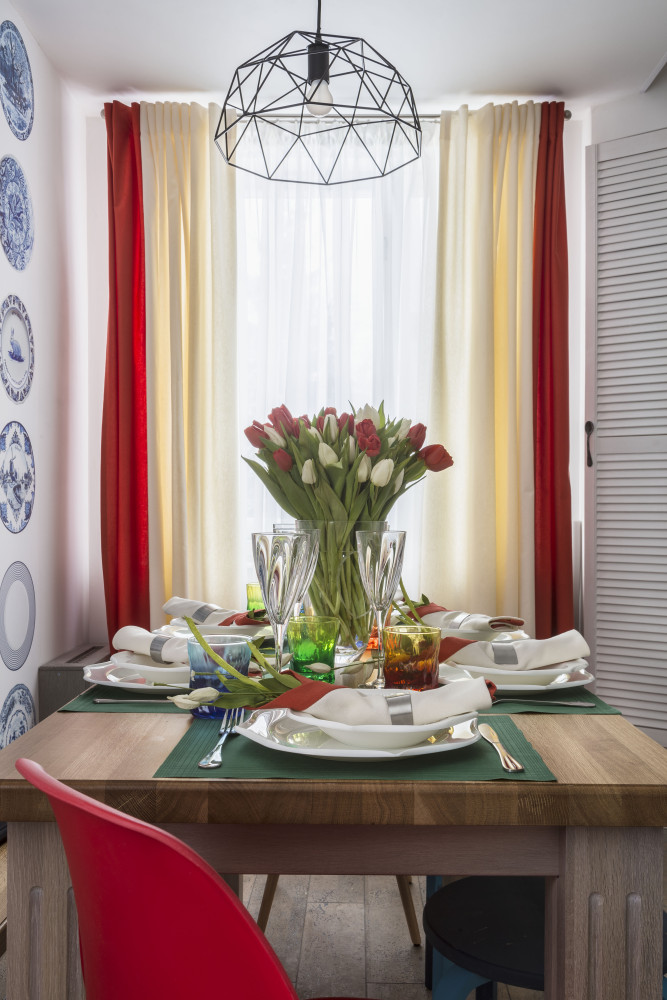 The main decoration of the dining area is photo wallpaper witha print of plates in traditional Dutch blue tones. The table and bench are made of solid oak. A characteristic feature of modern Dutch interiors is also the combination of the new and the traditional, so for contrast, bright red plastic chairs and stools, painted by the designer to match the main colors of the interior, are placed next to the oak table.
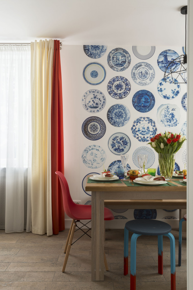 The table setting uses originalplates, the shape of which resembles an open tulip. In the center of the table is a vase with real flowers. And napkins with orange edging and glasses made of multi-colored glass make the table area even brighter and more impressive.
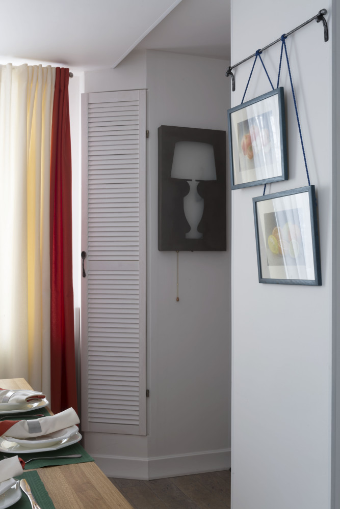
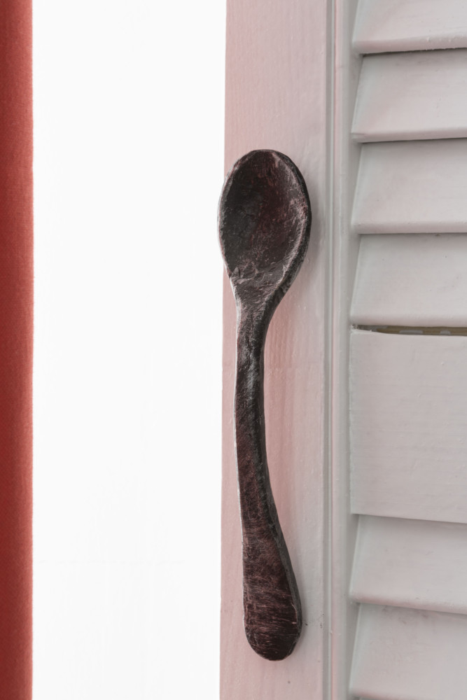
 Between the window and the door leading to the pantry,communications are hidden in the box. Adjacent to it is a built-in cupboard for dishes, the handle of which is made in the form of a spoon. The spoon, by the way, was forged by hand. An original designer sconce is located nearby.
 The decor of the dining area is completed by a diptych withfruits, specially painted in pastel by the author of the project for this interior. A special mount was forged for hanging the paintings: if the owners want to add to or change the composition, the wall will not have to be drilled.
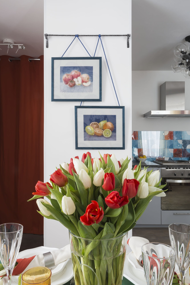 The kitchen itself has an L-shaped configuration.The hanging cabinets form an asymmetrical composition that echoes geometric abstractions in the spirit of Piet Mondrian. The main accent of the kitchen is the apron painting, made using the glazing technique and imitating tiles. Tempered glass is located on top of it. The countertop, panels on the left wall and a shelf on forged fasteners are cast from concrete. The edges of the countertop are specially left relief to give it a certain brutality. Another interesting detail in the kitchen interior is a chandelier with glass shades, which has a fashionable “molecular” shape.
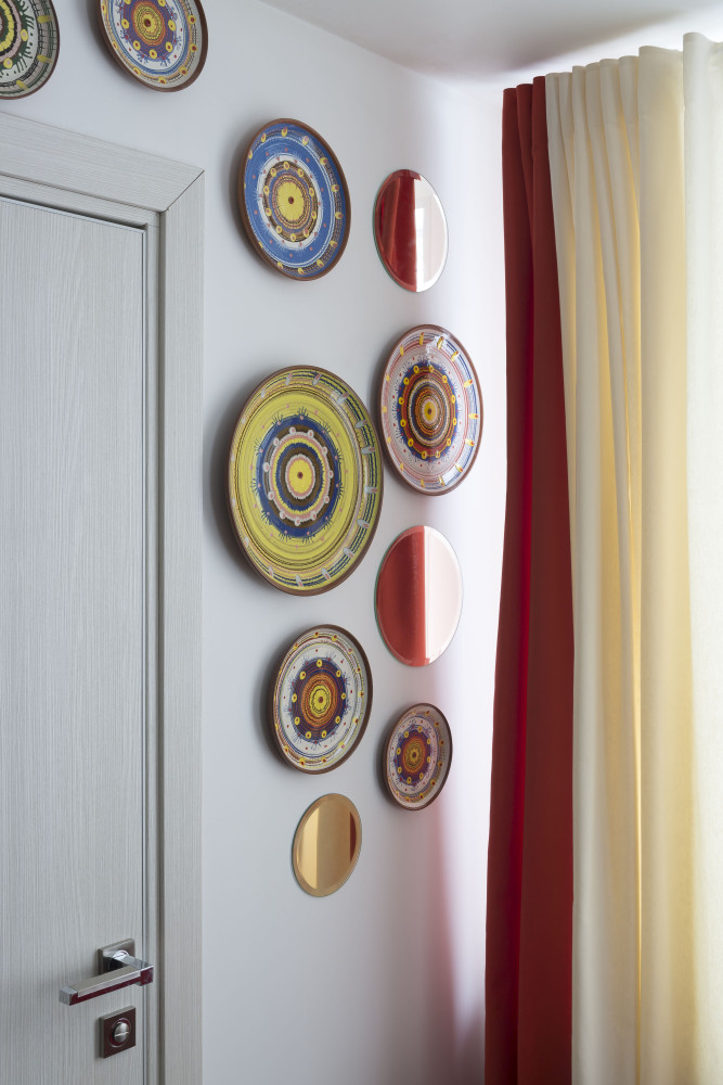
 The finishing touch is real volumeplates, mixed with round mirrors on the wall between the stairs and the window. The designer had to make a short trip to Tarusa to get the plates.
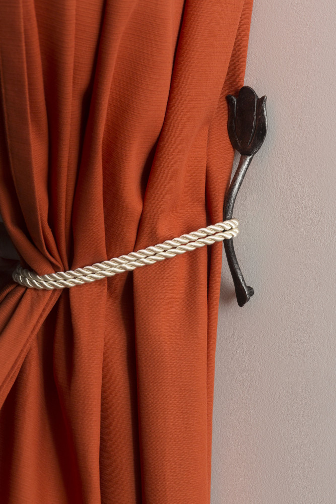
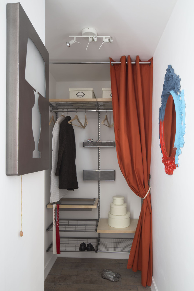
 Because the owner of the house wanted the premiseswere convenient and functional, the project used modern storage systems. On the inside of the pantry door there are metal shelves for detergents and various small items, which allow you to make the most of the small space. In the hallway there is a wardrobe system with pull-out shelves and hangers. Its elements can be independently swapped without disassembling the entire structure. Clothes in the hallway can be covered with a curtain, and a tulip, hand-forged according to a sketch by Anastasia Muravyova, is installed as a grab.

 *All photos: Denis Vasiliev.
TV program "Fazenda": Dutch cuisine for a mother of many children – etk-fashion.com
