Contrasting, monochromatic, pastel or black and white? Or maybe purple? How to choose and combine colors in the kitchen? We selected the most fashionable schemes and showed them to experts
Working with color is perhaps the most difficult partdecorator profession. Skillful use of color combinations can radically change the perception of a room, while inept use can ruin any interior. Living space, even if done in one color scheme, is never completely monochromatic. Furniture, walls, textiles made of different materials and textures will still create a variety of shades. Especially in the kitchen, the most functional and "colorful" room in our home.
That's why most people who choose a color for themselvespaint, tiles or kitchen fronts, subconsciously strive for neutral or pastel shades: mistakes are not so noticeable. And often later, looking at interior magazines with bright pictures, they regret it. In fact, there is no need to be afraid of color. You should be afraid of excess. To avoid it, you need to remember some features of color perception.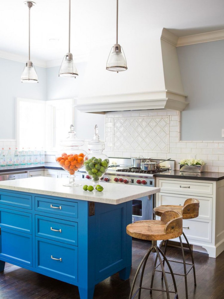

Color as such and its impact are almost neverdo not match. To put it simply, the color on the sample and the color in real space, next to other tones and shades, will look completely different. Artists call this feature the psychophysiology of color and skillfully use it to get this or that emotional reaction from us. Entire libraries have been written about how to do this, and good colorists stand out even in the professional environment.
For an ordinary person, in order not to make a mistake,it is enough to choose one, maximum two basic colors or shades and carefully add the rest to create the desired effect. As a "cheat sheet" you can use color charts that are issued for designers and decorators, or ready-made schemes that these designers and decorators then come up with for furniture and paint manufacturers. This way you will get a starting point from which you can build your own interior without unnecessary risks. So, what's in fashion this summer?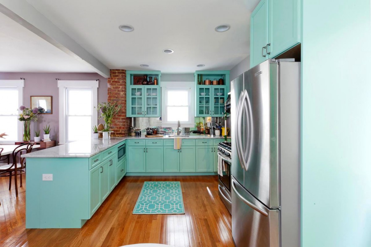

1. Blue ice, white and grey
A timeless classic of the Mediterranean and verya formula that is advantageous to use, where blue is air, white is light and airiness, and gray is clarity and shine. Blue and white are a great combination for painted facades, and the sunlight will effectively shimmer on the silver metal of the handles and lampshades. In order not to freeze from such a combination in the Russian climate, it is better to add warmth with a wooden floor or a table with chairs in natural shades. An additional plus is the free combination with any contrasting accents: bright paintings or prints, dishes, table linens.
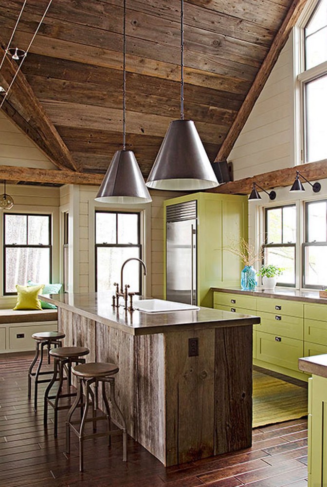
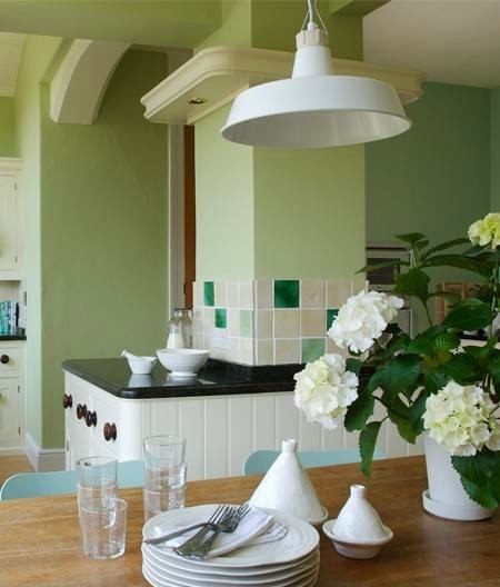
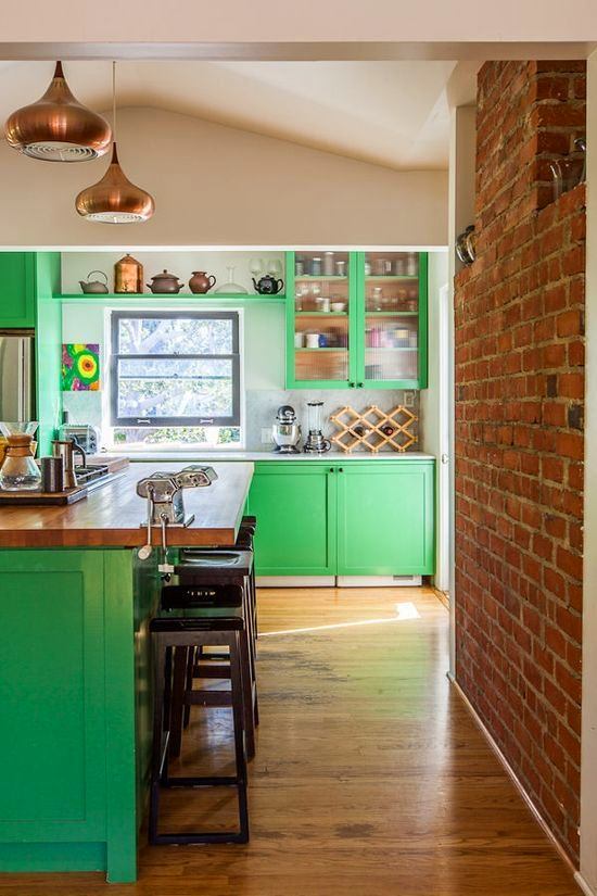
2. Green apple, white and dark brown
Apple green is one of the most noblecolors in the palette of painted wooden classics and old Provence. It is important not to overdo it, otherwise the excess will turn the room into a dollhouse. But it is not difficult: the color goes well with textured and dark wood, metal, both shiny and matte, white and black tiles. with elements of eclecticism, especially in contrast with industrial and emphatically rough objects.
 Alexey Eliseev, Manders:
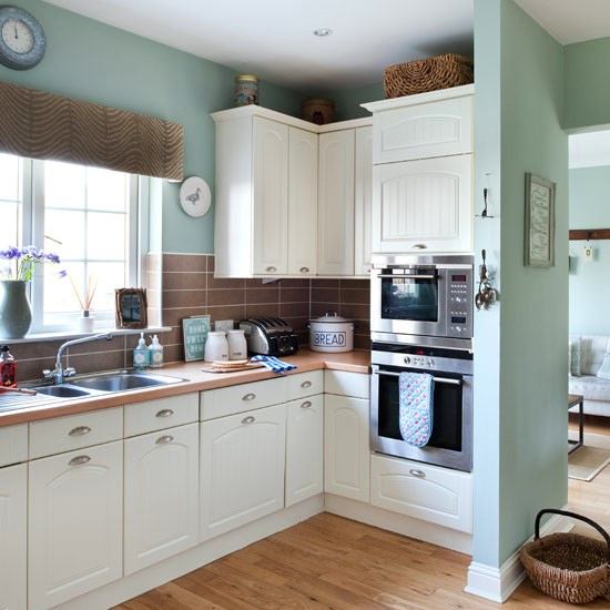
— Soft green and light green shades are at their peak nowpopularity in Britain. This is a historical color, a new interpretation of the English classic. It is called Eau de Nil - the waters of the Nile. In the 30s of the last century, walls were painted in this color not only in England, but throughout Europe. If two housewives met on the street and said: Eau de Nil! - everyone immediately understood what they were talking about. In general, when choosing a color for the walls of the kitchen, you need to start from the general concept of the interior and coordinate their color with those elements that already exist and will remain unchanged. manders.ru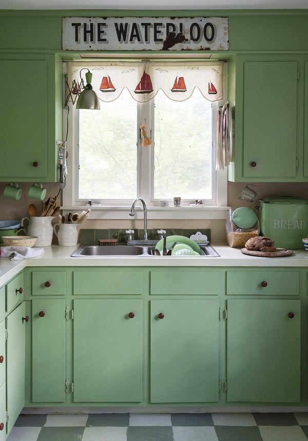
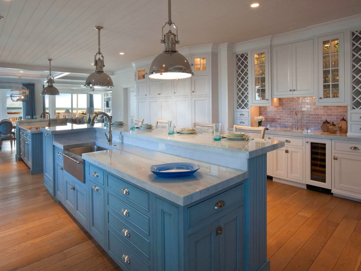
3. Dark blue and white
White sailor cap on the sunny seaside, paintedtiles of the old Dutch woman in the Turbins' house and summer tea parties made of Gzhel. There are things that can't come back because they never went away. If not out of fashion, then definitely out of memory. The blue and white kitchen is exactly like that. The simplest: blue bottom - white top. But if the space is quite large, you can take on bolder variations: diagonal compositions or solid blue facades with traditional tiles under the tiles and rustic rough wood. Whatever you come up with, you will still get one of the most respectable and "expensive" combinations, not so much in price, but in perception.

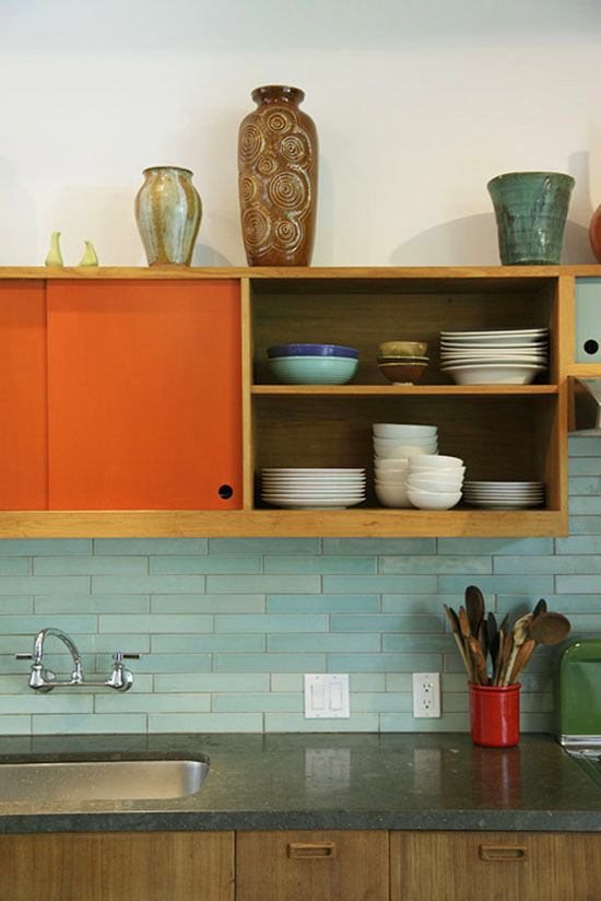
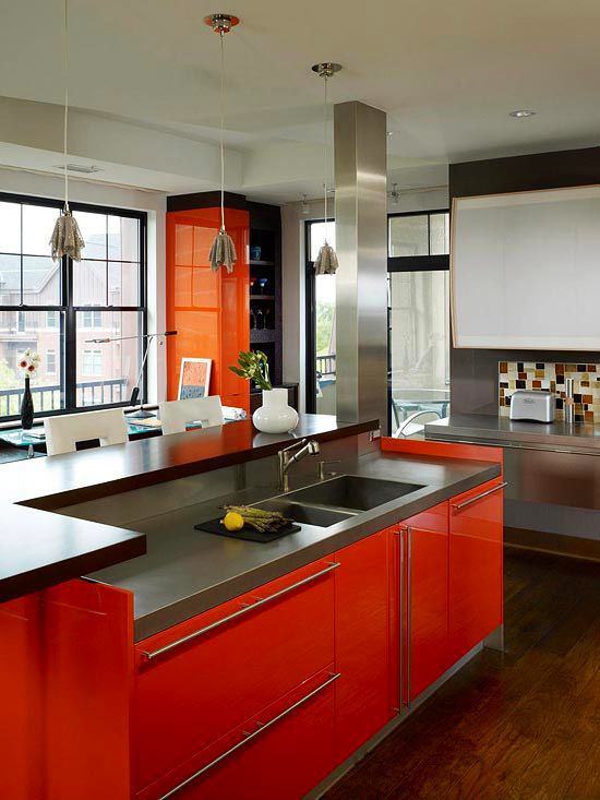
4. "Mad Orange" and Cobalt
Van Gogh's favourite combination, bold and joyfuland warm: a sunflower against a blue sky and green grass. But if you are far from painting, you need to be careful with the shape and size of the flower. A very successful example is orange walls, white furniture and blue-green decorative accents. As a transition - a warm wooden tone of the floor. In such a room there will be "eternal summer" all year round. Solid orange facades are a more individual solution. But it is also possible in combination with white tiles, for example, and dark wood.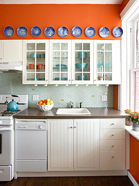

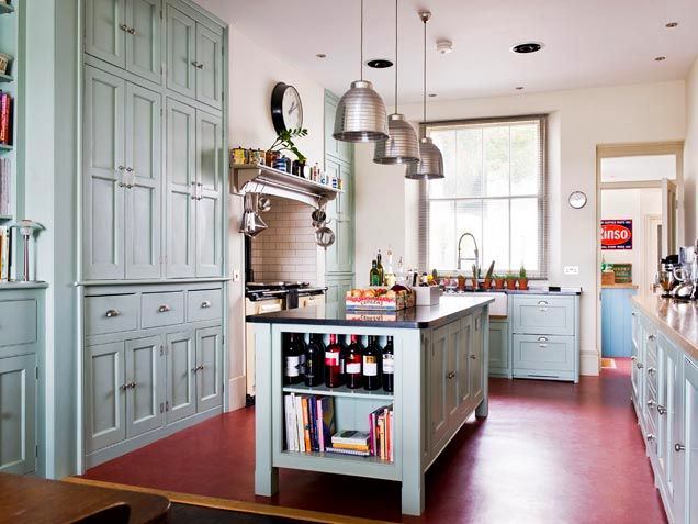
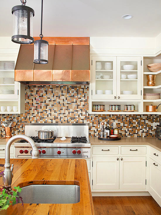
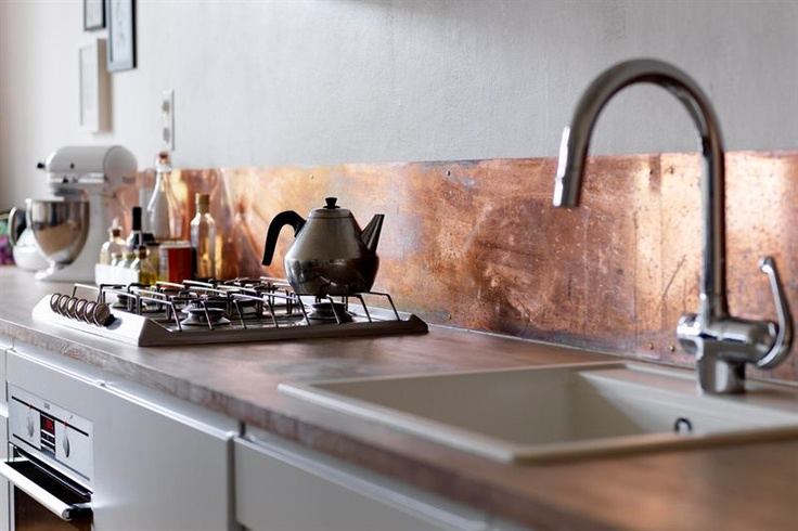
5. Copper with cream
, pseudo-copper or bronze handles, steelstoves and light cabinets - a light kitchen in an "earthly" tone with a set of expensive accessories. Copper hoods have been around for a long time, and countertops are next in line. However, when ordering one, do not forget about the tendency of the copper surface to become covered with a noble patina. Over time, its layer will become thicker, and there will be no trace of shine. However, many people like this effect.
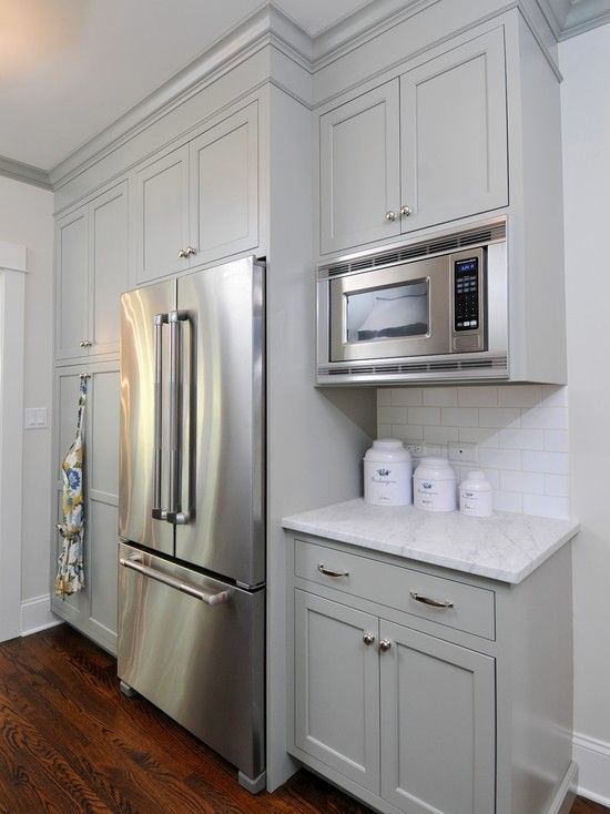
6. Gray and white
Do you think it sounds colourless? In vain!Every fourth kitchen sold in Europe last year was exactly like this. Gray is the only universal color in the palette that allows you to do literally anything with it. Want to know the true color of this or that object, without glare and reflections - put it on a gray background. If you have difficulties with color combinations - solve with gray. It will go with everything. And it is also an ideal basis for experiments with fashionable accessories of any shape, size and brightness, colorful tiles, glass, shiny and matte surfaces. Medium gray is a neutral tone, but with the help of a drop of additional color it can be made a little warmer or a little colder. In small rooms, dilute with white. Shaking and mixing is not forbidden.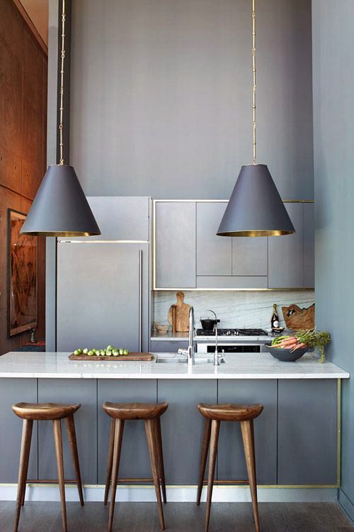

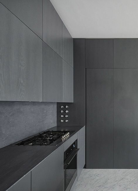
7. Orange, black and gray
Orange and black is a popular combinationexhibition samples of kitchens in a futuristic style. Many stop, but only a few buy. And this is understandable: the mixture is as aggressive as it is spectacular. With the addition of gray, the situation changes radically. The kitchen retains its super-modern look and the drama of the composition, but loses its depressing effect. Dark window spans and black or orange plastic lamps look very interesting in such interiors.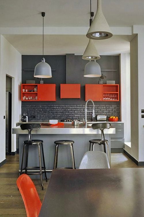
8. Coral, white and bright green
An extremely rare combination that has come into beinginterior from the exterior, that is, from landscape design - this is a common ratio of colors in rose gardens. Such a palette is more typical for the Spanish or Portuguese coast than for a Russian city apartment. But nothing prevents it from settling here - the combination is not only unusual, but also surprisingly warm and comfortable. The only thing you should not forget is proportions. One of the active colors, coral or green, will have to be given clear preference, and the second one should be used as rare accents. If the activity of the coral shade still confuses you, you can replace it with a softer and more familiar pale terracotta, the color of old brick. White will help to balance the composition.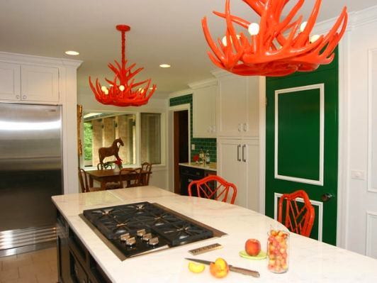

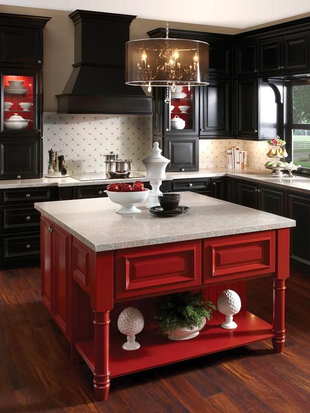
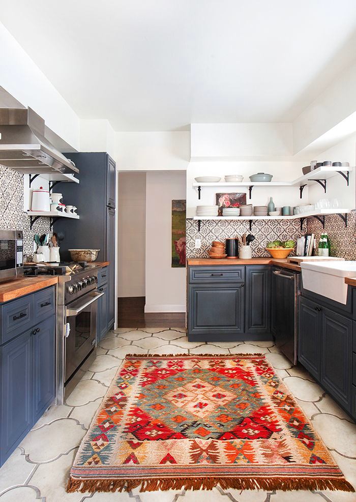
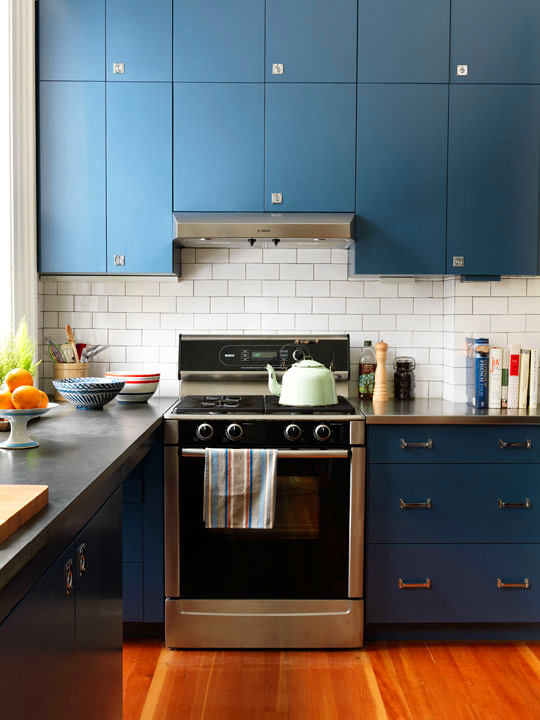
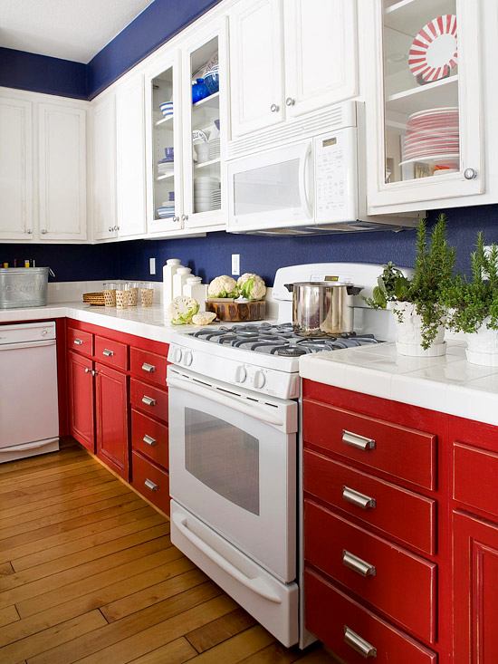
9. Red, blue, white
The basic color combination in painting, inIn Russian interiors, it is now used mainly to create teenage rooms in the British spirit. And in vain. The combination hides great creative potential. In pure and bright form, these tones were popular in America in the 50s. And if you tone them down a bit, they will suit almost any style: from high-tech to classic.
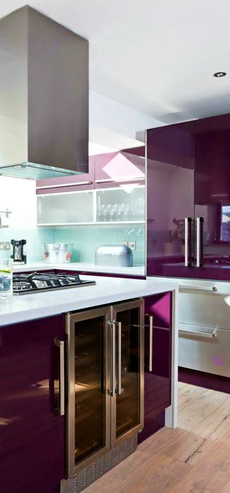
10. Purple, black and white
Purple kitchen "on an enamel wall" - optionfor fans of flashy interiors and art deco. Although in , dark pink and fuchsia are most often used to paint modern facades, but there are also classics and modern. Remember that next to black, even the palest fuchsia will start to glow neon and be careful with accessories. But it is best to start experimenting by combining individual spots of purple with black on a gray or white background, and take advantage of the decorative possibilities of wood.

 pinterest.com hgtv.com


