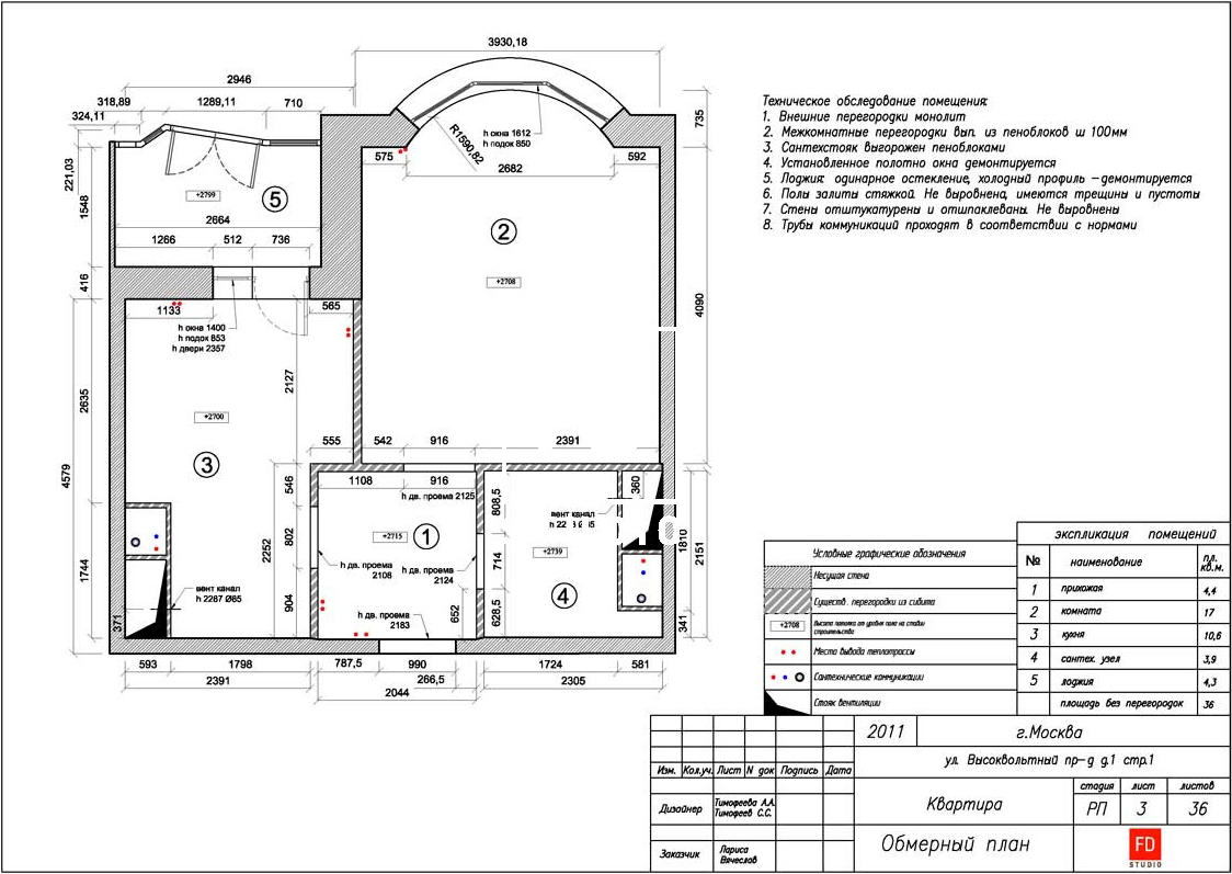
Absolute comfort, discreet minimalism andcalm color scheme — such an interior can easily be imagined in any metropolis in the world. We talked to the architect who designed this beautiful interior in Moscow about how to create an apartment for an active traveler. The owner of this apartment is a successful man, an avid traveler and cosmopolitan. He has many favorite places in Europe and Asia, and he wanted to transfer his most vivid impressions from his stay abroad to his own living space. The idea of comfortable housing with an international character was brought to life by architect and designer Olga Raiskaya. Olga Raiskaya, architect and designer In 2002, she graduated from the Ulyanovsk State Technical University, specializing in "Design of the Architectural Environment" (at the Faculty of Civil Engineering). She has been working in the field of design and construction for 15 years. Specializes in various types of objects - from urban architecture to private and public interiors. She prefers an individual approach to each project, and calls the most interesting thing in her work the implementation of an idea. The credo is to find the golden mean between the customer's wishes and how everything should ideally be. www.raiproject.com The interior of this apartment gravitates towards minimalism and is built on three key points: maximum comfort, neutral colors and a laconic modern style without eye-catching accents. The author of the project had to work hard on the original layout, including restoring the original boundaries of wet areas. The customer prefers isolated rooms, and Olga took into account all his wishes. The only compromise is a solid glass sliding partition between the kitchen and the living room, easily transforming the space from open to closed. In addition, glass is visually perceived as lighter, and the rooms look more spacious. At the same time, complete "isolation" is provided by heavy chocolate-colored velvet drapery along the glass partition. Its advantage is also that the acoustics of the home theater are improved.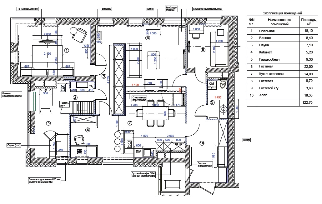
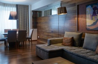
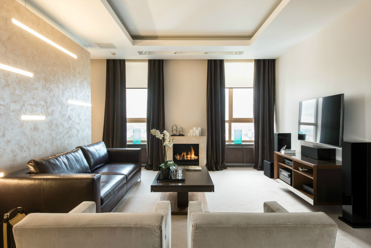
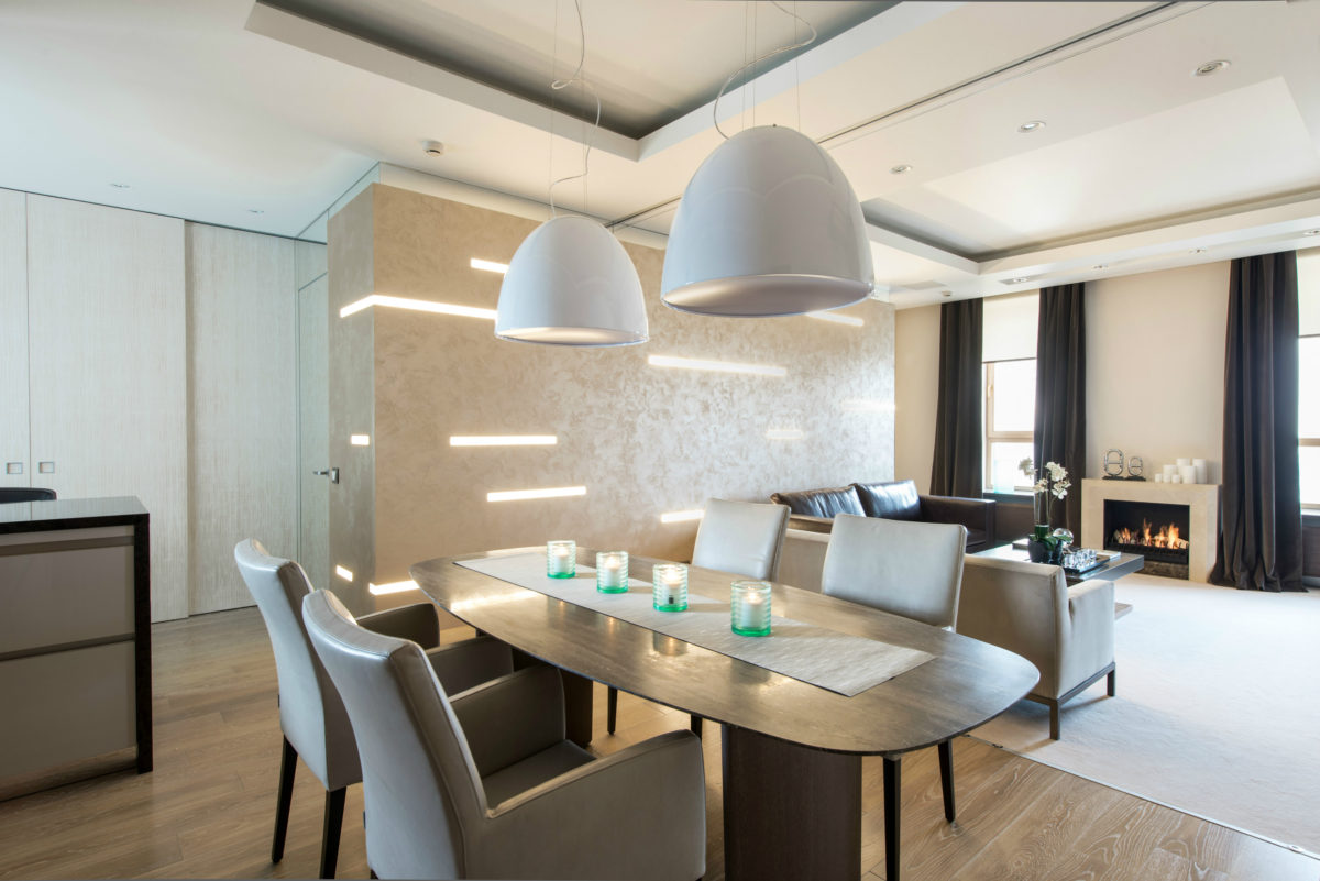
 There is another partition from the living room to the kitchen,which essentially forms the wall of the room. The direction of movement is indicated by light stripes, like a dotted line, while the structure itself is highlighted with golden plaster. Behind it is a large 4.7 m high wardrobe. The living room interior began with a sofa: the customer saw a similar model with exactly the same leather color in the salon. Then small Meridiani armchairs and a Hulsta coffee table were selected for it. The hanging cabinet for home theater equipment was custom-made by the company "Sofia-Decor" (Moscow), masterfully repeating the colors of the table: gray-brown varnish and American walnut veneer finish. The atmosphere in the living room is created by a stylish modern bio-fireplace. It is made according to the author's sketches from marble by the company "Prometheus" (Moscow).
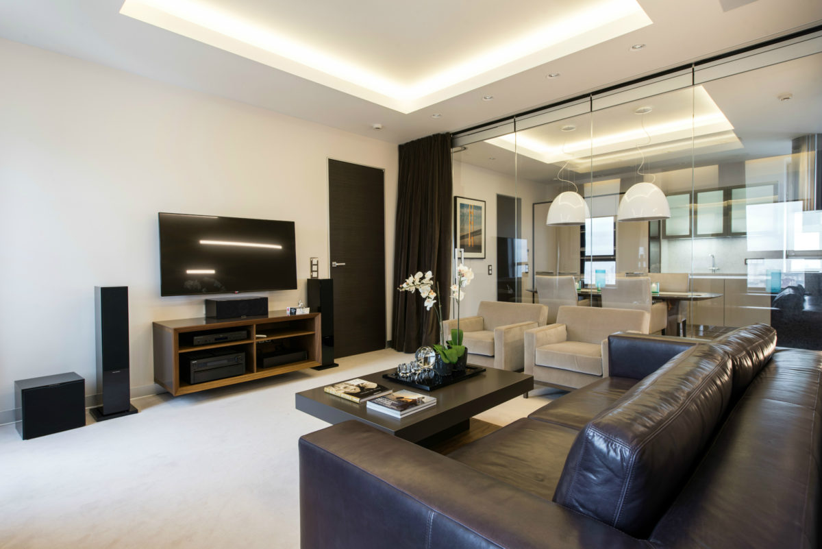 The color scheme is calm and neutral.We settled on a beige-gray palette, complemented by contrasting shades of dark wood and chocolate. Individual details are in lilac, eggplant, orange and mahogany. The lighting deserves special attention. It is multi-level. The light is mostly diffused, there is a lot of hidden lighting, creating its own mood. For example, in the bathroom, an RGB LED strip was used to illuminate the ceiling beams (as an element of color therapy). The function of local illumination is performed by a Flos lamp above the desk, white lampshades from Artemide above the dining table, for the same purpose, the headboard of the bed, mirrors in the bathroom and guest toilet are illuminated. All built-in wardrobes, office furniture (table, shelving unit), bedroom, lacquered cabinets in both bathrooms are made according to the author's sketches in Moscow by the company "Sofia-decor".
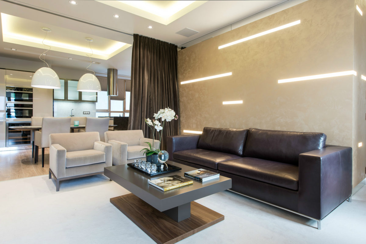
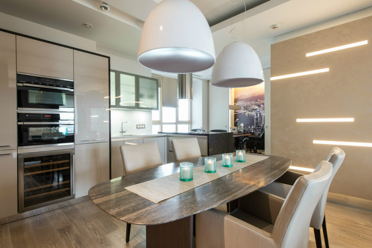
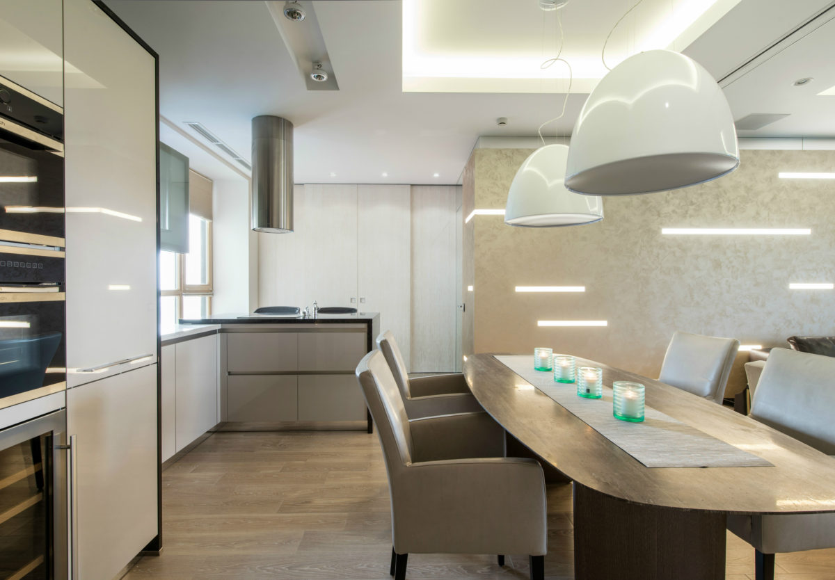
 The kitchen was chosen from the German brand Bauformat,lacquered facades. Functionally, it is divided into three parts - cabinets with built-in appliances (a large built-in refrigerator, a microwave oven, a compact oven, a wine cabinet - all Kuppersbush), a sink area with a dishwasher and a work area in the form of an island - a bar counter by the window. In order not to put the kitchen island next to the low windowsill, it was turned at a right angle to the sink, thereby turning it into a cozy place for breakfasts and snacks, and additional seating appeared on the wide (reinforced) windowsill. An elegant dining table from Misura Emme with a marble top was made to order according to individual dimensions (length - 2.20 m). The leather dining chairs are from the German brand Christine Ckroencke, and the dome-shaped pendant lights above the table are Artemide.

 The niche office is perfectly visiblefrom the entrance to the kitchen, so a print with a panorama of Hong Kong at night was placed on its view wall. The photo was slightly color-corrected, adding lilac-eggplant shades so that it would organically combine with the mahogany-colored desk. The printers were hidden in the rack opposite. If necessary, sliding doors isolate the office.
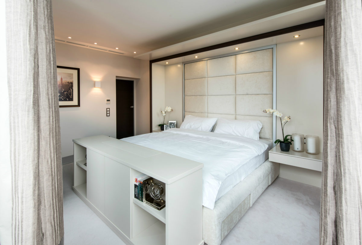
 The interior of the master bedroom is designed in colorivory. A matching natural wool carpet was selected for it. The furniture was made to order according to the author's sketches, including the bed frame with drawers, a soft wall-headboard upholstered in fabric from Jab, a frame with a walnut finish framing it, console drawer tables with lighting. Everything was made by the company "Sofia-decor". In general, the bedroom turned out to be light, without bright details. The main emphasis here is the view of the city and the picturesque panorama of the bridge from a bird's eye view.
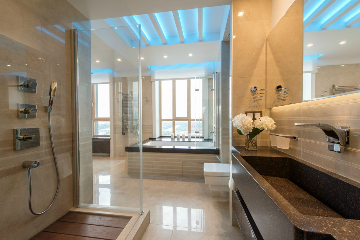
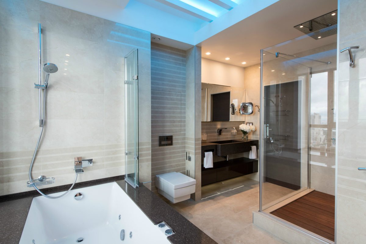
 For the master bathroom, we chose a glossy finishEmil Ceramica marble-textured tiles (a more economical option than marble, and also lighter and easier to maintain). The sink built into the niche is made of Corian, and the mirror above it was custom-made in Moscow. The mixer is from the Italian brand Flaminia. The shower cabin is equipped with a Hansgrohe tropical shower, and on the floor there is a custom-made teak shield. By the window there is a luxurious spacious bathtub with hydromassage from Duravit. The toilet is Villeroy&Boch, Memento.
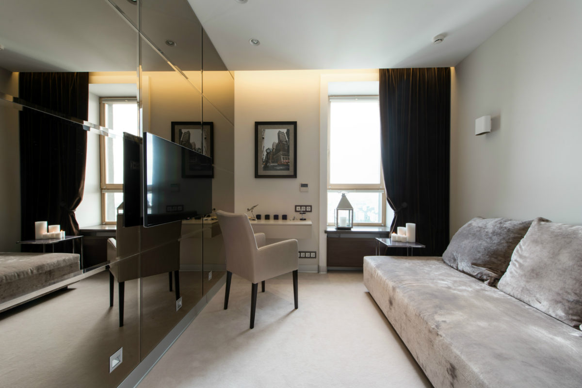
 The size of the guest room was limitedexisting window and monolithic wall, so one of the walls was completely covered with a bronze mirror, and the rest were made as light as possible. As a result, the room became much more spacious. In addition, it was possible to allocate a small place for working on a laptop - a console table with a chair. The wide sofa, which also serves as a bed, was made to order in Italy. The lamps are from Modulor and Wever&Ducre.
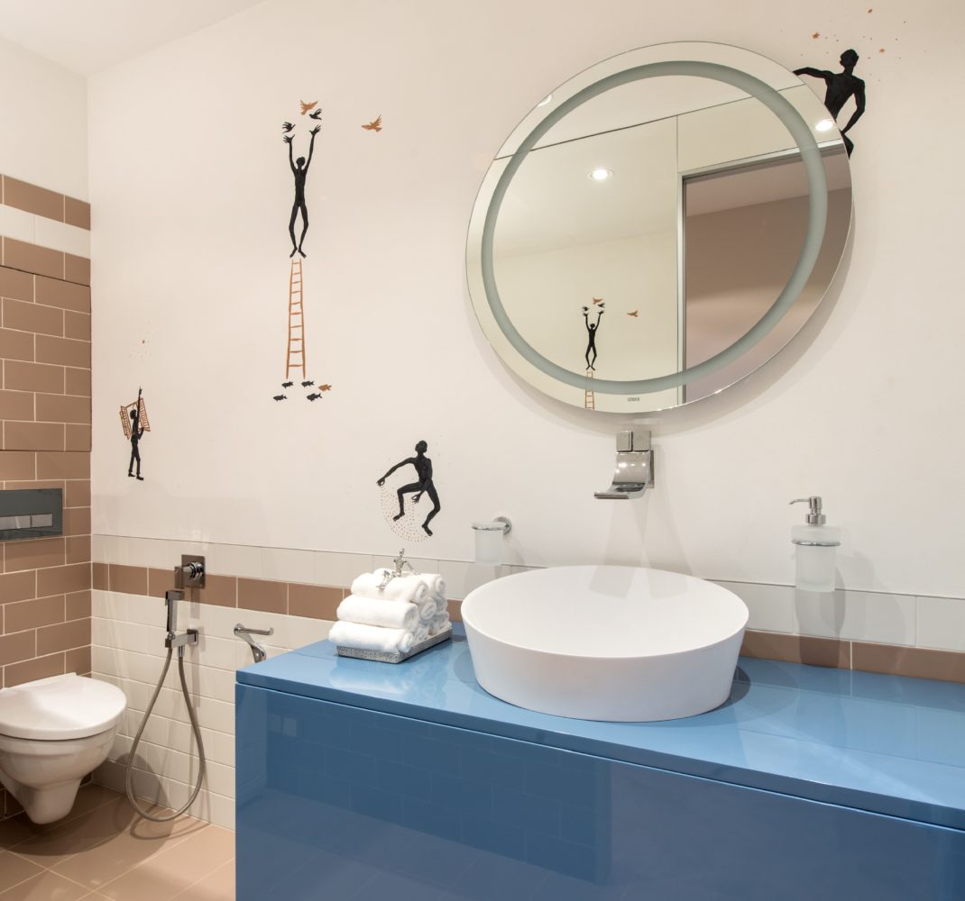
 The guest bathroom is finished with small tilesVogue, which corresponds to the small scale of the room. It is combined with decorative plaster based on lime. Interestingly, the owner of the house first liked the tiles from Bardelli with a pattern in the form of funny little people, but there was no suitable shape and color. Then the artist painted them directly on the plaster.
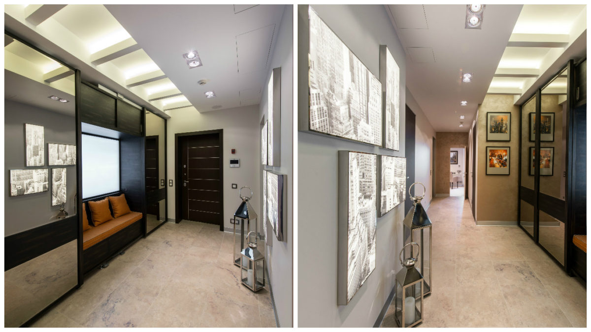
 I took an active part in the selection of materialsthe customer himself. The approach is simple — quality, color and tactile sensations. Thus, Sherwin Williams Home Duration paint in Everyday White, originally intended for public interiors with high traffic, was chosen due to its practicality: for example, it can be washed with a simple brush. The floors in the apartment are made of solid wood and custom-made in Moscow. The luxurious velvet curtains in the living room are from the Italian manufacturer Rubelli. The carpet is from the German brand Jab. It is made of 100% natural wool, has a high pile and is incredibly soft to the touch. The doors are Tre-Piu, Gray Oak, in an aluminum frame. By the way, aluminum skirting boards match them perfectly. Photo: Alexander Kamachkin.
Beautiful interior in neutral tones: 122 meters of minimalism – etk-fashion.com
