In this article we have collected the most useful andinteresting information about interiors for conservatives and innovators. About when to prefer symmetry, when to prefer asymmetry, and much more When starting a new project, it is worth paying attention to the surrounding environment. Experts are sure that the interior can have a very serious impact on the success of any enterprise, be it serious work or creative self-expression. It is recommended to look for inspiration in lively, asymmetrical interiors, but it is better to solve complex financial problems in an office with a symmetrical arrangement of furniture. The ancient Greeks considered a sphere on a plane (i.e. a circle) to be the most perfect figure in three-dimensional space. And several thousand years passed before such concepts as "symmetry" and "asymmetry" appeared. Over time, the symmetrical arrangement of furniture and decor was called a symbol of harmony, beauty, order and classical art.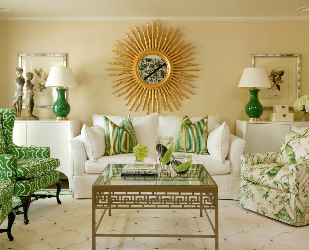
Symmetry is proportionalityIf you look intohistory of architecture, you can see that almost all palaces and castles, both inside and outside, were designed as symmetrically as possible. The most relevant is a symmetrical interior, combining equivalent pieces of furniture and decor that build a line in space (or with their help an emphasis is placed on a certain object). Due to the fact that symmetry is used simultaneously as a focus and an accent, this technique is very often used by artists and architects creating projects in the classical style.
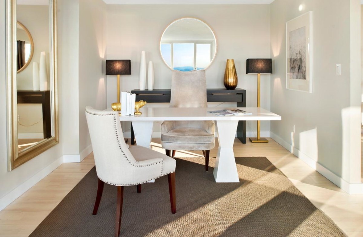
Nine out of ten offices are symmetrical.The interiors create the most strict atmosphere, most typical of government agencies and companies with a serious production focus. A similar design principle can also be found in shopping centers and hotels. Here, they are especially careful in creating the most neutral background and intuitive arrangement of various zones.
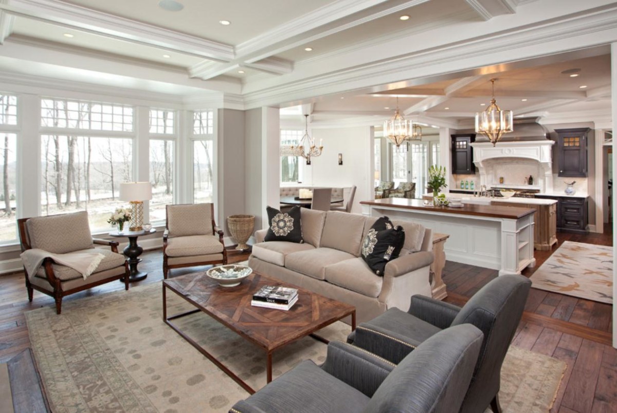
Peace and severitySymmetrical can also beresidential interiors. Rooms with such furnishings are best suited for relaxation and leisurely conversations. The principle of proportionality can also be used when highlighting certain areas in an apartment. But don't get too carried away with symmetry. The best in this case is the enemy of the good: the more symmetrical the interior, the stricter it will look and the more discomfort it will cause to stay in such a room.
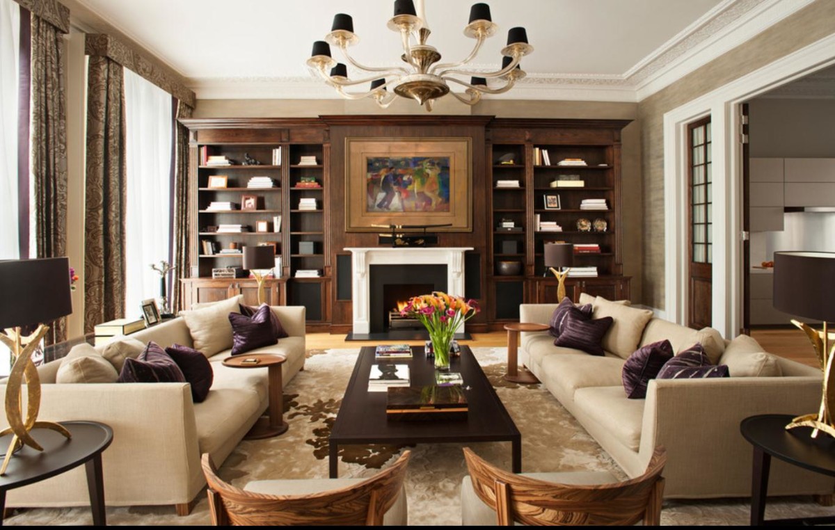 Remember:A house is not a museum, not an office, and not a shopping center. It is a place to rest and relax. So, when creating an interior for a living space, it is worth diluting the too actively striving for symmetry environment with asymmetrical details. This will give the room both life and dynamics. In symmetrical interiors, objects arranged deliberately asymmetrically attract attention. In this way, you can highlight both spectacular decor and a small personal collection. However, even asymmetrical zones should be justified and logically connected with the main idea of the interior.
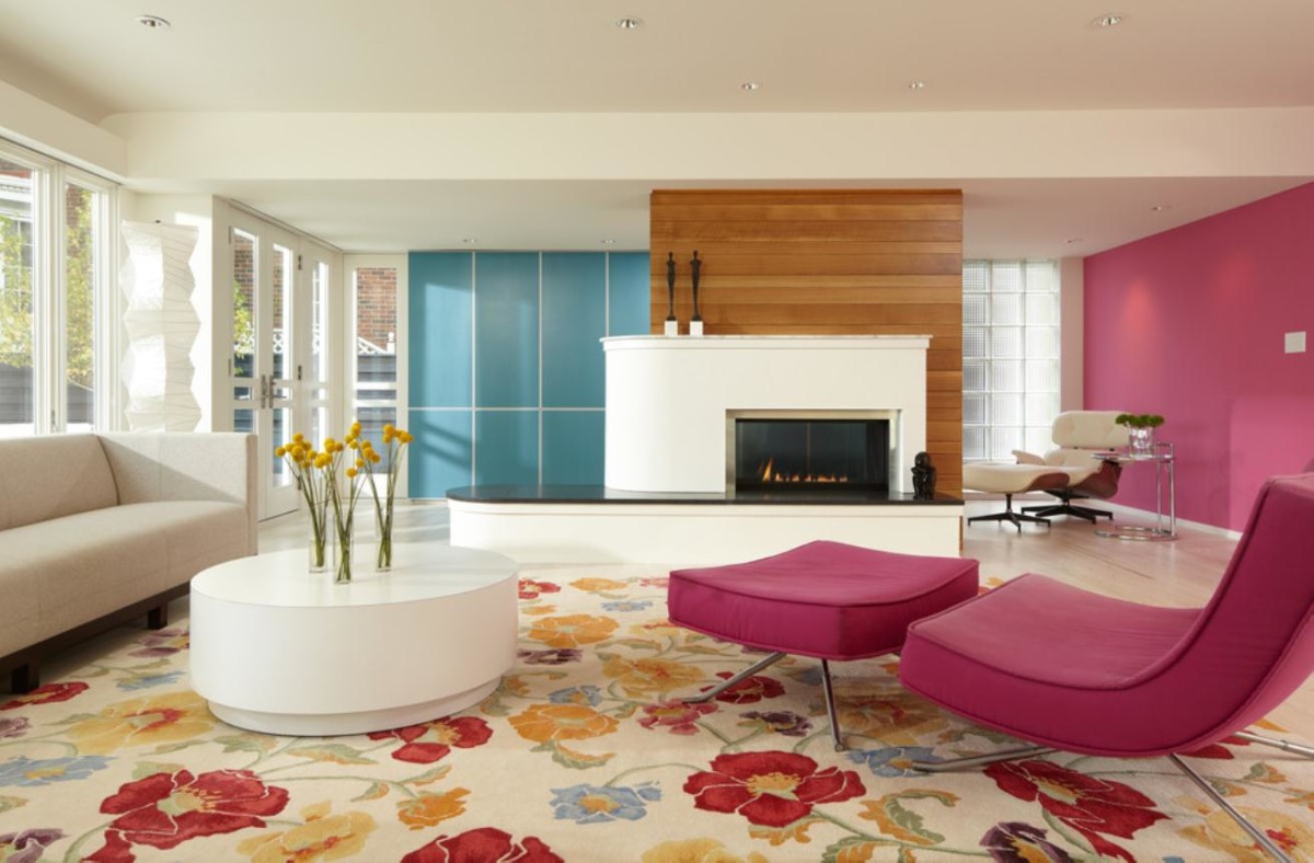
Psychological aspectAbout people whoprefer symmetrical interiors, one can say that they consider their home a fortress and are inclined to conservatism. As for the adherents of asymmetry, it is preferred by easy-going people who often change their tastes. Such people are called innovators.
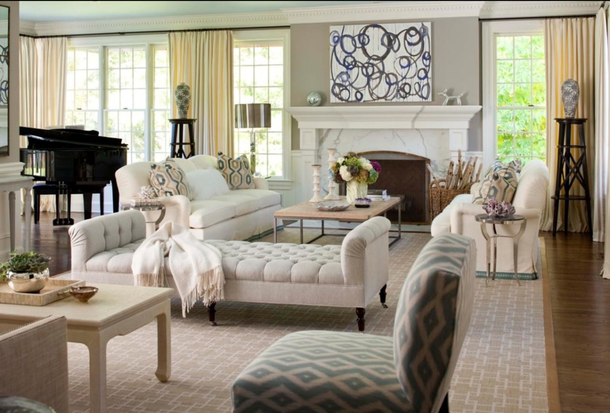 However, no matter what type you consider yourself to be,You should only start creating any interiors when you are especially creative. At the same time, you should never forget to add something of your own. If you cannot decide what you are more drawn to, remember that symmetrical interiors are best suited for dining rooms, children's rooms, living rooms and offices. Asymmetrical furnishings are most relevant in kitchens, play areas, bathrooms and creative studios. Inspiration in all its manifestations, a riot of energy and maximum creative impulses are welcome here.
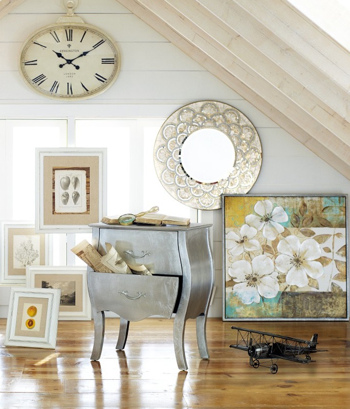 And remember that even minimal deviations from the general line of the interior fundamentally change the space, adding complexity and effect to it.