Dedicated to fans of eclecticism.Moorish arches, African desert, Lina Cavalieri's famous face, red arched doorways, turquoise doors — all in a typical, but definitely atypical Moscow apartment. A professional designer must be able to satisfy all the client's requirements. However, what if the customer does not have a clearly defined idea of the interior style? What if all his wishes are vague and contradictory? How to combine the incompatible, create an original, harmonious and positive interior that reflects the inner world of its inhabitants? According to Elena Bulagina, leading architect and designer of the Kapitel architectural bureau, the answer to all these questions is one word — . Elena Bulagina, architect Leading architect and designer of the Kapitel architectural bureau. Graduate of the Samara State University of Architecture and Civil Engineering (Faculty of Architecture). Author of numerous projects of residential and public spaces. Elena's works have been published in prestigious print media: "Redevelopment", "Beautiful Apartments", "Ideas for Your Home", "Best Interiors". The residents of this typical Moscow three-room apartment are a married couple and their student son. The head of the family often travels abroad due to his work. Inspired by the spirit of travel and imbued with the charm of Arab countries, he, in turn, instilled a love for the culture of the Middle East in his wife and son. Therefore, thinking about the interior of their dreams, the family imagined a bright, interesting space in which oriental motifs are intertwined with modern elements. At the same time, the owner of the apartment turned out to be partial to such styles as Empire and Art Deco. And the son wanted the design of his room to be distinguished by restraint and functionality. Oddly enough, but it was this whole mix of contrasts and contradictions that subsequently became the basis for a harmonious and original interior.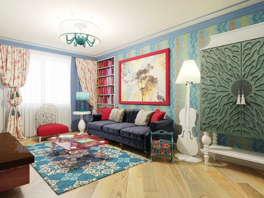
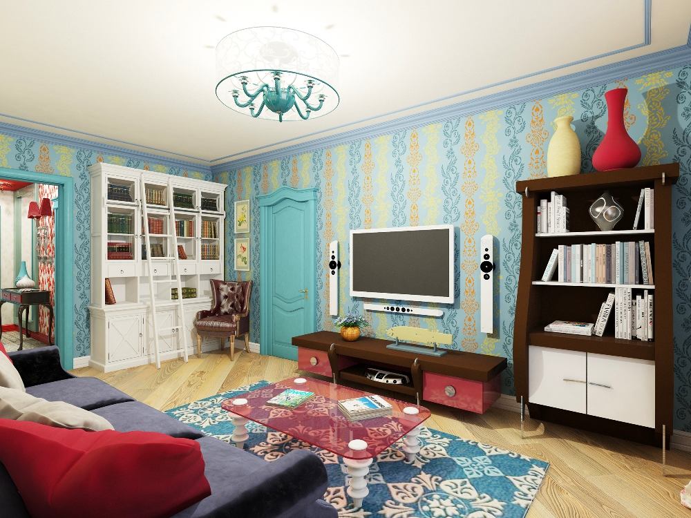
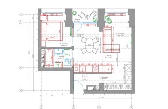
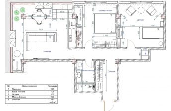
 For help in implementing your interiorThe clients turned to the architectural bureau "Kapitel" to fulfill the wishes of all family members and did not regret it. Architect-designer Elena Bulagina found a way to implement the wishes of all family members and created an extraordinary interior kaleidoscope in an eclectic style, which filled the space with exotic colors and a positive mood. Moreover, the author of the project managed to optimize the basic standard layout of the apartment without affecting the load-bearing walls. Dismantling the partition between the living space and the hall increased the area of the smaller bedroom from 11.4 to 19.7 square meters. This planning solution made it possible to turn the smallest room into a living room, and the room located closest to the front door was allocated for the son's bedroom. Smart! Student parties end late, which means that the shorter the distance from the entrance to the apartment to your own room, the less risk of waking up your parents. Elena Bulagina, architect-designer: - If customers do not have a clearly defined idea of the interior style, the best solution would be to turn to eclecticism. It allows you to use a mix of different styles, to build an individual interior, maximally focused on the preferences of customers and their ideas about the ideal space. The clear contours of established interior styles are blurred and something new, elegant, beautiful and positive is obtained. pro-kapitel.ru
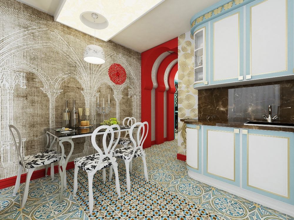
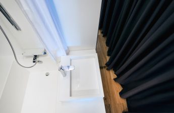
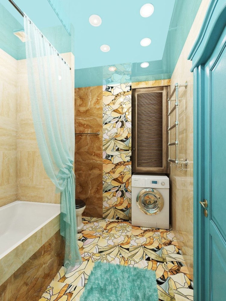
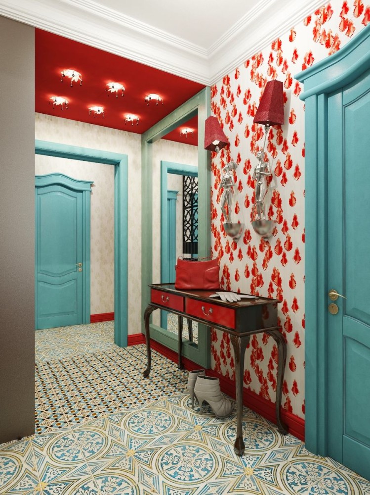
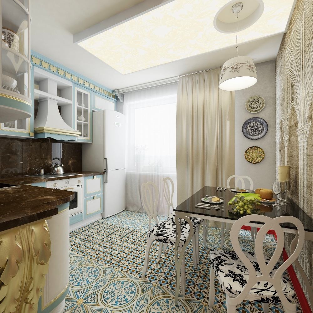
 To create a positive mood, ElenaBulagina used bold, active colors for the interior design: red, blue, yellow. However, she managed to avoid the shock effect by balancing them with white, as well as turquoise, beige and golden shades. You will find an example of another successful use of active colors in the interior . During foreign trips, the head of the family liked oriental patterns. Therefore, the floors in the kitchen are decorated with an ornament reminiscent of Arabic script, and the original arch that replaced the door is made in the Moorish style and painted in a catchy red color. It is supported by an equally noticeable red baseboard. The contour image of the vaults and columns with capitals also emphasizes the thematic mood of the interior and creates a fashionable effect of a contrasting wall. However, this contrast is not the traditional bright, but on the contrary - muted, softening the riot of the surrounding color palette. The bathroom, combined with the toilet, continues to demonstrate non-standard color combinations. Here, turquoise coexists harmoniously with shades of brown and yellow, creating an association with an oasis in the Arabian desert. The hidden functionality of the room is not immediately apparent. A special niche provides space for a large washing machine and utility shelves, skillfully disguised by decorative blinds.
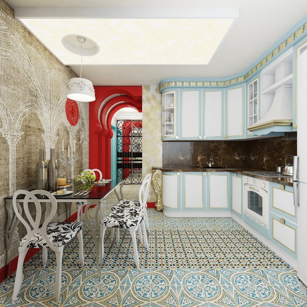
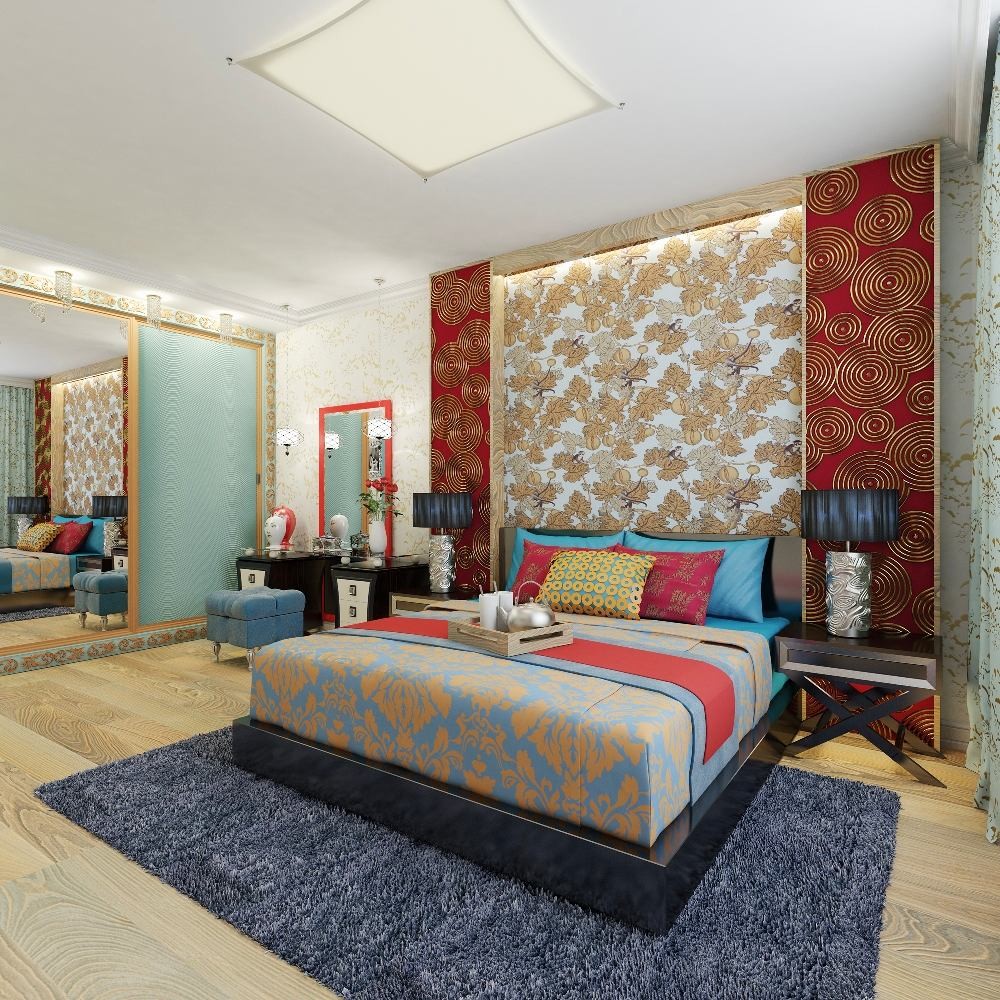
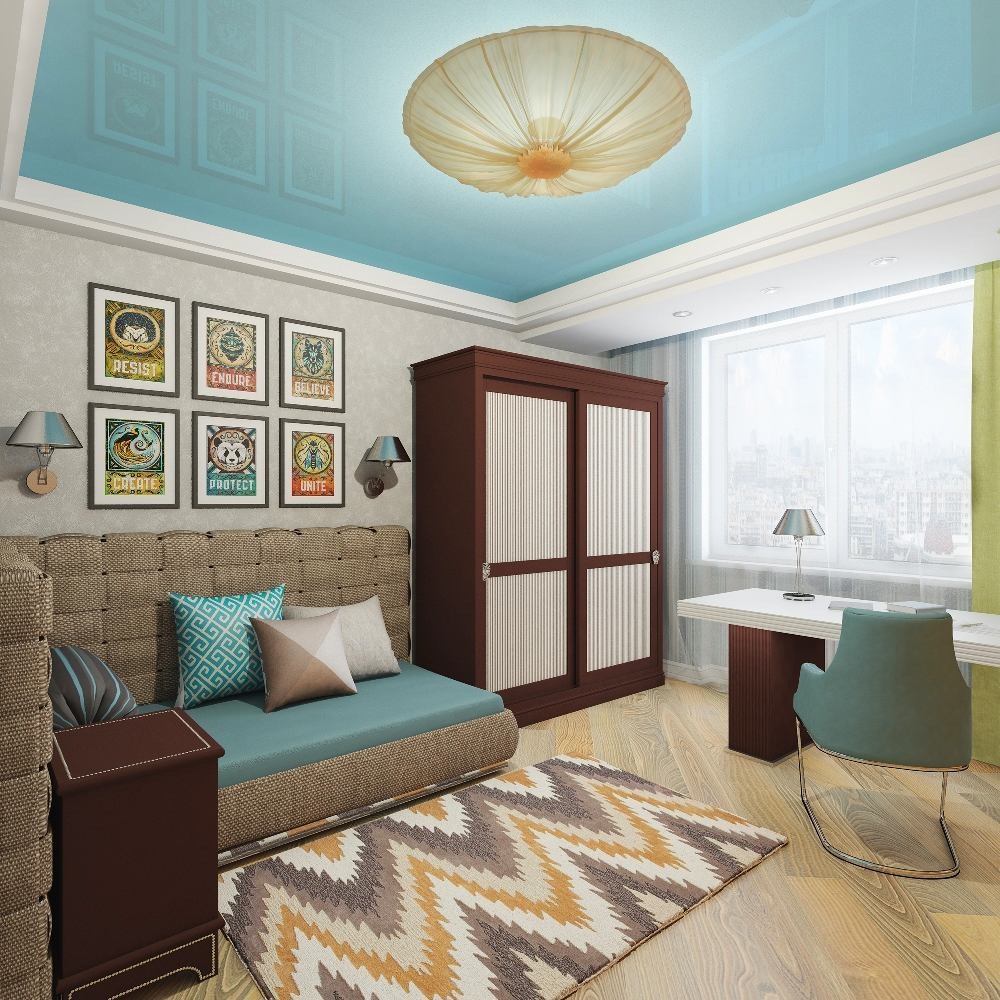
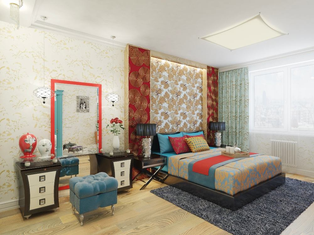
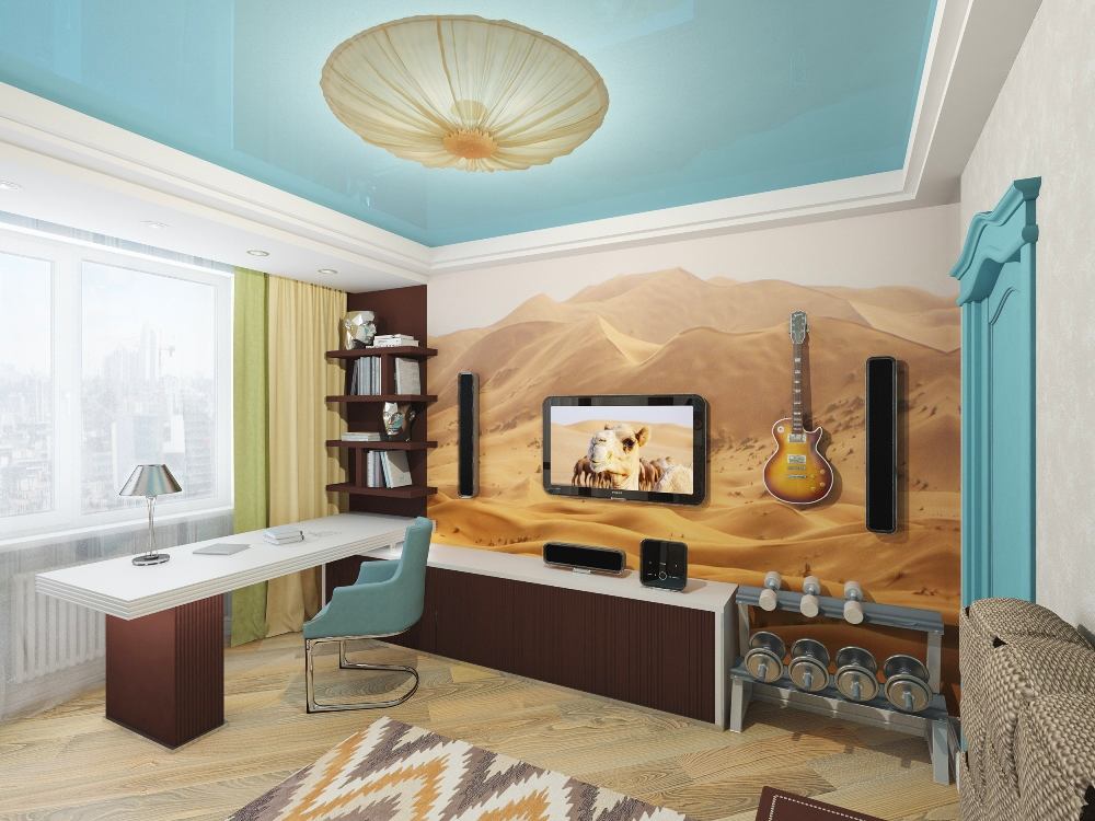
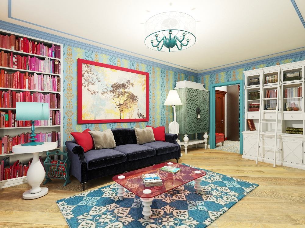
 The son's bedroom, unlike other rooms,is decorated in calm neutral tones. The ceiling drops with built-in lamps emphasize the contours of the room, and the glossy insert (stretch ceiling) increases the space of the room vertically. The cold color of the ceiling, according to the author, should evoke associations with a clear blue sky stretching over the desert. All rooms are furnished with vintage furniture, decorated with lamps, textiles and accessories in oriental and classical styles that satisfy the tastes of both spouses. In the living room, a floor lamp in the form of a cello catches the eye, which was not here by chance. It is a reminder of the youth of the hostess, dedicated to playing this musical instrument. In the design of the walls, actively used, for example, in the main bedroom you can see four of their varieties at once. In the son's bedroom, there is photo wallpaper depicting the desert, which he fell in love with during a trip with friends to Mongolia. This detail also acts as a link between the style of the room and the general idea of the interior of the apartment. In the kitchen, the wallpaper depicts a stylized arcade, whose ornate pattern intertwines with the complex pattern of the floor mosaic. The functional component of the interior is provided by the long and deep wardrobes, which are installed in the hallway and in both bedrooms.


The interior was designed using:
- light - Odeon (Italy), Possoni (Italy), L'Arte Luce (Italy);
- Furniture in the son's room - Leone (Dolfi) (Italy), sofa - made in Russia;
- Furniture in the living room and kitchen - Roy Bosh (USA / Russia), Karma;
- Wallpaper in the hallway - XXL (Elitis) (France);
- wallpaper in the living room and bedroom - Fornasetti (Cole & Son), Wall Vision Swedish Group (England/Sweden);
- Photopanno in the son's room - ASCreation (Germany);
- Paint - Baldini (Italy), Crown Paints (England);
- Cornices - "Europlast" (Russia);
- Parquet board - Polar Wood (Finland);
- Ceramic tiles - Peronda (Spain), collections Francisco Segarra and Candella;
- Suspended ceilings - Decken (Russia);
- Plumbing - Kaldewei (Germany);
- Towel dryer - Neoinox (Czech Republic);
- Washing machine - Bosch (Germany);
- Sockets and switches - Jung (Germany);
- Accessories - Hansgrohe (Germany).
Visualization provided by designer Elena Bulagina
