Why do you need vandal-proof protection in a simple apartment?furniture, a huge shoe cabinet and bicycles on the walls? We will tell you about this amazing apartment and its owners in our article This apartment was created for a large family: mom, dad and three children. They are all into sports and lead a busy life. But their main requirement and wish at the same time was the availability of space for storing shoes. Since there are a lot of them in the family, which is not surprising. Alexey Zhukov took on the implementation of the project. Alexey Zhukov, designer Graduated from the Yaroslav the Wise Novgorod State University in 2012, specializing in environmental design. Prefers minimalism, Scandinavian style, organic architecture. The whole family are sports fans: they ride bicycles, do fencing, play golf. Mom loves to draw, and her daughter plays the piano. Their apartment is located in Moscow, on the 12th floor in the Albatross residential complex, and the window offers a beautiful view of the Zhivopisny Bridge. Therefore, one of the family’s wishes was to make the apartment a kind of continuation of the landscape outside the window.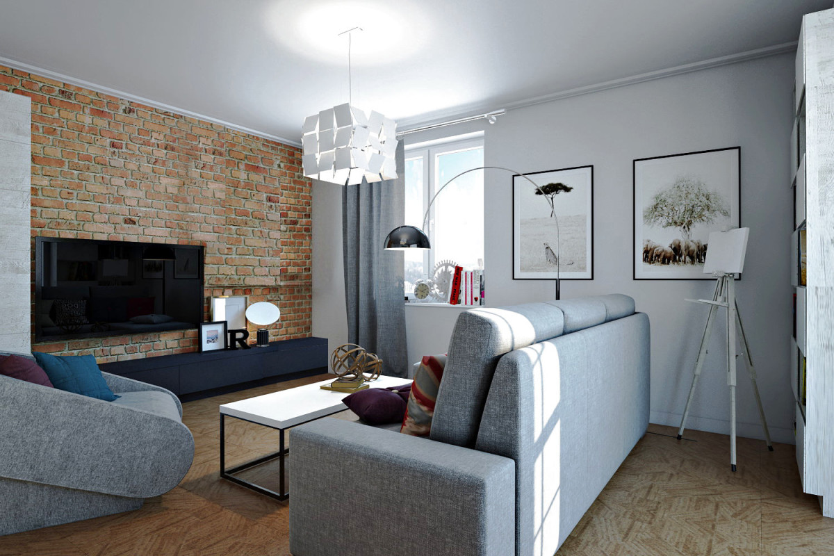 Alexey Zhukov, designer: - It is worth noting that children have allergies, so it was important for the customers to have environmentally friendly furniture and materials.
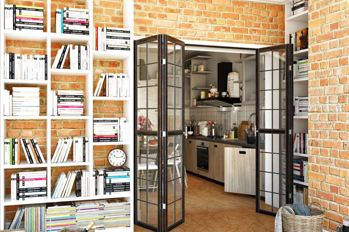
 So the family asked the designers to organizea separate place to store shoes, as they have a lot of them. For better lighting of the premises, it was possible to install doors with transparent elements - this is how the French door between the kitchen and the hallway appeared.
 Of course, the organization of places forstorage of bicycles, skis, foils, golf sets, adult and children's scooters, roller skates, skates. The customer himself asked to hang the bicycles on the walls and make them art objects, which pleased the designers very much. Not everyone agrees to such experiments.
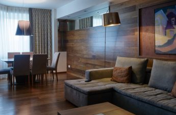
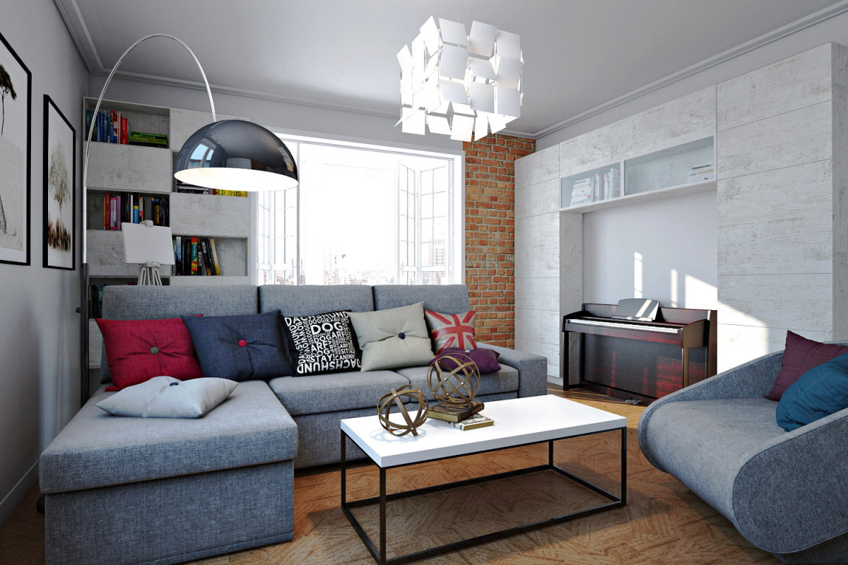
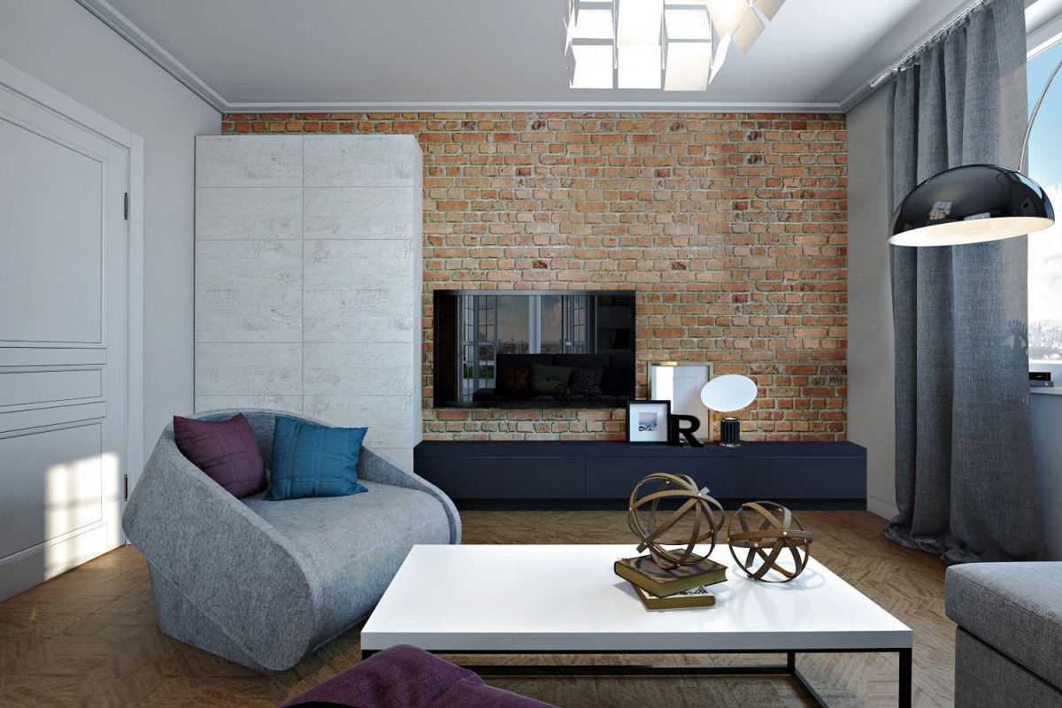
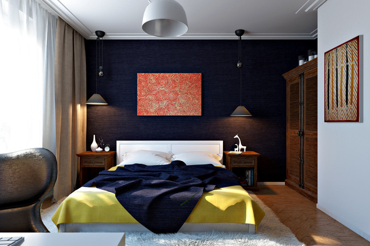
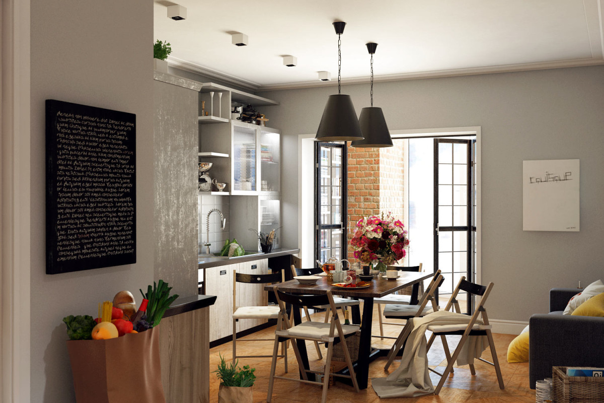 The main accent in this apartment wasbrick wall, emphasizing the loft style. And so that the interior does not seem sharp and aggressive, light-colored furniture and wood texture were added. The living room and hall were combined with one large library cabinet. The parents' bedroom is a little more contrasting than the living room - the walls are painted in contrasting colors, which slightly expands the space. A bright poster dilutes the color scheme of the dark wall and acts as an accent.
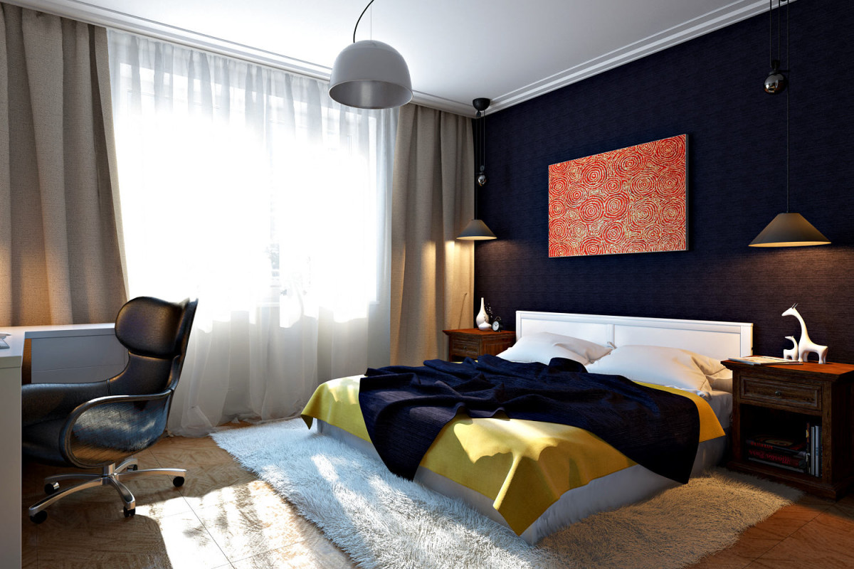
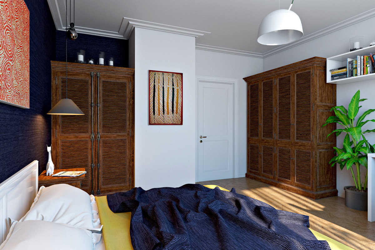
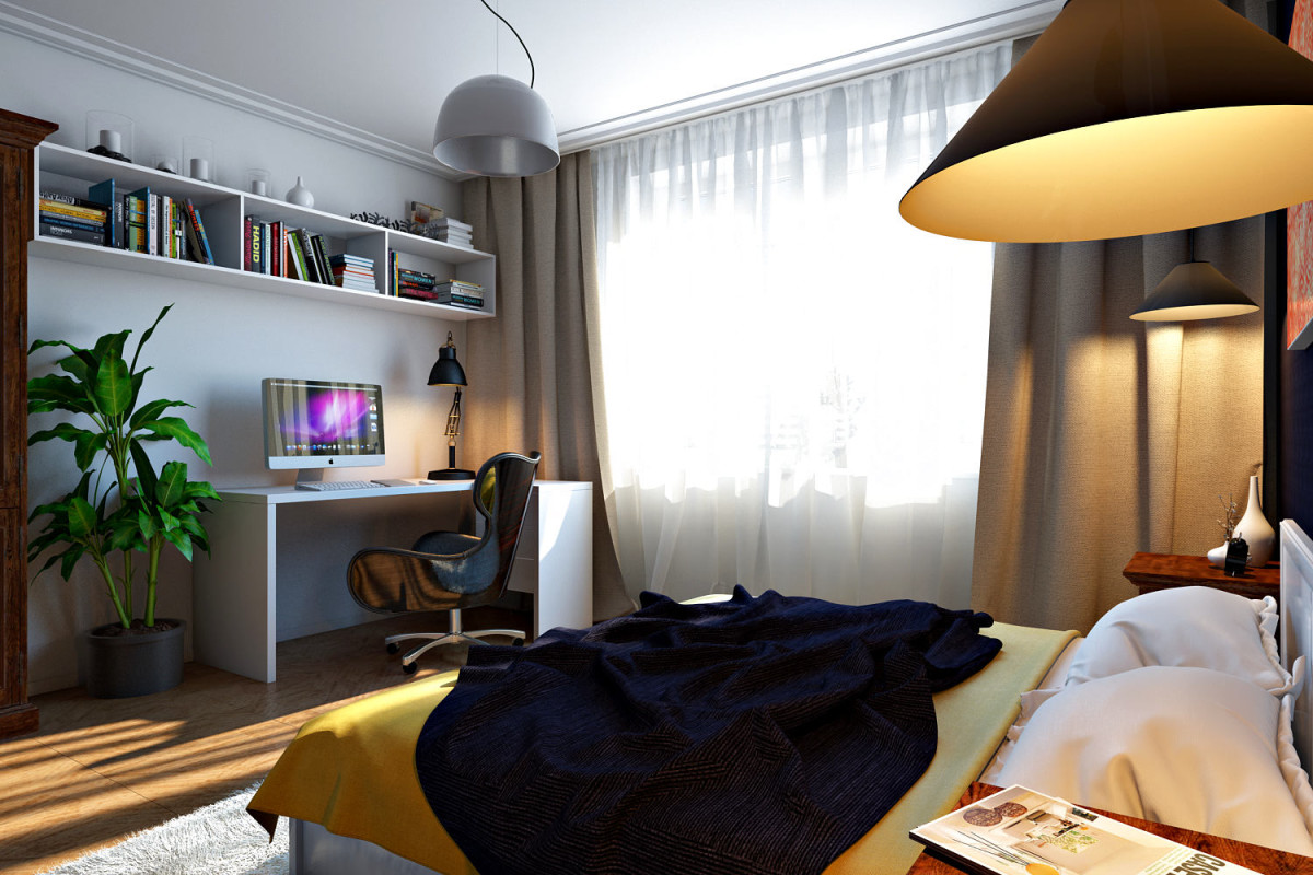 Here in the bedroom there was enough space fora small work area. The furniture in it is specially painted white so that it is less conspicuous and, in fact, merges with the wall. The room has Gramercy Home cabinets in a vintage style with an aged texture. And the lamps by the bed are height-adjustable, which allows you to make the lighting as convenient and comfortable as possible.
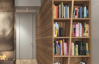
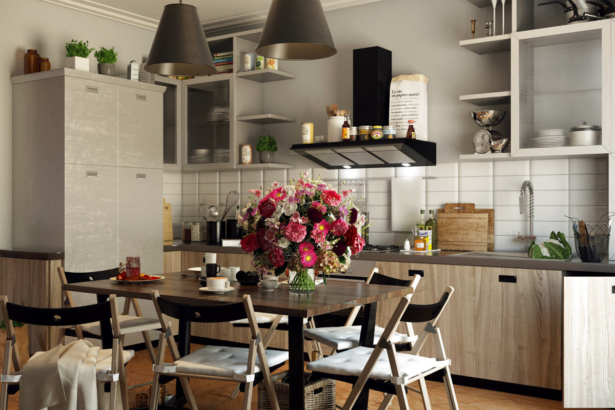
 The kitchen and the rather long corridor are actuallybecame one space, since it is unreasonable to allocate such a large area for the corridor. These two rooms in the apartment are united by a bookcase with randomly arranged shelves. The kitchen is decorated with a massive table and modern BoConcept chairs. And the loft-style furniture is from the Scavolini factory.
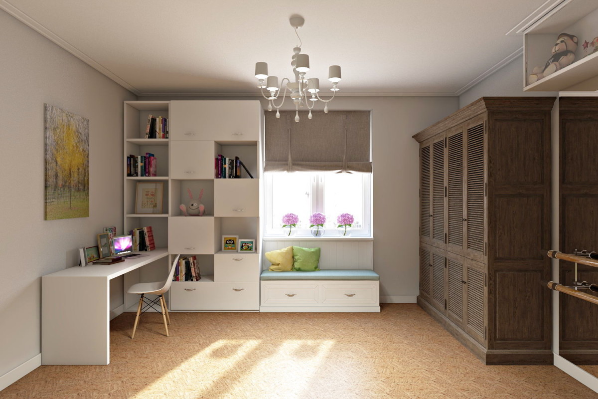
 Alexey Zhukov, designer:— The family has a pet. For this reason, we immediately refused to have fragile objects on the floor that would perform purely decorative functions. Therefore, everything here is as efficient and useful as possible. And the interior also has vandal-proof furniture and coverings. The girl's room has a very convenient workspace, which smoothly transitions into a furniture set with a soft seat. The designers managed to perfectly fit in a barre for dancing, which the girl is passionate about.

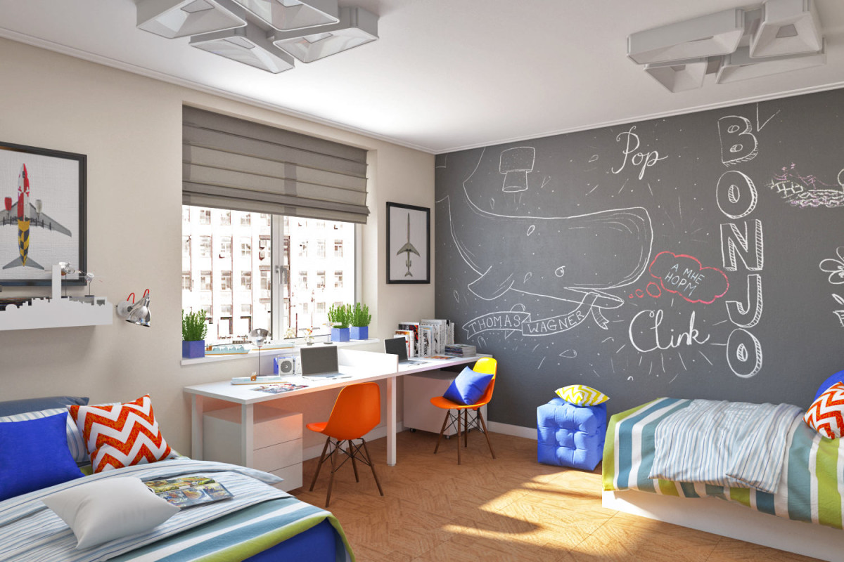
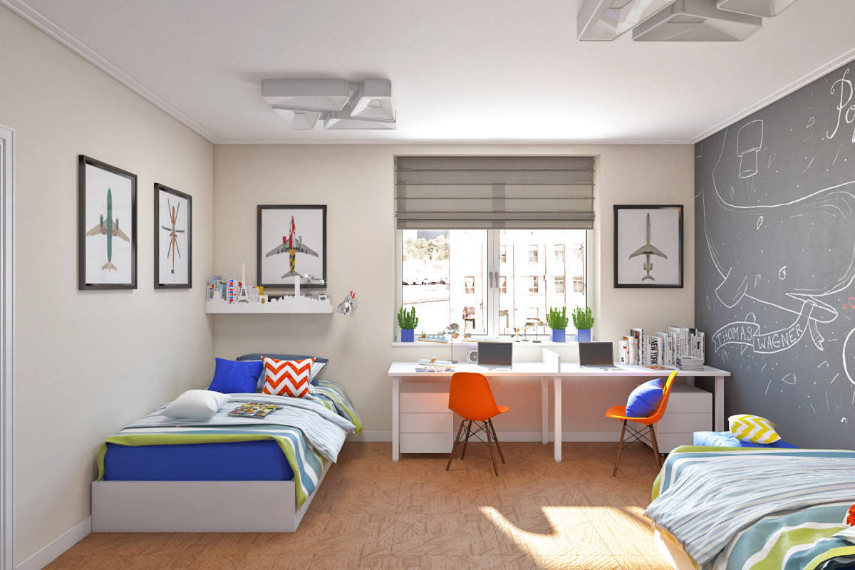
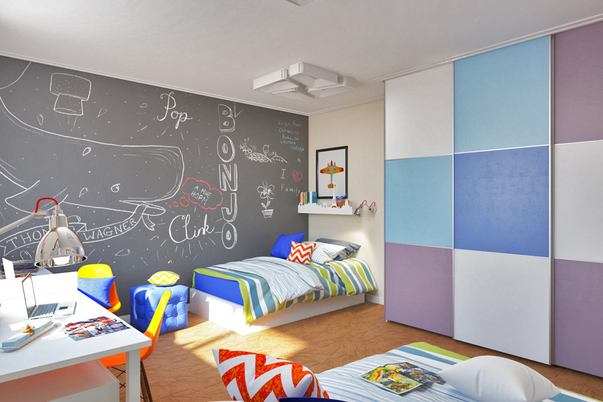
 The parents of these children will definitely neverwill worry that the fresh walls can be spoiled by children's art! The designers decorated one of the walls in the boys' room with a chalkboard - here you can draw and erase as much as you like and whatever you like.
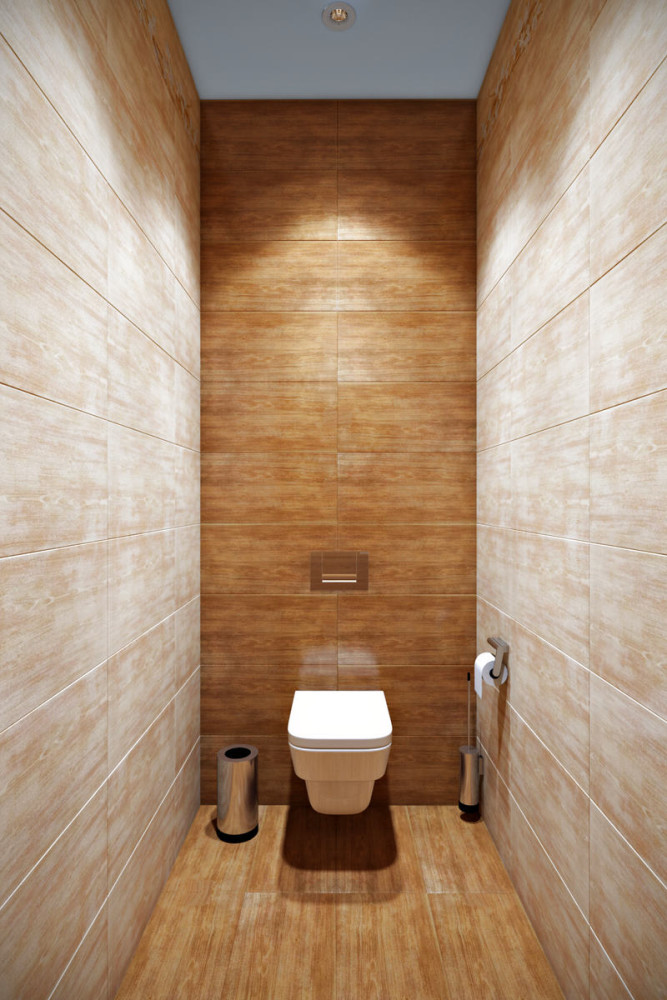
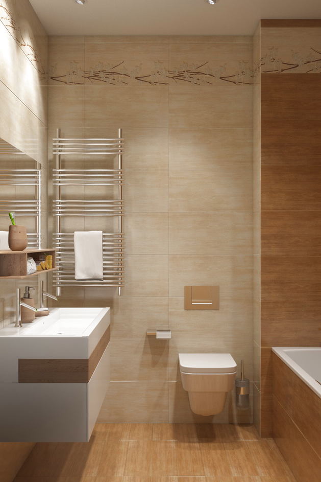
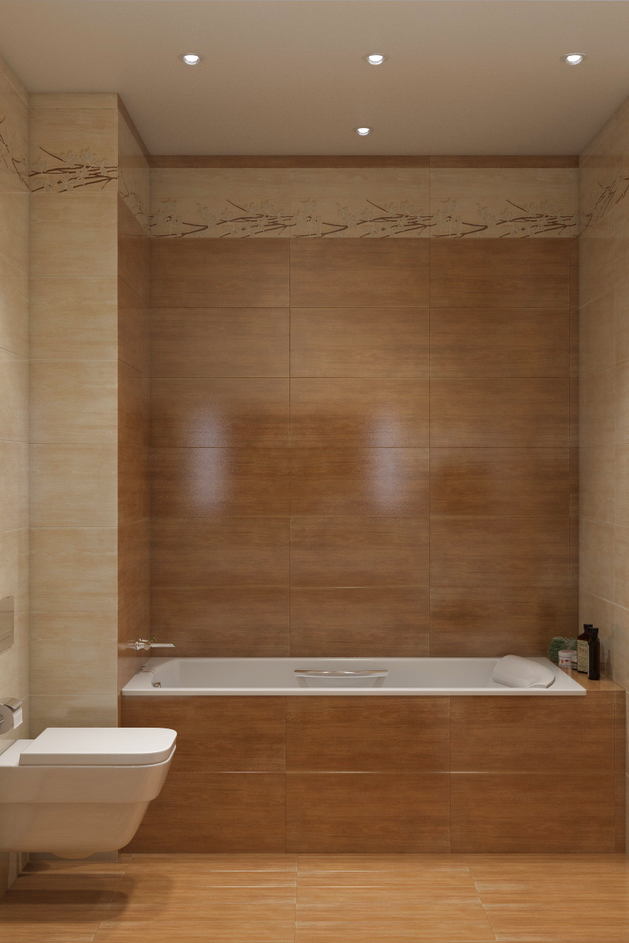
 The theme of eco-design, which was originallydecided to resort to because of children's allergies, is reflected even in the bathrooms. They are decorated with tiles with a wood pattern. This theme is supported by the furniture from the Jacob Delafon Terrace composition.
 The furniture in the hallway was made to order by the factory"Ronikon". The furniture composition for the living room was made there. Almost all the other furniture was bought at Gramercy Home. And the kitchen is from Scavolini Diesel. The project was completed a month ago.
Apartment for a large family: what to do when the storage of shoes became a problem
