This interior is a meeting point between two erasseveral very bold modern techniques. Thanks to the persistence of the designer and the trust of the customers, it was possible to create a comfortable living space for two generations of the family in a small area. The owner of this apartment is an active woman of the old school, who has great respect for the classics, but has not lost interest in the present. The author of the interior, Olga Ievleva, was able to reflect these preferences in a calm, pro-classical and at the same time quite original project. Olga Ievleva, interior designer, co-owner of the More Decore bureau Olga has mastered four professions, including an art historian, a fashion designer and, of course, an interior designer. At different times, she was engaged in scientific and editorial activities. However, she was finally able to "find herself" in interior design.
Redevelopment
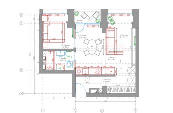
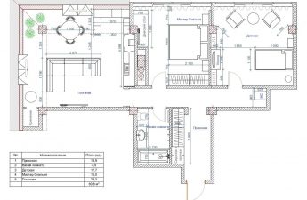
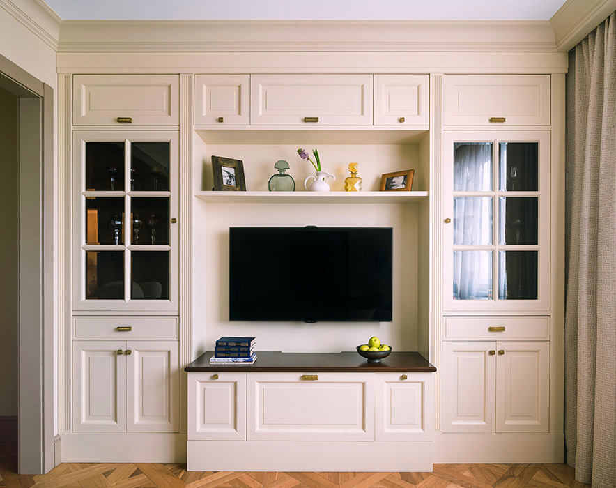
The smallest room in the apartment waswas combined with the corridor, and the wall and doorway that connected the two rooms were demolished. Instead, a wall with a wide opening was erected. Now this small room serves as a living room, there is a sofa, a built-in light yellow wardrobe and a TV.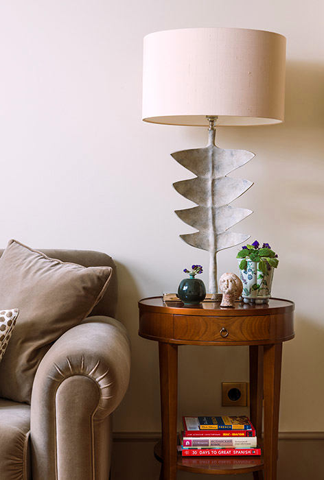
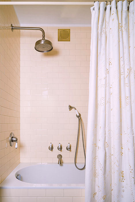
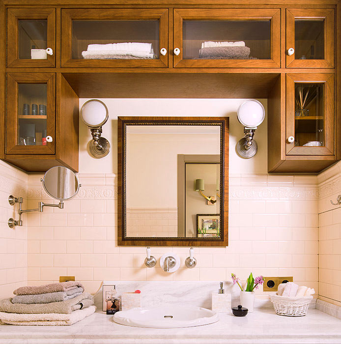
 In addition, the corridor was slightly narrowed, whichled to the kitchen. There were also entrances to two tiny bathrooms (bathroom + toilet). They were combined and expanded at the expense of the corridor. Opposite the entrance, another wall with an opening was erected. With its help, it was possible to separate the small corridor at the entrance from the corridor connected to the living room.

Style
The interior was born gradually.According to the author, the collages that were made during the design have changed greatly, although the general idea remains. The apartment is not uniform in style. It is more of a fusion of classics and modern minimalism.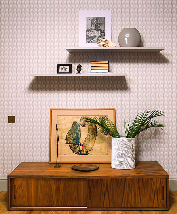
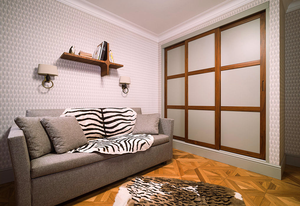
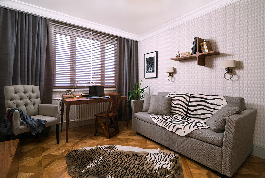 The bedroom, or rather the study of the hostess’s son —a more modern space, this was the client's wish. Of course, one apartment cannot have a classic living room and a modern bedroom. Therefore, the designer had to combine the rooms with furniture. For example, a small capitonné chair was placed in the study: on the one hand, it is a tribute to the classical tradition, on the other - a wardrobe next to quite strict, modern facades.
Light
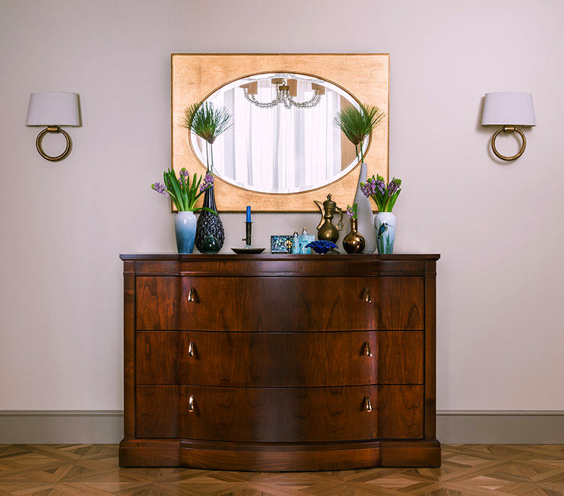
The lamps in this interior playunifying role. In the living room there are sofa lamps from the Porta Romana factory, more like sculptures than traditional table lamps; the sconces “with faces” in the study are also a little confusing. The light in the living room and study is the already mentioned Porta Romana, a wonderful English factory. The ceiling lamp in the kitchen is from the famous Danish factory Louis Poulsen, also a sprinkling of modern design into a classic theme.
 The chandelier in the owner's bedroom had to be painted.Initially, a chrome lamp was purchased, but it quickly became clear that it was not suitable. The designer personally covered the metal tubes with "gold" sheets.
Color
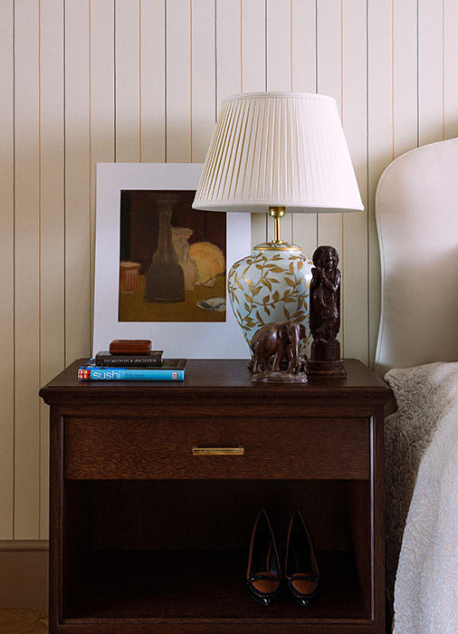
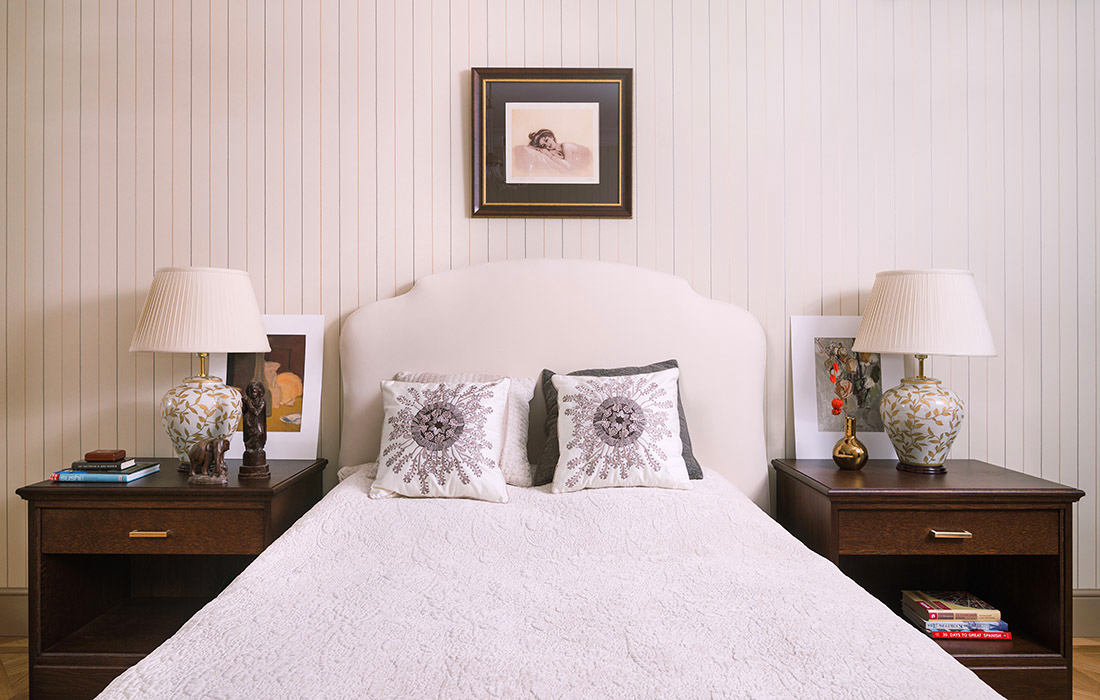
The palette in this interior is calm,calming, the owner did not feel the need for bright details. Most of the furniture was made to order by Moscow cabinetmakers - a built-in wardrobe in the living room (its color matches the color of the walls), the shade of the wooden tabletop was selected to match the color of the Morelato factory nightstands.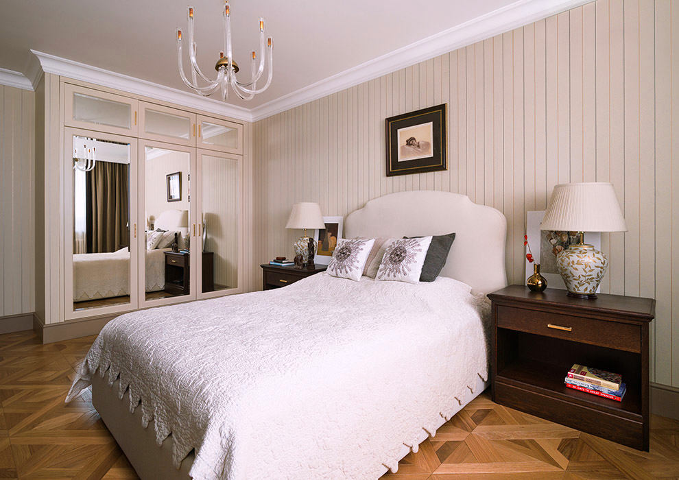
Furniture
The wardrobe in the hallway was made taking into account the wishescustomer. The presence of a bench was one of the conditions. On the inner right wall there is a secret door, behind which a plastic electrical panel is hidden; according to the designer's deep conviction, such things should always be hidden in joinery.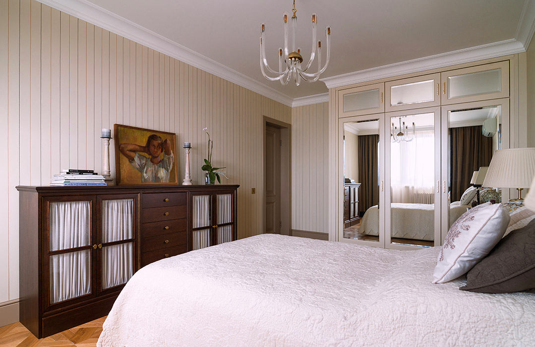
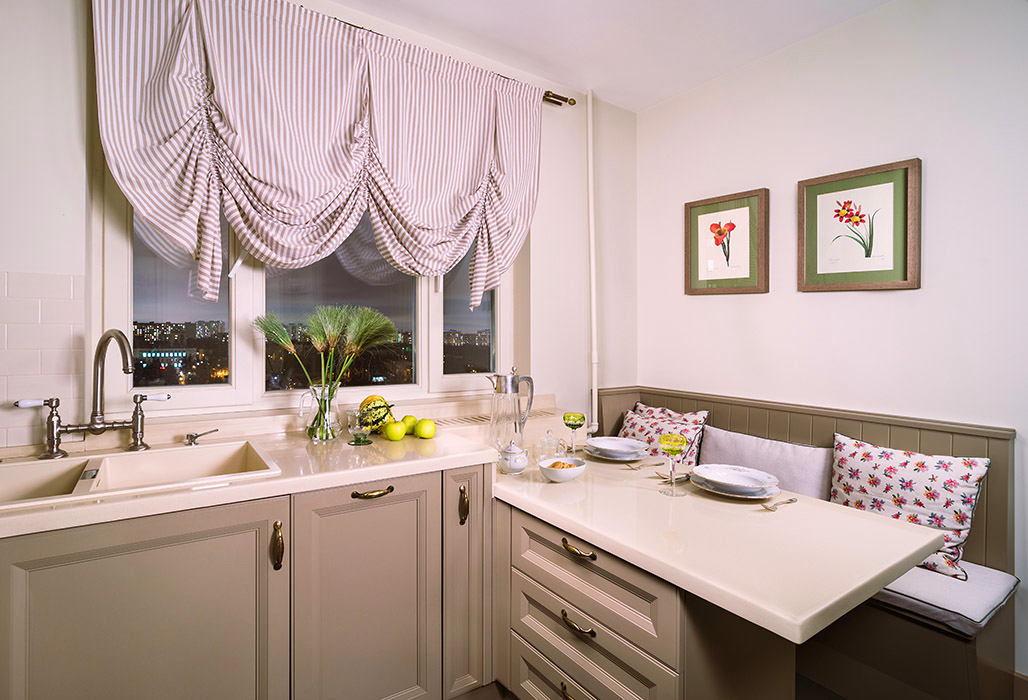
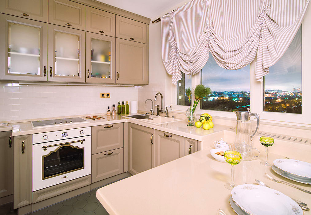
 The author planned the kitchen together with the owner.It was important for the customer to get a lot of work surfaces. But the designer really wanted to place the sink opposite the window, and she was supported. The bench was made to order to match the color of the kitchen after the countertop was installed. The color scheme of the kitchen itself, unusual for our expanses, almost matches the color of the doors and trim - both the designer and the owner liked this idea.