How to decorate an apartment in dark colors and at the same timewithout losing coziness and comfort? How to emphasize the advantages of panoramic views from the windows? An impressive Moscow project provides answers to all questions The fashion for light interiors is not to everyone's liking. Many people find it more comfortable to live surrounded by deeper, darker shades. Can a rather dark interior be cozy, despite all the stereotypes about "gloominess"? The project of a Moscow bachelor apartment from the design studio Liturinsky & Leost clearly answers this question. Igor Liturinsky and Ronan Leost, designers The design studio Liturinsky & Leost is a creative tandem of talented architects and designers. Since 2005, Igor Liturinsky and Ronan Leost have been working on a wide variety of projects: from private orders to public spaces, from restoration work to an integrated approach. The design studio's portfolio already includes more than 60 successfully implemented projects, including not only Russian ones, but also foreign ones (in Austria, Spain, France, the Seychelles). liturinskyleost.ru Earlier, we shared with you another project of the design studio Liturinsky & Leost — . Despite the fact that the apartment that we are about to show you is also created for a single man, this is a completely different story.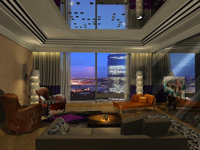 This 103 m² apartment is located inMoscow, in the tallest skyscraper in Europe, the Federation Tower. In 2009, this complex was recognized as the best building in the world (according to the results of the international Prix d’Exellence competition). Of course, the windows of the apartments located here offer stunning views of Moscow and the capital’s landmarks. And therefore, it was especially important to create an interior that would harmonize with the panoramic views, without overshadowing them, but also without getting lost against the backdrop of the city landscape.
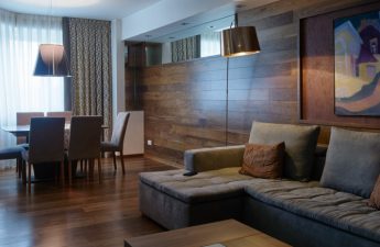
 Another difficulty associated with panoramicwindows, in that direct sunlight hits the apartment for several hours. And that means you need the ability not only to admire the panorama, but also to hide from ultraviolet radiation if necessary. Please note: this apartment has this option. Our opinion: - The designers have provided both thick curtains and translucent tulle, so that the owner of the apartment can regulate the degree of natural lighting in the apartment with a slight movement of the hand.
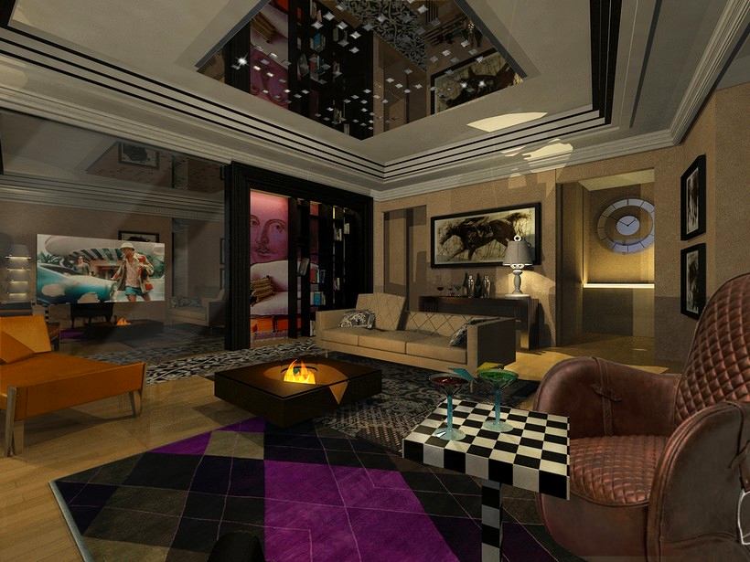
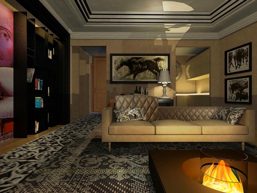 Initially, the layout of the premises was open:In the Federation Tower complex, apartments have only a few supporting columns, leaving the owners with full freedom to plan their personal space. As a result of the work on the project by the design studio Liturinsky & Leost, the apartment turned out to be a two-room apartment with a spacious bedroom and living room (29 m² and 41.2 m², respectively), as well as a small kitchen (5.7 m²). All this, of course, meets the wishes of the customer and corresponds to his lifestyle. Our opinion - Apparently, the owner of the apartment is a hospitable person. The living room has a large sofa and several comfortable armchairs. All the furniture is located around , and in such a way as not to block the beautiful panoramic view.
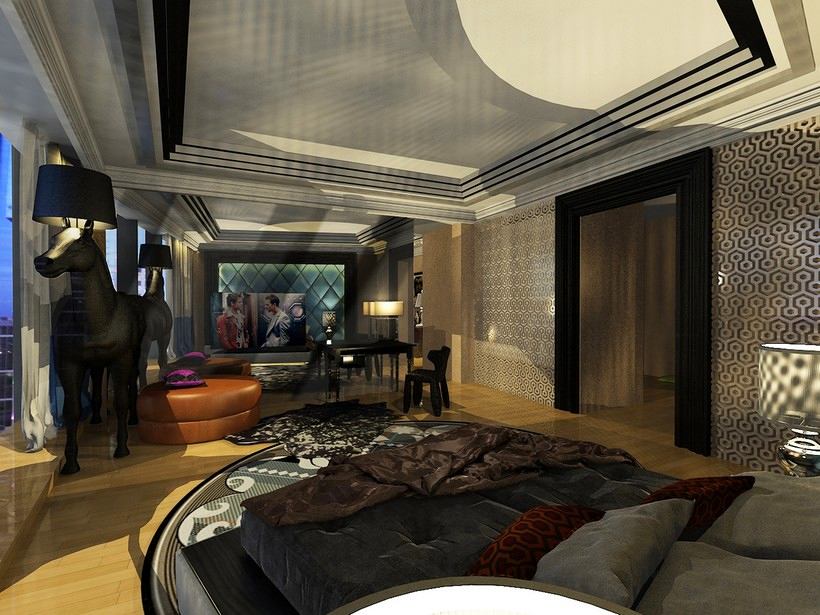
 The interior turned out to be quite complex and rich.patterns, textures, with unexpected design techniques. In addition, the overall color scheme was chosen to be quite dark. The reason for this was obviously the excess of natural light in the apartment.
 The owner of the apartment's love for horses is obvious:In the bedroom there is an impressive floor lamp in the shape of a horse, and in the living room the walls are decorated with drawings of horses. In addition, the chairs in the living room are stylized as saddles - with stirrups on the armrests.
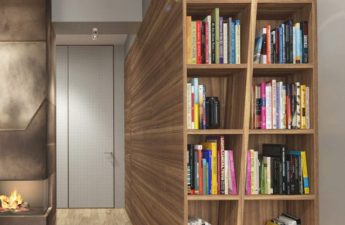
 Interestingly, there is very little storage furniture in the apartment. The secret is in the 5 m² area adjacent to the bedroom.
List of brands used in the project
Living room:
- Mirrors - the company "Gran 99";
- Shelving - Arlequin C Cabinets Ferruccio Laviani;
- A coffee table - Chess Table Moooi;
- Fireplace - Planika Coffee Fire Long;
- Console - Eichholtz Carlisle Bench Table, Eichholtz Trolley Beverly Hills 04872;
- Chair with stirrups - Saddle Easy Chair, Monster Bar Stool Moooi;
- Carpet - jan Kath carpet, Stepevi;
- Textiles - "Moscow Silk";
- Decor - Kelly Hoppen Pot The Long Kelly Hoppen;
- Tableware - Palace Tableware;
- Lighting - Xal pendant lights by Light & Design, Set Up Shade by Marcel Wanders.
Bedroom:
- Soft panels are made to order in the workshop of Bella Pelle;
- Table - Moooi Two Tops Secretary, Monster Stool Moooi;
- carpet - Fata Morgana TJ Two by Marcel Wanders;
- Textiles - "Moscow Silk";
- Lighting - Eichholtz Lamp Arlington Crystal, Horse Lamp by Front | Moooi.
5 tricks to help make a dark interior cozy:
liturinskyleost.ru, federationtower.ru
