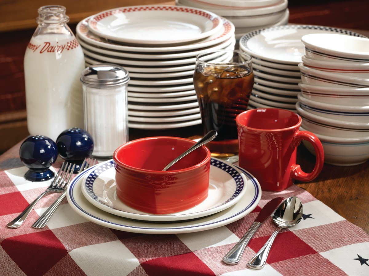
Flowers, which are predicted to be particularly successful in thisA lot, and it's quite difficult to talk about each in detail. However, we plan to release a series of materials and start with the brightest. We decided to invite a professional in this matter and showed him one of the shades of this year - Fiesta
Not so long ago, we were talking about a whole list of shades of the year,selected by the Pantone Color Institute. However, each of the shades, in our opinion, needs a deeper assessment and analysis. We invited interior designer Varvara Zelenetskaya and asked her to share her thoughts on the brightest shade of the year, Fiesta. Varvara Zelenetskaya, interior designer
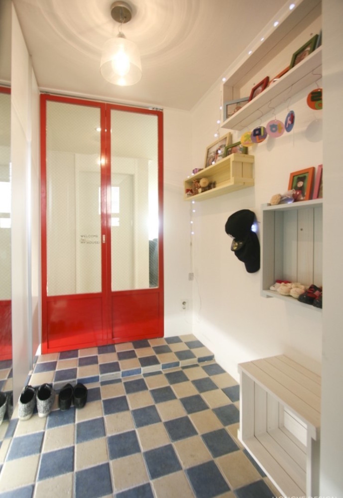
Certified Interior Design Specialist andfurniture, art management specialist (graduated from the Humanitarian and Applied Institute and the Institute of Contemporary Art), trained in Florence at the Lorenzo di Medeci Design Institute. Since 2002, he has been a co-owner of the Dekointeriors studio in the Central House of Architects. In 2005 she opened a studio, works with interiors ranging from an architectural project to individual items that are developed and created independently according to the sketches of the studio's designers in her own workshop. vzstudio.ru - Let's start with the fact that all shades in which there are orange, red, yellow combinations of these colors are most relevant for living spaces, such as living rooms, halls, hallways and, of course, for public institutions - clubs, restaurants ... These colors activate energy. Therefore, for me, the shade Fiesta is insanely joyful, juicy and, in the right sense, alive. 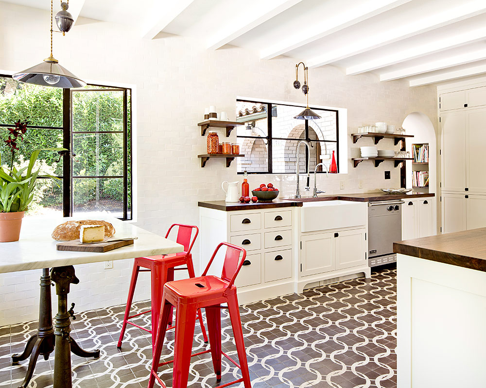

However, with all this there is someFeeling retro. Something similar was very popular in the coloristics of the 80s of the last century. Now the fashion for the 80's comes back, and that's why the choice of Pantone seems kinda cunning. But that's not all: Fiesta, in my opinion, is even more complex and multifaceted than it seems. The shade itself I would call cold and rather bleached. That is, it is not an almadovar scarlet red, it is really complicated, there are also notes of yellow, ocher, and white. 
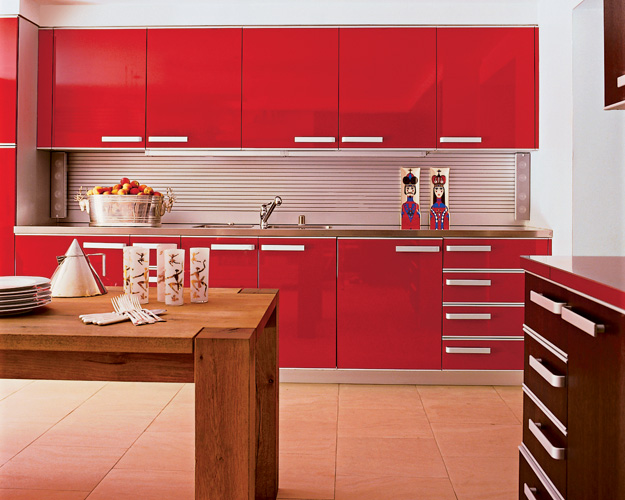
As for the application, I see this shade inMostly in varnish. For example, if we talk about the kitchen, then, of course, it's polished facades. Very interesting this complex color will look in the skin. I'm not sure that the proper effect can be achieved in matte invoices. I would use it in all kinds of reflective surfaces - glass, tiles, metal.