It's always sad to say goodbye to summer, even if in autumn andhas its own special charm. Do you want to prolong the outgoing feeling of warmth and make the interior cozy and sunny? Get inspired with us by the new Laura Ashley collection and use the best ideas in your home It doesn't matter whether you love classics, adore country style or prefer modern: everyone wants comfort, including famous designers. Among them is the iconic English brand Laura Ashley, which in the new autumn-winter collection has collected the most juicy colors, interesting patterns and harmonious combinations to create truly beautiful interiors in Victorian style and not only. We have selected the most interesting ideas and identified five fashionable colors that will definitely be relevant to this one and which you can use in your home. We invite you to look at stunning photos from the new collection with us, get inspired and go shopping for real English paints and wallpapers. 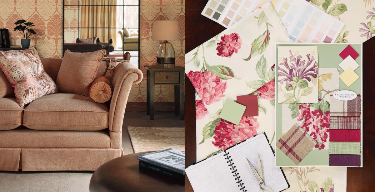
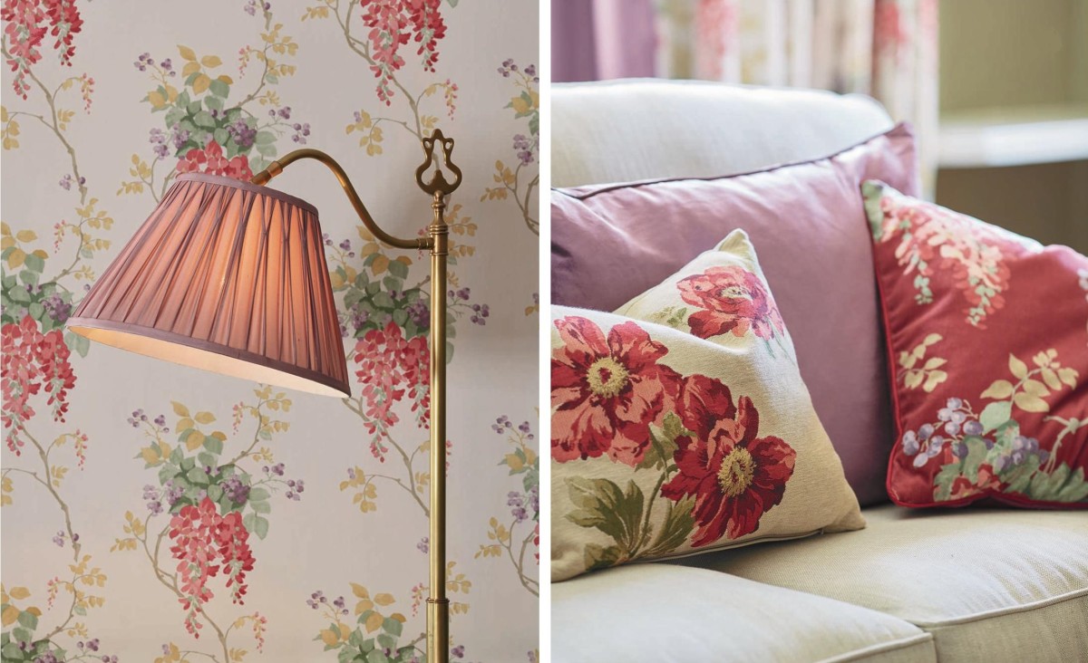
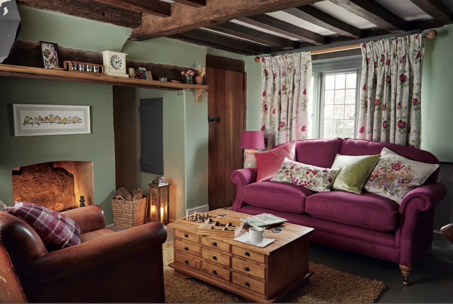
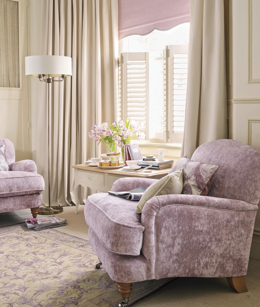
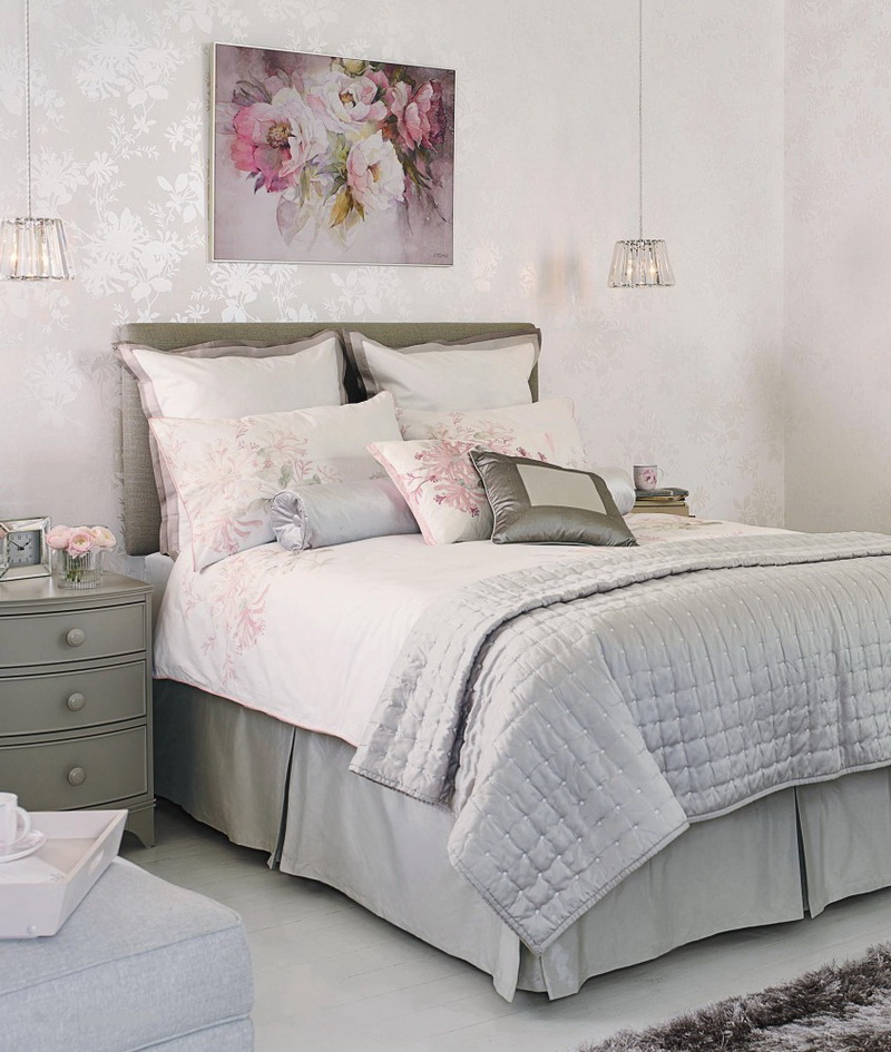
 Juicy pink Rich, voluminous color,reminiscent of aged wine or lush peonies and asters, which are in bloom at the beginning of autumn. No associations with princess rooms or inappropriate glamor - this shade of pink looks luxurious and not at all frivolous. Since dark pink is a rather active color that visually "weighs down" the interior, the designers suggest using it as bright accents. Lampshade, sofa cushions, textiles, an armchair and even a sofa: we combine all this with furniture and furnishings in a calm color scheme.
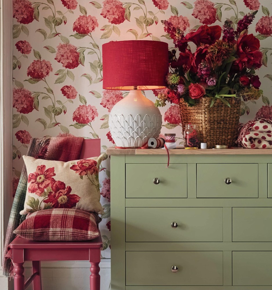
 Do you want to make from your apartment a realEnglish sweet home? Just buy a wallpaper in a flower. It can be both small and large drawing, graphic or gentle watercolor. And so that they do not look stolen from the grandmother's room, choose those in which there is a trendy now saturated pink - it not only attracts glances, but also refreshes the interior.
  Wallpapers Sanderson from the collection of Parchment Flowers
 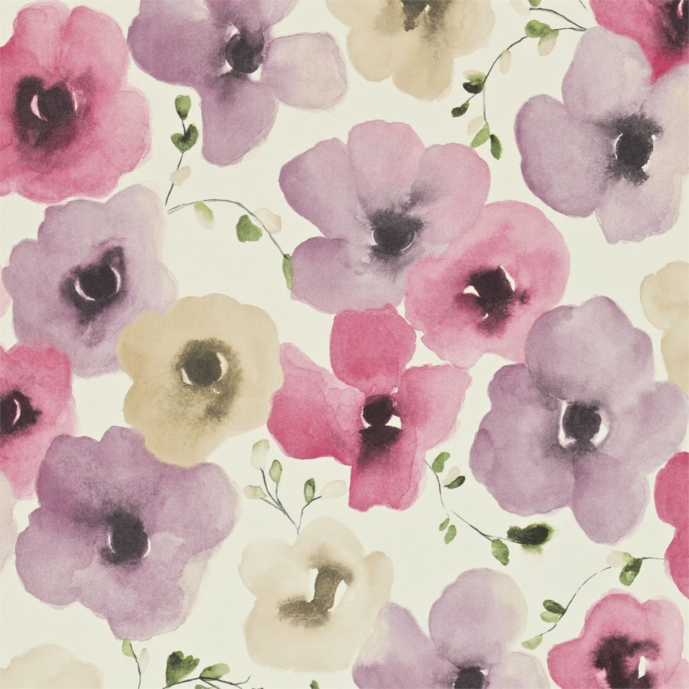 Sanderson wallpapers from the collection Color for Living
 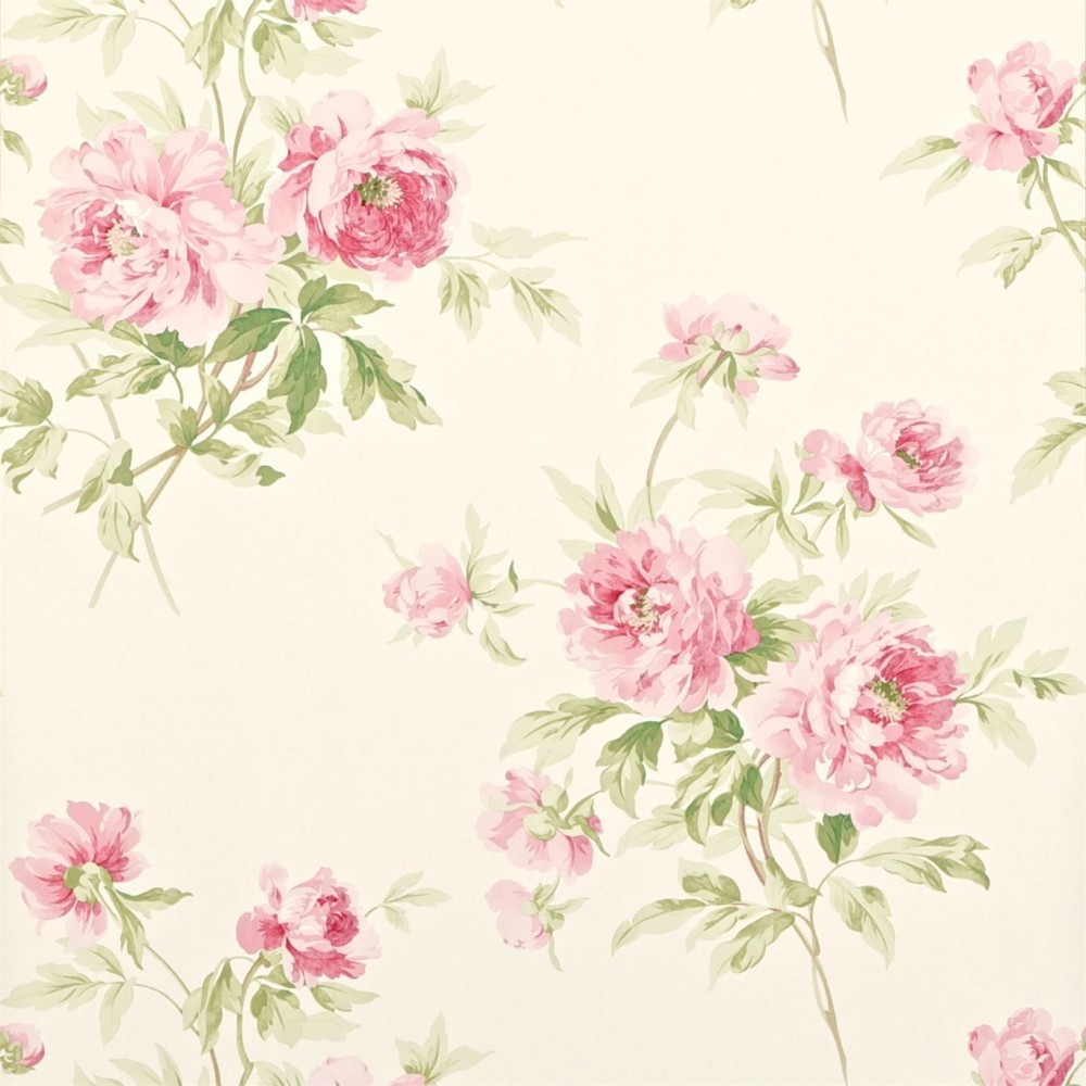 Wallpaper Sanderson from the collection Caverley Magicpastel shades Pastel shades are any shades of bright colors diluted with white. Light blue - from bright blue, powdery - from fuchsia, peach - from orange, and so on. An amazing feature of this dim, delicate palette is that it can exist both as a background for active interior elements, and absolutely independently. The interiors from this collection are a prime example of this. Due to the fact that pastel colors are quite calm and not aggressive, they can be safely combined with each other, without fear of laxity. A variety of textures, unusual prints, etc. will help to make the interior more interesting.
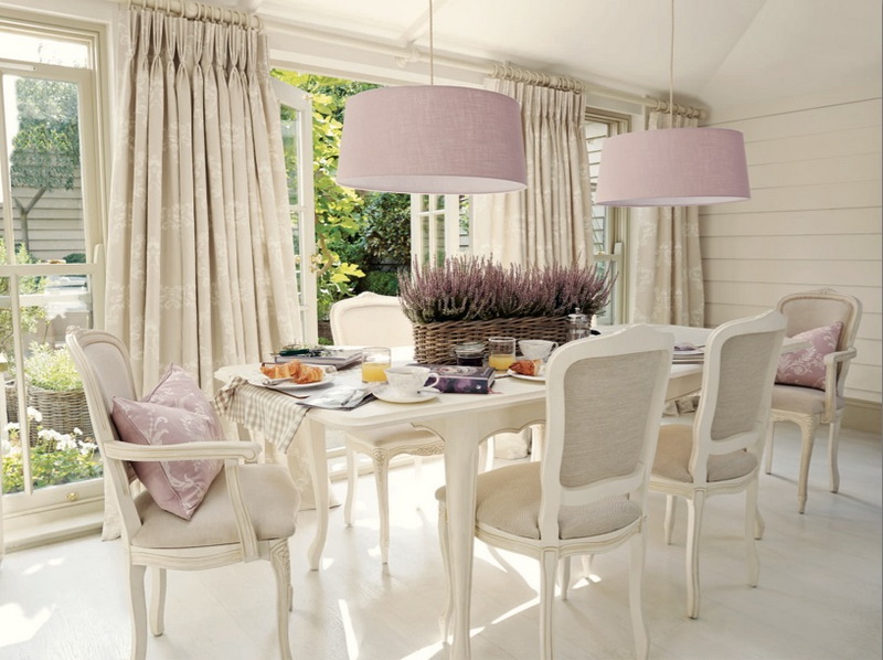

 Decorating the interior in pastel colors, you yourselfdecide if it will be cold or warm and how many colors to use. How to choose a wall finish? Yes, any: both wallpaper and paint will do. The main rule is no flashy colorful elements that stand out from the overall picture. Pay attention to wallpaper in a neutral color with a low-contrast pattern or in light shades: from powdery to mint.
 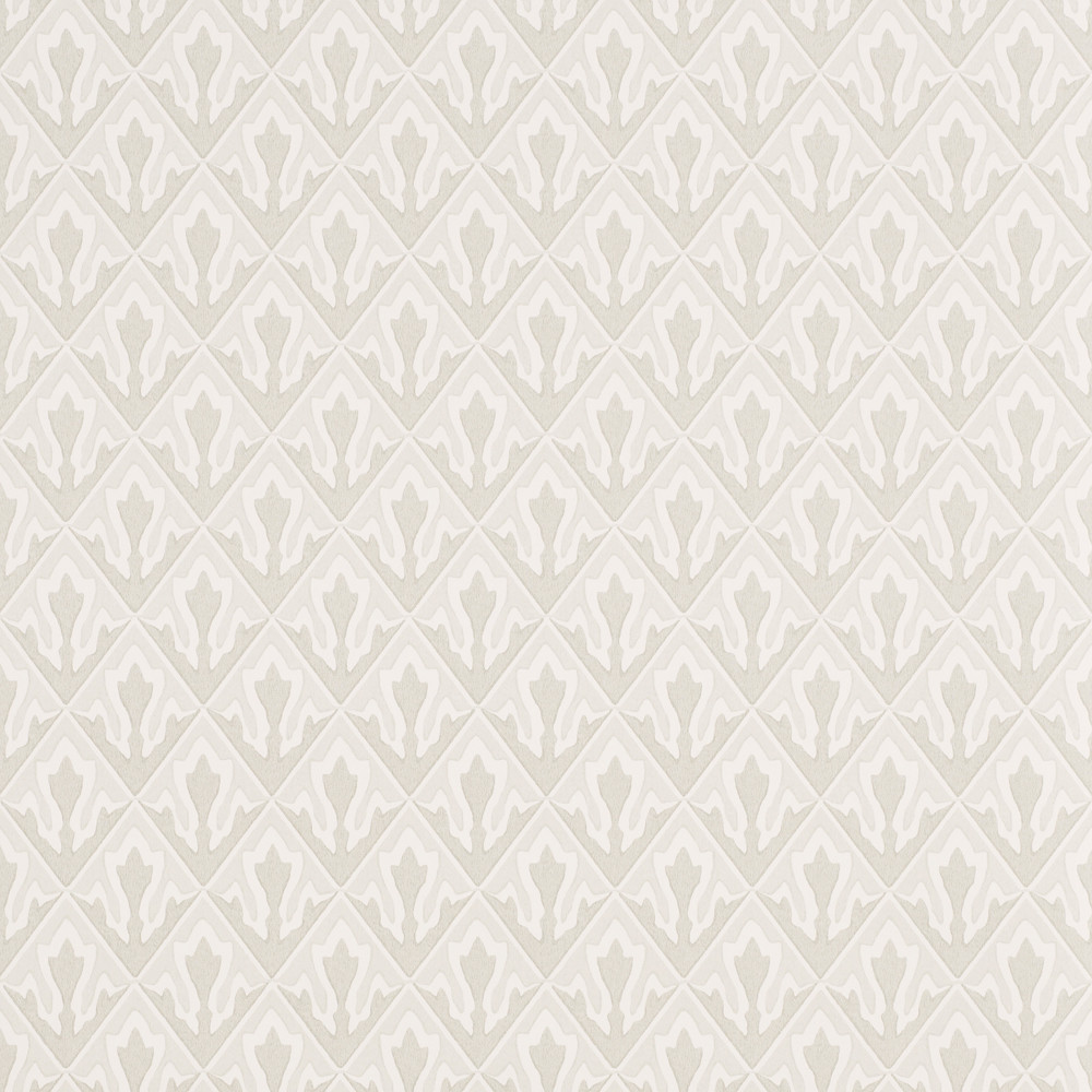 Zoffany wallpapers: Crocus model
  Paint Designers Guild New Mauve №144
 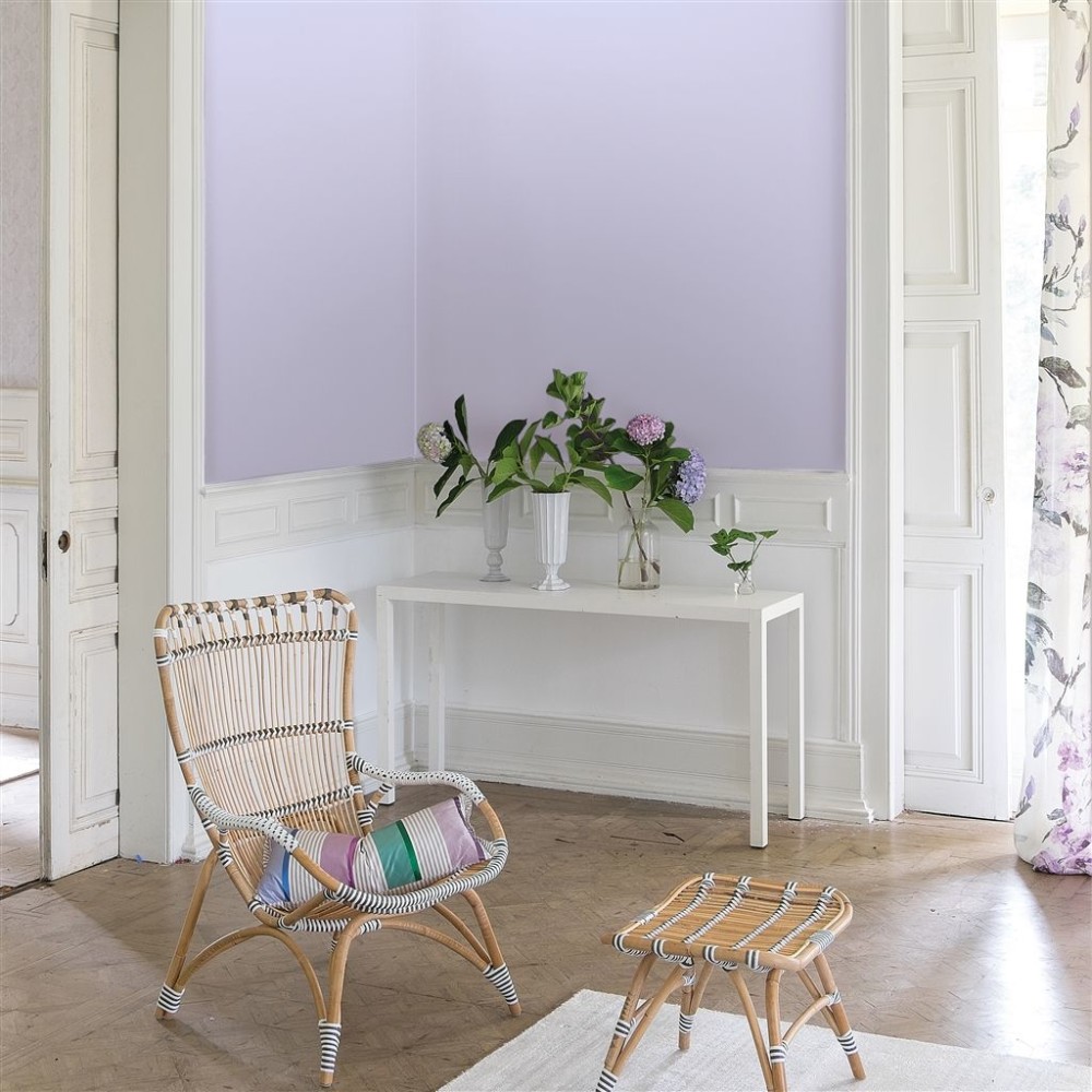 Designers Guild New Mauve paint No. 144 Deepblue And not just blue, but the so-called china blue - a deep, rich shade that can often be found in traditional Chinese painting. Today it expands the boundaries and is found not only in paintings, but also in interiors around the world. It is recommended to combine it, observing the canons, that is, with white, as well as with gray and black. Let's remember the lessons of psychology: the blue color pacifies, but in excess it can have a depressing effect, so you should not overdo it with it.
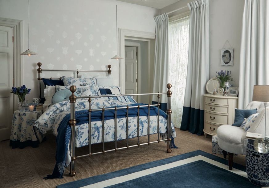
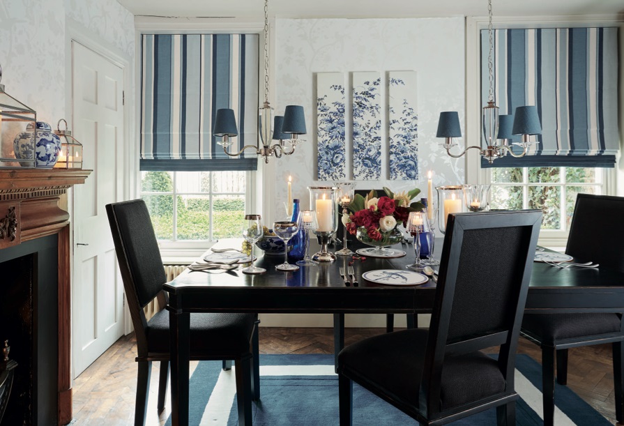
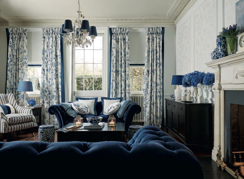

 In order not to overload the room quite activeBlue, use it in a dosed way: choose wallpaper in which it is present as an additional color, or paint an accent wall in it, leaving the other three neutral. If you want to use this color for a complete finish (for example in a cabinet or library), then we recommend doing this in a small area. Since blue is a cold and distant color, it visually erases the boundaries and pushes the walls away, thereby expanding the space and filling it with air.
 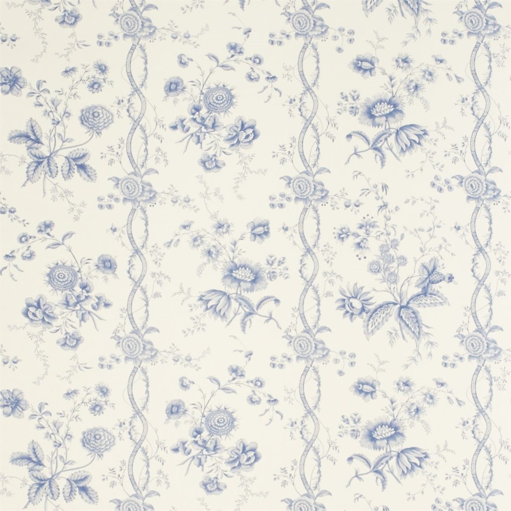 Wallpapers Sanderson from Toile collection
  Sanderson Wallpapers from Vintage Collection
 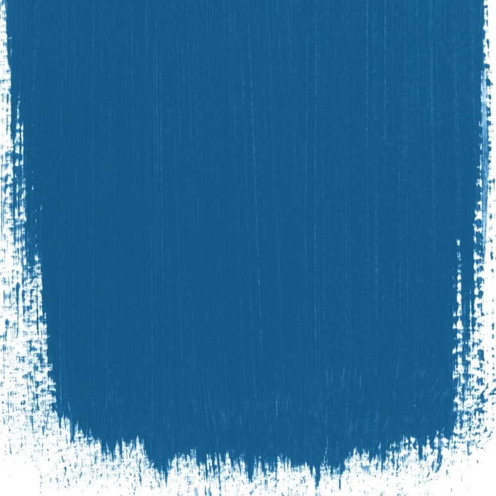 Designers Guild Lapis Lazuli paint # 51Sky blue The blue palette parade continues with a fresh and truly summer blue. It is equally appropriate in classic and Mediterranean, and, for example, in a Scandinavian interior. It is best to combine with gray, beige and shades of white. If you decide to accent this color, do not leave it alone: repeat blue in textiles, wallpaper patterns or decorative elements. To avoid losing color, do not distract attention from it with a bright floor or ceiling - let the finish be neutral.
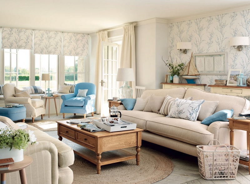
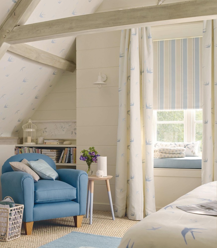


![]() There are few people who would not likeblue. It evokes extremely positive associations (sky, sea, wildflowers) and is suitable for both women and men. When decorating the walls in this color, play with shades: more saturated and cold tones are suitable for the kitchen and bathroom, and it is better to choose more airy options for the bedroom and living room.
There are few people who would not likeblue. It evokes extremely positive associations (sky, sea, wildflowers) and is suitable for both women and men. When decorating the walls in this color, play with shades: more saturated and cold tones are suitable for the kitchen and bathroom, and it is better to choose more airy options for the bedroom and living room. 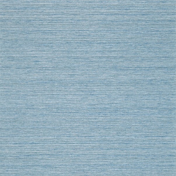 Wallpaper Zoffani from the collection Elementi
  Paint Designers Guild Jodhpur Palace №56
  Designers Guild Jodhpur Palace paint # 56Refined gray The uniformity of gray is nothing more than a stereotype, and the interiors from the brand's new collection convincingly prove this. Gray and its shades can not only be a good background, but also take center stage in the palette of the entire interior. Compensate for the neutrality of the color with a variety of textures and be sure to use bright elements: for example, blotches of rich yellow.
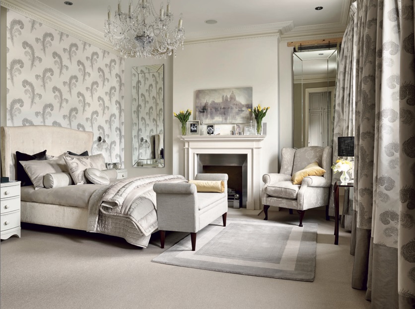

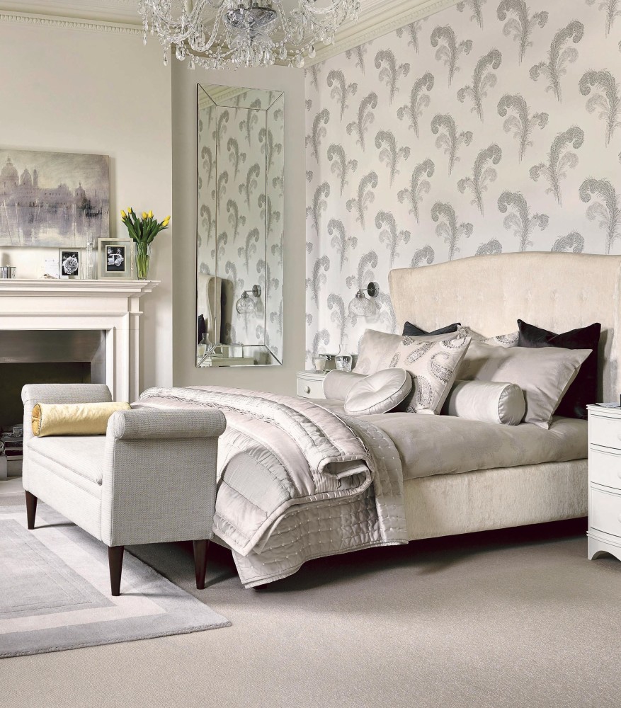
 Continuing the tradition of these interiors, payattention to a sophisticated yet vibrant combination of gray and yellow. He is also "friends" with white, pink, green ... Yes, in general with all colors, including their own shades. And gray is also very practical: spots or scratches are not visible on it as much as on white and black, and this is one of the. And since gray has no psychological "contraindications", it can be safely used both as one of several colors on the wallpaper, and as the background of all walls at once.
 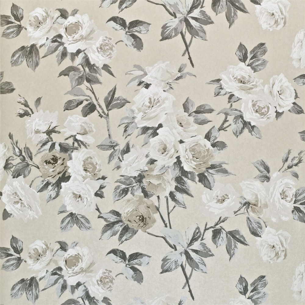 Sanderson Wallpapers from Vintage Collection
 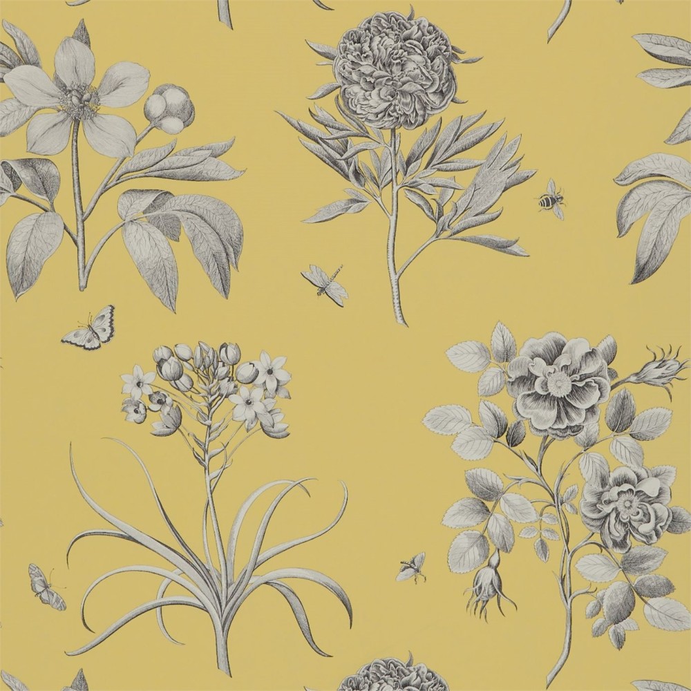 Wallpapers Sanderson from the collection of Parchment Flowers
 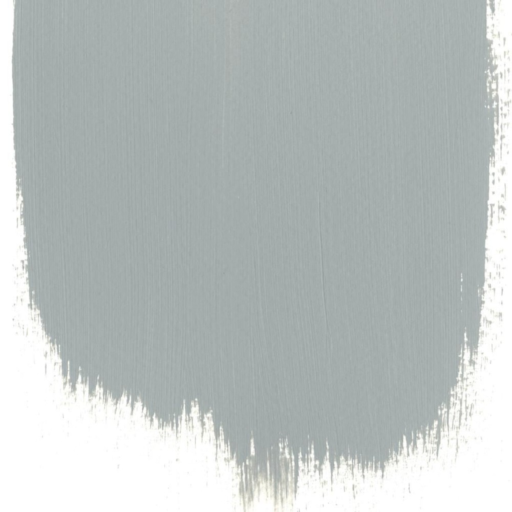 Paint Designers Guild Partician № 41
What is fashionable this fall: 5 main colors of the season - etk-fashion.com


