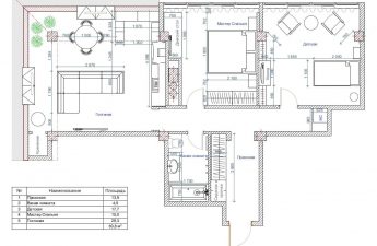
Looking for fresh ideas for apartment design? This project has more than enough. There is an unusual kitchen apron that extends beyond the kitchen, a turquoise children's room, and a well-designed kitchen-living room
The designer of this project joined at the stage,when the construction had already begun. It was necessary to help the customer with the choice of finishing materials, furniture, and also to develop a color and style solution for the interior. Elvira Narotneva, designer-decorator She received this profession while studying at the Higher School of Environmental Design MArHI and at the studio "Details". Specializes in the design and decoration of residential and office spaces. She loves to anticipate the wishes of customers in her work, combining different styles and objects into a single harmonious picture. elviranarotneva-design.com
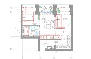
— The customer already had a planning solution, andpretty good. The only thing that raised questions for me was the strange 20 cm wide column wall - I suggested making it at least 40 cm, its length suited me, and I also suggested changing the configuration of the ceilings in the bedroom. This would allow us to make lighting in the future and not use a chandelier.
I first met the customer atpreliminary consultation. Having listened to all his wishes, two weeks later I brought him a design project concept, as well as catalogues with fabrics, wallpapers and palettes of proposed wall colours, which, in my opinion, suited him best.
The second meeting showed that I was on the right track.— the customer liked my proposals right away. And throughout the project I was convinced more than once that we “speak the same language” and our tastes coincide in many ways. But there was a fly in the ointment in this project — construction work was constantly delayed or suspended for various reasons beyond my control.
I could not influence this process in any way, since the construction team was hired by the customer himself. Due to this and a number of other reasons, work on the project took about two years.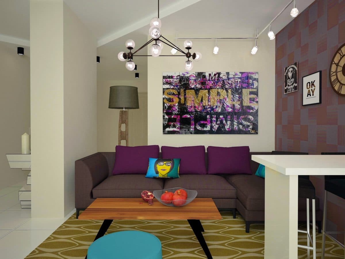 The design project was developed for a family of three. As a designer, I was faced with the task of creating a harmonious space that combines comfort and functionality.
The customer's initial wish was to combineliving room and kitchen. The main color of the walls in the apartment is neutral, with the exception of the children's room and bathrooms, and the logical solution, accordingly, was to make an accent wall. In the kitchen area, part of this wall was covered with transparent glass. It does not disturb the general appearance of the living room and at the same time carries a functional load, being an apron.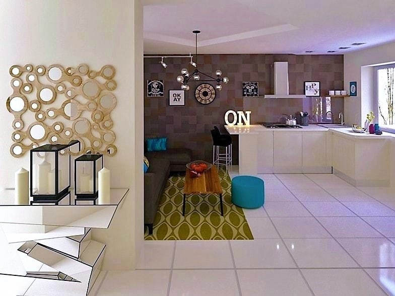
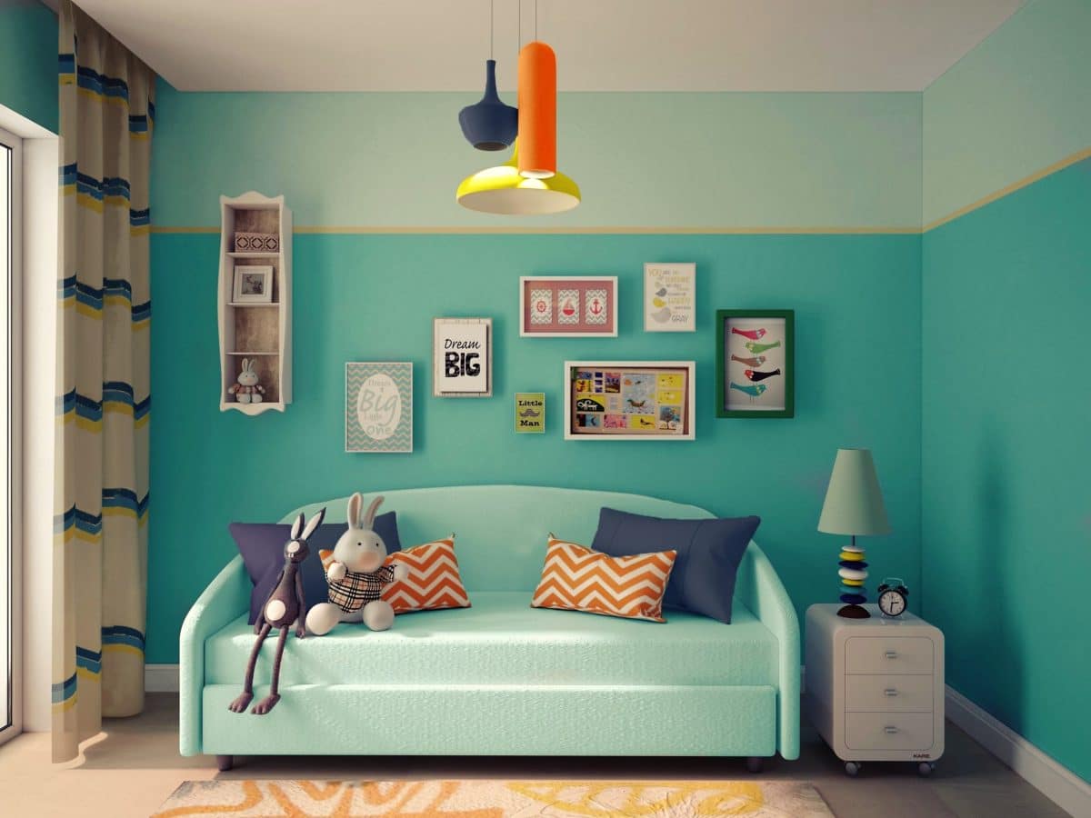
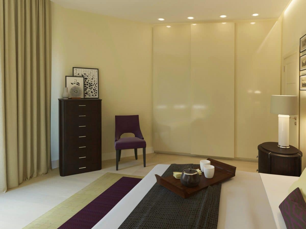
An interesting solution was pillows with prints,which sound in one ensemble with the posters on the walls. In the master bedroom, it was also decided to make an accent wall behind the headboard. However, in this case, fabric was used instead of wallpaper. It was used to cover a frame that visually resembles a screen. The children's room for a girl looks cheerful and happy thanks to successful color combinations of different shades of blue, yellow and orange. White furniture and bright, but not flashy details (carpet, toys, curtains, etc.) add a special lightness to the children's interior.
Living room-kitchen:
- The kitchen - Julia Novars;
- Console, mirror and bar chairs - Kare;
- Carpet - Kado;
- The coffee table (in the style of midcentury) was assembled from the available details in a friendly woodworking workshop;
- Posters - Westwing;
- chandelier — Cosmorelax.
Bedroom:
- Bed - Flou;
- Bedside tables - Selva;
- Built-in wardrobes - Mr. Doors;
- Fabrics - Kado;
- Watercolor paintings brought by a designer from Italy.
- table, nightstand, hanging shelves, TV stand, chandelier, lamp — Kare;
- Carpet - Manders;
- Walls - paint Manders (Sanderson).
