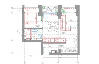
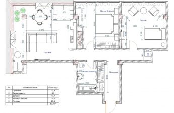
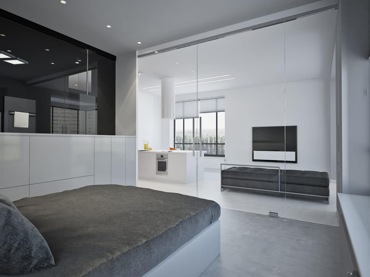
This is an ideal apartment for those who live inin a constant rush and does everything on the run. The designer managed to create a simple and clear interior, which at the same time meets all the requirements of modern design. In a metropolis, there is no time for conventions and compromises - there are enough difficulties in everyday life, and the interior must be functional, comfortable and conducive to rest from the big city. This is exactly the kind of housing that designer Stepan Bugaev managed to turn this two-room apartment into. Related articles Stepan Bugaev, interior designer Graduated from Moscow Institute of Physics and Technology with a master's degree in physics and from the Higher School of Economics with a master's degree in business informatics. Has his own design studio, under his leadership, more than 500 design projects have been implemented. Included in the top 100 best designers, according to the leading interior publication AD. He is a teacher at the HSE School of Design, teaches his own course "Interior Design. Rules for Creating a Successful Project." Gives open lectures on interior design and writes articles for leading interior magazines and portals. — The clear decision we came to while working on the project was to implement it in strict minimalism. As a result, the entire apartment is a visually open space, where all zones are inextricably linked and create a single concept. This was achieved thanks to the absence of blank walls between the rooms: the bedroom and shower are separated from the main space by glass partitions. The color scheme was supposed to emphasize the atmosphere of lightness and spaciousness, and at the same time play its role in zoning. So we settled on a muted monochrome, and with the help of contrasting transitions we divided the apartment into zones and skillfully hid the shower.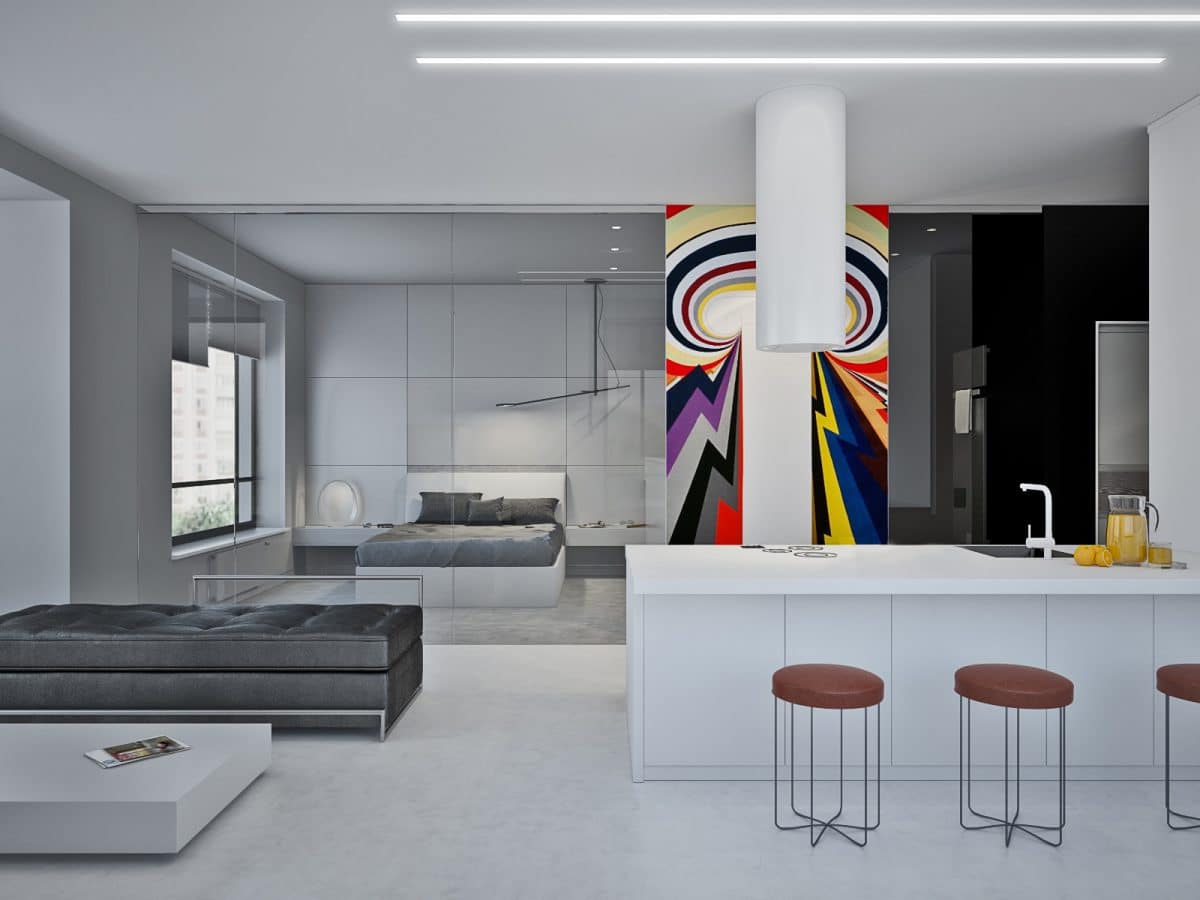
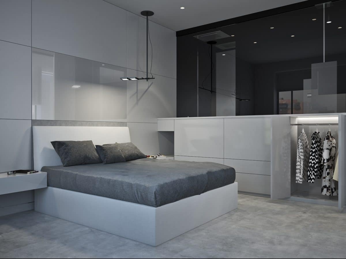
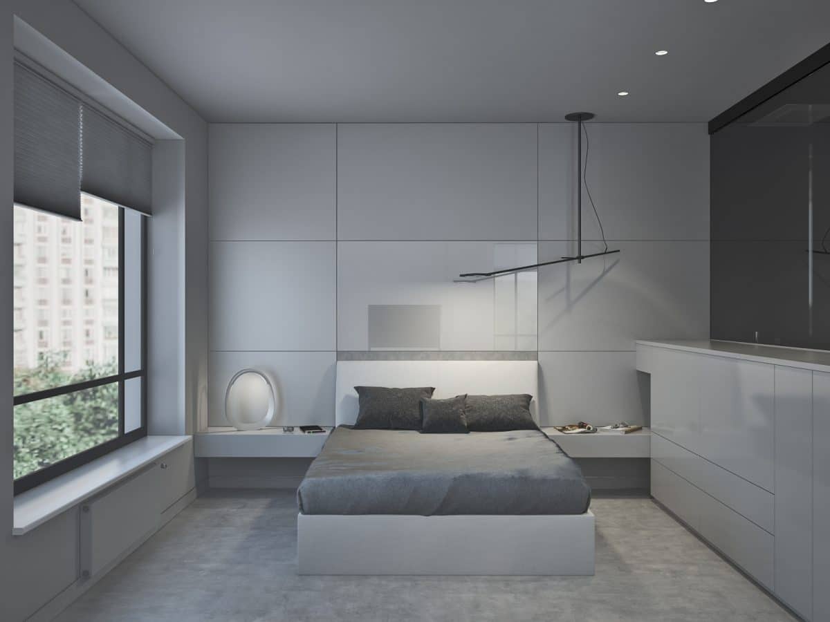
 Storage of clothes in the bedroom is organized ina low furniture system that seems to merge with the walls and other furniture. By the way, most of the furniture is custom-made, except for the bed - it was found at the Italian manufacturer Bonaldo. Every little detail has been thought out for the convenience of the owners: for example, a sliding glass system allows you to watch TV right from your bed. Special attention was paid to lighting: a Vibra lamp with a ceiling mount can be used for reading in bed, background lighting will be provided by a table lamp, and additional lighting for the dressing room is located along the border with the bathroom area. Related articles
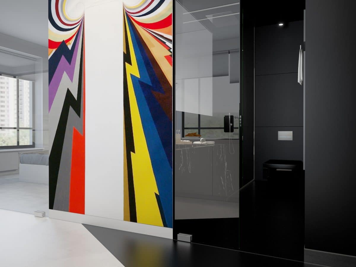
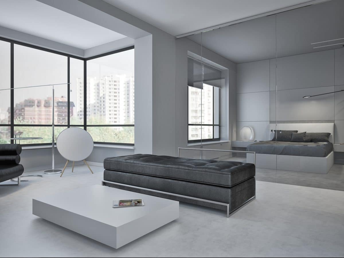
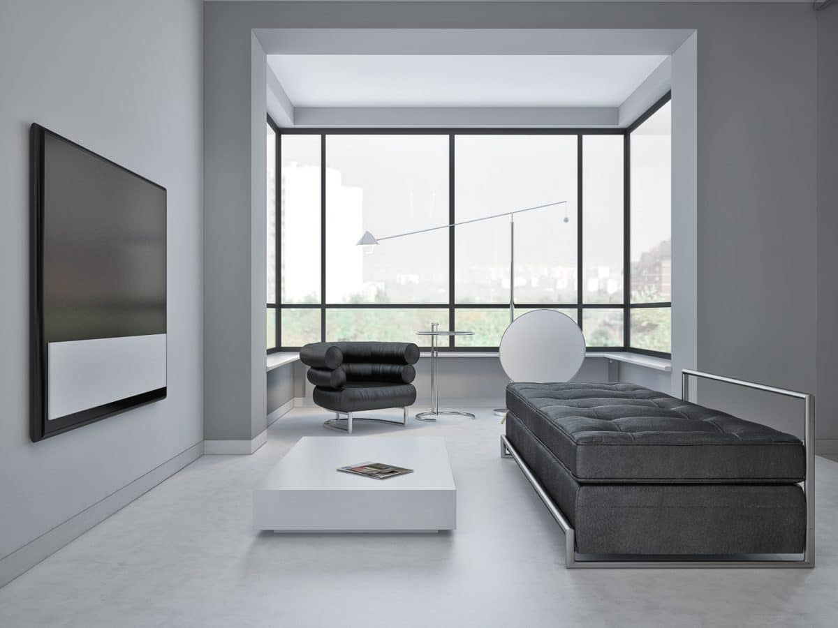
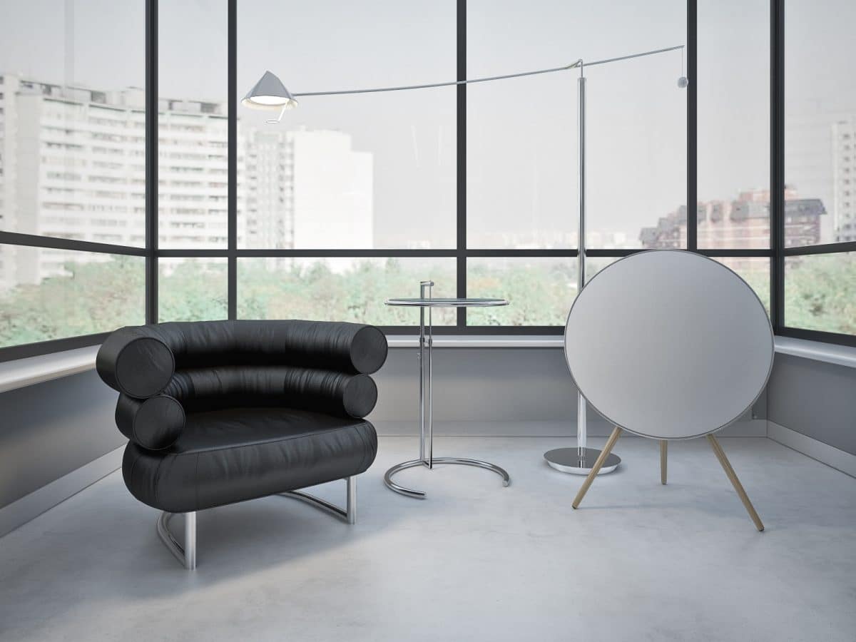
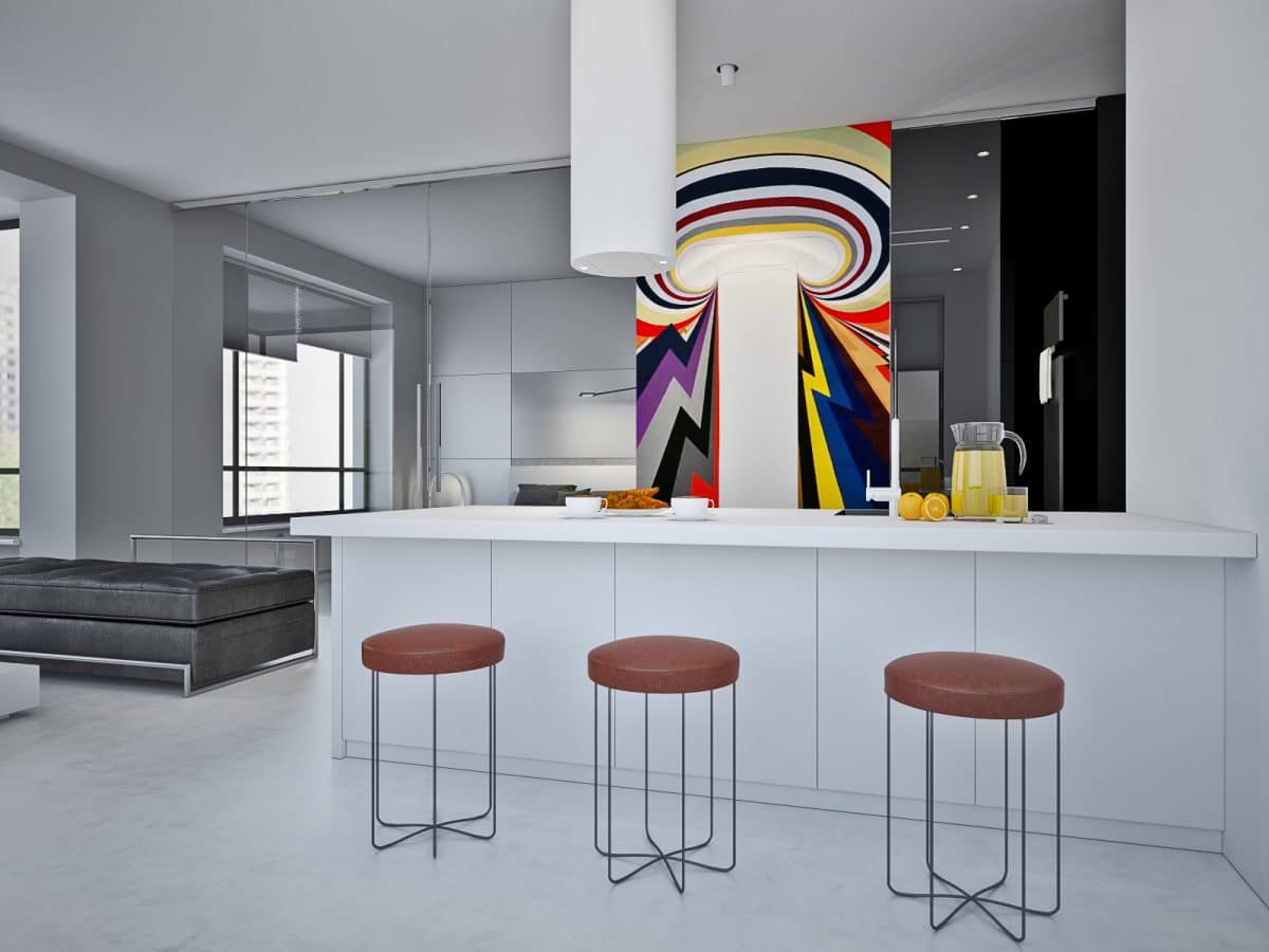
 The main feature of the living room ispanoramic windows, which we did not block, but on the contrary, drew attention to them, choosing low furniture of simple shapes. This furniture would be unremarkable if not for its creator - the legendary designer Eileen Gray. And the only bright spot against the background of monochrome colors was the painting that marks the center of the apartment.
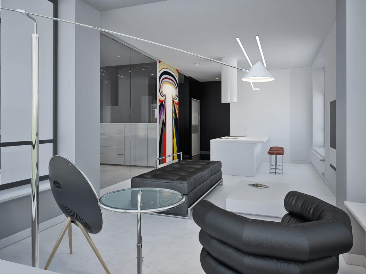
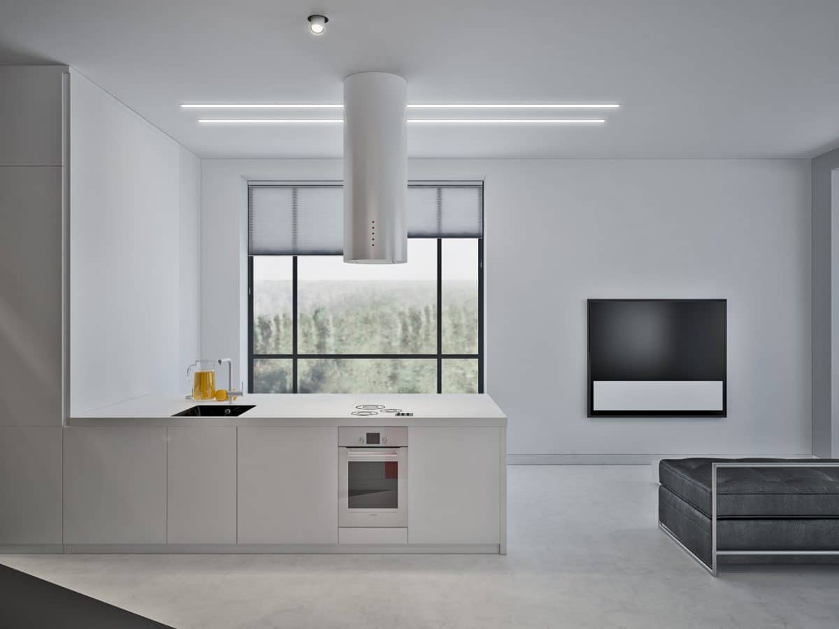
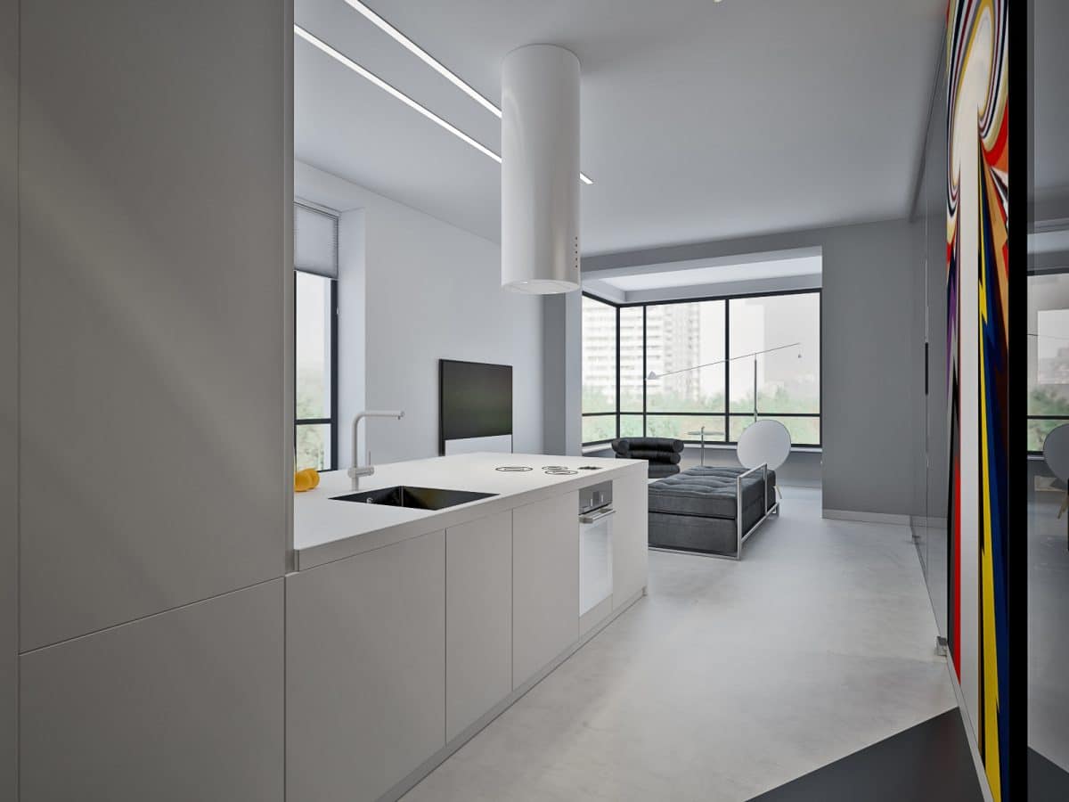
 White Italian Kitchen MittelCucina, thanks to its monolithic construction, looks like part of the layout. The kitchen set is designed so that the storage area is completely located in the lower part, and the work surface can be used as a dining table. Thus, free walls make the apartment visually more spacious, and a wide countertop allows you to perform any culinary feats and comfortably receive guests.
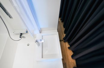
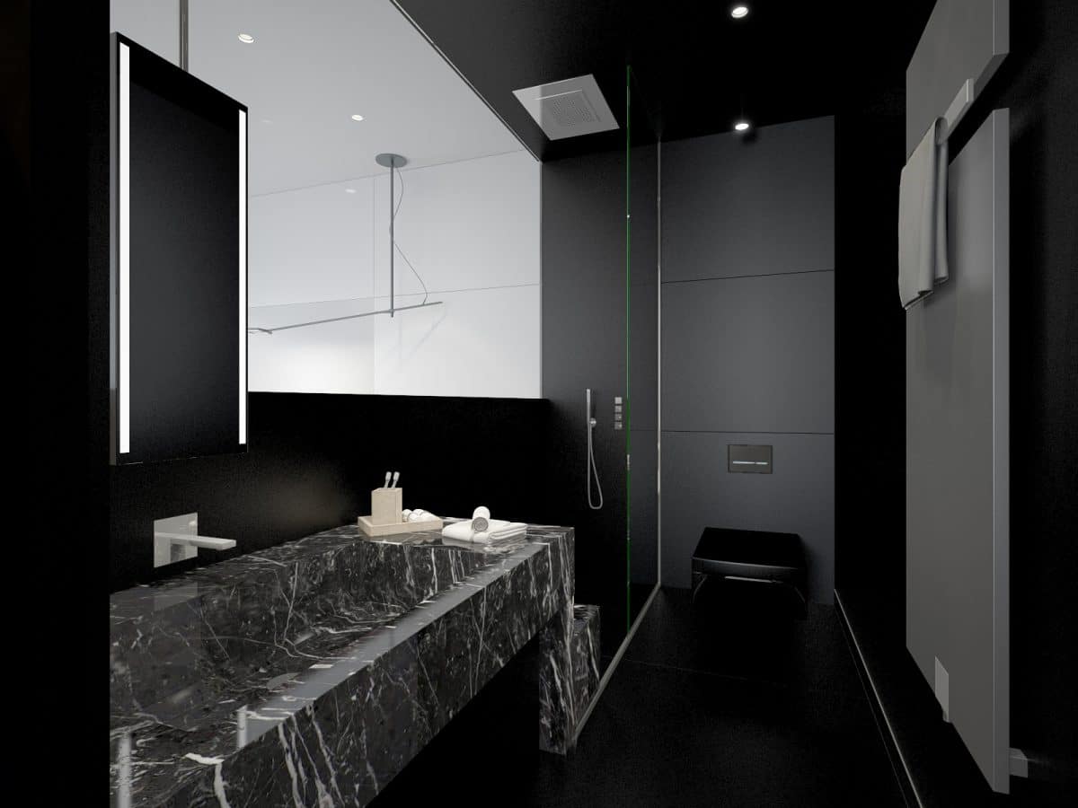
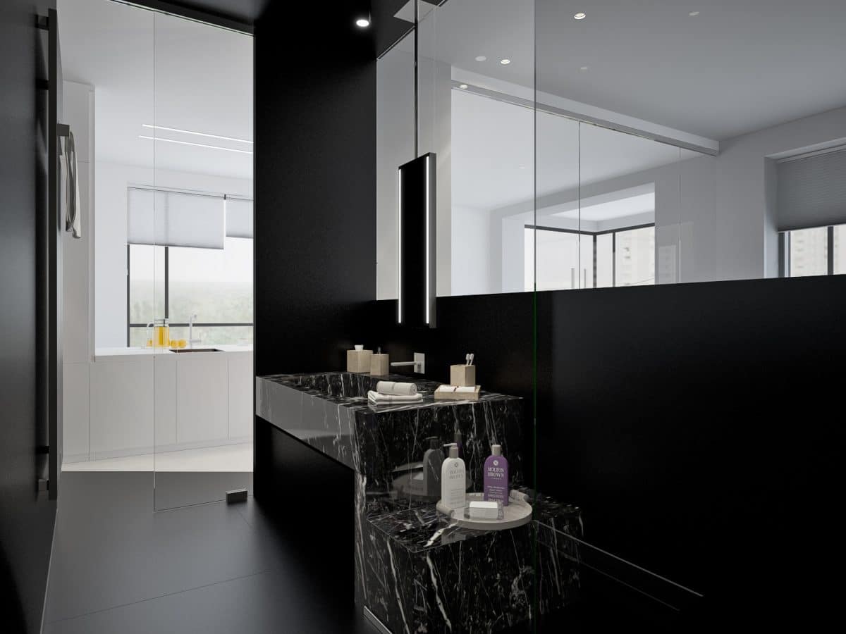
 They decided to diversify the snow-white interiorsomething dark: the shower turned out in black, passing from the floor covering to the plumbing and walls. Everything here is custom-made from marble, except for the toilet from the German brand Duravit. Well, and the main feature of the shower: with the help of glass partitions, it became another part of the room, where there are no separate rooms, but only a solid space, free from stereotypes. Related articles

Interior design of a small two-piece: minimalism and monochrome
