How creative people create interiors and whyapartments become unique? Probably, they do not deny themselves anything and do not set limits. Let's figure it out! This charming apartment, a little reminiscent of a doll or just a fairy tale, is located in Chelyabinsk and belongs to a creative girl who specializes in design, but not interior design. For her, it is just something like a hobby. Oksana Pigina decorated her apartment with her own hands, and as a result received an absolutely charming home. Oksana Pigina, designer Professional advertising designer (printing, web), creator, branding specialist (Ekaterinburg, UrSU). Occasionally does public and private interiors (including as part of creating a brand concept). Artist (abstractionism, naive). When a designer, and especially an artist, does something for himself, this is probably the most difficult. Difficult because there are no and cannot be any limits! After all, you accept many styles, you love them all - and what will you choose in the end? In my opinion, the brighter the individuality of any person, the less standard interior solutions suit him. Often it is necessary to create non-existent things, rethink ergonomics in order to feel the harmony of space.
Oksana Pigina
Redevelopment
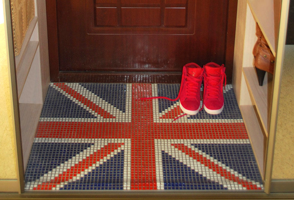
This apartment itself has been radically changed.purpose of the premises. The kitchen turned into a bedroom. The dressing room and the walls that formed the hallway were demolished. As a result, the hallway was reduced to 0.6 sq. m. There is simply no need for more, Oksana is sure. The kitchen was also subjected to a major overhaul. Its area was 7.5 sq. m, after the renovation it became only 3 sq. m.

Dreams of a hostess
Oksana wanted her apartment to blend in withnature, which is nearby. The house was built almost in the city center, and there is a forest next to it. Nature, ecology and naturalness had to fill the apartment as much as possible. We wanted more clean air, so a fan appeared in the room, not an air conditioner; the softest cork on the floor; the balcony is not glazed and the windows are open all the time. We really wanted to achieve the maximum light in the room and learn how to expand the space to infinity. And also - for the bathtub to be cut into the rock and there to be a waterfall. To some extent, Oksana managed to implement this. The girl was categorically against folding furniture, mini-furniture, a fenced off area for a bedroom 2 m x 2 m, without windows and air.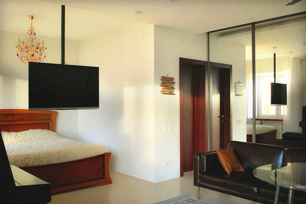
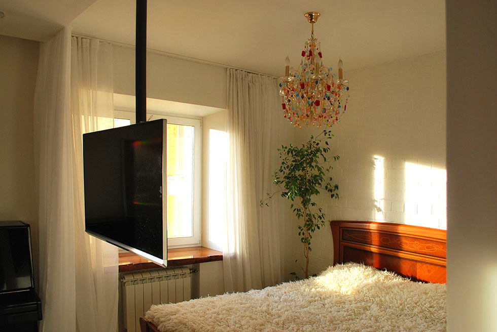
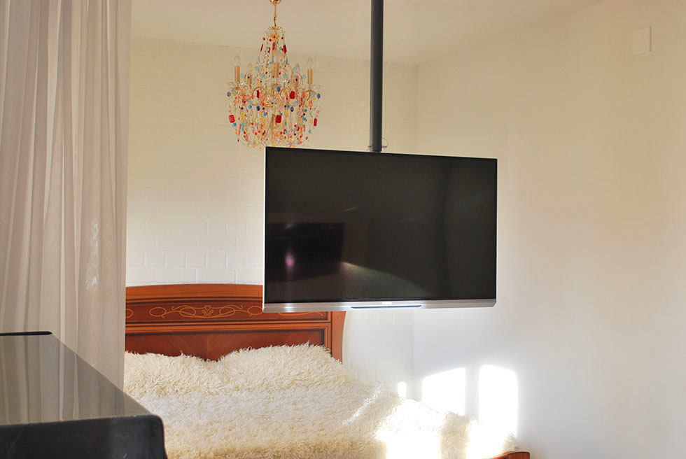 Since the girl has a busy life,often have to hold business meetings right at home. Therefore, another important task was the need to provide for the possibility of business communication with two or three customers at the same time. And the TV should be comfortably viewed at the right angle from any point. The bedroom, by the way, can be easily fenced off with a light curtain if necessary.
Light
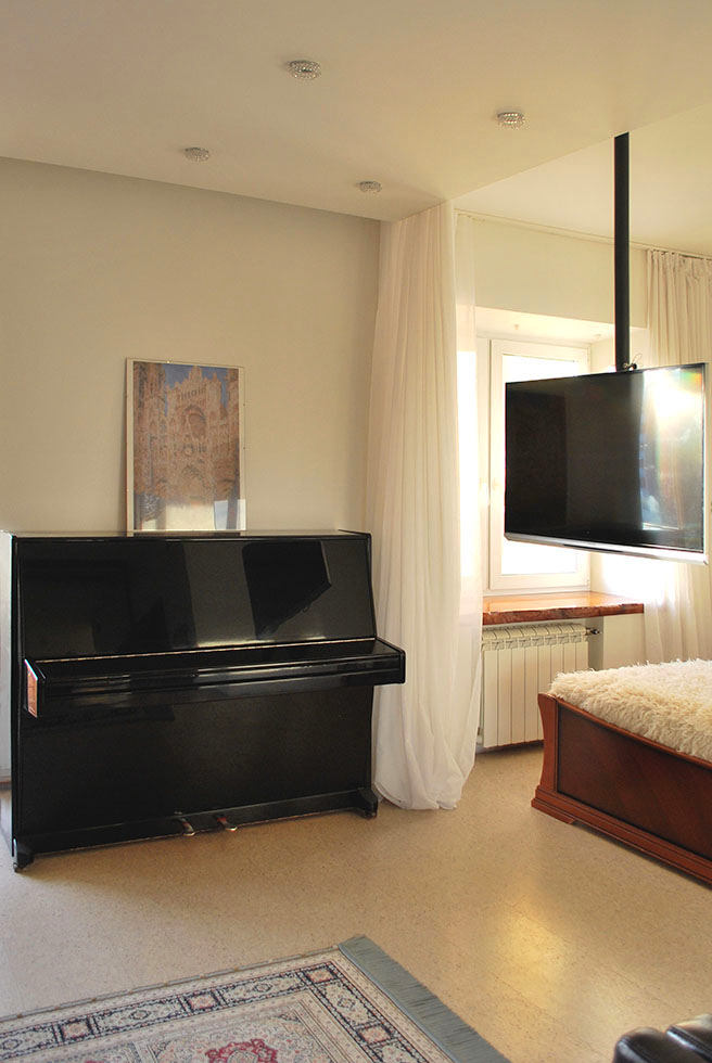
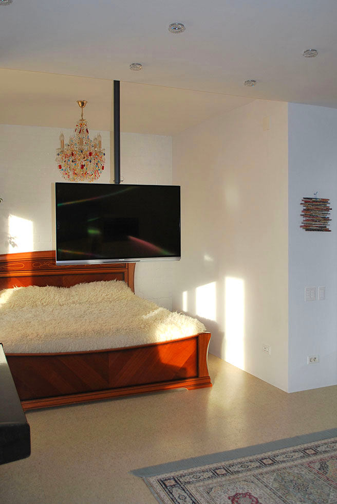
Light here essentially performs a functionzoning. In addition, in a small room there should be as many lighting scenarios as possible so that a person feels comfortable in different roles. There are three types of lighting: maximum light (the type of lamp is not important, the intensity is important), intimate, relaxing light (ambilight TV backlighting is very good), decorative light - lamps with crystal elements that create patterns on the ceiling. This chandelier, it must be said, has undergone changes. At some point, Oksana wanted to add color, and she hung more than a hundred elements on an ordinary crystal chandelier: Italian beads, roses and chains. The bathroom is decorated with a forged chandelier with plant decor.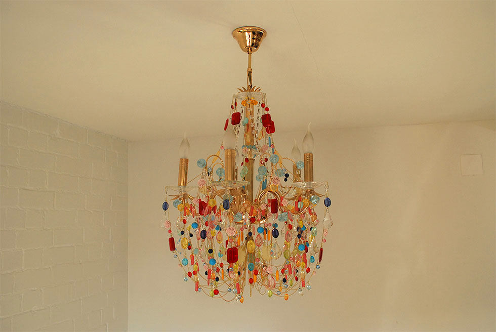
Color and textiles
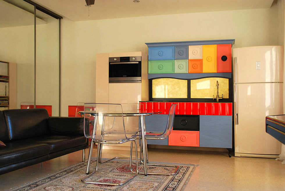
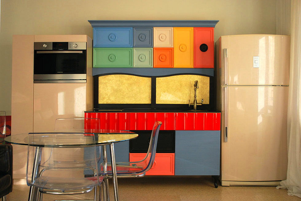
Choosing a color combination in an apartment is ratheris determined by the peculiarity of the creative artistic manner (bright juicy colors of abstract works, endless pulsating combinations of colorful spots of watercolors), passionate love for the Eastern culture and the southern sun. The girl was captivated by the Togas blanket made of natural sheep wool, so it decorated the bed. The kitchen in the apartment deserves special attention. And not only because it takes up only three square meters. It is the brightest, most unusual, you want to look at it and guess what it is made of and why exactly it is like that. And of course, because of the beautiful drawers. Oksana Pigina, designer: - The version of the kitchen that we have now is the third. One was creamy white and beige based on Arabic script. Then I watched Kandahar and it became clear that the Arabic "fear of emptiness" has no place in my house. Thinking over the second option, I folded the design with the need to place a plumbing pump, a water filter, and remove the kettle from sight. I am convinced that a small apartment simply does not need a large kitchen! I love to cook, but I do not do it from morning till night, and I do not eat from morning till night, and I do not have a bunch of children who need to be constantly fed. So only the most necessary things were left. Even a separate oven was eliminated. Then I thought that looking at large monochromatic surfaces opposite the bed for a long time, no matter how complex or simple their color, would inevitably get boring. This is probably surprising, but it was makeup that inspired Oksana to paint today's multi-colored facade. More specifically, this is a photo found on the Internet. And already in the process of selecting shades, the colors becamea little softer and more delicate. Then the search began for how and where all this could be realized. The girl even molded samples of the facade from hardening plastic. In the end, this idea was realized in the furniture studio "Servant’es". Here they individually wrote a program for the machine, created cutters of an individual shape. Sanding and painting were also done in the studio. Digital tinting - according to NCS. Fittings - Blum.
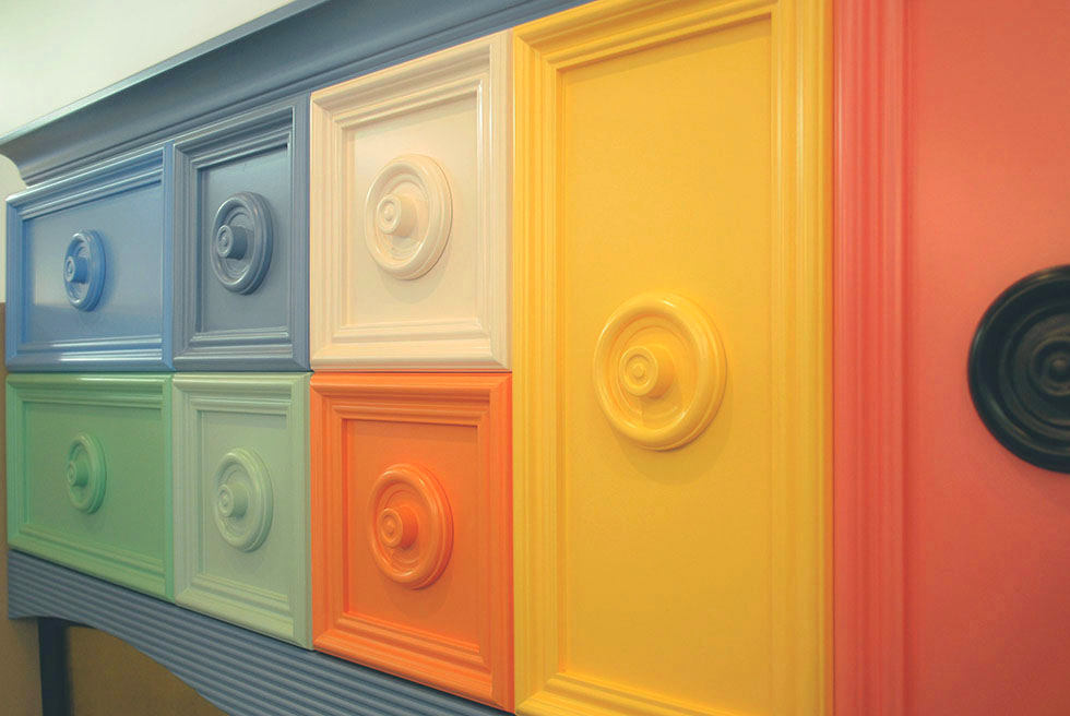
Furniture and brands
Made to order
- kitchen - furniture studio "Sideboard";
- Built-in wardrobe by Oksana's sketches - in local furniture companies;
- Windowsills - in the carpentry workshop.
Ceiling fan — Hunter. Ceiling rod and bracket — Kromax. Bed — Venier (Italy), cherry veneer inlay. Sofa and dining group — IKEA. Doors — Titul Quadro.
Bathroom
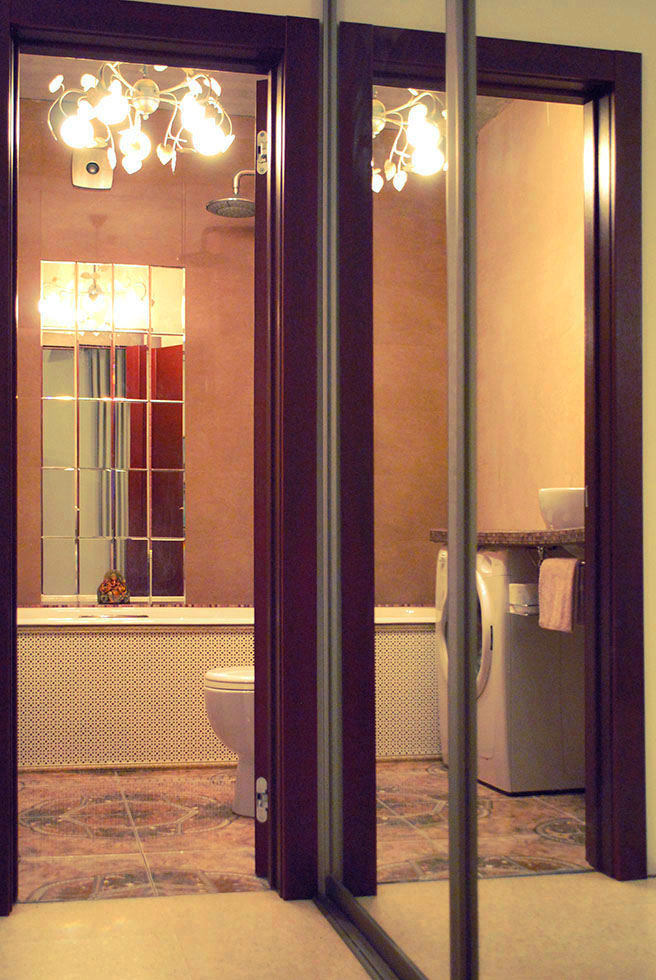
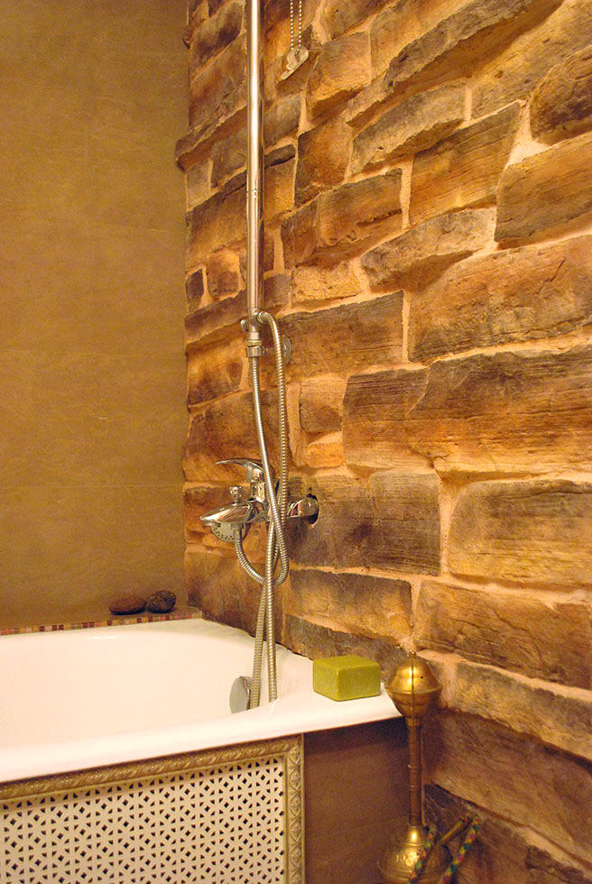
The bathroom in this apartment is very warm andconducive to relaxation. And also unusual: Oksana placed the sink at a height of 100 cm, which turned out to be very convenient. She realized her dream of a waterfall and a rock by decorating the walls with stone.