Today we are showing an unusual apartment, inin which interior designer Stepan Bugaev was able to combine the romance of the attic, loft elements, multi-level ceilings and unusual art objects. In a word, we wish we could live like this The customer of this project is a producer, director and, in general, a creative person. He got an unusual apartment, full of non-standard elements: an attic floor, large windows, multi-level ceilings, a terrace and a complex configuration. Interior designer Stepan Bugaev took on the task of collecting all these details and creating a space that is not only aesthetically pleasing and creative, but also convenient for everyday life. Stepan Bugaev, interior designer Graduated from Moscow Institute of Physics and Technology with a master's degree in physics and from the Higher School of Economics with a master's degree in business informatics. Has his own design studio, under his leadership more than 500 design projects have been implemented. Included in the top 100 best designers, according to the leading interior design publication AD. He is a lecturer at the HSE School of Design and teaches his own course, “Interior Design. Rules for Creating a Successful Project.” He gives open lectures on interior design and writes articles for leading interior design magazines and portals. This project has a whole set of “tricks,” but the main one can rightfully be considered the unusual ceiling, which, due to the break in the roof, has a different height in each room. Also, the roof slopes are designed in such a way that there is no symmetry in the interior and some structural beams are lowered quite low, and this, in turn, became an obstacle to creating an open layout. For this reason, the designer did not make any structural changes and worked mainly with the decoration and filling the apartment with furniture and decor.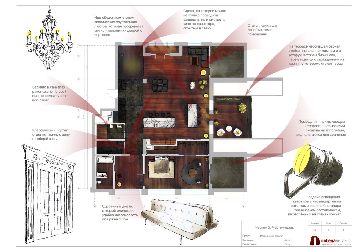 The chosen interior concept allowedmix in one apartment completely different in style, but at the same time harmoniously adjacent things: classic door frame frames, loft lamps, an art object in the form of the head of Nefertiti, etc. Despite the fact that at first glance such a combination sounds quite bold, all these items together do not look pretentious or out of place.
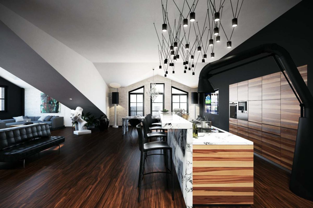 The main zoning tool inThe public space is characterized by color: the black and white palette clearly divides the room into the entrance area (black) and the recreation and reception area (white). But the color scheme is not limited to this: natural materials of corresponding shades are integrated into the black and white interior.
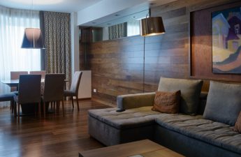
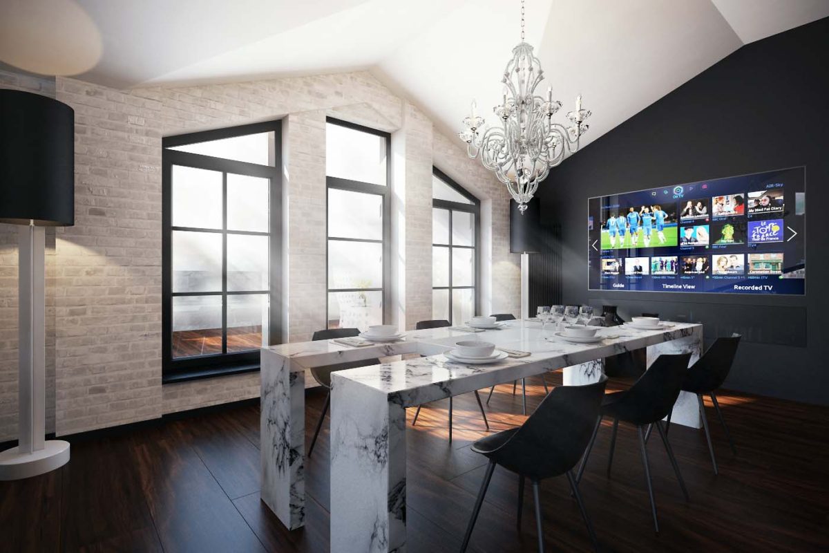
 The dining area is located in the brightestplace of the apartment - a large light opening along the entire wall, formed thanks to the open terrace. The central place in the dining group is occupied by the Dining Desk Draenert table made of natural marble, and the classic crystal chandelier Scheherazade9624 from Schonbek serves as an accent.
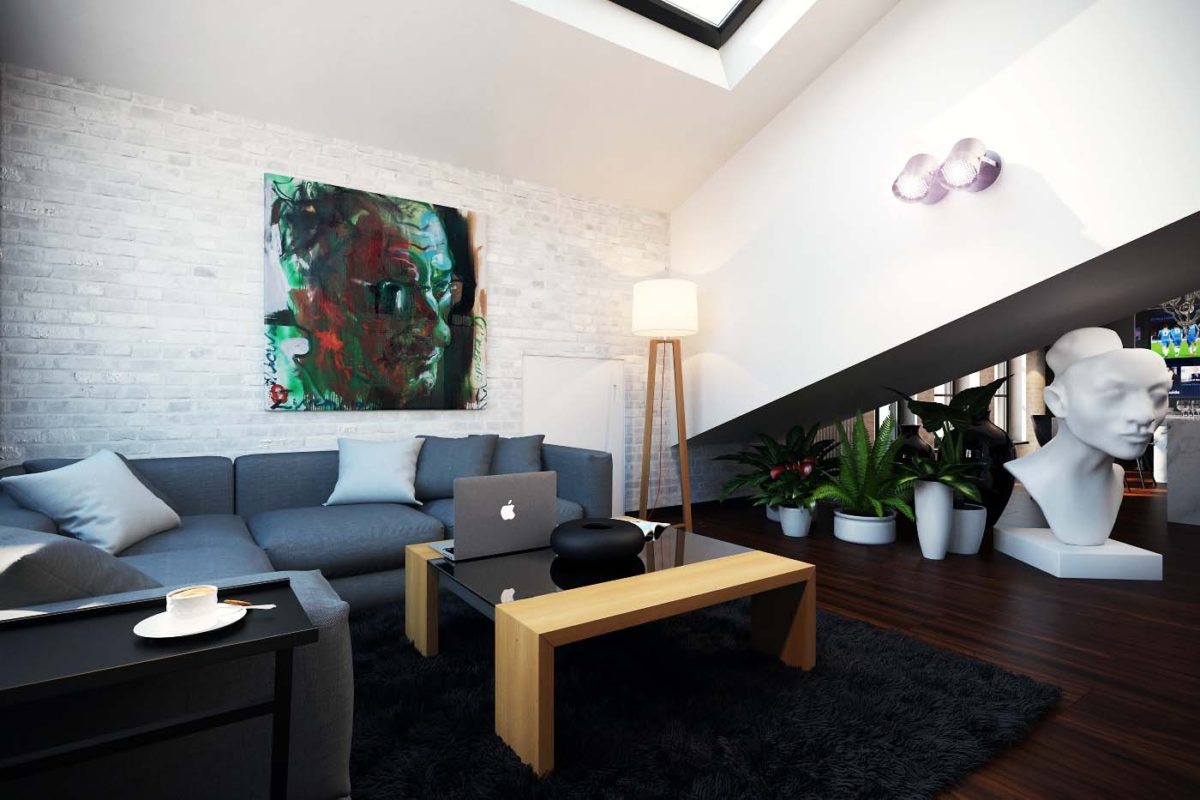
 The recreation area is visually separated fromkitchen-dining room with a double leather Cassina sofa and a sloping roof slope, under which are located indoor plants, decorative vases and the already mentioned snow-white head of Nefertiti.
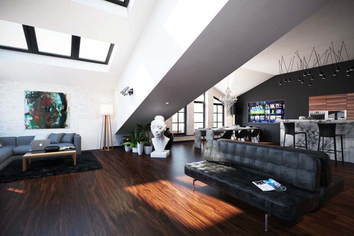 In the kitchen area all the furniture is from the Eggersmann factory.built into the wall, and for breakfast, a light snack or chatting with friends while cooking, there is a bar counter with four high stools, separating the work area from the rest of the space.
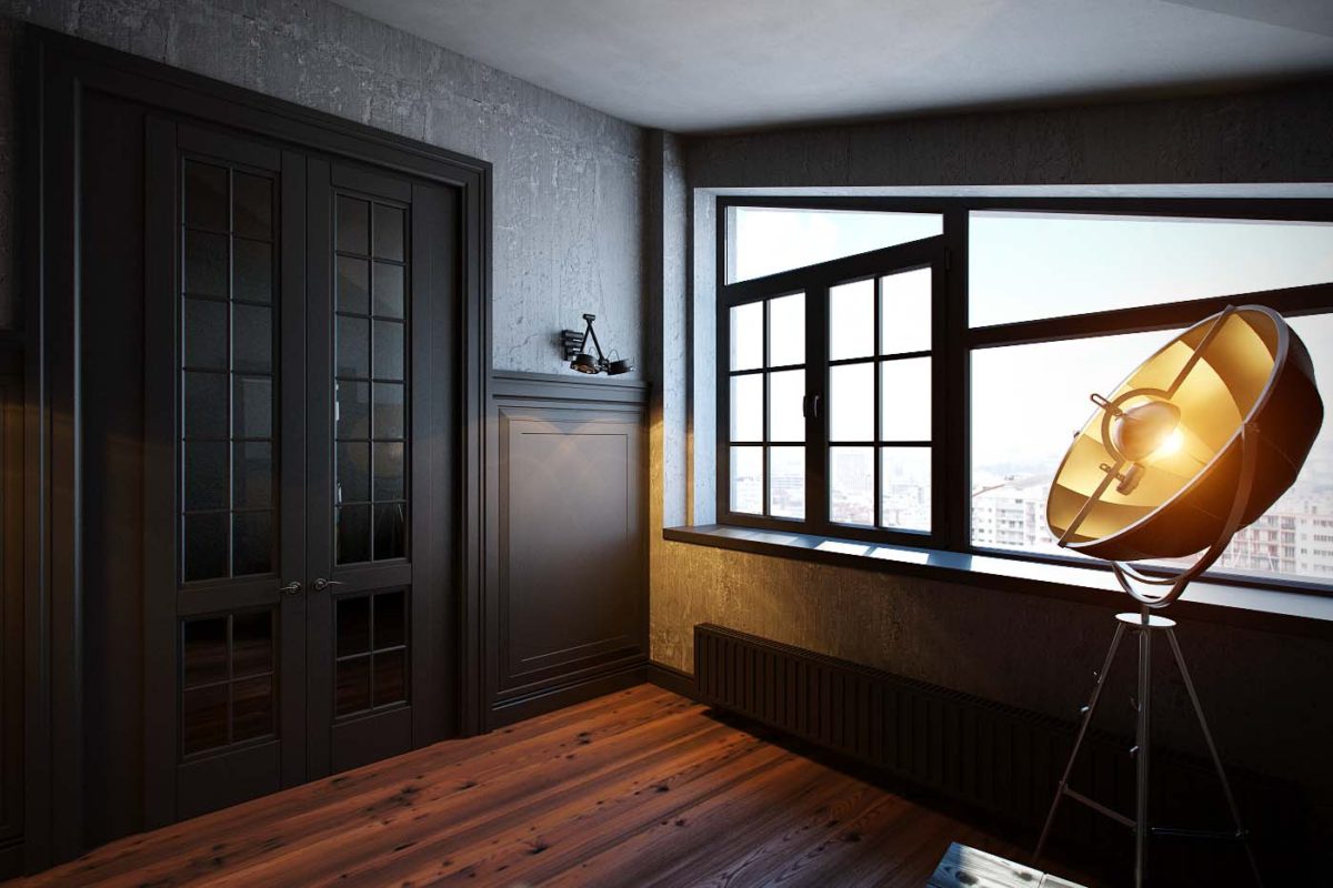
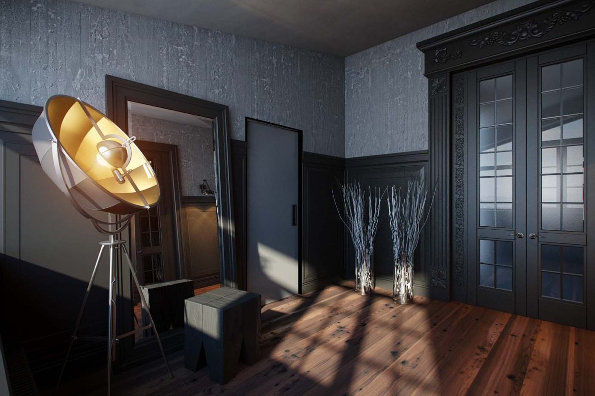
 Transition from public to private area and fromThe transition from the bedroom to the bathroom was made at the expense of the large hall. It was decided to design it in the style of the facades of Italian houses, reflecting the concept of the residential complex "Italian Quarter" in classic elements: door portals, wall panels imitating the entrance to the building, and wall decoration with decorative plaster Microcemento.
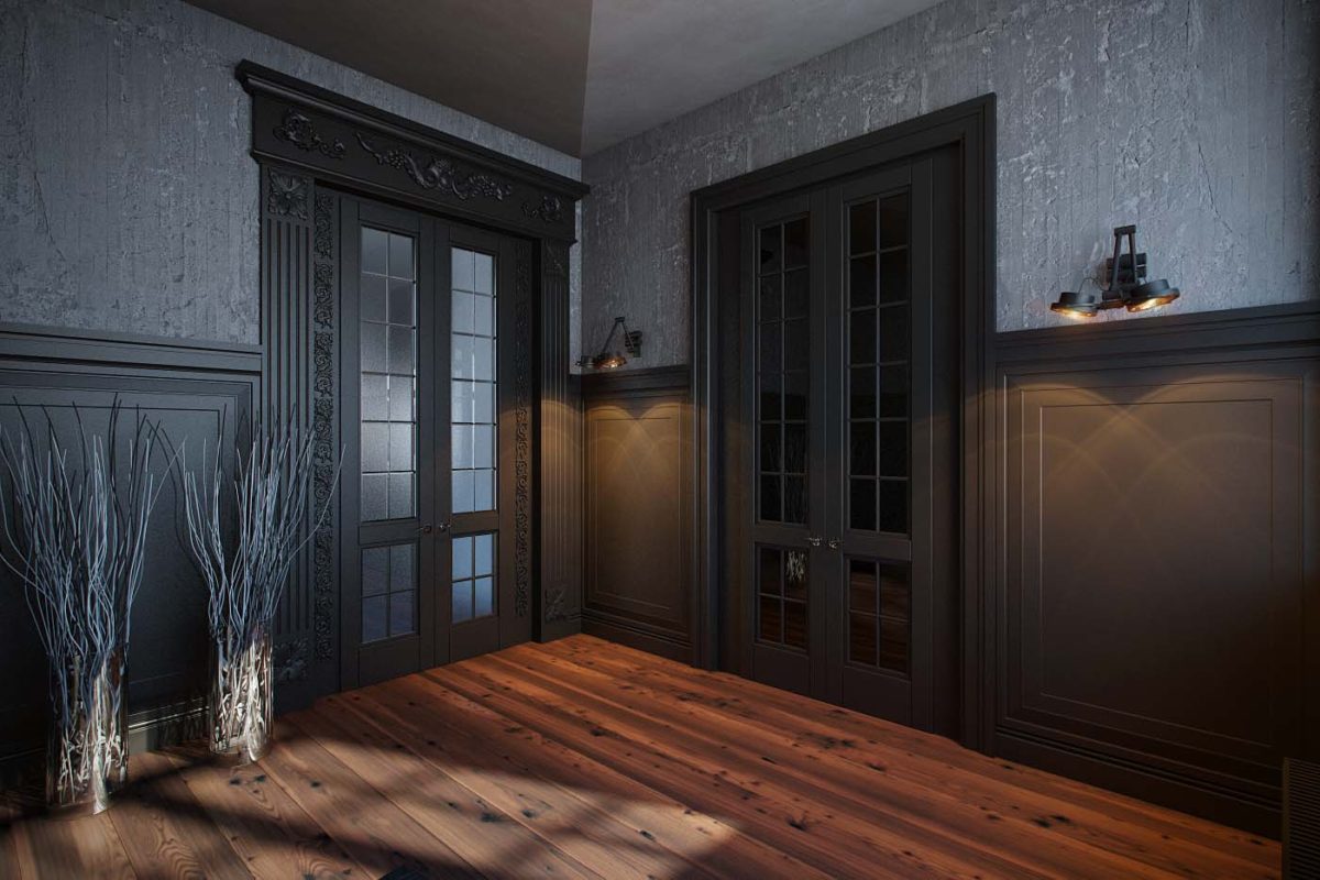 However, the hall does not look strictly classical:It also features modern details, such as the Fortuny floor lamp from the Italian factory Pallucco and the hand-made black solid oak stool Devina Nais.
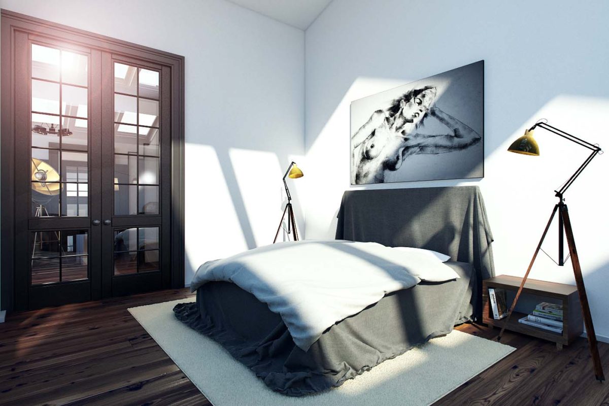
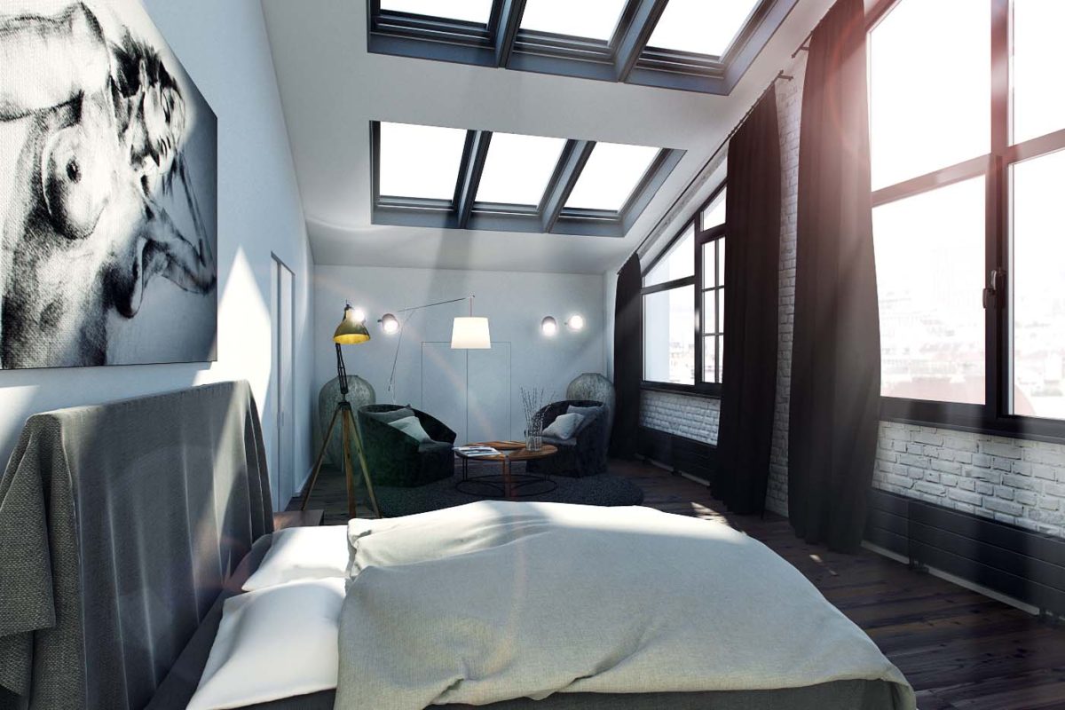
 The color scheme of the bedroom generally follows the overallblack and white theme, and the use of natural materials brings a sense of coziness to the interior and makes it interesting due to the variety of textures. The stylistic concept of this room is a loft space on the attic floor, in which the ideology of minimalism is combined with Italian art objects and classical elements.
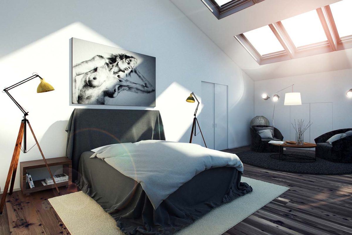 The central place in the bedroom is occupied by a largebed. On the sides are industrial Manhattan tripod floor lamps with wooden tripod bases. In the middle of each is a brass hinge, which allows you to adjust the comfortable height of the lamp.
 The bedroom is divided into two functional zones, and hidden niches contain a wardrobe and storage space.
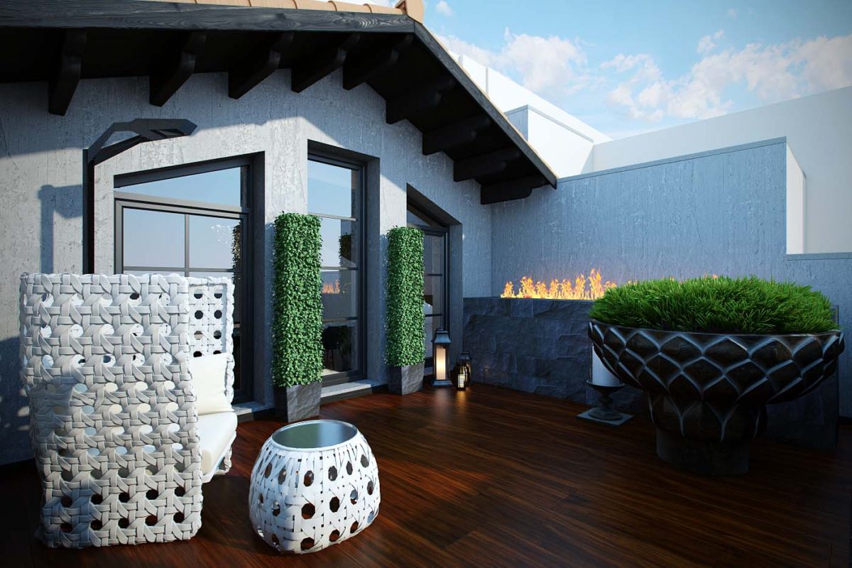
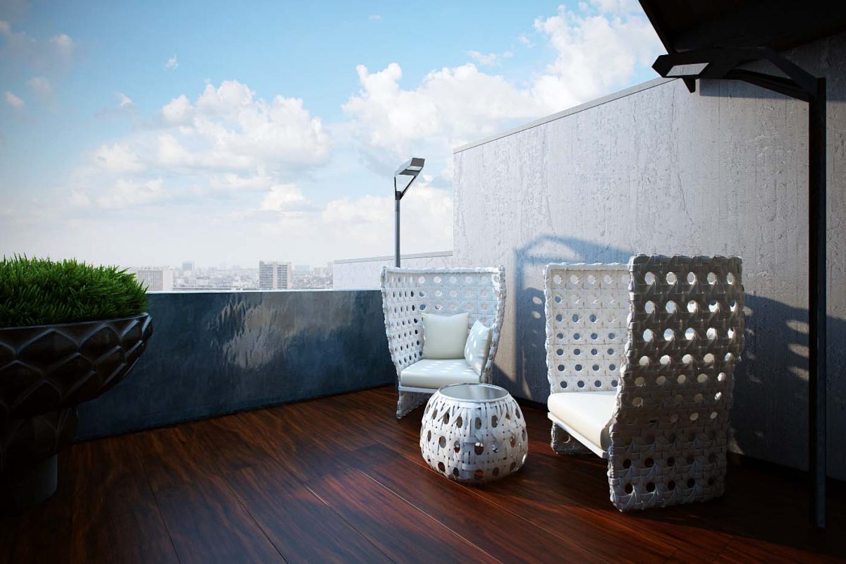
 One of the main highlights of this apartment isa terrace with a beautiful view of Moscow. When designing it, the designer decided to combine several elements in one space: air, fire, embodied in a bio-fireplace built into the bar counter, and water flowing down the stone fence of the terrace. The result is a small but very cozy place to relax.
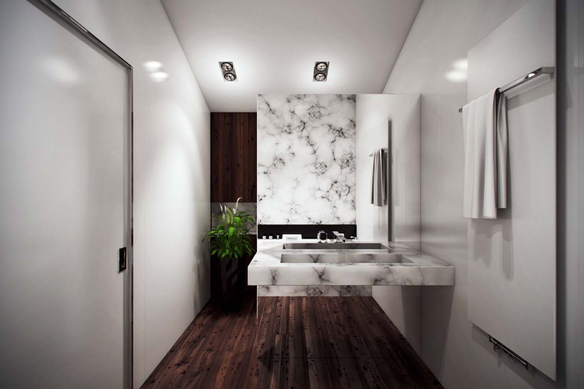
 The main bathroom is bright andrather warm color scheme. For the finishing, the designer chose Art Skin tiles from Cotto D’este and natural wood (tinted pine). The sink is made of custom-made marble, all the plumbing is by Antonio Lupi.
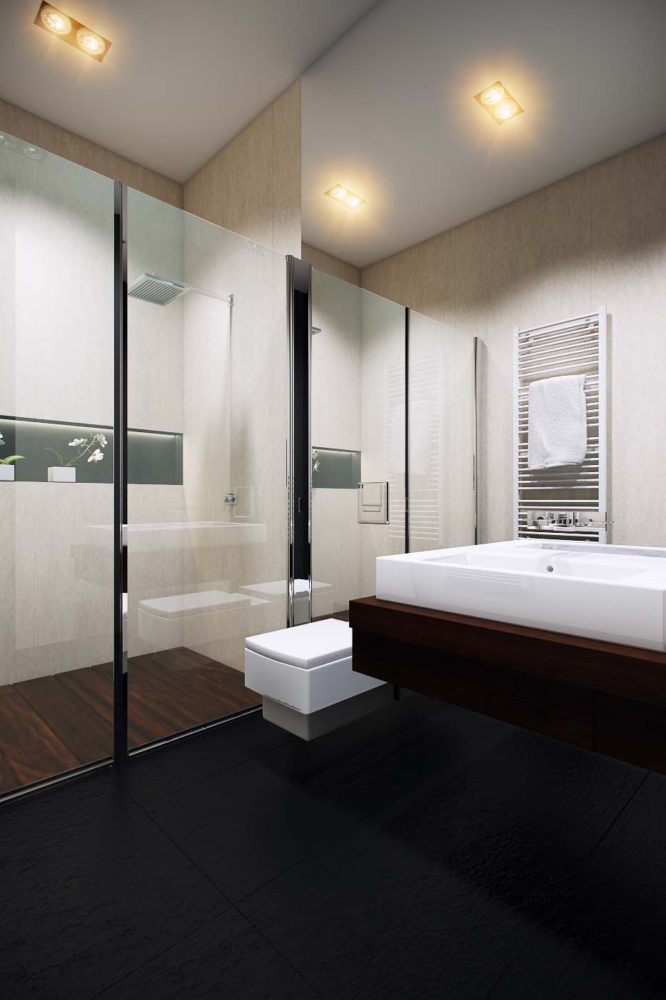
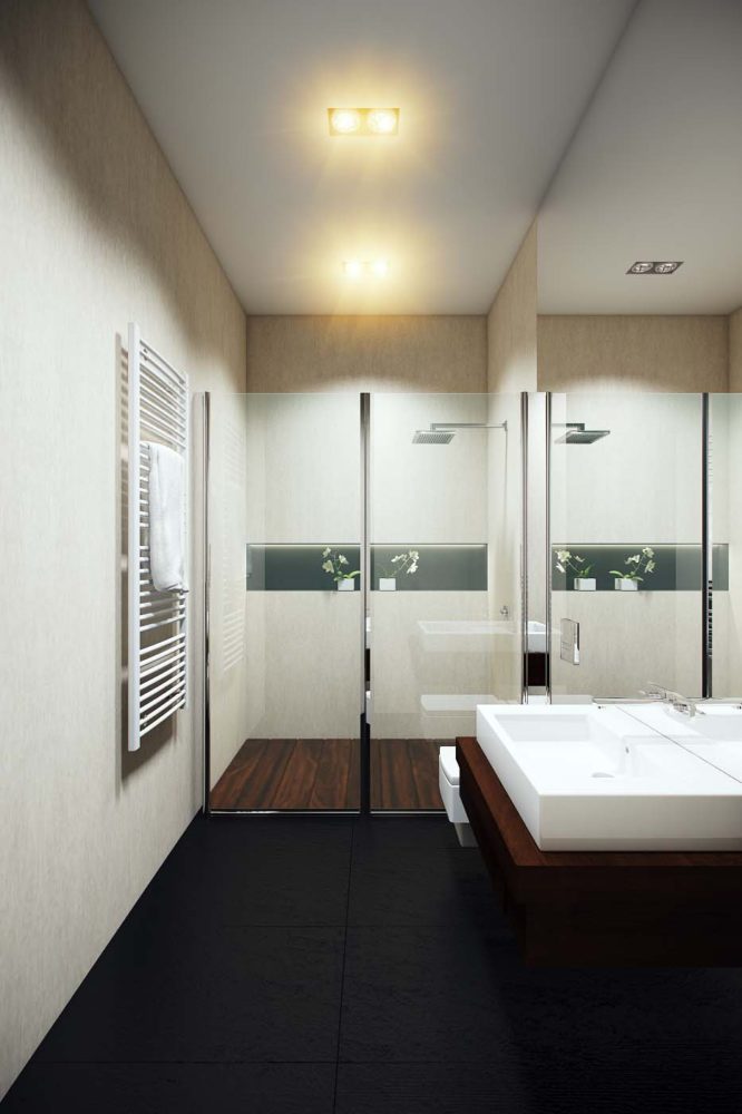
 For finishing the second bathroom, we used decorative plaster, plumbing fixtures — Duravit and Hansgrohe (shower system). An interesting element of the interior of this bathroom was a large mirror covering the entire wall.
 Advice from interior designer Stepan Bugaev:
- The textures of natural materials: stone and wood, will help make the interior of your apartment cozy and more interesting.
- If you don’t want to distract attention from the public area with a kitchen set, hidden facades and will come to your aid.
- A white ceiling allows the space to be filled with light, and the flooring will stand out even more against its background. This technique creates the feeling that there is no ceiling.
- Want to use a black lamp in your interior, but it seems bulky and heavy? Choose models with a light frame structure: they will neutralize this feeling.
This interior featured: Public area:
- kitchen - Eggersmann (Germany);
- lighting fixtures in the kitchen area — Vibia (Spain), MATCH lighting system;
- dining table - Draenert (Germany);
- crystal chandelier - Schonbek (USA), model Scheherazade9624;
- leather sofa - Cassina (Italy);
- textile sofa - Pianca (Italy);
- windows, floor and wall coverings - Barausse (Italy).
Hall:
- floor lamp - Pallucco (Italy), Fortuny model;
- stool - Devina Nais (Italy);
- Finishing - decorative plaster Microcemento (Spain).
Bedroom:
- Bed - Lema (Italy);
- Lighting fixtures - Manhattan tripod floor lamp (UK).
Bathroom:
- Plumbing - Antonio Lupi (Italy);
- A washbasin is made to order;
- Heated towel rail - Brem (italy);
- tiles — Cotto D’este (Italy), model Art Skin;
- A door with a hidden box - Movi (Italy).
Bathroom:
- Towel dryer - Zehnder (Germany);
- Plumbing - Duravit (Germany);
- Shower system - Hansgrohe (Germany);
- Door - Barausse (Italy).
