Today we want to introduce you to an apartment that is both elegant and strict, and not devoid of bright elements. 94 meters, which will appeal to lovers of contrasts
The owner of the apartment is cheerful, successful and fullfresh ideas. During the first conversation with the designer, she said that she wanted to make an apartment for herself. She likes combinations of contrasting colors and cool shades, in particular black, white and gray. In terms of planning, the only desire was to preserve the spaciousness of the apartment, but not to the detriment of functional areas. Olesya Maznaya coped with all the tasks perfectly. Olesya Maznaya, designer: - I began my career as a designer after graduating from the Moscow Architectural Institute, having founded the Olesya Maznaya Interiors studio. For several years now, I have been creating residential and public spaces in various styles: modern, classic, Provence, art deco, minimalism, high-tech, ethnic, country, eclecticism and loft. It is important for me that the interior is individually tailored for each client, reflecting the characteristics, needs and lifestyle of the owner. I try to create an atmosphere in which everyone will feel comfortable and pleasant. olesyamaznaya.com
Initially the apartment was without partitions, but withwith connections to bathrooms, kitchen, living and non-residential areas. This was the starting point when the redevelopment was just beginning. The result is an open space divided into two parts by a mirror partition Bilico bidirezionsle from Longhi. One area is for guests, and the other is for the owner.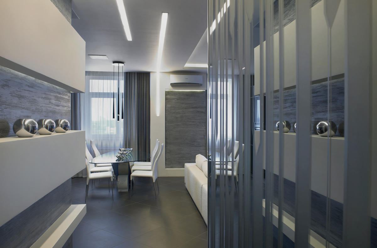
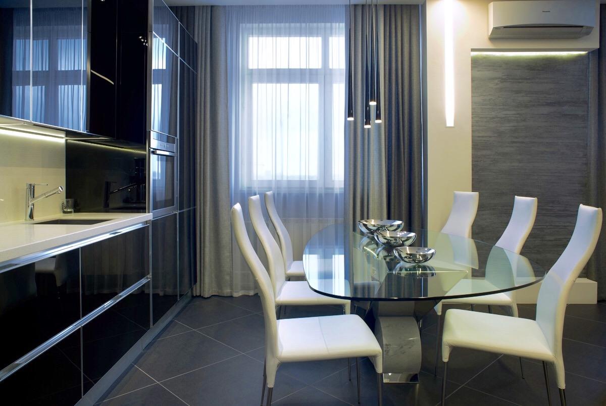
To visually save space in the kitchencombined with the living room. The entire kitchen is black, and its surface is glossy. The laconicism of the furniture is emphasized by strict lines and the absence of fittings.
- Kitchen - Unika, brand Effeti.
- Household appliances — Neff, Miele, Kuppersbusch, Liebherr.
Dining area with white elegant chairs is a great dealcontrasts with the black kitchen. The glass transparent table on a massive chrome leg looks both light and monumental. The elongated thin cones of the lamps hang unnoticed right above the table.
- Dining table and chairs - Cattelan Italia.
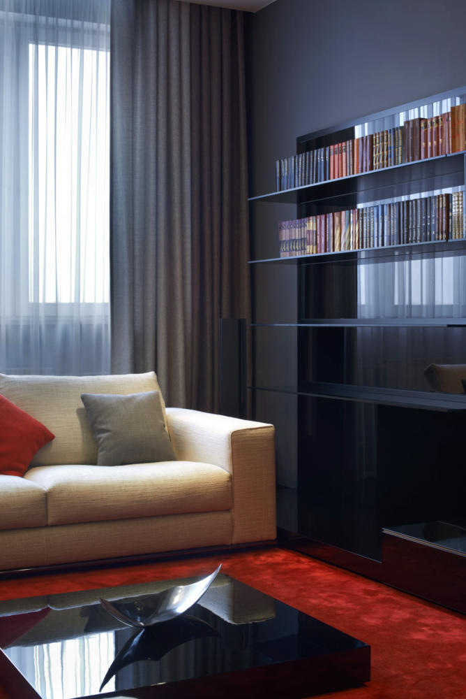
In the center of the room there is a large Minotti sofa group. The space just begged for bright accents. They were the red silk carpet Dynasty Silk and pillows from the EBRU brand.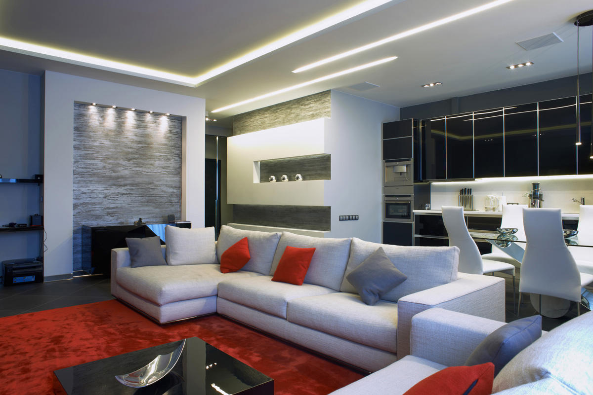
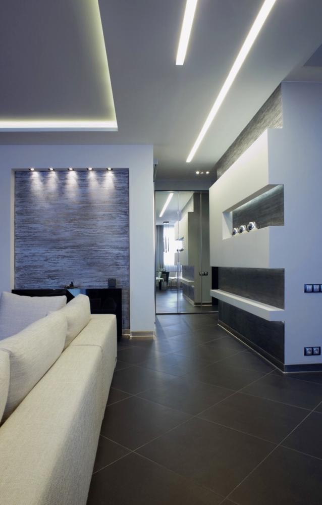
Black elements are cleverly placed in the interiorfurniture. They do not overload the living room at all and do not attract special attention. The dynamics and shape of the space are given by plasterboard structures, which set the character of the entire room.
- Library and TV furniture in the living room - Abacus, Rimagesio.
Lighting deserves special attention.In the kitchen, these are spotlights in the ceiling and work area lighting. Along the living room, LED strips stretch, which in some places descend onto the walls, emphasizing the geometry of the space.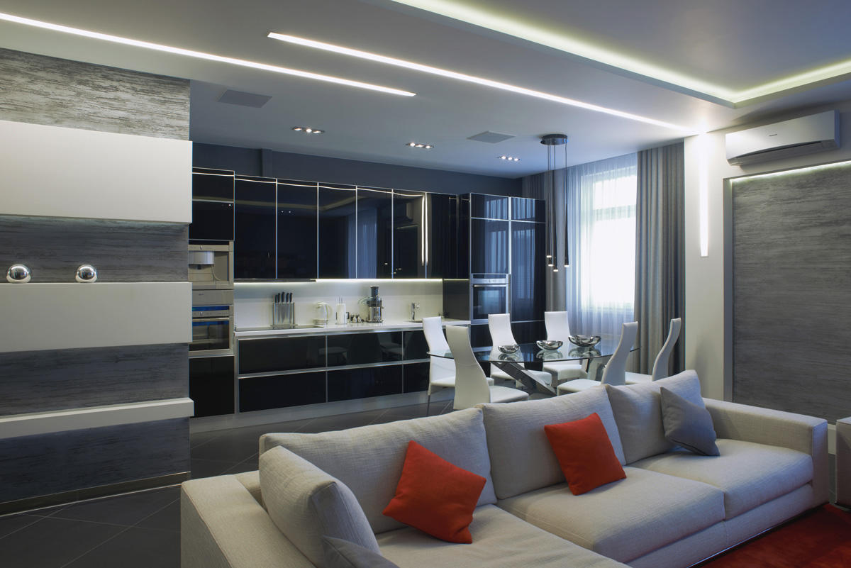
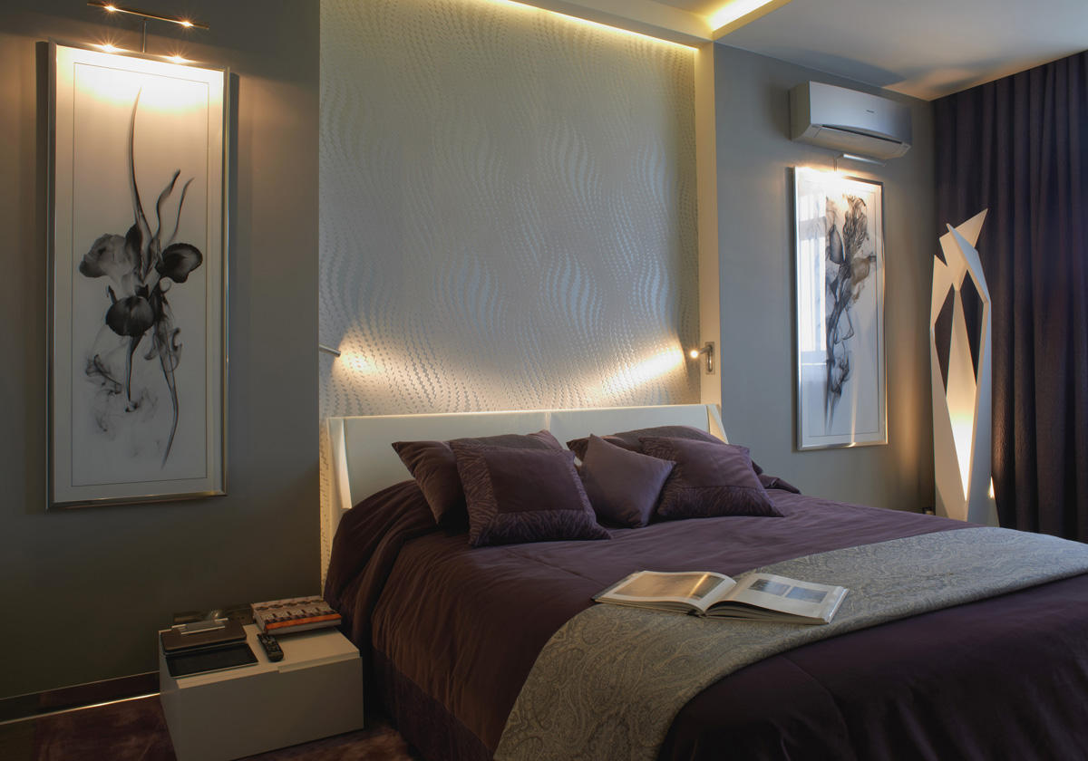
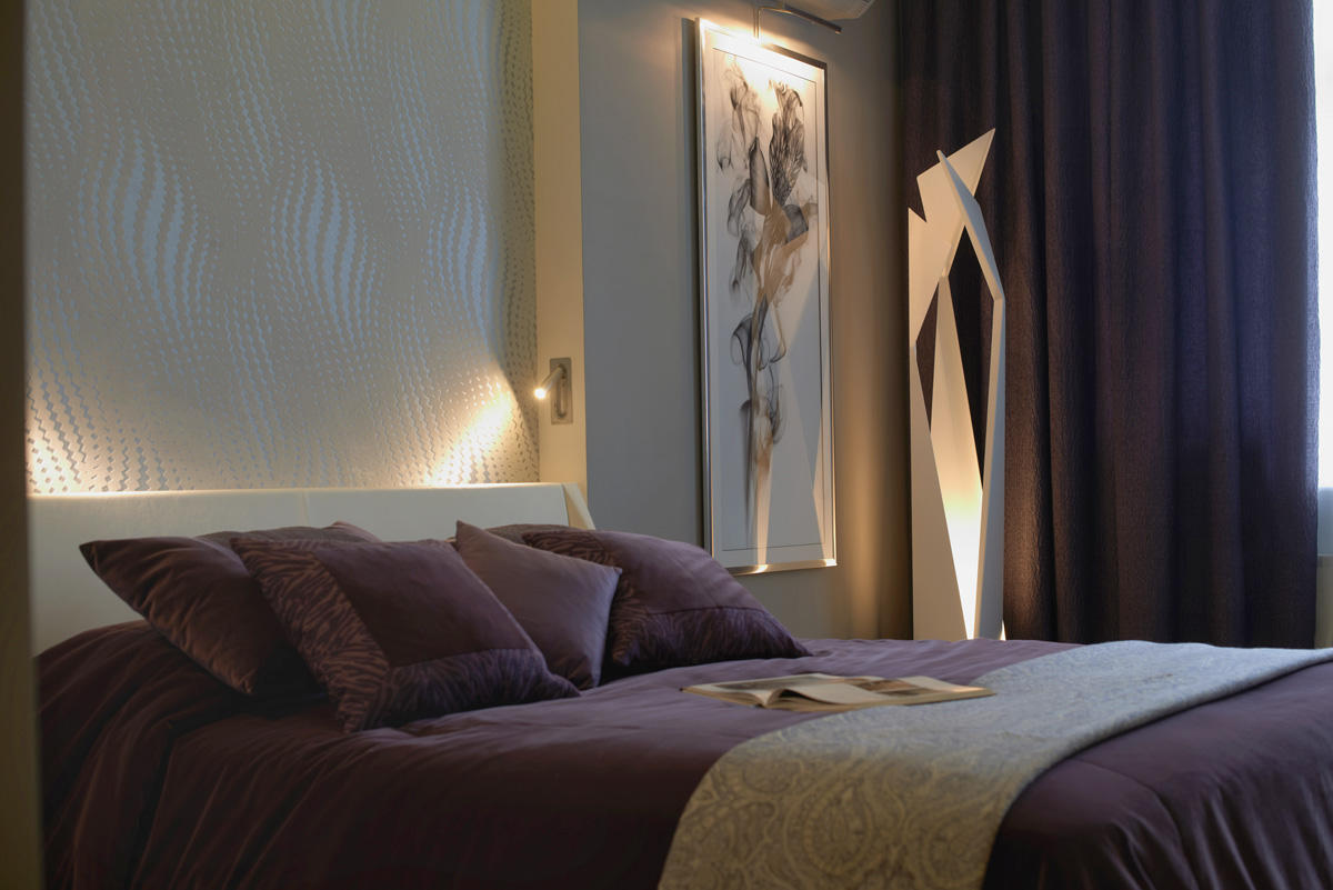
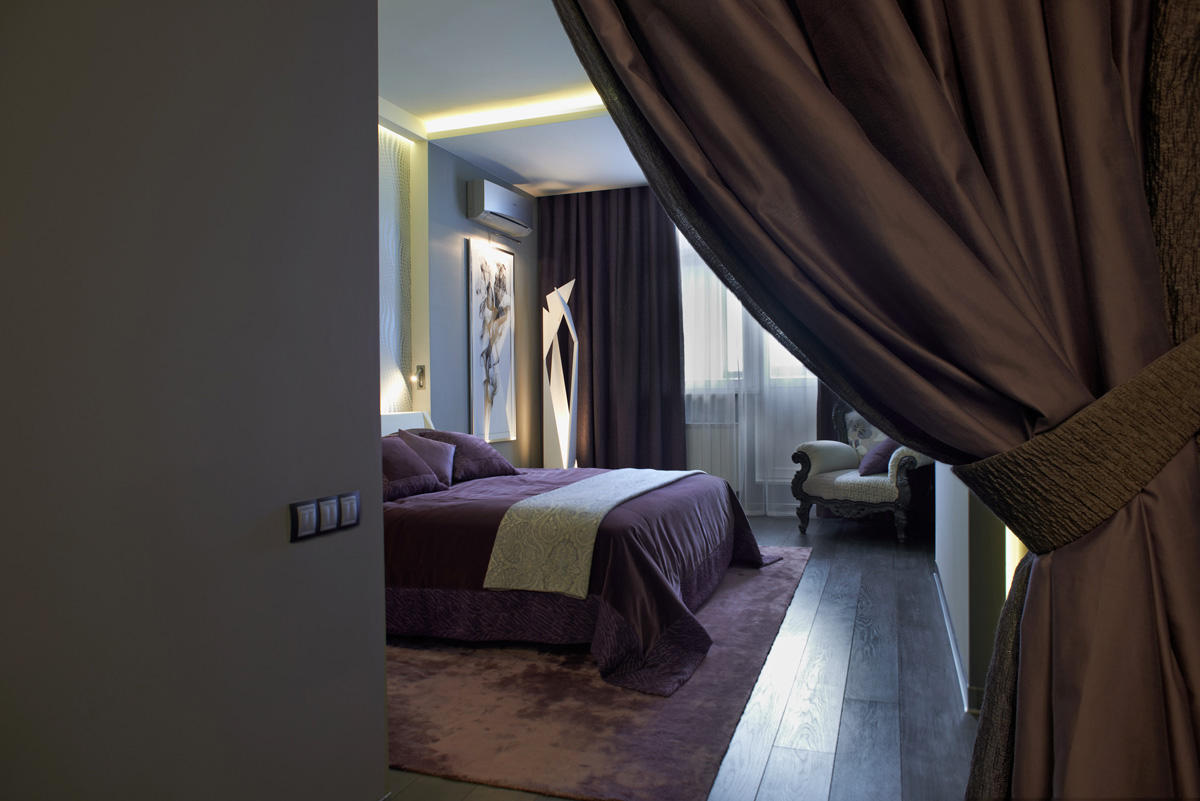
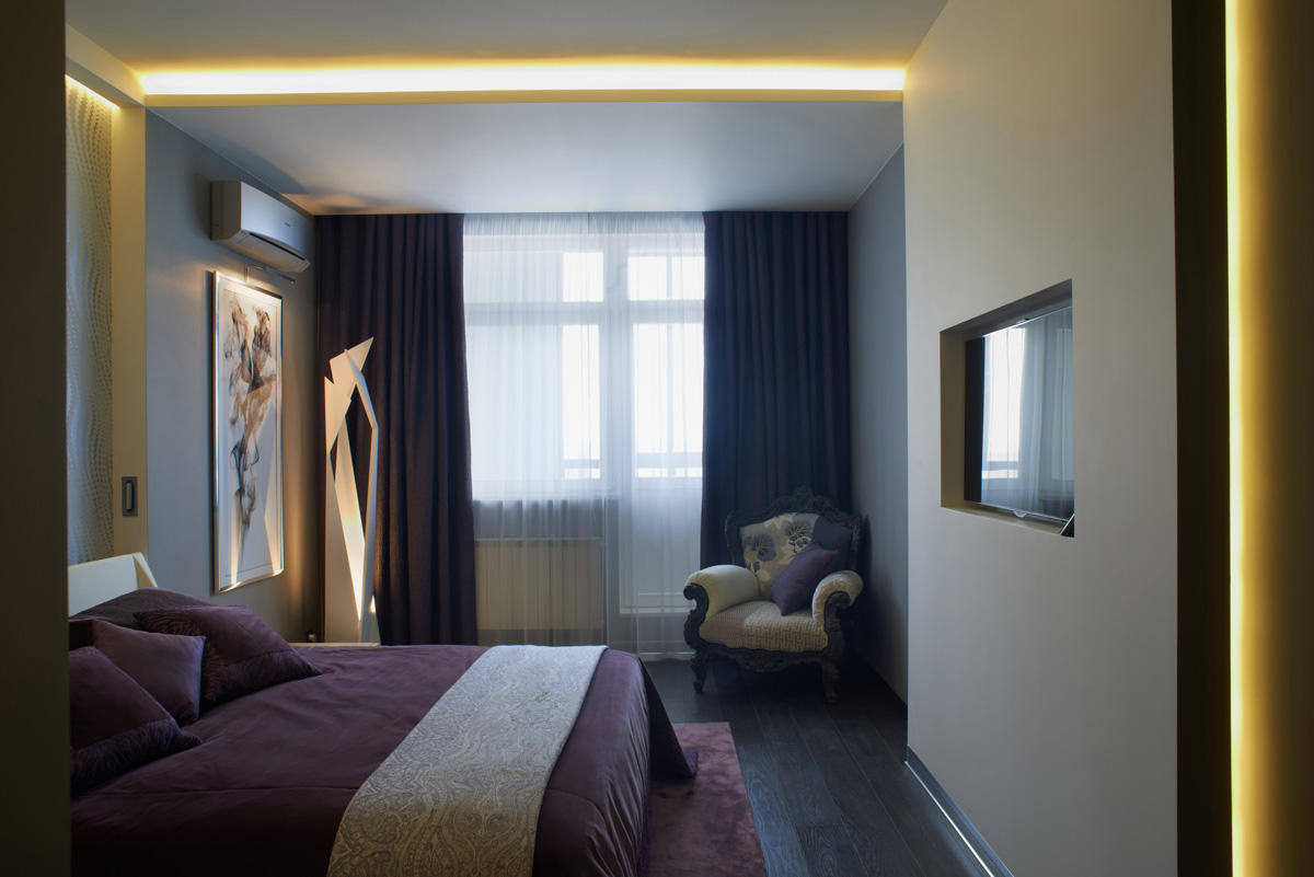
When you enter the bedroom, you can immediately notice that the overallThe concept of the apartment remained the same, but some elements have changed. The master bedroom has a feeling of coziness and warmth, because it is a place for rest and sleep. Take, for example, a classic chair with carved legs and back. Next to it, in the adjacent corner, there is a white high-tech floor lamp. These two different in style interior items go well together.
- Bed - Cattelan Italia.
- Fabrics for curtains, bedspreads, pillows, blankets — De Le Cuona, Andrew Martin.
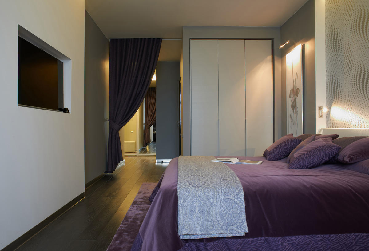
The muted purple tones in the textiles create a pleasant, relaxing atmosphere, while the textured wallpaper behind the headboard complements the room's interior.