Is it possible to create an interior that is ahead of the curve?time? And the kitchen, which will become the hallmark of the house? Our unequivocal answer is yes. As proof - a successful example of an "apartment from the future" with a futuristic design "The Future is Near" - this title could be given to an exemplary science fiction novel about artificial intelligence and flying cars, and this is also how you can describe the unique interior of an apartment in Bratislava. A prestigious area, glass high-rises, elitism in everything - this is the choice and habitat of successful Slovaks. Our heroes, a couple of young and wealthy people, by definition could not save on living space. Impressive investments in interior design, the amount of which is commensurate with half the cost of the apartment, contributed to the transformation of an already respectable apartment into a domesticated . The project was entrusted to the design studio Rado Rick designers for a reason. A characteristic feature of their work is giving expensiveness and functionality to the space. Guided by the principle of “Not becoming a thing of the past in a few years,” founder and creative director Radomír Minjarík embodies ideas that are out of step with time. Radomír Minjarík, designer
As a student at the Academy of Fine Arts anddesign in Bratislava, in 2007 he founded the design studio Rado Rick designers. After completing his studies, he was invited as a design consultant to a well-known company manufacturing luxury furniture. Two years later, he decided to fully concentrate on his own business. radorick.com The main goal in developing the interior, which the owners of the apartment pursued, was to create a kind of "vacuum" separated from the outside world. Free space for two, where it is customary to turn off the mobile phone immediately, and the hustle and bustle of corporate everyday life is postponed until Monday. Hence the spaciousness of the loft, practicality and minimalism, not devoid of feelings. The wall overlapping the kitchen and the room in the original layout was dismantled. Thus, the dining area and subsequently the living room were combined into one space with clear zoning. "French windows" along the entire wall let in an immense amount of natural light. hide the exit to the summer terrace with an impressive panorama of the old city.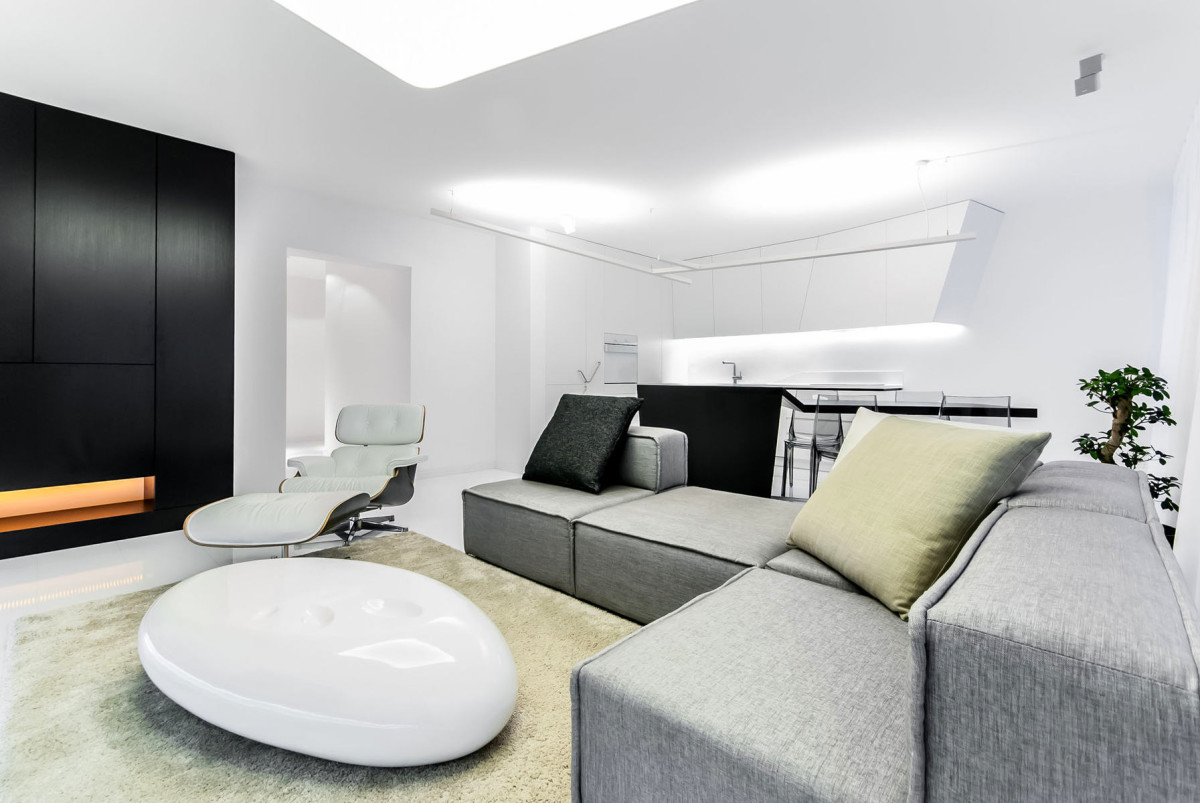
 The owners describe themselves as follows:"We are not rich enough to buy cheap things." This is rather modesty than truth, because even custom-made furniture is not without respectability. Most of it is assembled from artificial stone HI-MACS® and natural wood. Due to the reflective surface of the floors and the lighting of the functional console under the multimedia, it seems that the shelf is floating in zero gravity. The doors of the spacious shelving section are devoid of handles, but when you press on the surface, a magnetic lock is triggered, which smoothly opens it. This system is used in all cabinet furniture in the apartment. Warm tones of the cabinet lighting paired with the fireplace dilute the cold shades of the predominant white color of the living room and the home as a whole.
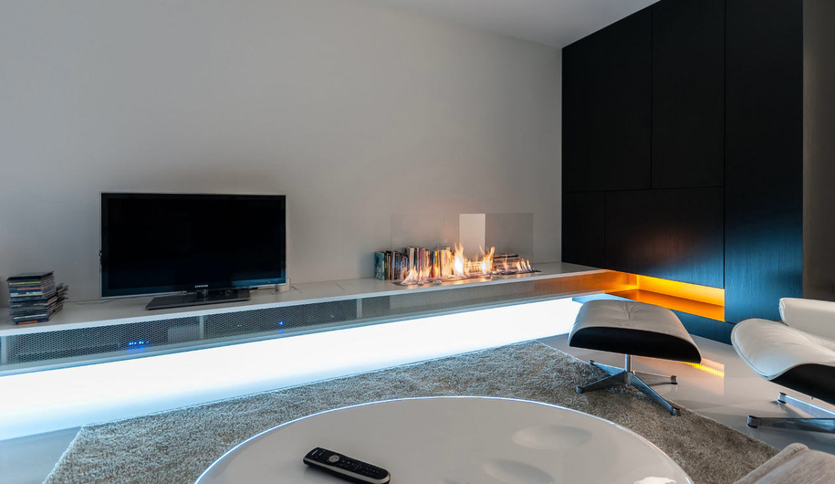
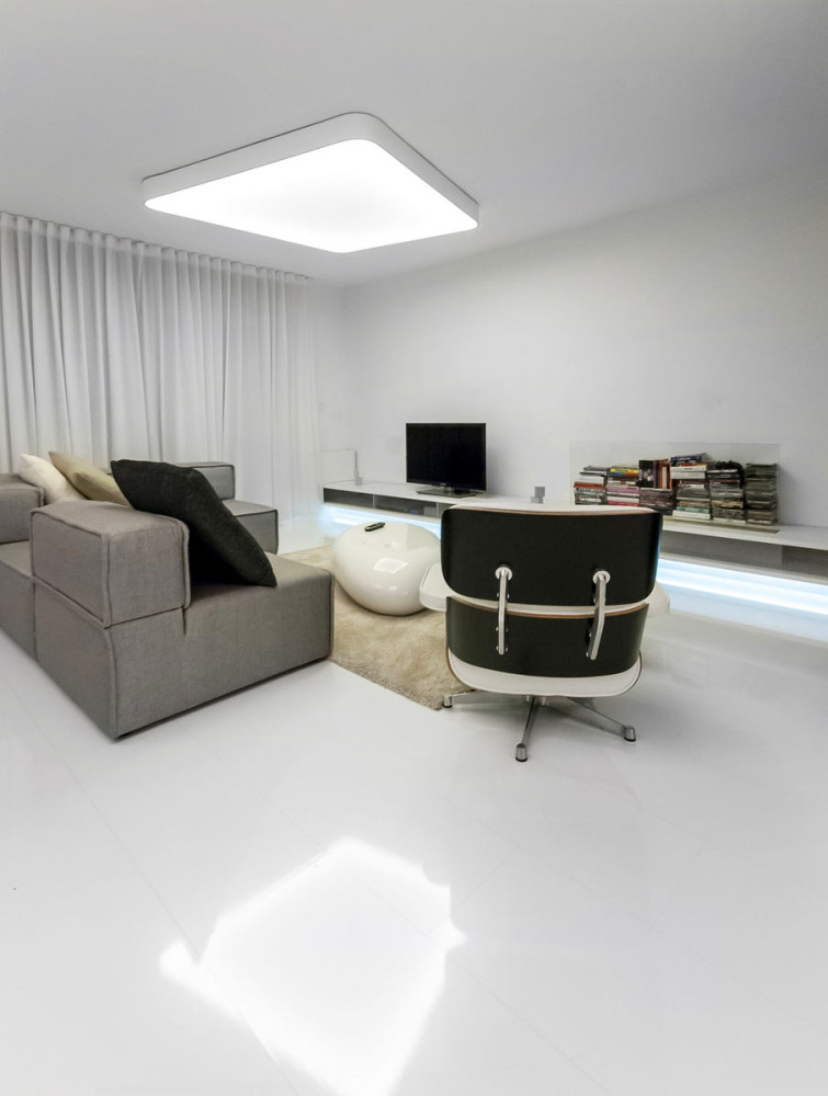
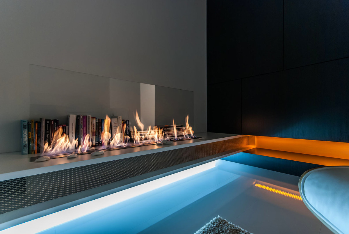 The strict geometry of space is smoothed outa tea table resembling a giant sea pebble and a comfortable chair with a footrest. The responsibility for creating a cozy atmosphere is borne by a voluminous carpet in the recreation area and a dwarf tree. They are like a reminder that this is still a living space, and not the cabin of an intergalactic starship. The organization of light in the house is especially admirable. General lighting in the living room in the form of a ceiling lamp with hidden fasteners, hanging strip lights in the kitchen area and lighting integrated into the furniture - all this makes the apartment dynamic and spacious.
 Completely opposite to the general color schemeThe solution is the bathroom and toilet. The coal-black tiles are complemented by silver mosaics on the floor and walls, and several decorative plants serve as bright accents. In addition, not everyone can boast of .
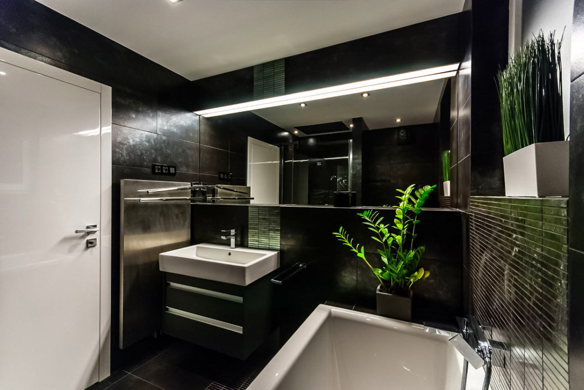
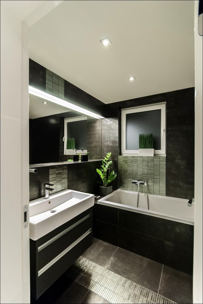
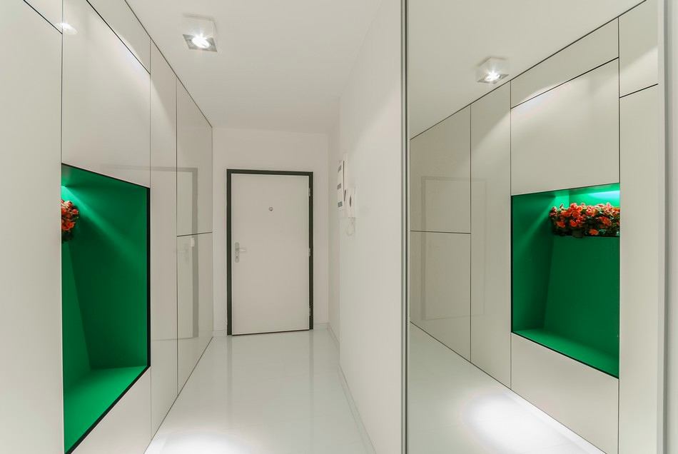
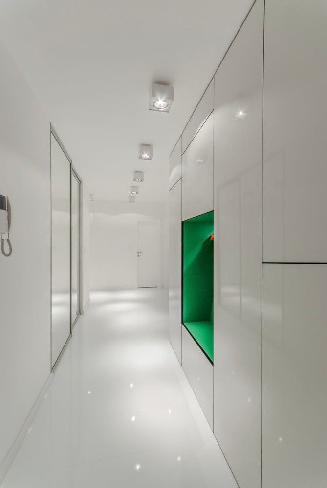
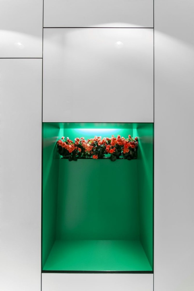
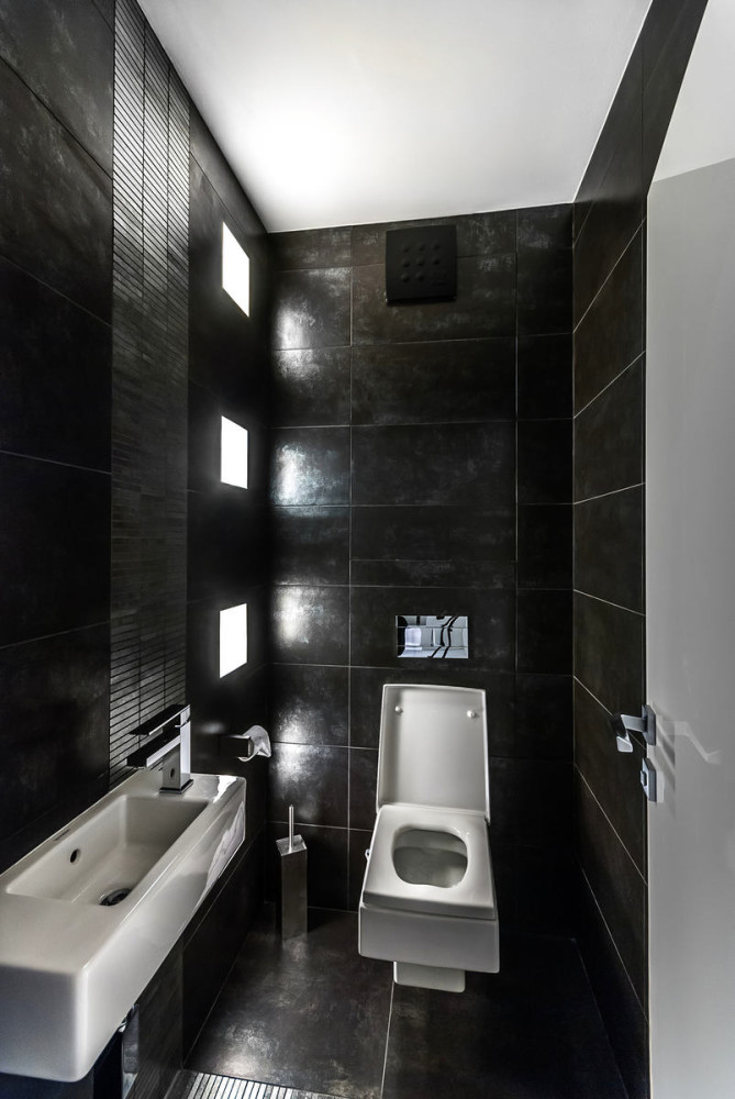 Another splash of color on the walls of the apartmentbecame a soft green niche in the hallway closet. At first glance, it is unclear whether this is a hanger decorated with artificial flowers, or an unsuccessful use of space in the closet. In fact, this is a special housewife, which also serves as a niche for a container with indoor flowers.
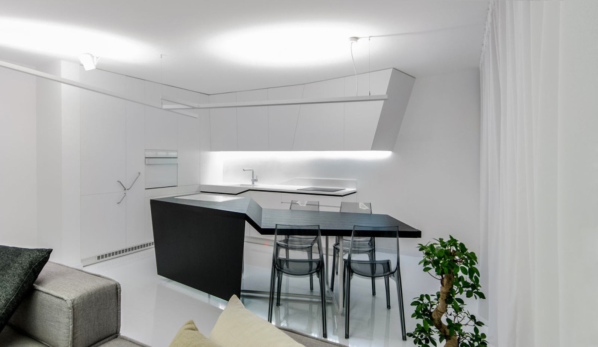
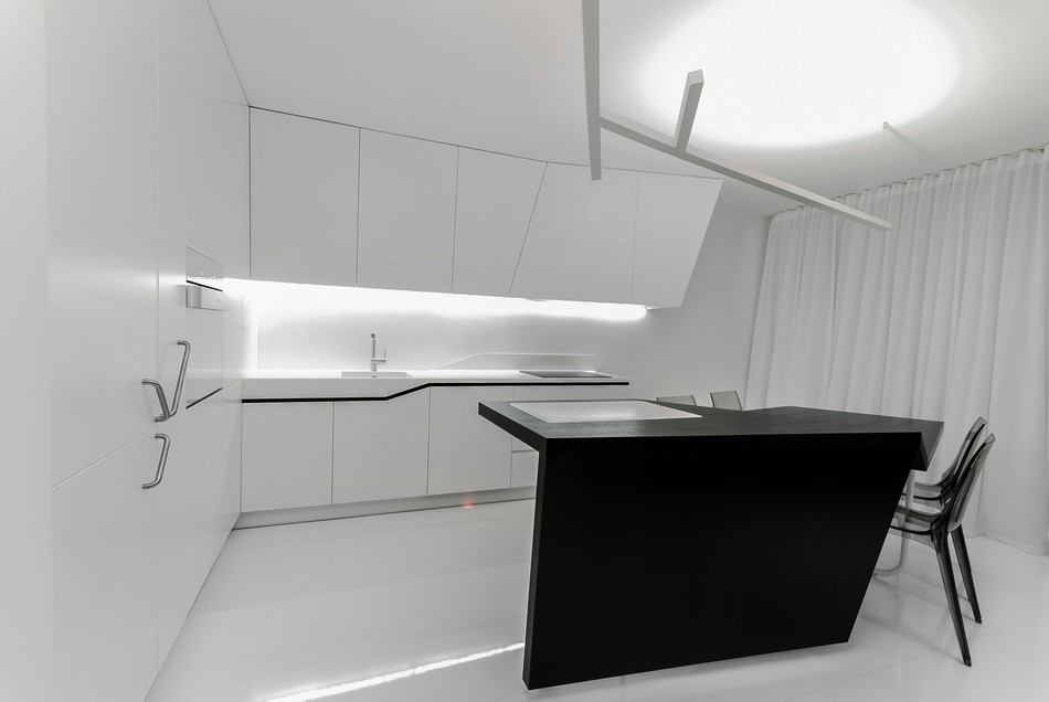
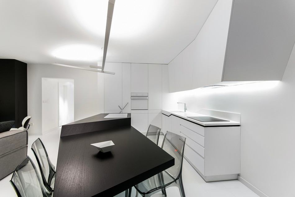
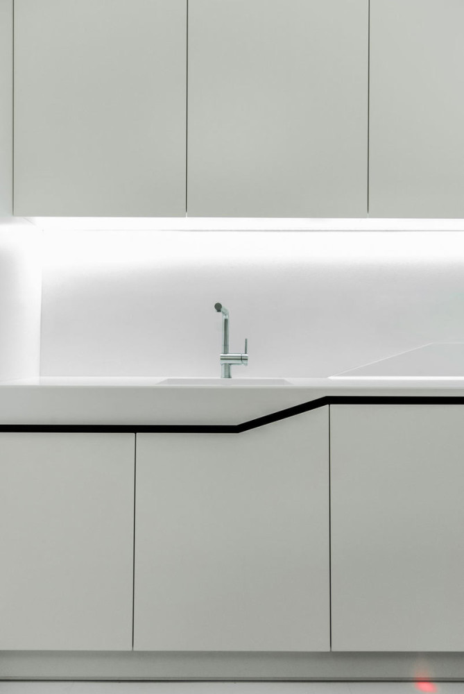
 Undoubtedly, the furniture flagship of the home can bename the kitchen section. Its shape is defined by straight and broken lines. It seems that it is a solid surface. Household appliances are skillfully disguised, the handles are the only thing that gives away the refrigerator, dishwasher and freezer. In the center of the dining area there is a wooden console, which simultaneously serves as a table for four and a work surface. It has a built-in cutting board made of a special durable coating, and transparent acrylic chairs eliminate visible clutter.



Where to get a futuristic kitchen
Take the first steps towards creating your own"apartments of the future" can be created right now - and start right from the kitchen. There are many manufacturers of kitchen furniture with an extraordinary design. For example, the French factory Mobalpa has wonderful options for futuristic furniture in its arsenal. Luxurious and "Arch" (Arch) is the quintessence of the flight of designer thought. This kitchen model completely redesigns the space of the apartment, adding a special atmosphere of wealth and hinting at the refined taste of the owner. It is a tandem of the work area with built-in appliances on the wall and an island that serves as a table for eating and a bar. It is noteworthy that, in addition to aesthetics, it is extremely practical and equipped with the latest technology. Not every kitchen has a countertop with an adjustable height level. In "Arch", due to special mechanisms, the surface moves in the range from 88 to 98 cm using manual control - convenient, isn't it?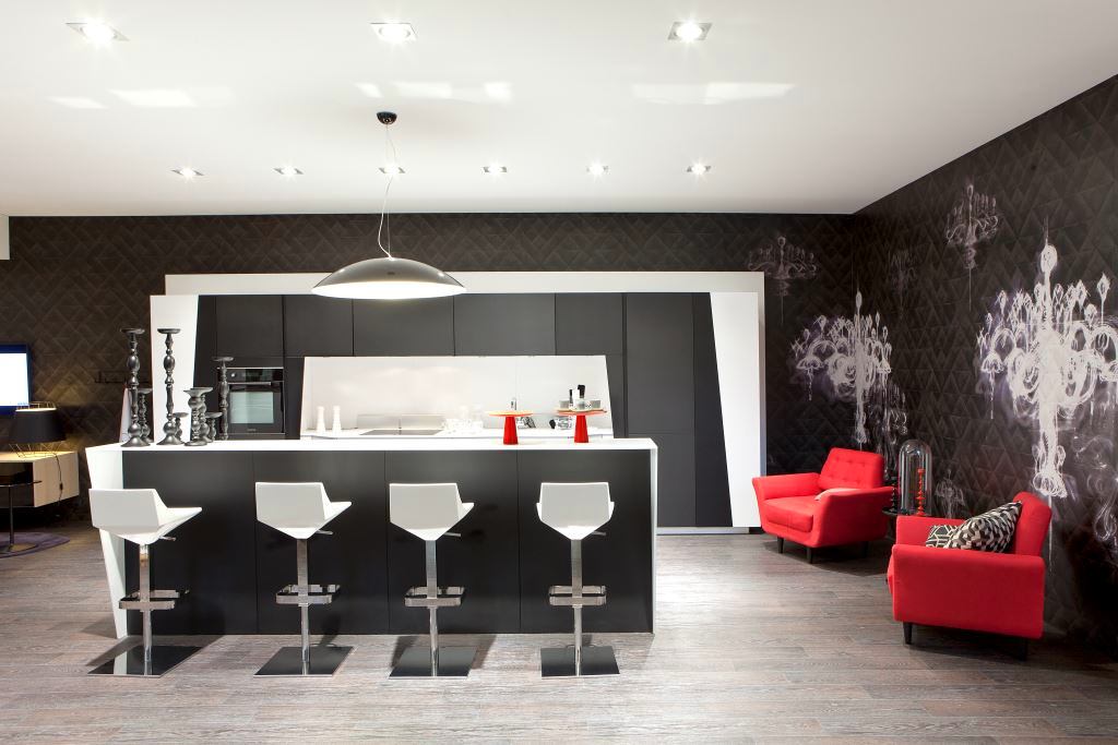
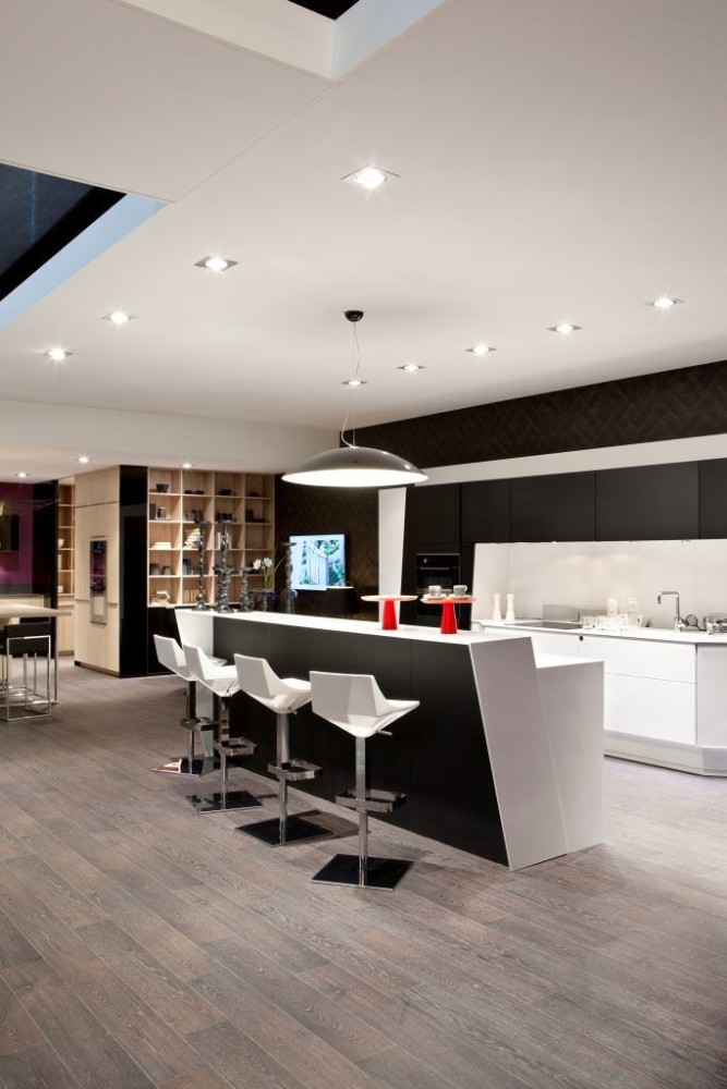 Made in an avant-garde style, it is notwill leave no one indifferent. The harmony of lines and geometric shapes creates a real architectural ensemble right in the dining area. The model was presented as a prototype at the international exhibition of kitchen appliances Eurocucina 2014 in Milan. Increased interest was noticed not only by experts and designers, but also by guests of the event. It is expected that it will go on sale in mid-2015. Artur Guchigov, official representative of the Mobalpa factory in the Russian Federation and the CIS: - When starting the project, the factory designer received the task of giving the kitchen the spirit of Paris. The Eiffel Tower and the Arc de Triomphe are the main symbols of the city. Hence the characteristic features in the design. For example, in the wall section, the base of the tower is easily visible, the appearance of which is formed by cabinets made in black. Moving away a few meters, you can see that the side columns and the upper part of the kitchen resemble the Arc de Triomphe. Thus, it turns out that the tower is enclosed in an arch. By adding red in the form of a pair of soft chairs, the designer emphasized the French chic, characteristic of the combination of white, black and red. All composite materials available at the factory can be used in such a kitchen. The specially developed matte Soft varnish protects surfaces from negative mechanical and thermal effects, and does not leave fingerprints on the facade. The color scheme of the kitchen components can be chosen by the client from more than 20 options. mobalpa.fr radorick.com, pinterest.com, Artur Guchigov
