Plastic chairs by Philippe Starck in the backgroundold brickwork, a private living room for the hostess and a bright bathroom with an unusual door - on 100 square meters, the team of the Aiya Lisova Design studio realized all the wishes of the customer and created a stylish European interior. The owner of this apartment is a creative and versatile person. Tatyana leads an active lifestyle, loves to travel, is interested in art and paints pictures herself, and also collects vintage interior items. She turned to the Aiya Lisova studio with a request to improve the layout of the apartment and place on 100 square meters a bedroom with a large dressing room for her, a room for an adult son, a kitchen-dining room combined with a living room, and a small private living room where one could relax after work, do yoga and draw. Aiya Lisova, Aiya Lisova Design Graduate of the Department of Art History of Moscow State University. M. V. Lomonosov and the International School of Design, specializing in "Designer of residential and public spaces". Completed the Lyndall Fernie course at Chelsea College of Arts in London, regularly takes advanced training courses in Russia and abroad. Has been designing private interiors since 2010, currently conducts special courses and master classes, and runs her own studio Aiya Lisova Design. www.aiyalisova.ru Layout The customer got an apartment with a rather complex corner layout. As a result, there are a lot of windows and light, but at the same time the bathroom with the corresponding water and sewerage outlets is "squeezed" in the center by load-bearing walls. In this regard, it was decided to make only a minor redevelopment: dismantle some walls, combine the kitchen with the living room and allocate an area for a private living room, which was the owner's dream.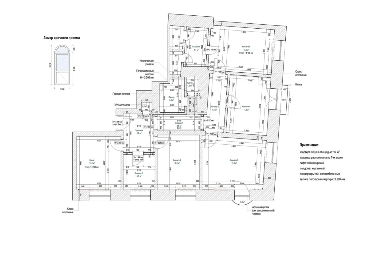
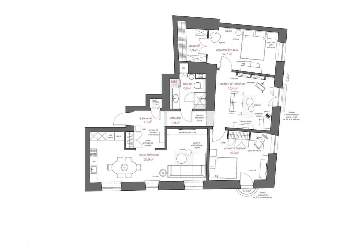 Aya Lissova, designer:— The apartment is located in the Tverskoy district, in an old house with a rich history. To preserve this atmosphere, during the redevelopment we tried to leave as much of the historical molding and ceiling rosettes intact as possible. Color and style For the interior of this apartment, the designers chose an elegant, but at the same time modern style with elements of eclecticism. As for the color scheme, preference was given to a calm palette with local bright accents, the role of which is played by individual pieces of furniture or decor. The floors in the apartment are laid out with natural warm oak parquet Coswick in a French herringbone pattern. It was decided to preserve all the doors, having them restored in the studio's carpentry workshop and painted white. Also, retro switches with external wiring Bironi were used throughout the apartment.
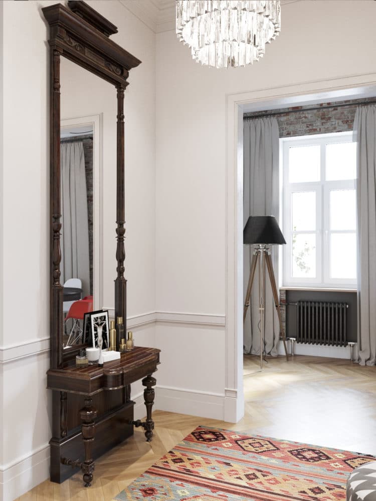
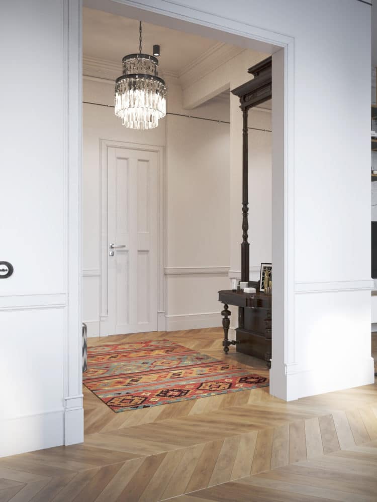
 Hallway In the hallway is locateda spacious floor-to-ceiling wardrobe for outerwear, a vintage console with mirror, and a black and white pouf from Missoni Home. The client purchased the console specifically for this apartment, and the designers only had to find a worthy place for it. The hallway interior is also decorated with a geometric rug purchased at Dovlet House and a formal Odeon Clear Glass Fringe Chandelier.
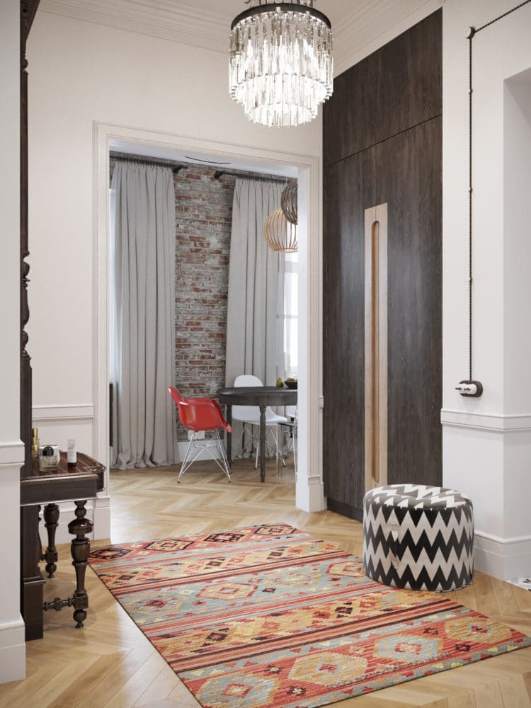
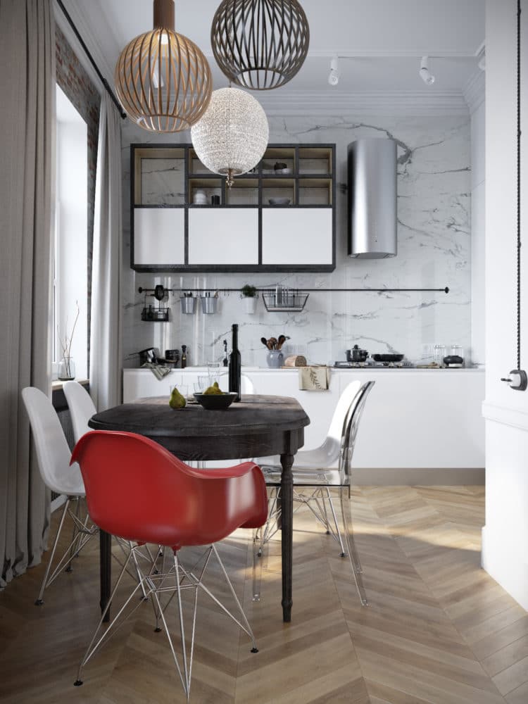
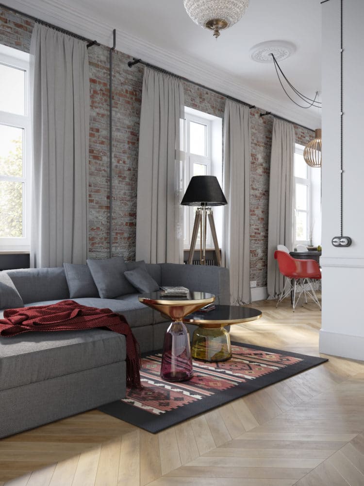
 Kitchen-living room Single publicThe space was created by merging the kitchen and two small rooms measuring 5.3 sq. m and 10.9 sq. m, and three windows make it spacious and bright. The style of this area is eclectic and quite contrasting. For the kitchen, the designers chose white minimalist custom-made furniture and a bianco carara apron. Along one wall there is a work surface with a sink, built-in dishwasher and hob. Four vertical columns with a refrigerator, oven, microwave and deep, roomy shelves for storage were built into the niche of the second wall. A white track light with spotlights runs along the perimeter of the ceiling.
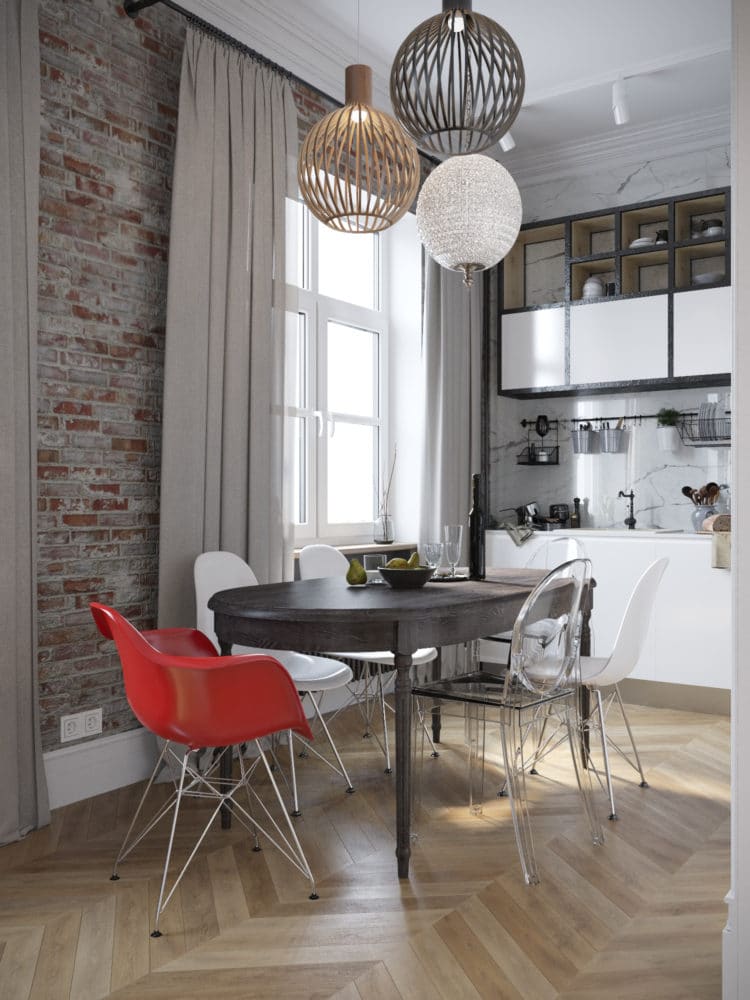 The dining area is located at the narrowest partroom and is a kind of transition between the kitchen and the living room. For the dining area, the designers chose an oval table made of dark wood from Curations Limited and multi-colored plastic chairs from Kartell, Eames and Victoria Ghost models. Above the table, they placed a group of pendant lamps: two strict and geometric ones from Secto Design Octo and, in contrast to them, a light and delicate lamp from Eichholtz.
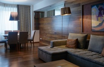
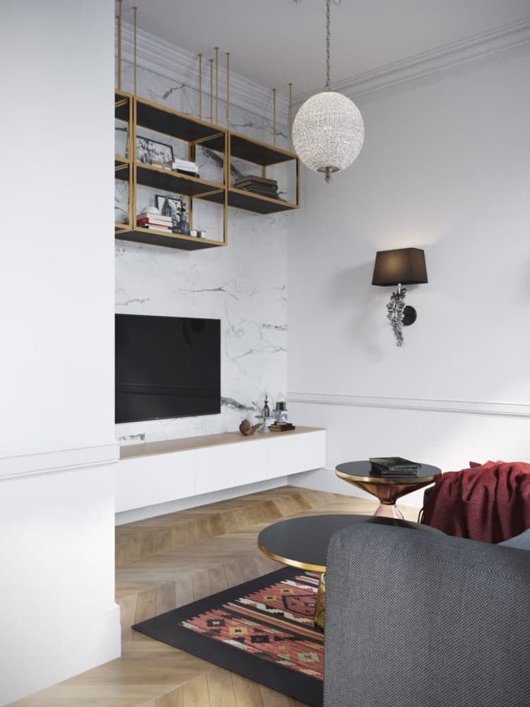
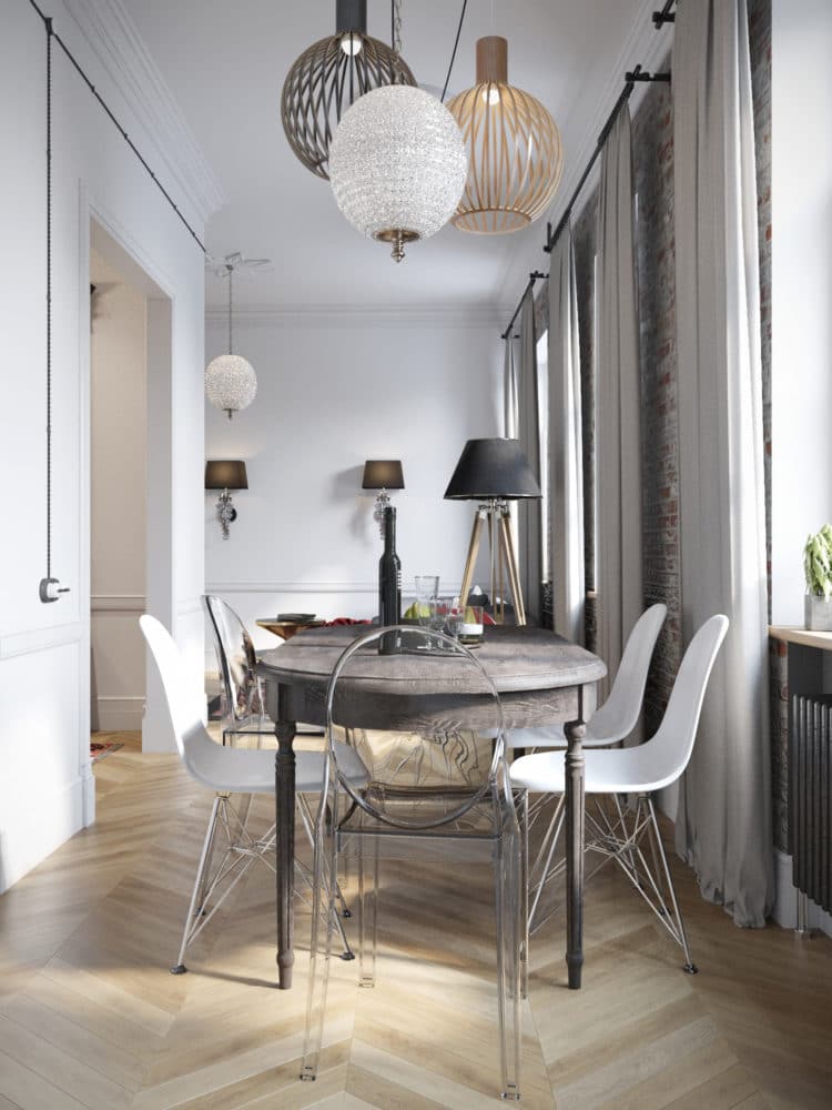 In the living room area, the designers placed a largea grey corner sofa, two coffee tables of different heights from ClassiCon and a TV unit with custom-made shelves, the wall behind which is finished in the same marble as the kitchen splashback. The interior of the living room echoes the hallway: the carpet on the floor here is from the same collection. All the lighting in the living room area is from the Dutch brand Eichholtz.
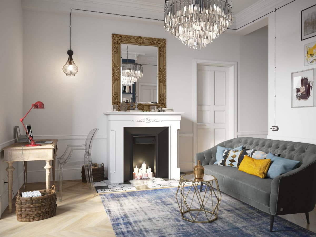
 Private living room Upon requestThe client's designers allocated a separate room for a small living room, where the owner could relax, read books, devote time to her hobby and do yoga. This immediately led to a number of tasks: to organize a convenient storage system for books, allocate space for an easel and yoga classes, and also find a place for a desk.
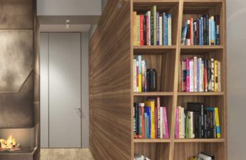
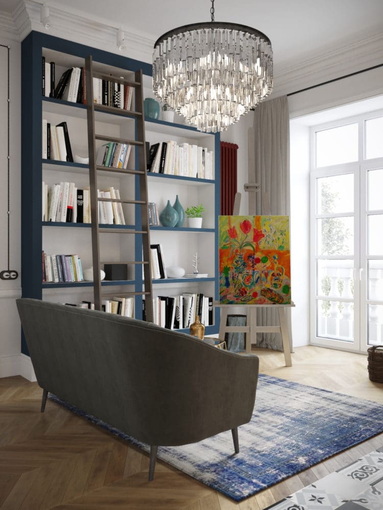
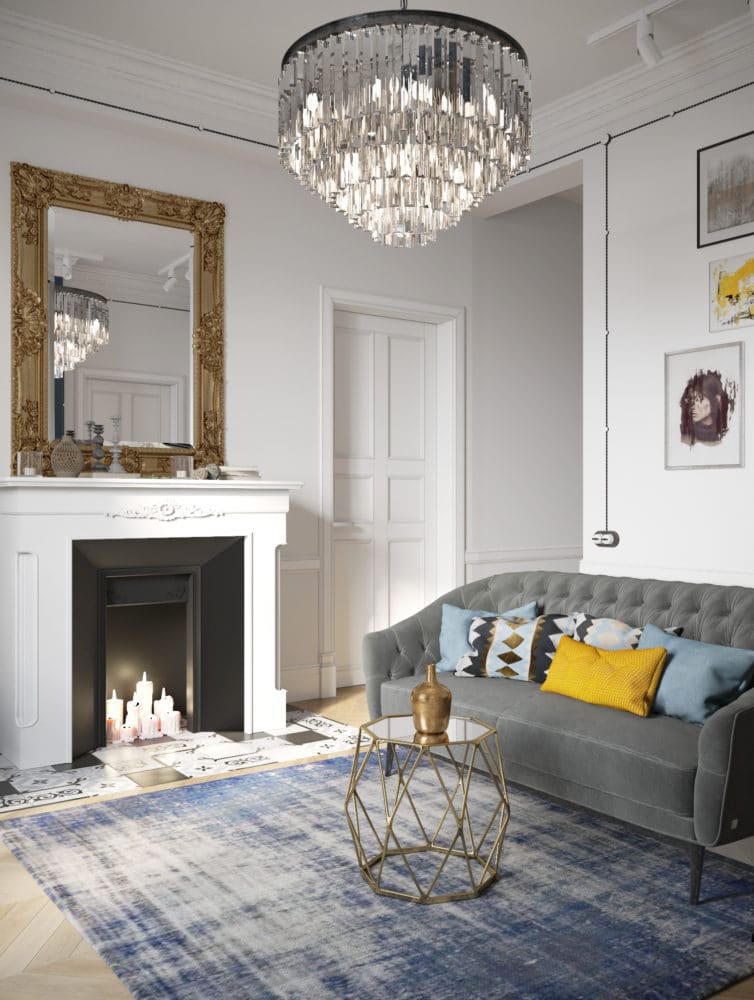
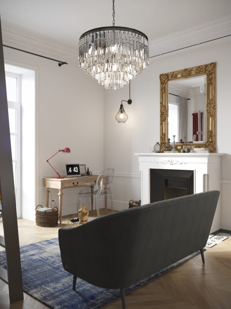
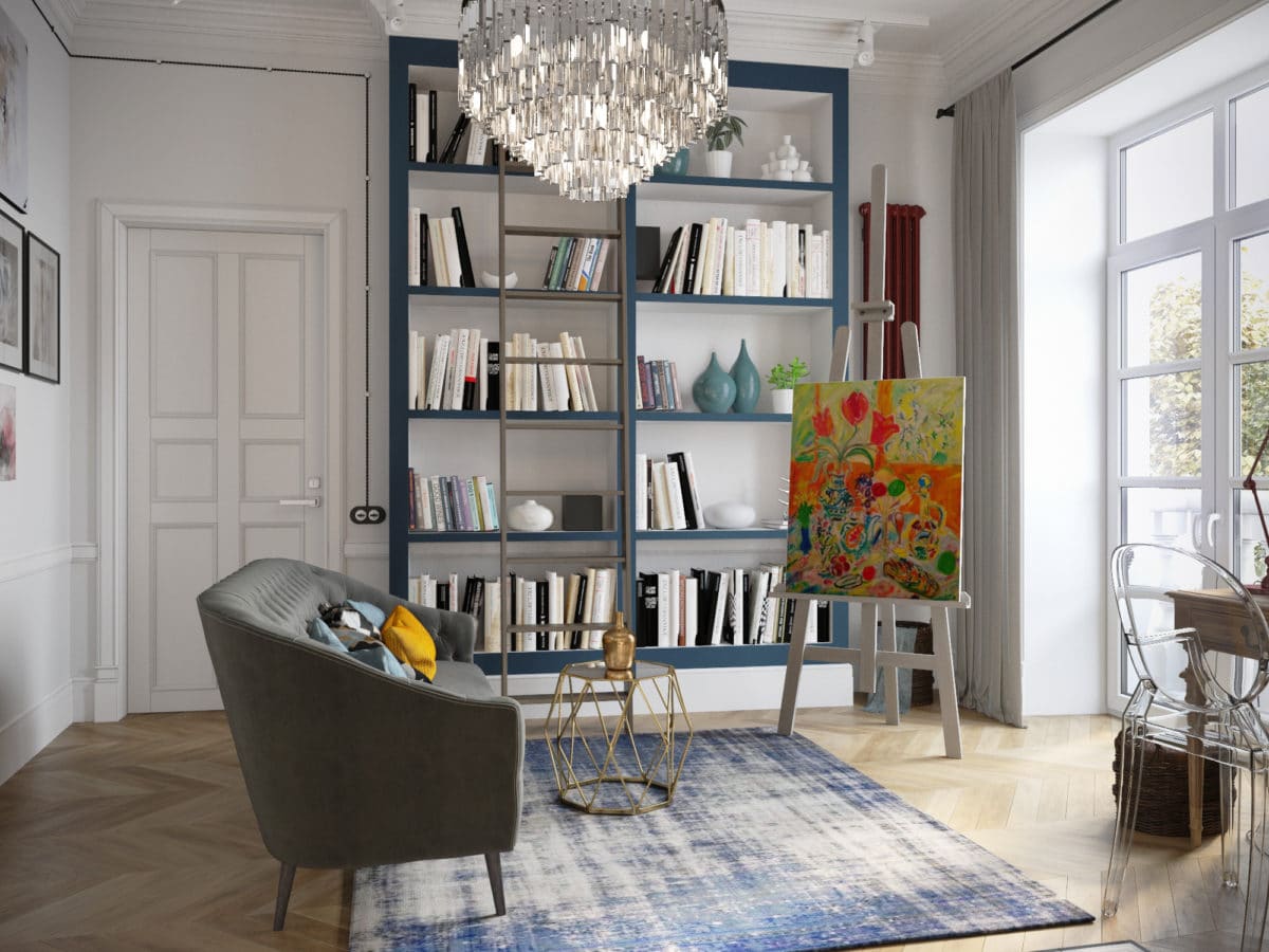 So, for storing books, the designers have provideda capacious blue plasterboard shelving unit with a ladder that allows you to easily get books from the upper shelves. Next to it is a cozy gray Amouage sofa from Busnelli with a small coffee table from Zara Home and an easel. For the windows, we chose light gray curtains made of thick fabric.
 To the right of the sofa they built a false stone, insidewhich you can light candles in the evenings. The area around it is laid out with black and white tiles from the Spanish brand Vives Terrades. A vintage mirror in a massive gold frame was hung above the fireplace, and a small workspace with a custom-made wooden table and a transparent Louis Ghost chair from Kartell was placed by the window.
 The owner's bedroom The customer's bedroom was decorated inlight and very calm palette: creamy white, shades of gray and deep blue as an accent. The bed with a soft headboard was ordered from the Elkhanes workshop, the solid oak bedside tables were purchased from the Americans Gramercy, and the elegant table lamps were found at Kartell. For general lighting, two unusual lamps from the CAOS collection by Arturo Alvarez were chosen.
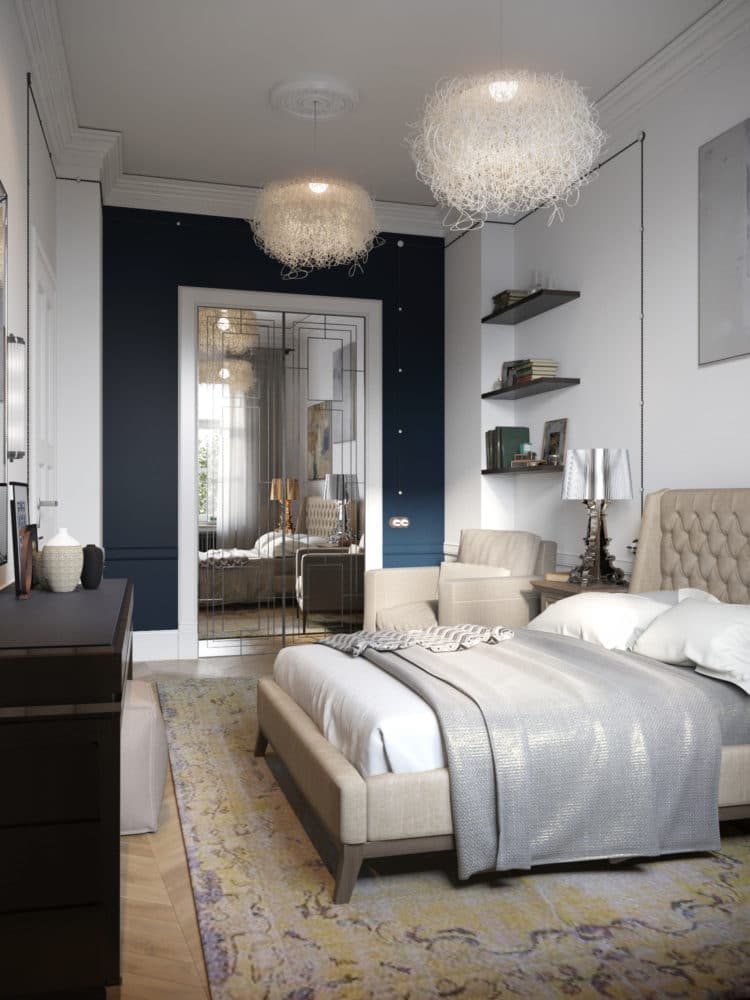
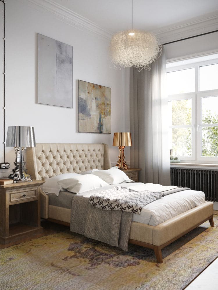 There are only two dark spots in the bedroom interior:a spacious dressing table opposite the bed and a wall leading to the dressing room. The hinged mirrored door leading into it with a geometric pattern in the Art Deco style was made to order.
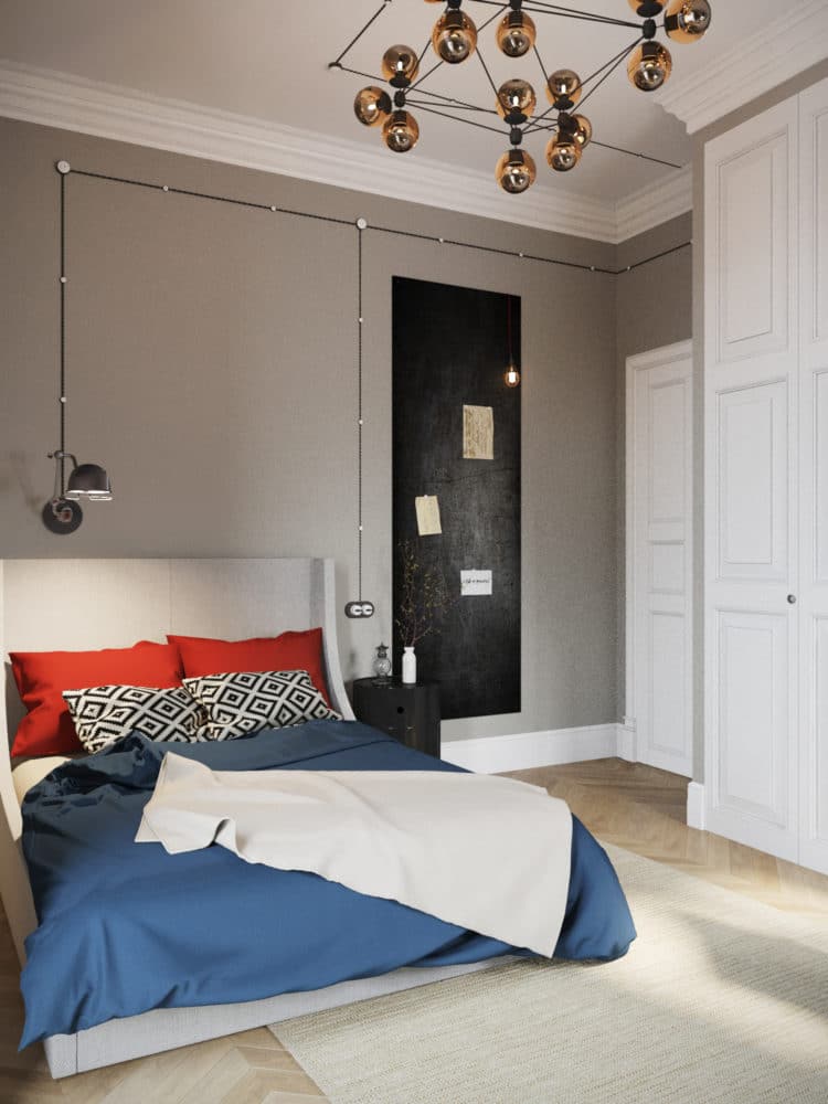
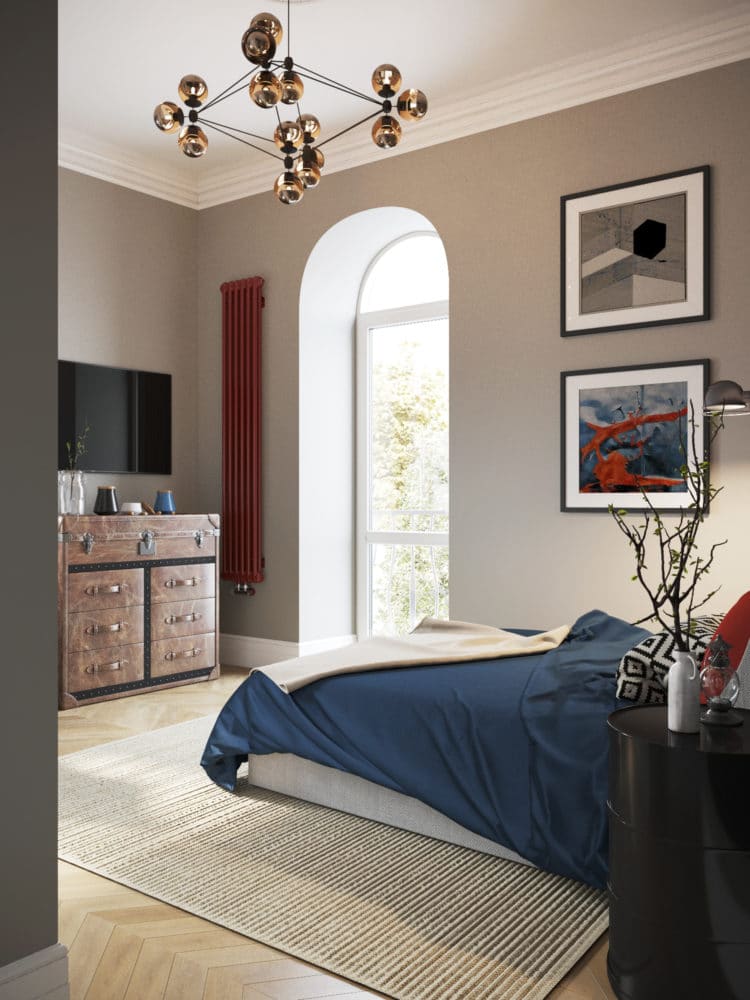
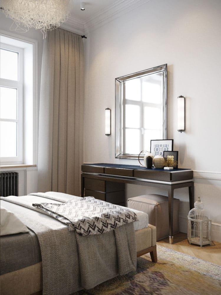 Son's bedroom The son's bedroom was decorated inin a restrained adult style. The walls were painted in Urbane Gray (225) by the English brand Little Greene, and the bed in light upholstery was custom-made in a furniture workshop. A Hatchet sconce in a loft style was hung above the bed, and the bedside table was chosen in black. The designers also hung a large magnetic board next to the bed, on which the owner of the room can store his collection of magnets. The vertical radiator was painted a rich wine color.
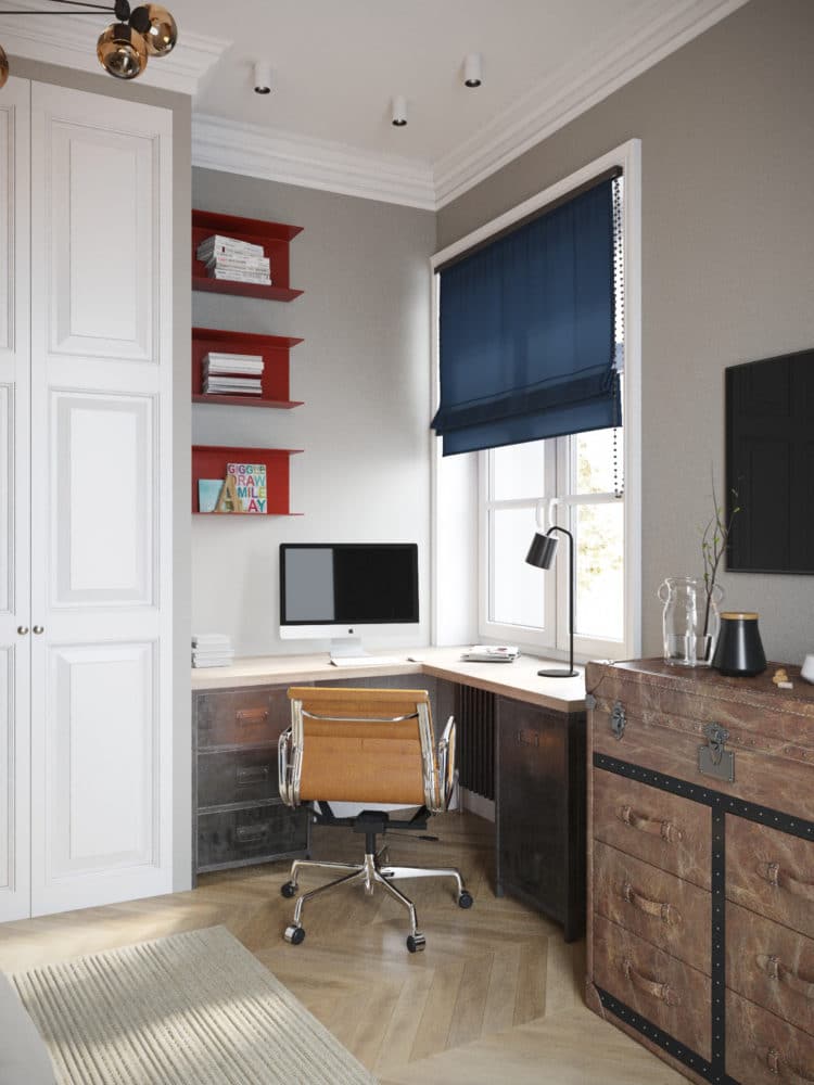
 A fairly spacious area was organized by the window.work area with a corner desk custom-made in the workshop and a leather Eames Style Ribbed chair. A storage niche was made in the wall next to it and closed with white doors with classic panels.
 Bathroom As already mentioned, becauseThe layout features the bathroom is located in the very center of the apartment. In terms of color, it also turned out to be the most saturated: for the walls, the designers chose moisture-resistant Little Greene paint and white Diamante Biselado Bianco "hog" tiles for the wet areas (sink and shower). The floor was laid with Mosaic Del Sur tiles with a bright pattern.
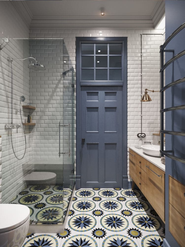
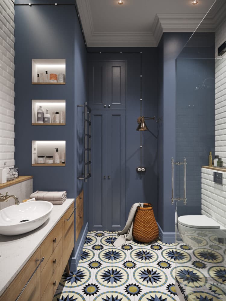 To the left of the entrance to the bathroom there is a cabinetwith a Villeroy & Boch countertop washbasin and a Venetian mirror above it, the countertop is made of Belenco Fairy White quartz. The outer drawers of the cabinet have very convenient handles that not only perform their main function, but also serve as towel holders. A gas water heater is hidden in the box to the right of the washbasin, and the washing machine is “put away” in a cabinet at the back of the bathroom.
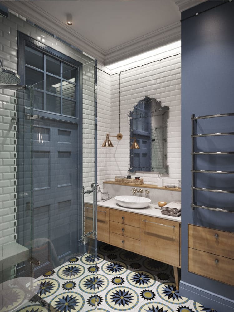
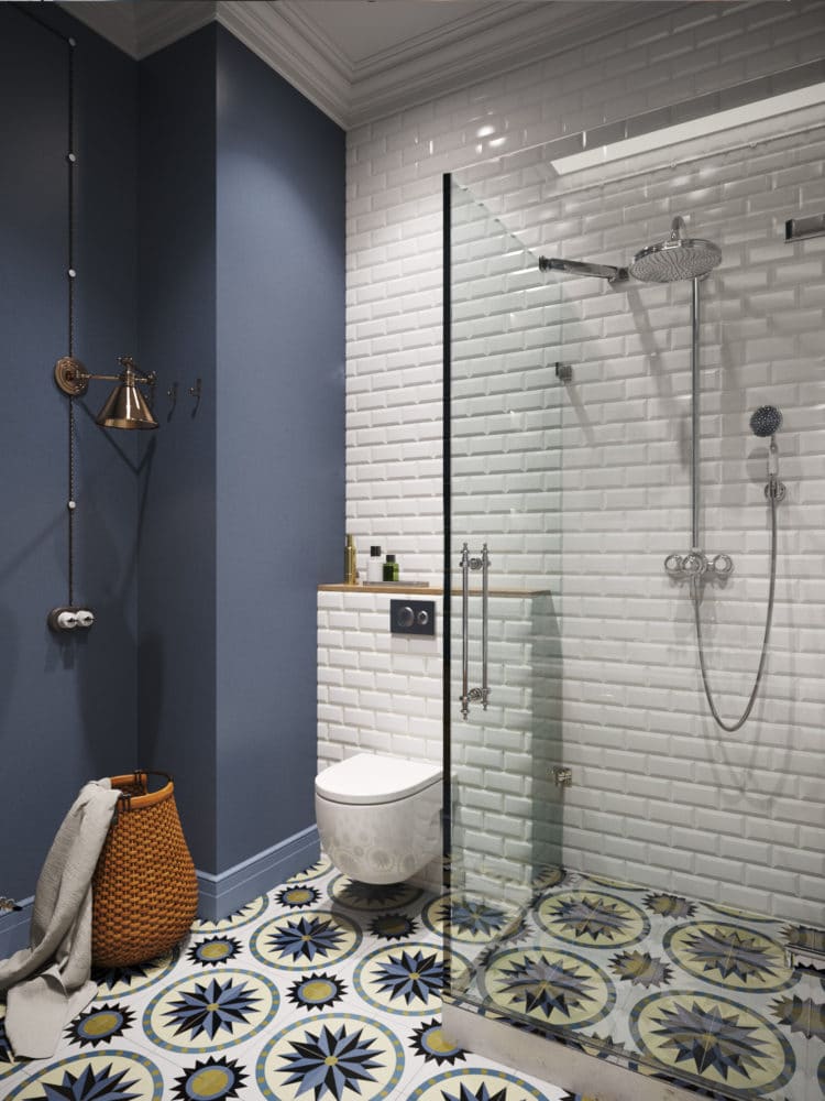 Aya Lissova, designer:— The door in the bathroom is the most unusual in the apartment, with a light window at the top. Previously, it led to a small room near the kitchen. During the redevelopment, we dismantled it, restored it and installed it in the bathroom, painting it a rich shade of blue to match the color of the walls and the pattern of the floor tiles. The following were used in this interior: Hallway:
- chandelier - Restoration Hardware (USA), model Odeon Clear Glass Fringe Chandelier;
- pouf - Missoni Home (Italy);
- carpet - Dovlet House (Russia);
- parquet - Coswick (Canada).
Kitchen-dining room:
- The set is made to order according to sketches of designers;
- Ceiling lamp - Centrsvet (Russia);
- lamps - Secto Design (Finland), collection Octo 4240, Eichholtz (Holland);
- dining table - Curations Limited (USA);
- chairs - Kartell (Italy), models Victoria Ghost and Eames;
- parquet - Coswick (Canada).
Living room:
- coffee tables - ClassiCon (Germany);
- carpet - Dovlet House (Russia);
- bra - Eichholtz (Holland), model Beau Site;
- floor lamp - Eichholtz (Holland);
- shelves in the TV-zone are made to order according to the sketches of designers;
- parquet - Coswick (Canada).
Private living room:
- sofa - Busnelli (Italy), model Amouage;
- coffee table - Zara Home (Spain);
- chandelier - Restoration Hardware (USA), model Odeon Clear Glass Fringe Chandelier;
- carpet - Urban Outfitters (USA);
- The desktop is made to order according to the sketches of designers;
- chair - Kartell (Italy), model Louis Ghost;
- sconces above the table - Studio Beam (USA), collection of Marco Wall;
- tiles near the fireplace - Vives Terrades (Spain);
- parquet - Coswick (Canada).
Master bedroom:
- The bed is made to order according to the sketches of designers;
- bedside tables - Gramercy (USA);
- table lamps - Kartell (Italy), model Bourgie;
- sconces - Devon&Devon (Italy), model Chicago;
- ceiling lights - Arturo Alvarez (Spain), collection of CAOS;
- The door to the dressing room is made to order according to the sketches of designers;
- parquet - Coswick (Canada).
Son's bedroom:
- The bed is made to order according to the sketches of designers;
- bedside table - Kartell (Italy), Componibili series;
- sconces above the bed - Cosmorelax (Russia), Hatchet;
- chandelier — Roll and Hill (USA), model Modo;
- The desktop is made to order according to the sketches of designers;
- working chair - Scott Howard (Great Britain), model Eames Style Ribbed;
- radiator - Arbonia (Germany);
- wall paint - Little Greene (UK), shade Urbane Gray;
- parquet - Coswick (Canada).
Bathroom:
- mixers - Hansgrohe (Germany), Axor Montreux collection;
- sink - Villeroy & Bosch (Germany), collection Loop & Friends;
- quartz for countertops - Belenco (Turkey), color Fairy White;
- vintage sconces - Hudson Valley (USA);
- mirror - Louvrehome (Russia), model Salvatore;
- wall paint - Little Greene (UK), a shade of Juniper Ash;
- tiles in wet areas - Tonalite (Italy), Diamante collection, model Biselado Bianco;
- tiles on the floor - Mosaic Del Sur (Spain).
