Calm and restrained classic with a littlea touch of French country house — and this is in the center of Moscow! We especially liked how the small kitchen was decorated, it turned out very tasty The customers of this project were successful specialists engaged in the development of fire-resistant fabrics and other materials. Such work is usually associated with serious mental research coupled with constant experiments and tests, so the interior of the home had to be such that one could relax in it as comfortably as possible. Kira Vavakina took on the project. Kira Vavakina Kira Vavakina is an interior designer, graduated from the Moscow State Academy of Art and Industry named after S. G. Stroganov. Author of a large number of works both in Moscow and beyond. As Kira herself believes, each project should be unique and inimitable, which can be seen in her interior solutions. https://www.facebook.com/kira.vavakina?fref=ts — About the repair process for all participantsonly happy memories remain. The work was incredibly easy and in an atmosphere of complete mutual understanding. Fortunately for everyone, the designer tried to manage the budget optimally and did not go over it. Such things, you must admit, always make you happy.
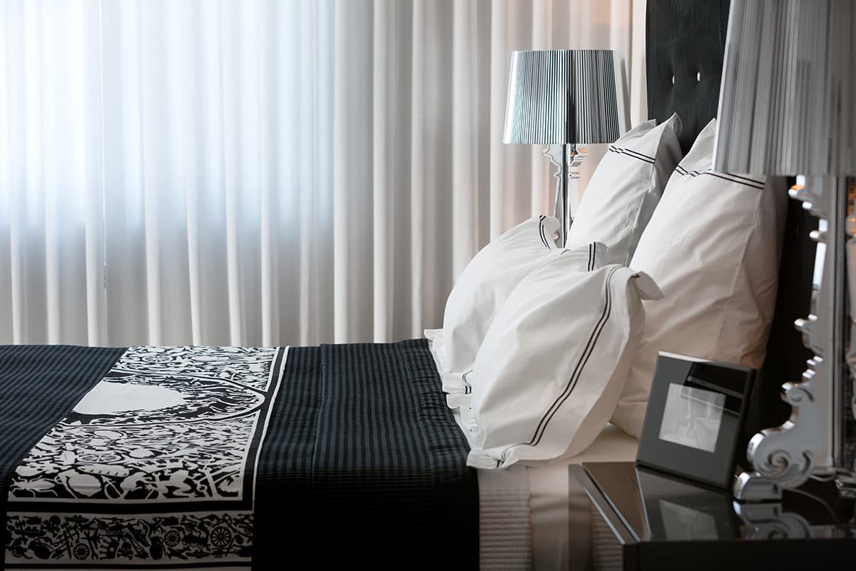 The basis for the entire interior was chosenwhite and beige color scheme. This is especially evident in the bedrooms, the contrasting component of which immediately relaxes and pacifies. And in the living room, it was decided to make two zones: by the window - an armchair with a table and a mirror, and opposite the TV - a velvet sofa in chocolate color. All the furniture was chosen to match the walls, ceiling and doors. The idea was to have white and beige in various patterns and textures of wallpaper, upholstery fabrics and curtains with pillows. And as a result, a very soft and neutral character of the interior was obtained. Kira Vavakina, interior designer
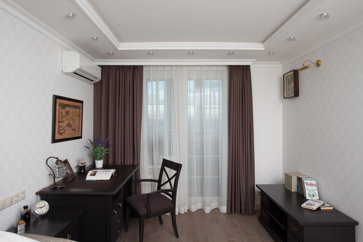
 For the son's room, wallpaper with a light color was chosendiamond - a strict and elegant element that can sometimes be seen on men's sweaters. The dark chocolate colors of the bed, table and nightstand only emphasize the "unfemininity" of this room.
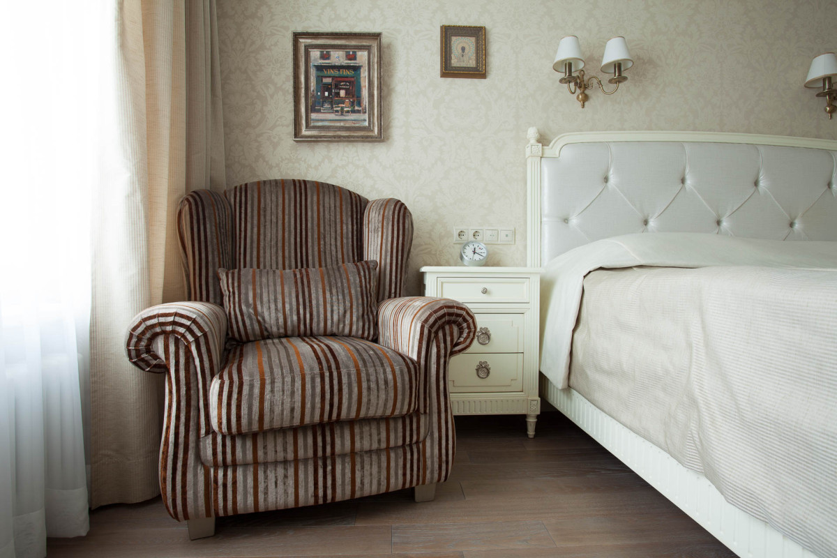
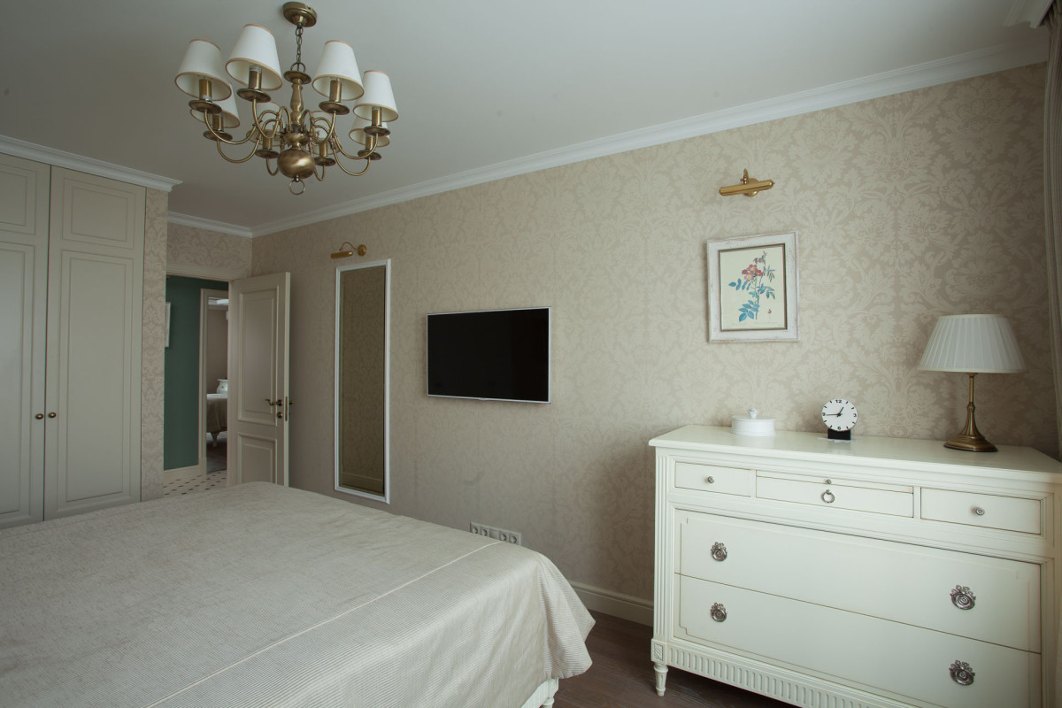
 The shades of furniture in other rooms are also100% matched the set color scheme. The master bedroom has a large and very beautiful white pattern, the daughter's is a little smaller, but just as cute and fresh. I always select all the textiles for the curtains at the very end, when the furniture is already in place: beds, sofas, and tables. In this case, there are no misses. Although sometimes, when you see a beautiful fabric, you want, on the contrary, to match the entire environment to it. The interior is a very interesting thing, inspiration can come from anywhere. Kira Vavakina, interior designer
 For the kitchen as a fundamentalThe element was made of solid wood, painted in a milky color. The tiles on the kitchen apron were immediately liked by everyone for their appearance, reminiscent of beige "chintz" printed on ceramics. In general, the kitchen was made for almost three months. And the handles were selected later in Moscow.
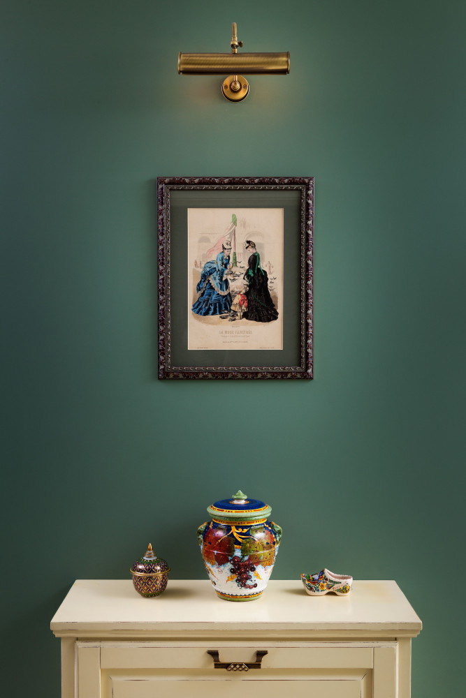
 There were some minor complications with the corridor due toits location right in the center of the apartment. It was decided to divide it into three zones along the length: a dressing room, a hallway with a large mirror, and in the middle to make a niche-library with paintings and an open wall. For a bright contrast to all the beige, a deep green color was chosen, and English tiles in the form of a classic "checkerboard", also green, were laid on the floor.
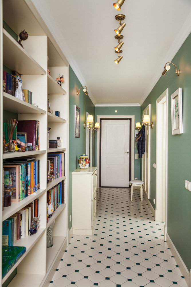
 All built-in wardrobes and the library were made according todrawings and were brought from Belarus. The rest of the furniture is Italian, selected from catalogs. The floors are made of solid oak, the paint is from the company "Sibirsky Les". The MDF doors were purchased from the manufacturer "Entrada".
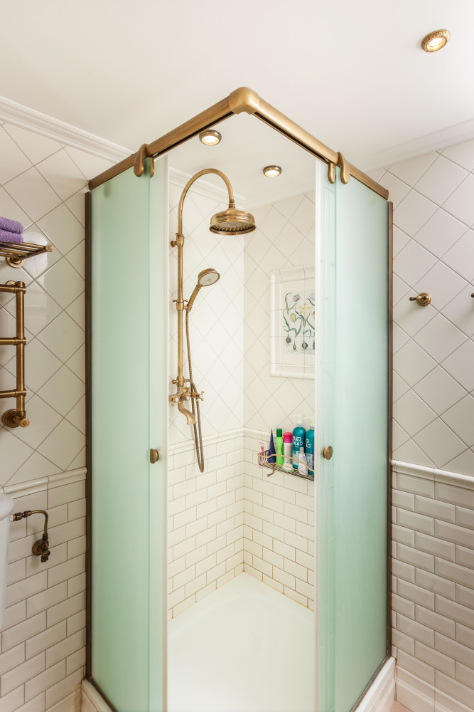
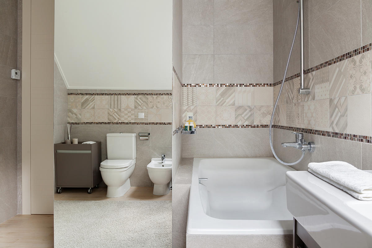
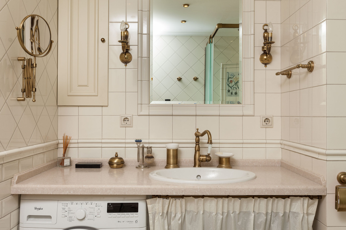
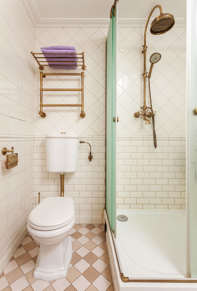
 The bathroom is completed with its expensive appearanceoverall delighted impression of the apartment. Different types of tiles produced a wonderful combination, and the interior of the bathroom is complemented by brass accessories, faucets and mirrors. The design on the glass in the shower took more than three weeks to make, but the wait was definitely worth it. In general, every detail is amazing and looks appropriate.
 Photographer Andrey Sorokin.
Creamy apartment with a charming little kitchen – etk-fashion.com
