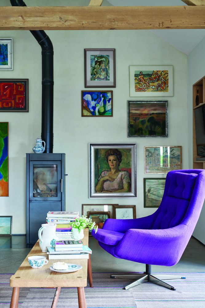
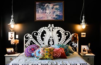
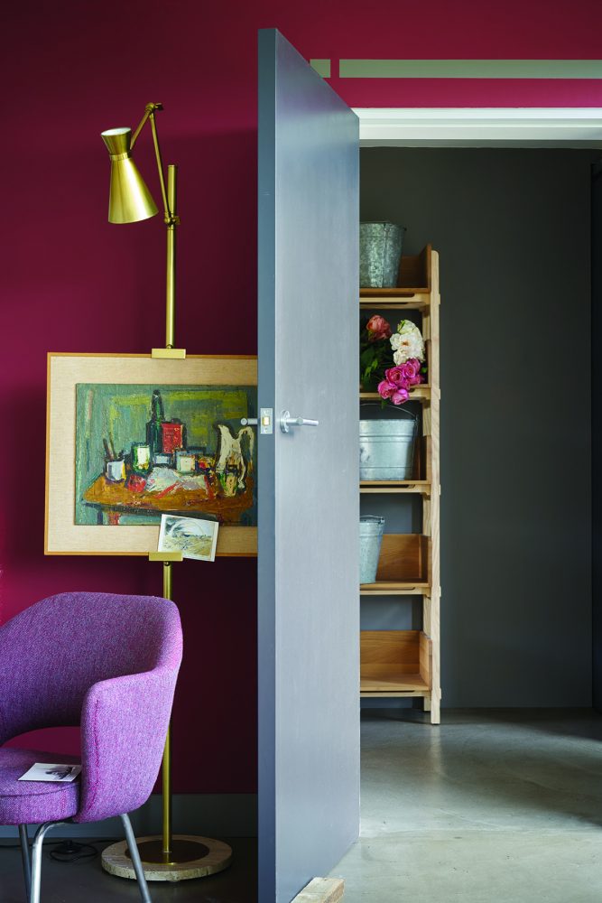
The Color Institute recently named the maincolors of the next year, and the British company, represented in Mаnders salons, has already released a new line of shades for spring. These are Radicchio, Studio Green, Hay and All White. Meet! The British brand Farrow & Ball, specializing in the production of paints and wallpaper, has made a new collection of shades for 2017. For the interior decor, the designers chose a color palette and created combinations of expressive, bright accents with more restrained delicate tones. The colors Radicchio, Studio Green, Hay and All White have unchanging beauty, remaining comfortable and familiar, despite being used in unexpected combinations. Timeless, nostalgic Hay and Studio Green, invigorating Radicchio, pure and simple All White - all colors are characterized by sophistication, thanks to which they fit perfectly into both modern and historical interiors. Radicchio Pink has been playing a leading role in decor for the last year, and there is now a natural shift towards richer reds that exude optimism. With its complex blue undertone, Radicchio feels luxurious, romantic and sensual rather than juicy or bright. It pairs flawlessly with simple, harmonious greys such as Mole’s Breath, Purbeck Stone and Ammonite, which can be used in interiors to add impressive depth. To create a positive atmosphere, Radicchio should always dominate the color scheme, with greys serving as an integral but complementary element.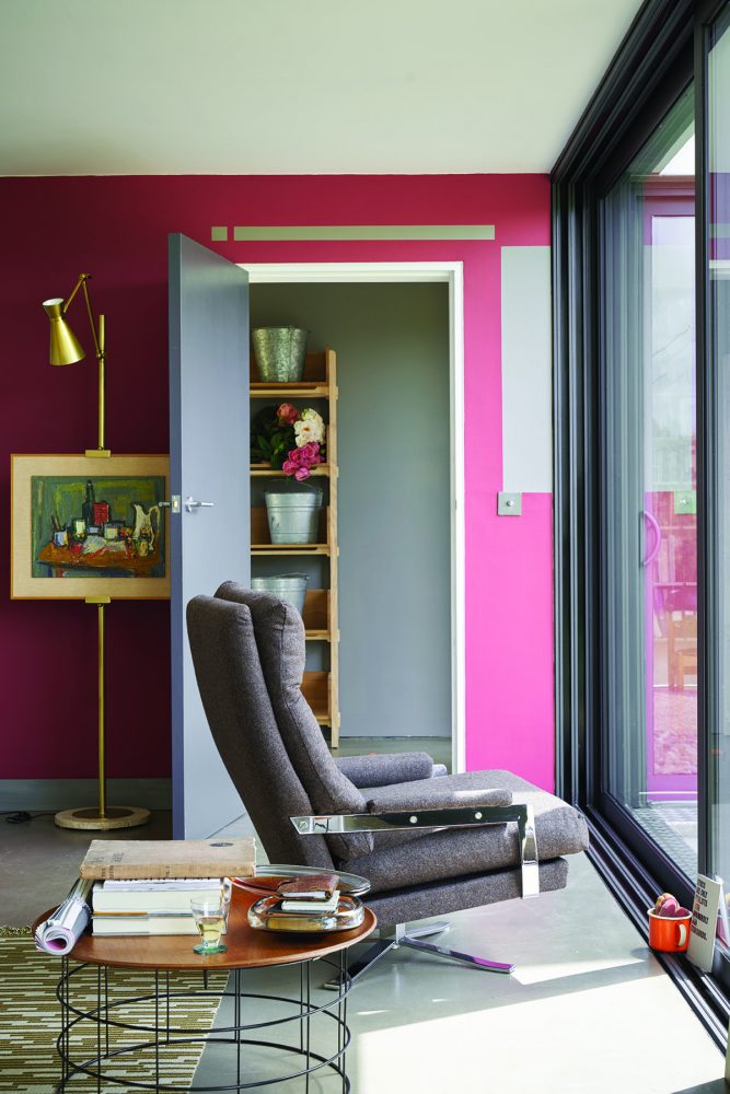
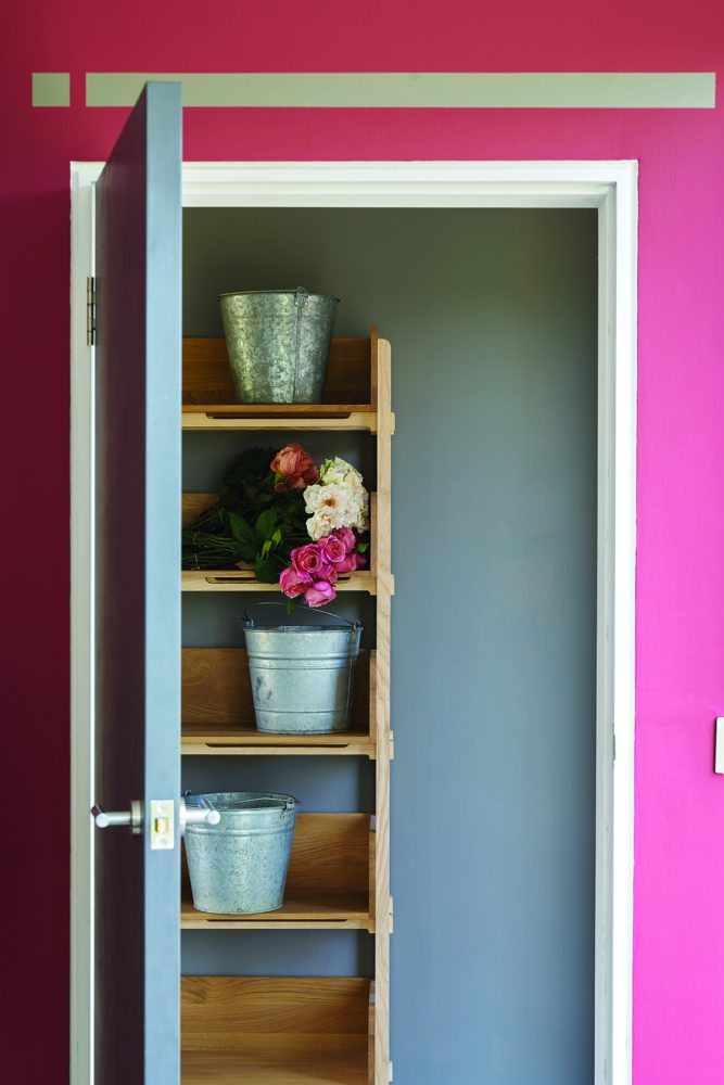
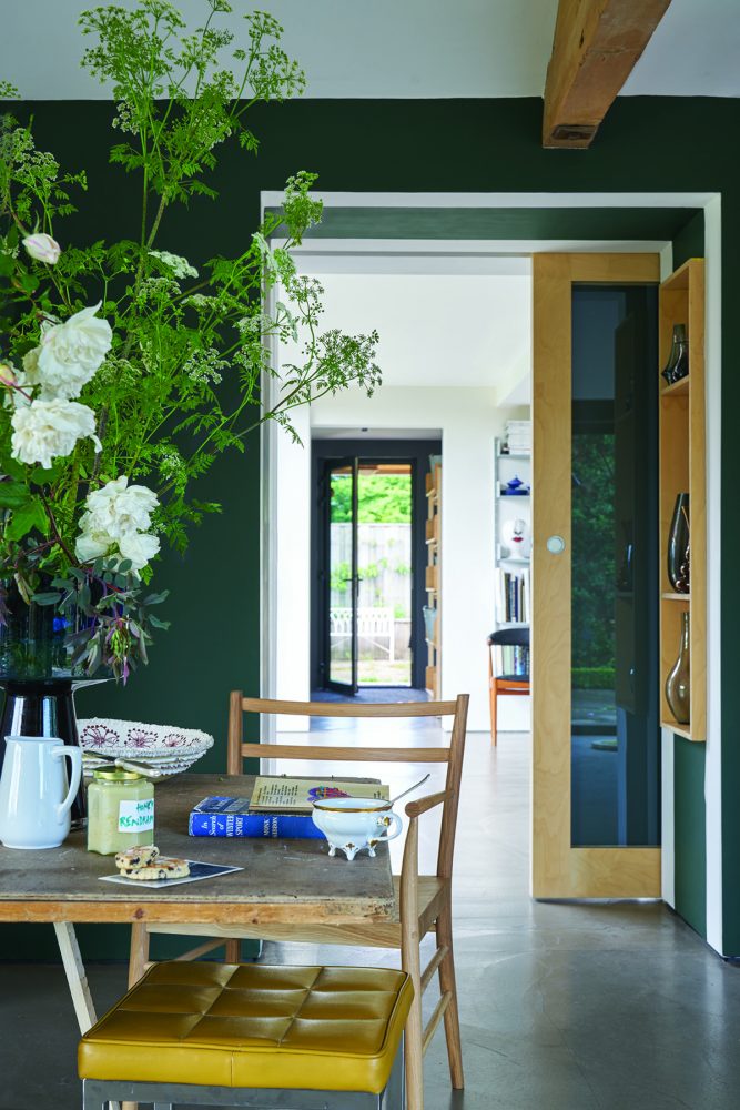
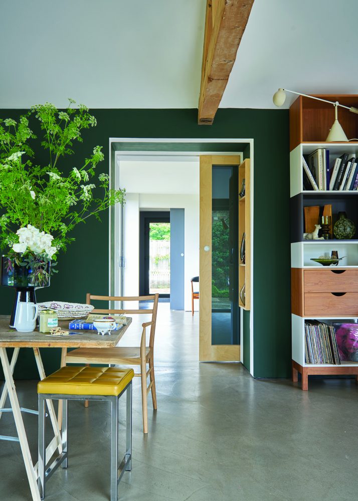
 Studio Green Use on WallsThe use of grey-green instead of the popular charcoal-dark colours seems provocative. Of course, Studio Green is intended more for connoisseurs and creates a nostalgic feeling, however, it can be used in the most modern interiors. This discreet colour becomes very natural when combined with cream shades such as New White, Farrow’s Cream and Pointing, which are perfectly combined and create an atmosphere of calm and serenity in the room. The Studio Green shade conveys not only the coziness of privacy, but also a sense of harmony and security, which testifies to the aesthetic and protective properties of the colour.
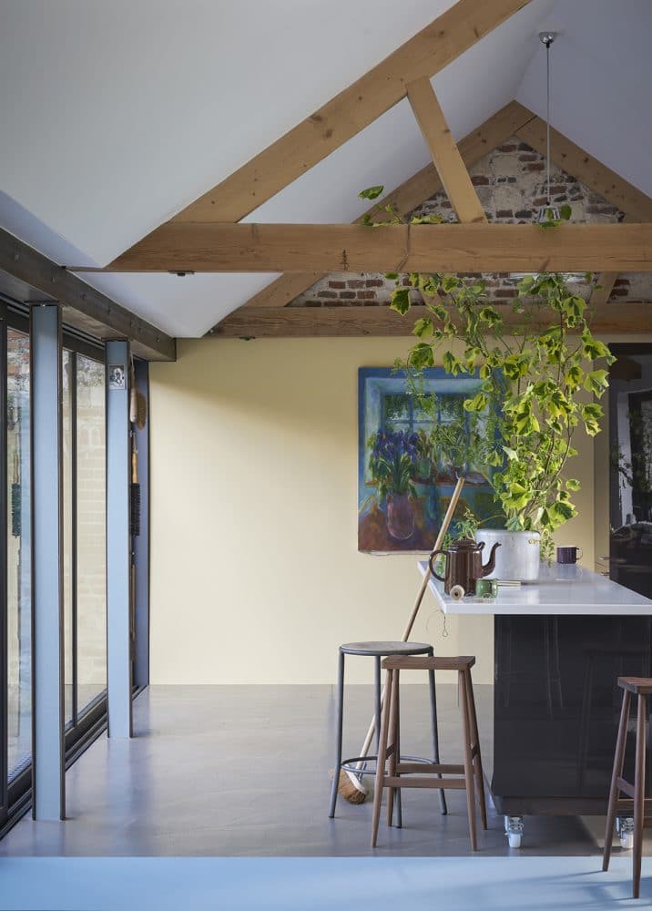
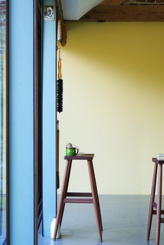
 Hay The subdued color Hay is perceived asSoft and familiar. Its calm tone creates an atmosphere of depth and softness in rooms. It is not a warm or sunny yellow, although it does cool down in bright light, but rather a vintage and whimsical tone with an underlying green. This color is best balanced by the matching Oval Room Blue and Setting Plaster, which are reminiscent of the brightly colored interiors of the mid-20th century. And elegant Wimborne White can be used as a warm, reflective neutral on the ceiling. Although this color combination seems quite eclectic, it creates a severe, yet pleasant, optimistic atmosphere.
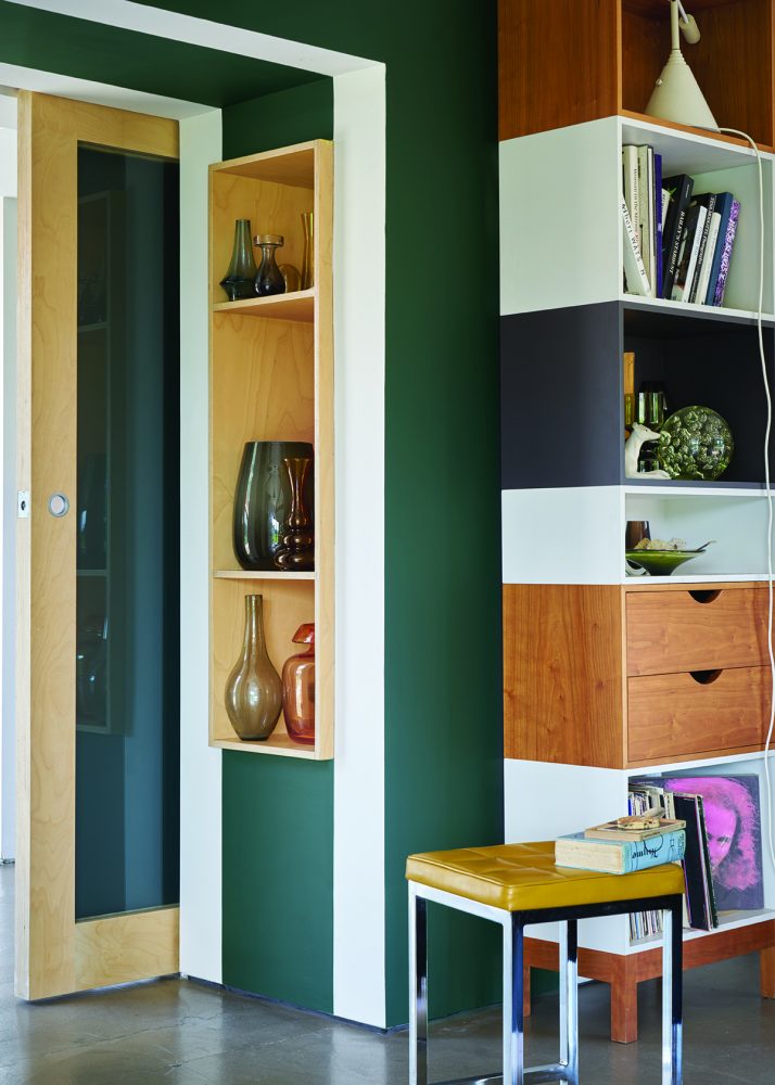
 All White Pure white is a color devoid of shades andassociations. All White does not contain pigments and creates a simple, not strict or “shiny”, but fresh atmosphere. By combining different shades of white, a feeling of stillness and calm is achieved. Great White, Cabbage White and Strong White, which have different shades, can be used in any combination with All White to create subtle decorative accents. They are also the perfect background for art objects and natural materials. Combinations of these seemingly simple colors enrich the interior.

What color will be fashionable in 2017: new shades
