What is Zen style in the interior and how to do it correctlyto work with? We found the answers to this question in a Moscow apartment where a young yoga teacher lives. The Zen style has absorbed Japanese minimalism, the texture inherent in Chinese interiors, and the lightness present in Indian styles. Here, we can see features of many styles of the Asian-Pacific region, combined together and adapted to Western realities. The philosophy of this style is aimed at calm, harmony between the interior and its owner, the interior and nature. There should be balance in everything - in the color scheme, lighting, choice of textures and materials. Today we want to tell you about an apartment located in Moscow and decorated in this style. Its interior was created by designer Natalia Volkova. Natalia Volkova, interior designer - I am an interior designer of private and public spaces. I also develop and create original decor items. My main education in the field of design is from the Interior Design School "Details". In the design itself, I try to focus on the principles of Japanese aesthetics - free space, expression of an idea in a few strokes, absence of excess and fuss, depth of concept... I study the direction of the Zen style in the interior, I keep a blog on this topic. artcrafts.ru
At the Crossroads of Cultures
The customer of this project was a young mana bachelor who is interested in authentic Eastern culture. His profession is also connected with the East. He is a teacher of Kundalini Yoga. He travels a lot, conducts seminars and practices in different parts of the world. In his interior, the young man wanted to harmoniously combine the West and the East, the modern and the traditional, the future and the past. It was imperative to use environmentally friendly materials here. That is why the Zen style perfectly suited his needs.
Layout features
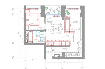
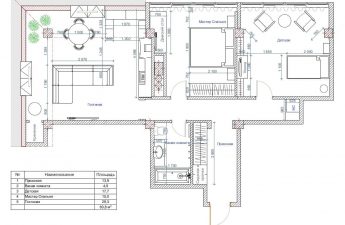
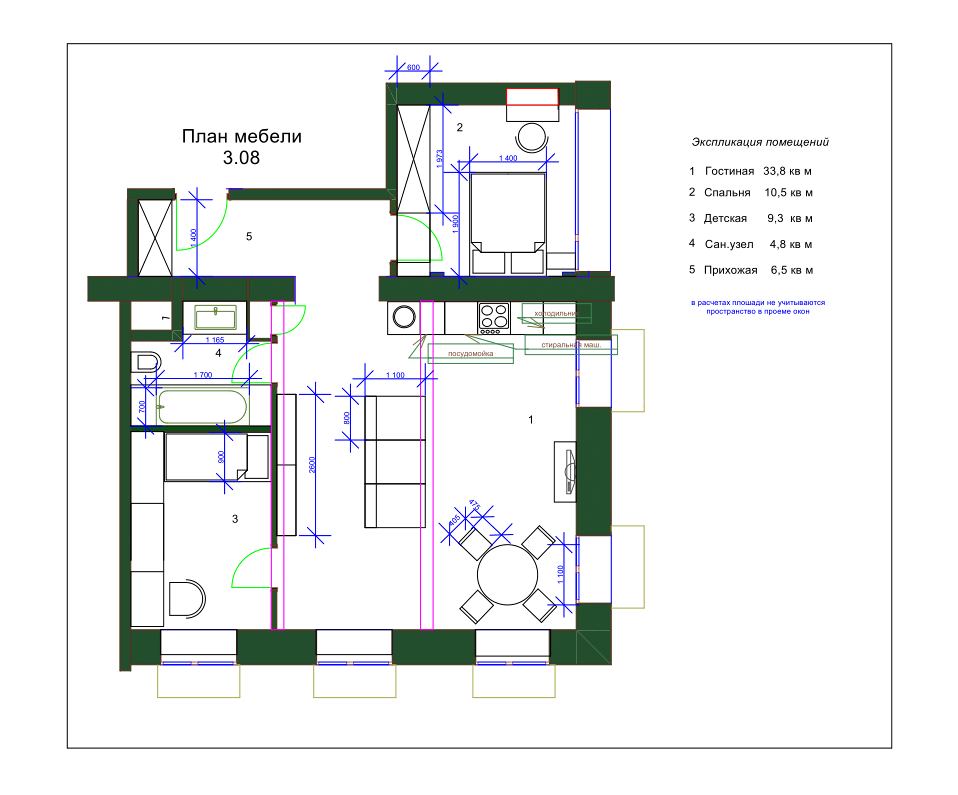
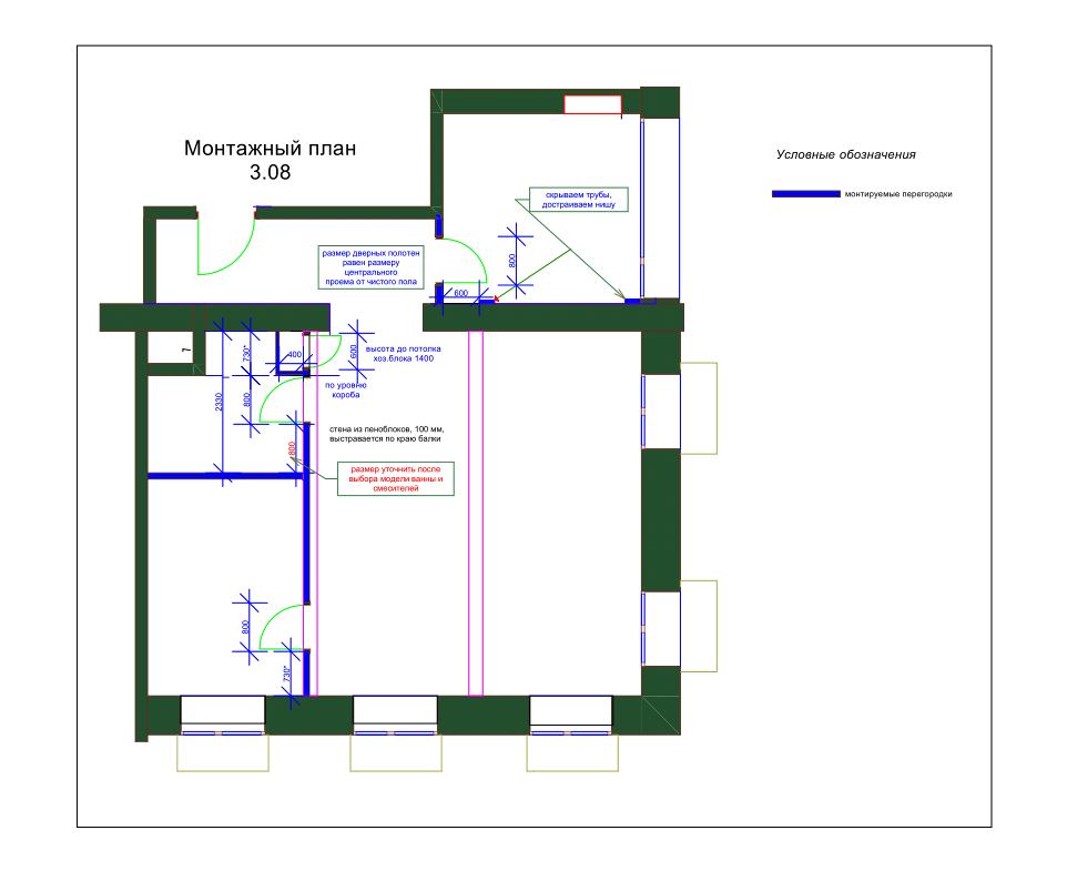
The owner of the apartment loves open and brightspace. He saw the future interior as light, spacious and filled with "air". In addition, he likes to receive guests. Since the apartment is in a new building, they decided to abandon the global redevelopment. The only thing they changed was removing the floor heating radiators to make the room more spacious, and also erecting one partition. Natalia Volkova, interior designer: - The main room was planned taking into account the customer's wishes - the presence of a large space that combines the functions of a living room and a kitchen. The customer likes to invite guests and sometimes organizes yoga classes at his home.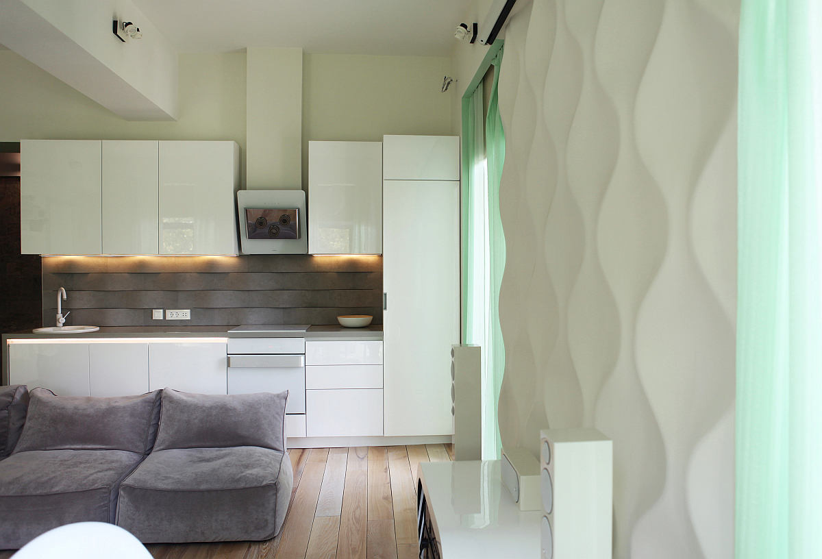
An atmosphere of calm
In keeping with the Zen style, the designer does notused bright contrasting shades. The main emphasis here is on smooth shapes and natural textures. Soft light colors refresh the space, create that very light atmosphere that the owner of the apartment so wanted to see in his interior. Natalia Volkova, interior designer: - To give the interior "life", we introduced a shade of spring greenery. We decided to emphasize the verticals of the space with this color, visually expanding it. Window slopes, door frames, and curtains are made in this shade.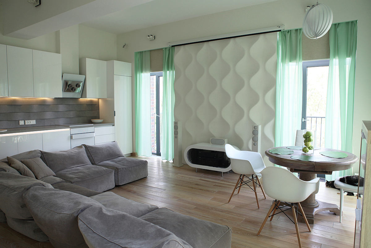
Gray as a balancing element
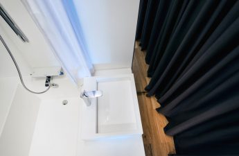
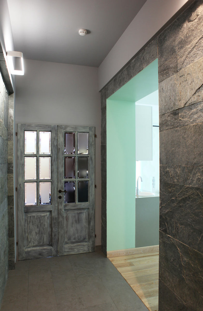
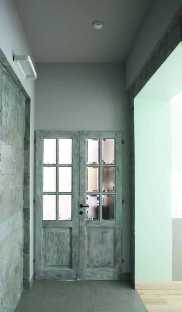
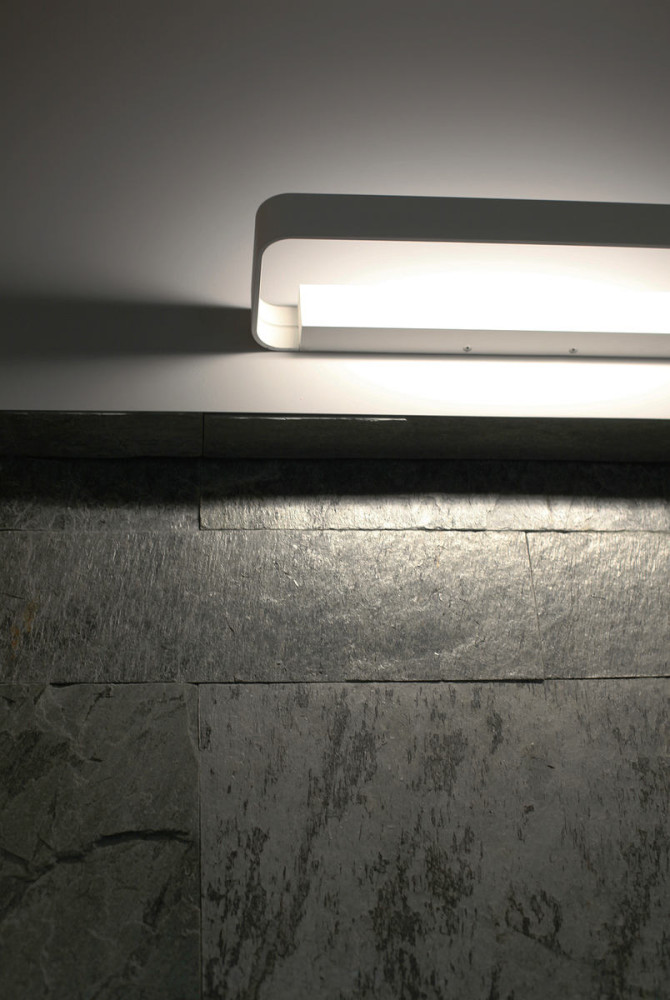
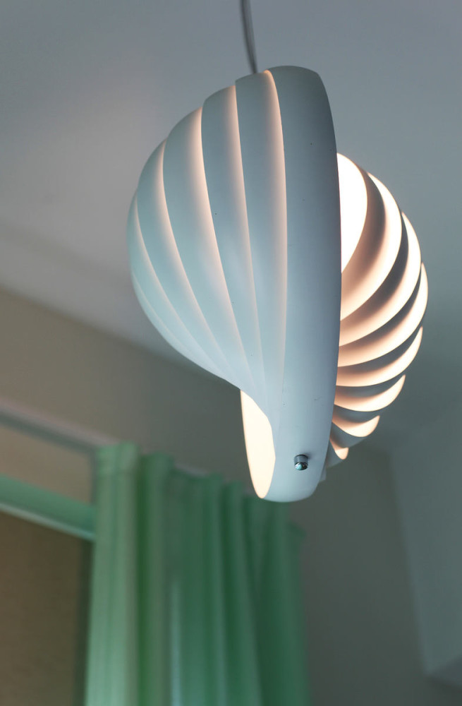
The corridor is dominated by grey colours.It sets a calm wave from the first moments of being in the apartment and prepares for the airy, minty interior of the living room. The main emphasis in the hallway is on the niche, finished with silver slate slabs, the cut of which was made to order for this project. The bathroom is a continuation of the general history of the space. Light shades of the walls echo the interior of the living room, and the gray texture of the porcelain stoneware and mosaic is a reference to the design of the hallway. Natalia Volkova, interior designer: - The main lighting is LED lamps of a modern design. The interior also features gray - tiles on the apron and upholstery of the sofa. It allows you to shade the white, light elements without violating the laconicism of the chosen style.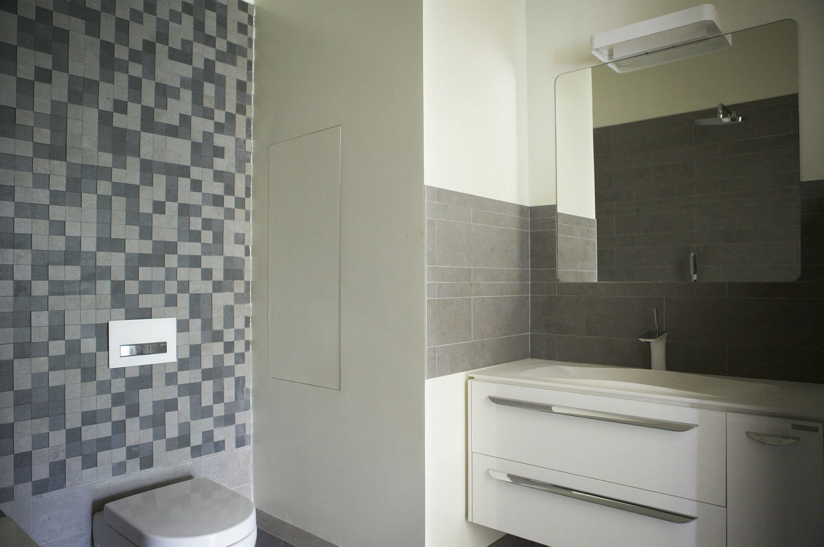


Materials, brands and finishes
Kitchen:
- Modern kitchen with a laconic glossy surface from the company "Kitchens of modern people" was made to order for three months.
- Extractor - brand Cata, model Podium 600 blanca.
Living room:
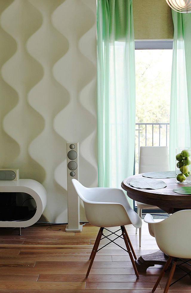
- Audio system from the Monitor Audio brand. Since the customer loves music of different genres, one of his wishes was a good audio system.
- Cabinet for equipment - Retro Hoop Coffee Table,Company Zespoke (brought to order from the US). It was this model that was chosen specifically to maintain smooth bionic forms against the backdrop of the pattern of panels.
- The chairs are from the Prismea/Varo factory, Fulvia collection, as well as replicas of the famous Tower designer chair model, bought at one of the furniture sales.
- Chest - brand Hoff, model Clio.
Wallpaper, paint, textiles:
- Tile on apron in the kitchen, walls and floor in the bathroom, the floor in the hallway - granite of Apavisa Nanoevolution, color Gray.
- Mosaic in the bathroom - the company Apavisa Nanoevolution, model Ivory striato mosaic. It supports the theme of natural stone in the interior.
- The walls in the living room and bathroom are painted with Dulux brand paint.
- Gypsum panels - the company Artpole, the collection of Soul. The drawing of these panels is one of the main accents on the central wall in the living room.
- The niche in the hallway is decorated with slabs of silver slate, the cuts of which were made to order.
Floors, doors:
- The doors in the living room are Leto. To make the whole space, modern doors with a glossy surface (white linen and green platbands) were chosen. So they resonate with the format of kitchen furniture and the color solution of the entire interior.
- The floor is a massive board (ash, oil), firmSib-Master. Natural shade of the tree with a light patination and brooch to set the economic direction in the interior. Toning was developed specifically for this project.
Natalia Volkova, interior designer:— The most valuable thing about this interior is that we were able to maintain the balance that we stated at the beginning of the project. Many of the client’s friends confirm that the apartment is a reflection of his character, and this space, according to the owner, has become a source of strength for him.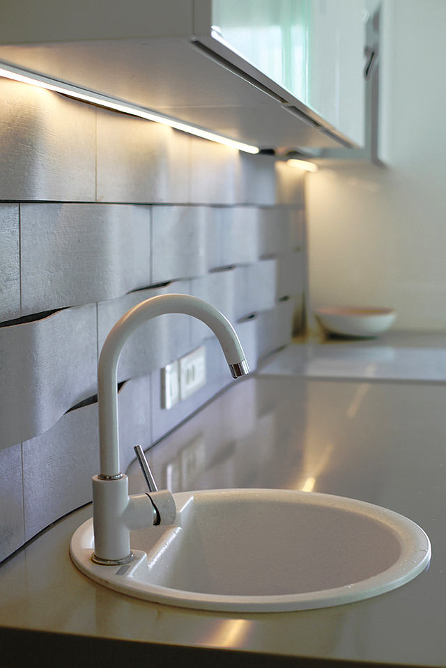


Tips on arranging such an interior from Natalia Volkova
Apartment layout
 photos provided by Natalia Volkova
