Gray color is self-sufficient and beautiful in itself.Yourself, but if you understand the intricacies of working with its warm and cold colors, then you are at risk of falling in love with this color forever. Let's do this today.
Today, the taboo of any topic isprobably at the lowest possible level. We do not know about the rest, but in terms of interior design, this is a huge plus. Black interiors no longer evoke associations with the scenery of a vampire movie, white is no longer "hospital", red, as it turned out, also has a right to exist. As for the gray color, for some time now it has occupied a special place in the minds of not only designers and architects, but also those who are considered to be the final consumer, you and I that is. That is why today we will try to figure out how to work correctly with its shades, or rather, with their temperature component. Cool shades of gray
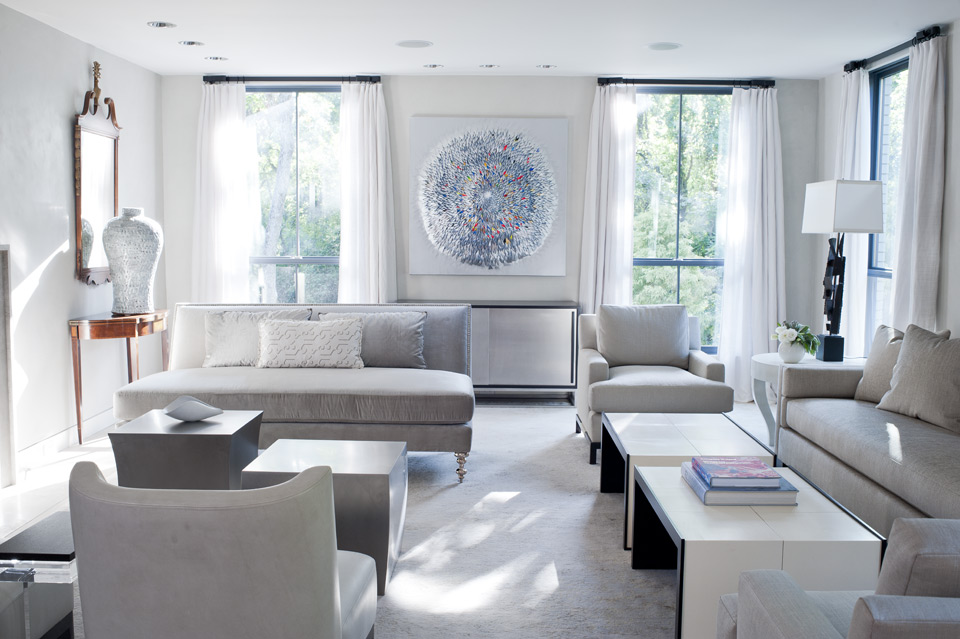
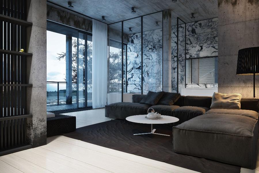
There are two ways of development of events - a plot andterritorial. The first concerns the semantic component of the interior. Loft or bachelor lair thanks to the cold shades of gray will add to the brutality and, if you will, in the mystery. For this kind of research, bare concrete, untreated metal, rough wood and minimalist furniture are the best surroundings. And, of course, the cold gray, gravitating towards the shade of the lead or the gloomy sky - that's it.
The second component is the location of the room. Here the semantic load does not have any value. If the windows of the room go out to the sunny side and it is almost constantly brightly lit, if you do not want to - the space will have to be harmonized and among others choose for this "cool" shades of gray. 
 Ruslan Kirnichansky, architect:
- Gray is one of the most difficult to organizeLiving space. Gray is a transitional shade from white to black, and this transition can consist of many steps and branches to other colors. In order not to get confused in the selection of a gray tint, you need to clearly define the task that this color will solve, for example filling the room, furniture and textiles in warm colors. And to organize them and laconically place them in space, the unifying color of the walls is required. To solve this problem, one of the shades of gray, but cold, is ideal. Conditional gray, changing to blue or green. Playing on the contrast, you decide the issue of visual "overheating" of the room and warm colors of furniture and textiles will be profitable to stand out on the cold color of the walls.
One of the rules of a competent visual solutionthe room is the balance of warm and cold surfaces. Even a room with windows oriented to the southwest in central Russia (the sunniest rooms) can be “cooled” by increasing the balance of cold colors in the interior. Sunlight exposure and the direction of the windows is an important factor in determining the balance of warm and cool colors required for a particular living space. Fab-im.com Warm shades of gray
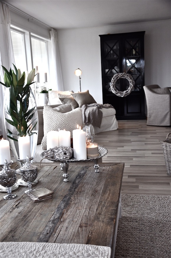
If everything is clear with icy brutality, thenThe possibilities of using gray in feminine and "family" interiors are not considered so often and still cause controversy. But it is in such spaces that warm shades of gray can solve a lot of difficulties, make the interior dynamic, "in a good way" complex and quite fashionable.
Even if the moment of buying a gray sofa is alreadymissed, with the help of the correct shade of the walls and a supporting palette of gray in textiles, rather disparate objects can be brought together, creating a complete and completely self-sufficient composition. Ruslan Kirnichansky, architect:
- The level of insolation also depends on the possibleContrast color solution, as a sharp contrast in the use of dark and light colors can either supplement the room, or deprive it of airiness and ease of perception. If the insolation level is weak or medium, I recommend not using contrasting combinations, since in this scenario the contrast will make the room smaller and darker. But this does not mean that in such rooms everything should be "smooth and even", instead of contrast, use another technique called nuance - this is a comparison of similar shades with some difference. Tested in practice: in dark rooms, the nuance will look like a contrast in rooms filled with sunlight.
The most important thing in developing a color scheme is to find a balance for a particular room, taking into account the external factor of insolation. Fab-im.com