We found a luxury penthouse that was immediatelyattracted us with several amazing ideas. In addition to the fact that this space is a real loft, created on a space of 71 meters, it is also a film studio! Such a project is published on our resource for the first time. This is not an apartment or a salon, and not even a showroom, but a real film studio. The author of the project, Yana Molodykh, told us about what is what here and how. Yana Molodykh, interior designer
Education: Kyiv National University of Civil Engineering and Architecture (KNUBA) and the Details School and Studio, Moscow.
Specialization: design and decor of residential and public spaces (restaurants, offices, boutiques).
Credo: "Love people and love what you do, and the world around you will become much more beautiful." yanamol.com
— Previously, there was a roof on the site of the premises, whichcould have served as an open space, but the customer decided to transform this area into a private space. He is the owner of a film studio, and this place, according to his idea, was supposed to become an island for privacy, relaxation, even some kind of meditation. The customer did not want to close the windows with any protective systems, leaving the opportunity to watch the clouds float across the sky.
The film studio premises are located on the territoryformer cannery, and organically fit into the interior and supported the overall concept of the film studio. There was no special redevelopment - a glass and metal structure was erected over the roof, a ventilation system was installed, and the floors were prepared.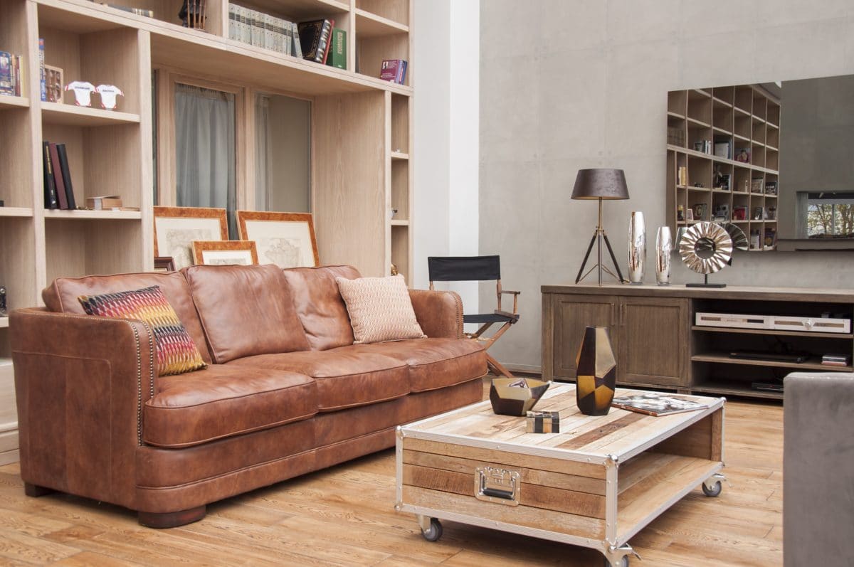
The project took two months to complete - the customer wanted to receive a finished interior by his birthday, and the deadlines were tight, leaving no time for reflection.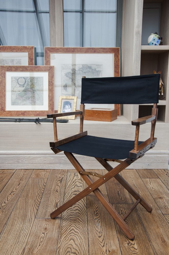
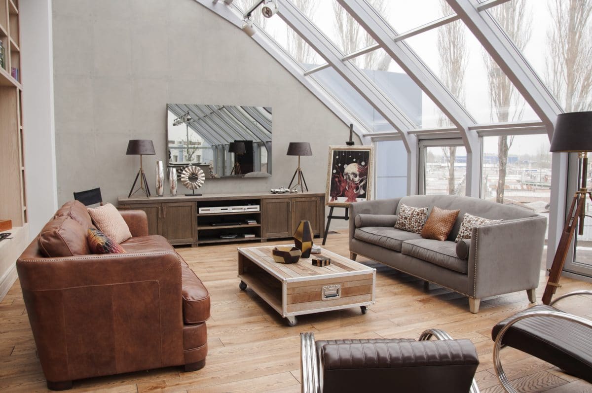

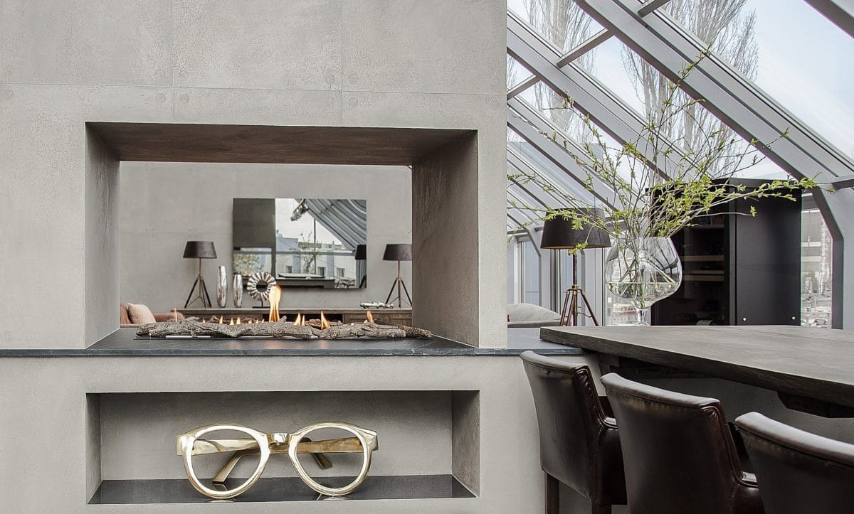
It was decided to use natural materials in the designcolors that emphasize the texture of concrete and stone. The color of the walls is determined by the color of the concrete. Decorative plaster was also applied to imitate concrete panels.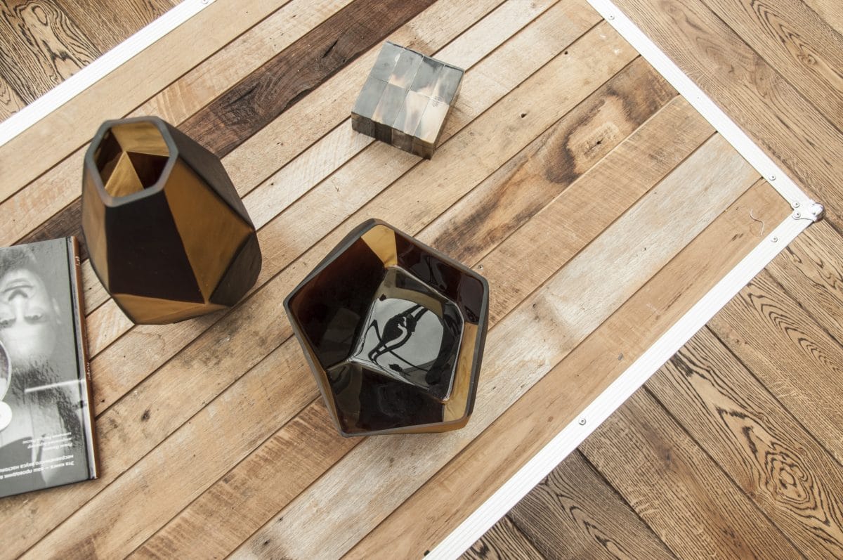
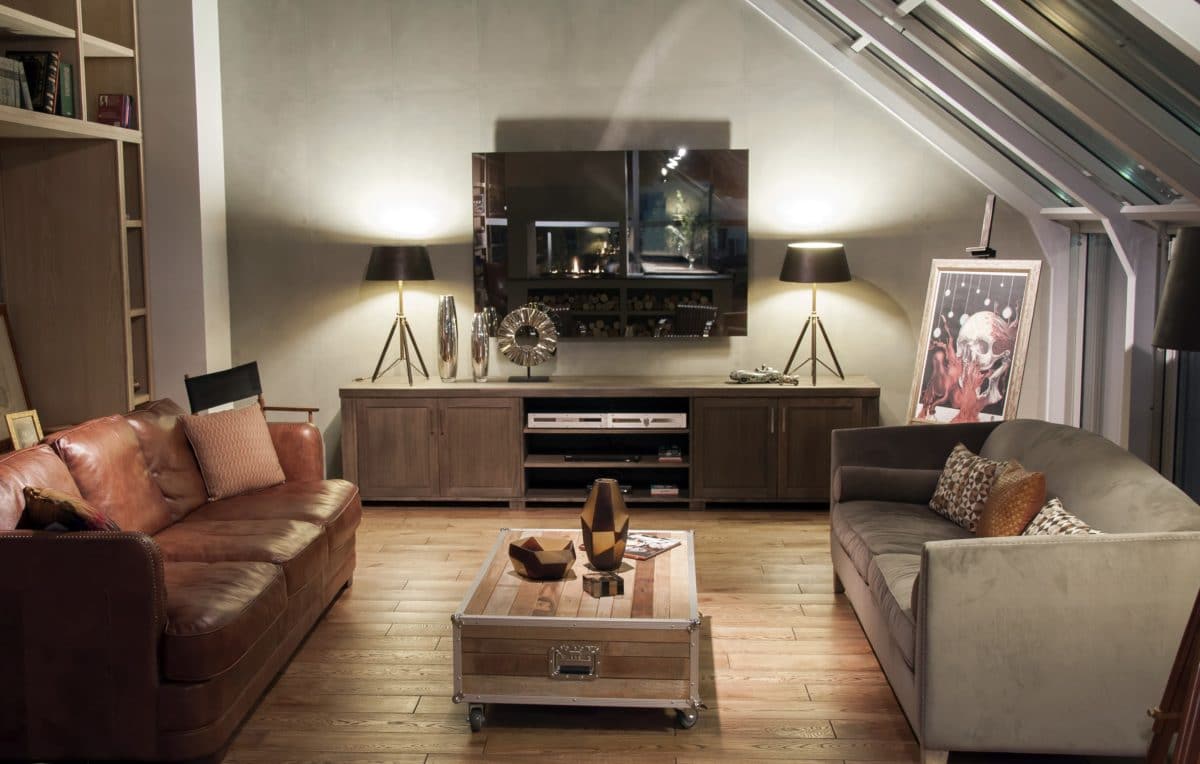
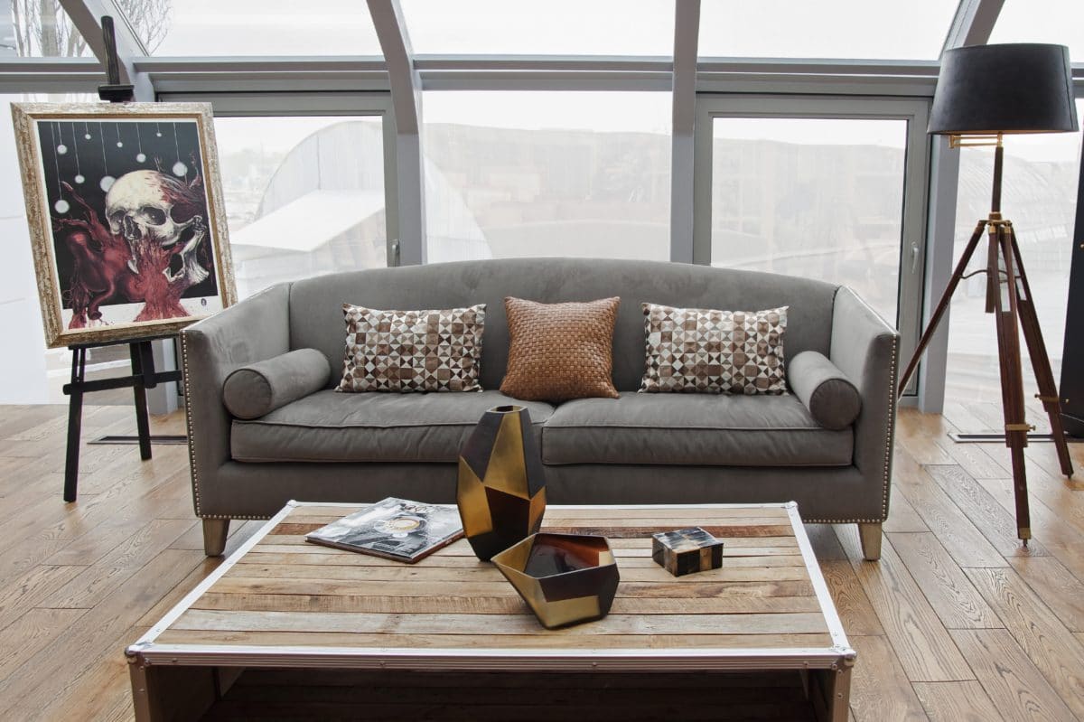
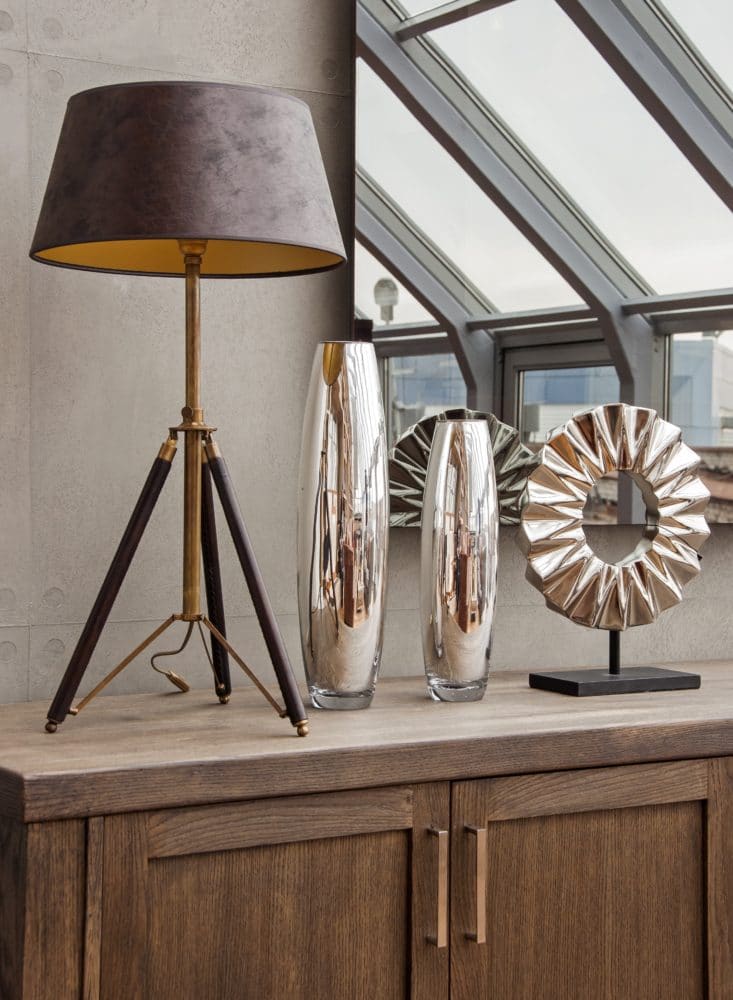
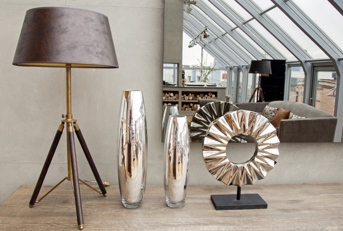
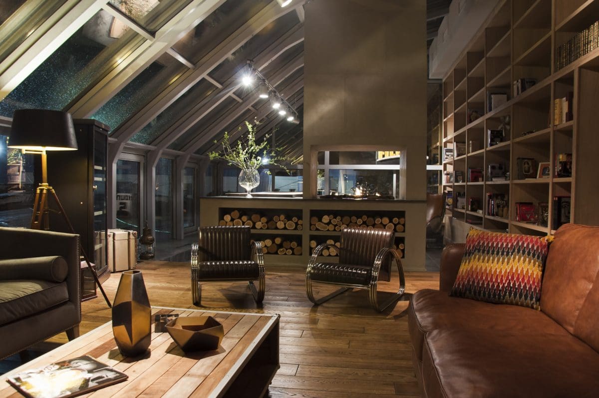
 The light scenario of the space had toto create a relaxed mood, picking out individual zones and dissolving glass walls in the darkness. There was no particular connection to color in the interior - the main task was to create a calming atmosphere. Leather lampshades of table lamps and a floor lamp with gold coating inside created a soft diffused light, spotlights under the ceiling are on a dimmer, thanks to which it is possible to regulate the degree of illumination of the interior and change the angle of inclination, highlighting certain areas.

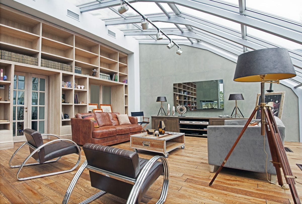
The library, TV stand, table and window sill are all made according to my original sketches from solid oak tinted in the chosen shades.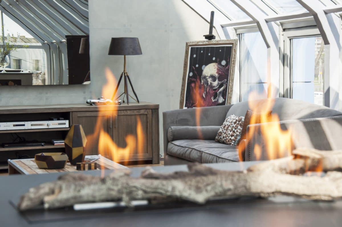
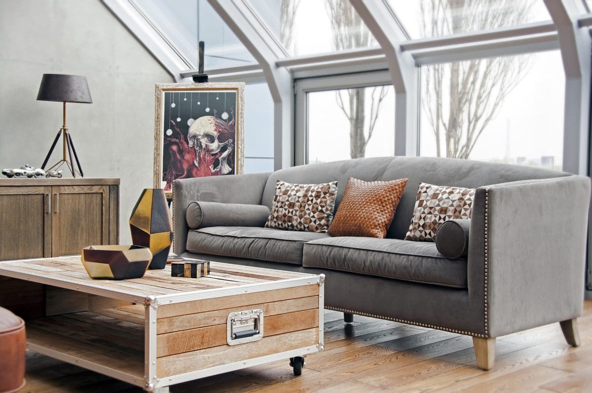
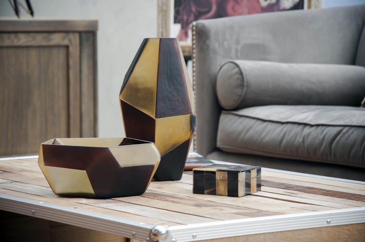
The choice of furniture was determined by the elevator style,which necessarily includes leather and wood. The interior had to look lived-in, with history. A solid, respectable leather sofa was made by the French brand Hazel. Opposite it, against the background of the window, stands a light, airy classic velour sofa from the Belgians from Pomax - it softens the brutal masculine interior a little. Between the sofas is a wooden table on wheels, handmade, also created by Pomax.
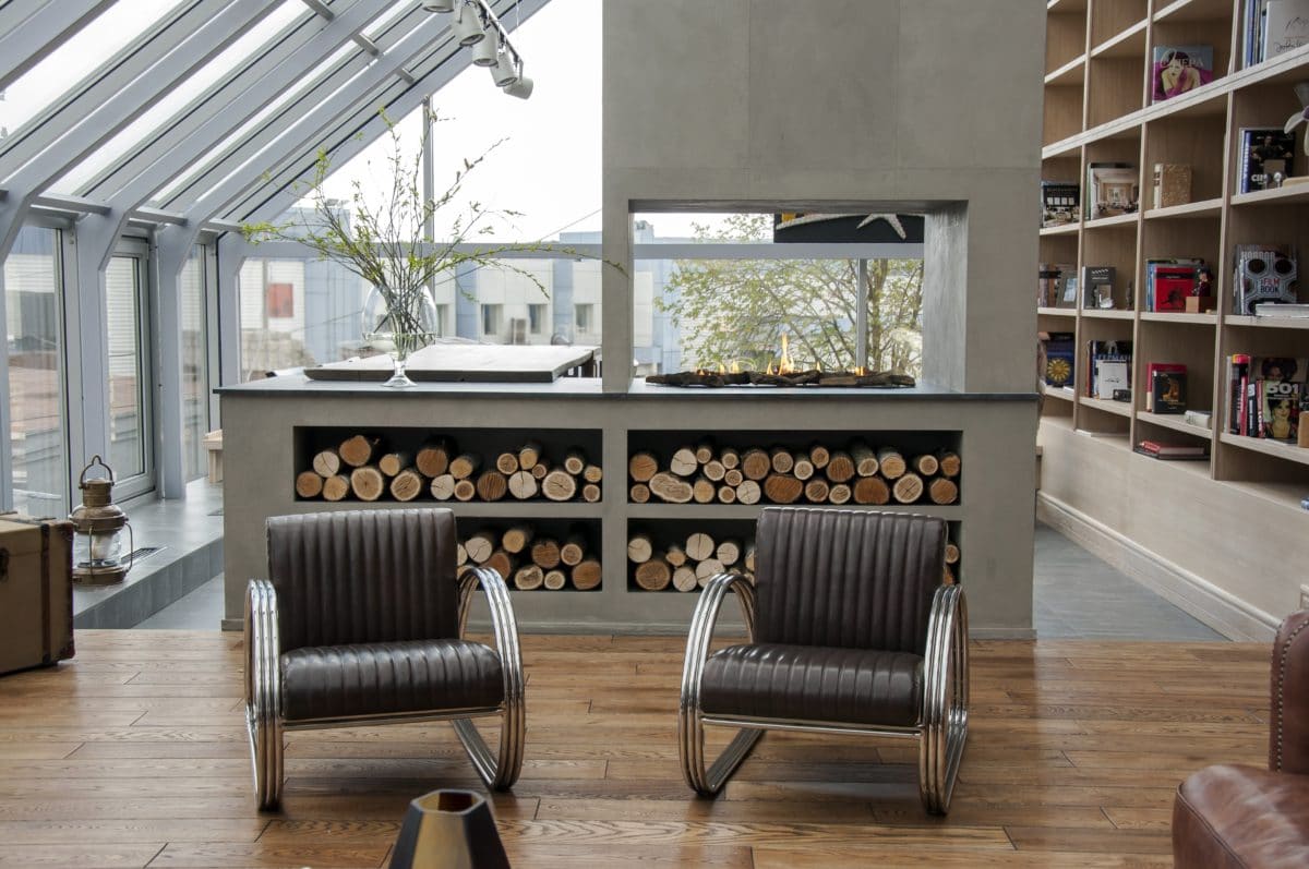

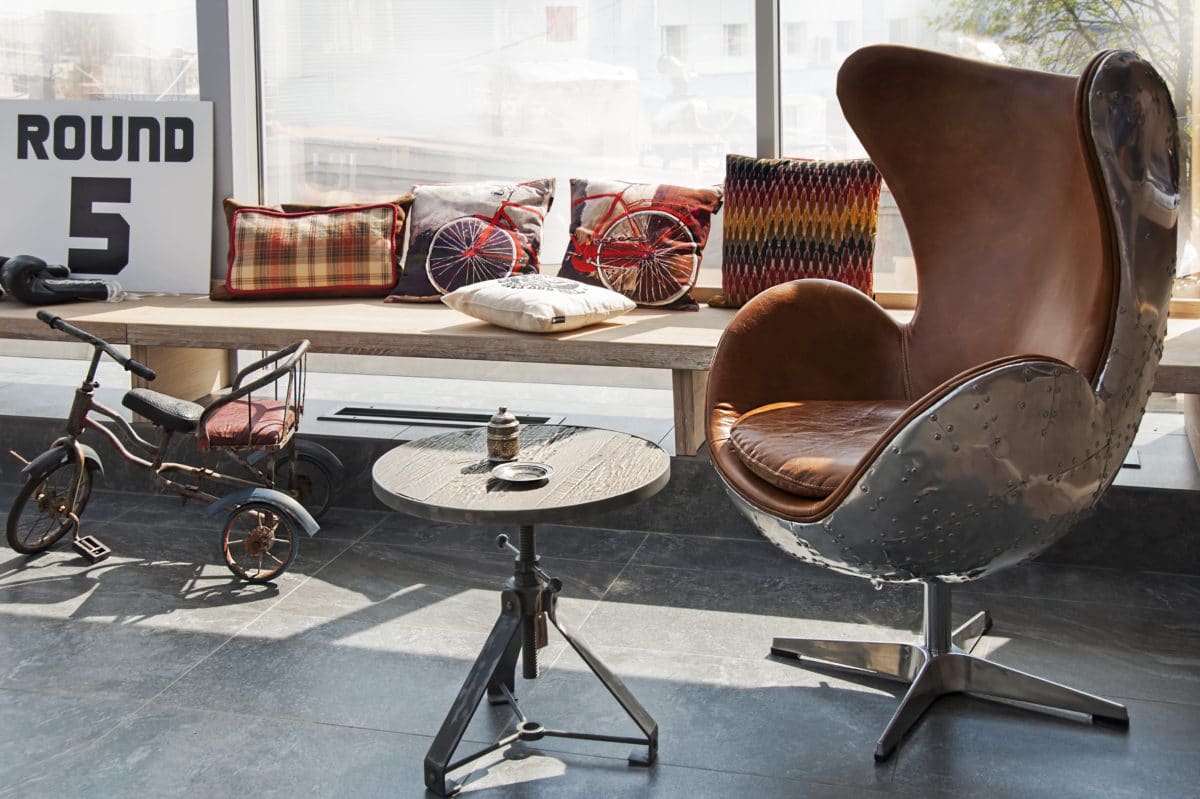
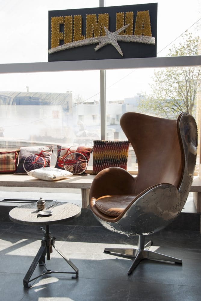
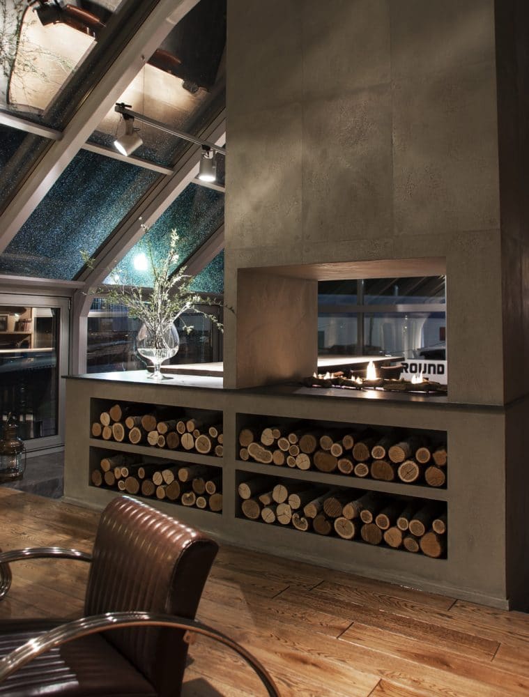
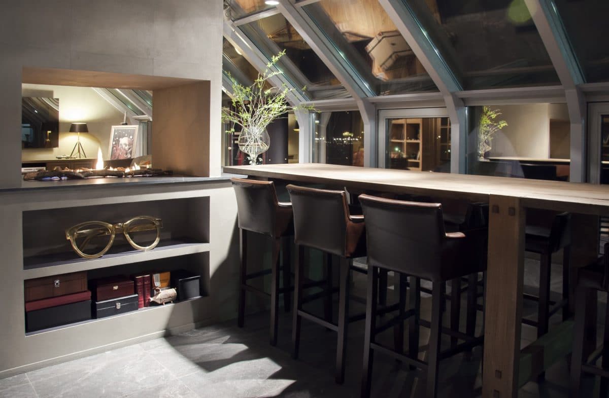
Near the fireplace are leather Bugatti chairs fromall the same Pomax, they add dynamics to the interior. In the corner there is a Pomax egg chair - next to it there is a small Pomax coffee table and a rare bicycle by the Spanish brand Francisco Segarra. A TV is hidden behind the mirror. The Planika bio-fireplace warms with its heat and creates a feeling of comfort in this glass room.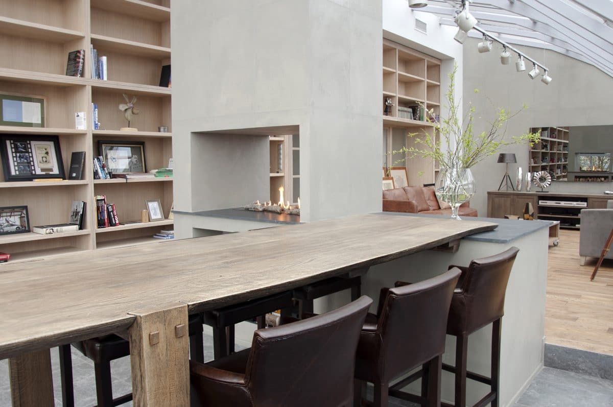
The walls are finished with decorative plaster imitating the texture of concrete. The textile design is made using pillows from the Belgian brand Dome Deco.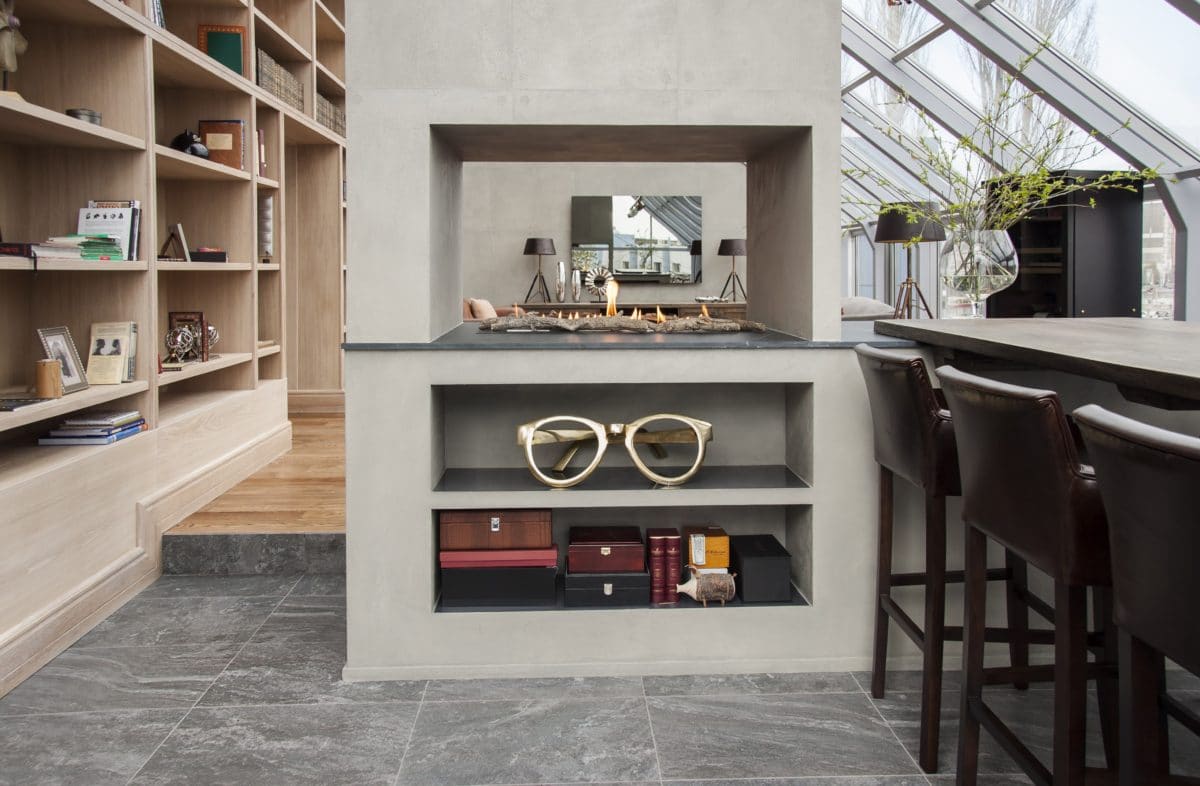
The floors are made of brushed oak deck boards.In the area of the negotiation table, porcelain stoneware with an imitation of a marble pattern was used - this decision was caused by the desire to visually divide the room into two zones not only by the fireplace portal, but also by different-level floors with different coverings. The doors are also oak, with beveled glass inserts, repeating the color and texture of the library shelving and not standing out against its background.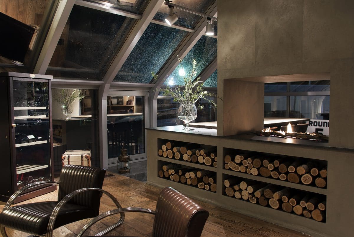
This project is one of my favorites.The tight deadlines did not give time for reflection, the entire selection process often took place intuitively. Everything went quite smoothly, the customer was satisfied, and I got a great experience of working under limited time and learned to trust my intuition in choosing decor.