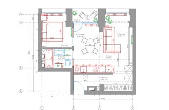
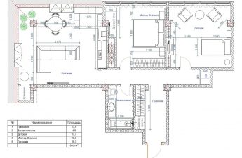
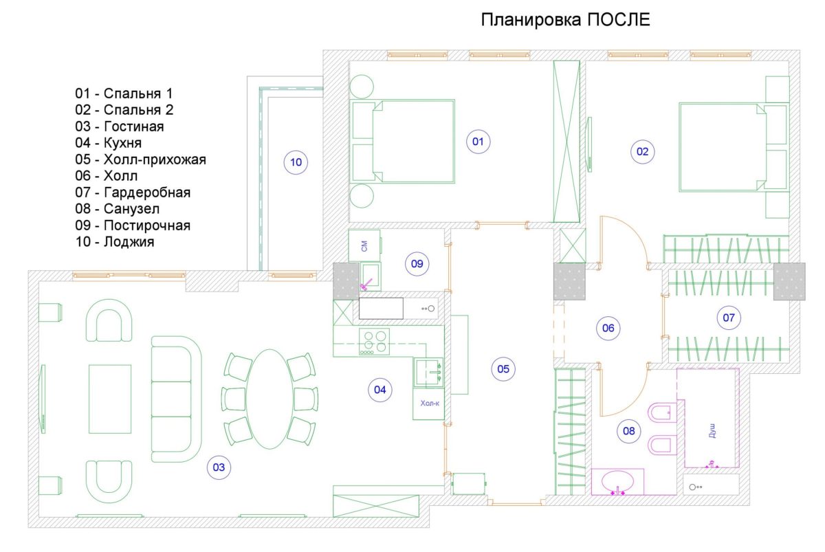
The owners of this Moscow apartment dreamed ofa fold-out sofa for guests in the living room, and received a completely new layout and an exquisite neoclassical interior to boot The owners of a three-room apartment in the Italian Quarter residential complex — a middle-aged couple — wanted to create a beautiful and functional living space with an elegant interior and a well-thought-out layout that suited their lifestyle. With this request, they turned to a designer, who managed to bring all their wishes to life. Alexander Krivov, designer Until 2009, he worked in large companies in the field of construction and real estate, while simultaneously doing interior design. In 2009, he received an education in interior design at London's KLC School of Design, after which he founded his own studio, Golden Silk Interiors. Alexander works in different styles both in Russia and abroad. When creating each of his projects, he strives to make an interior that is not only beautiful, but also utilitarian and as comfortable as possible for living. www.goldensilk.ru The main wish of the customers was related to the layout solution. The original layout assumed a standard kitchen-living room-bedroom set, but the owners like to receive guests who often stay overnight, so it was important to have a large or fold-out sofa in the living room. In response to this request, I suggested remodeling and abandoning the separate kitchen, moving it to the living room, and turning the resulting free space into a guest bedroom with the prospect of converting it into a children's room.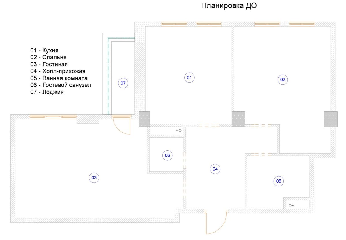
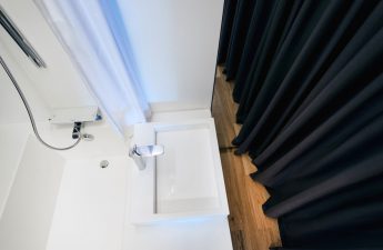
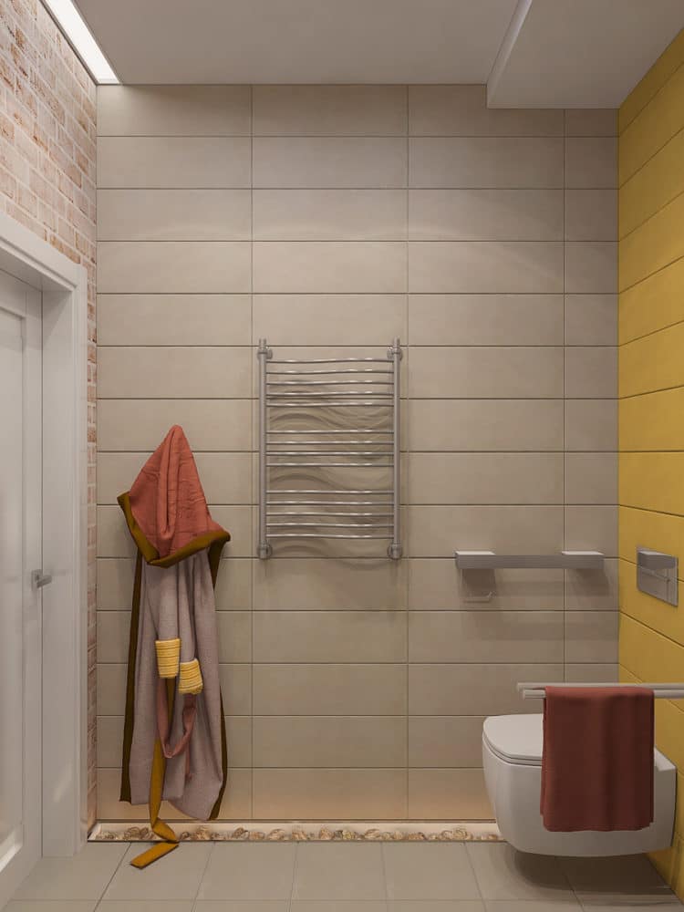
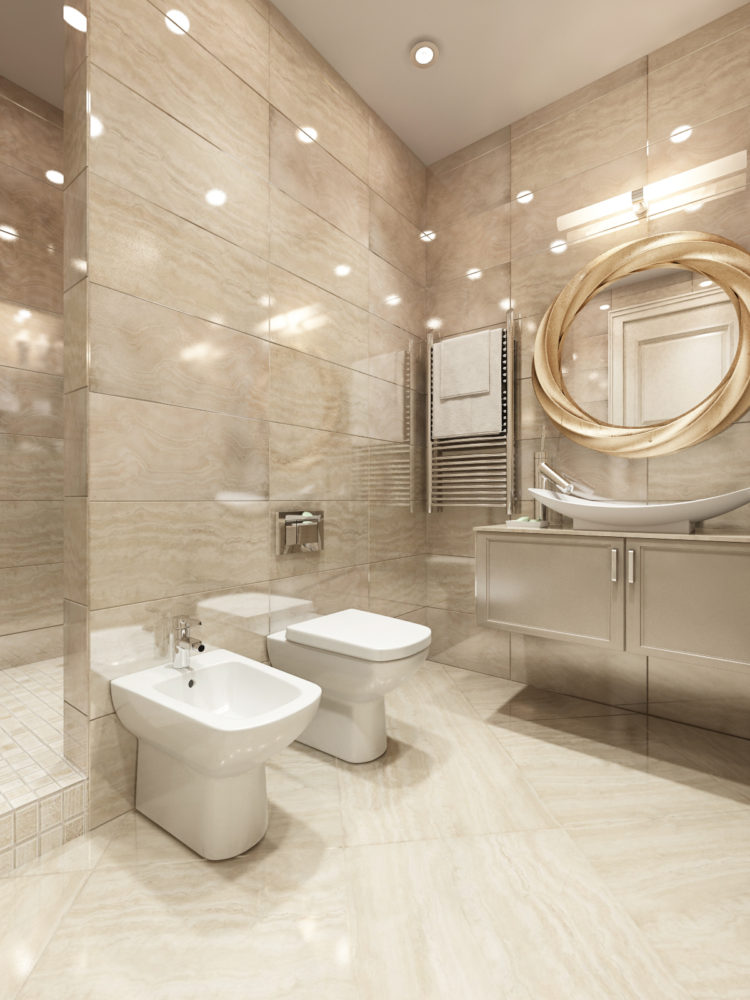
 The apartment is stylistically modern.classics with elements of art deco. The only thing that “stands out” from the ensemble is the bathroom: it turned out to be more modern and dynamic, although there is a hint of art deco here too – a round mirror in a massive frame.
 The overall color scheme of the apartment turned out verylight and calm: the main colors are beige, white, shades of gray, bronze details and wood texture. The role of color spots is played by paintings that are in all the rooms.
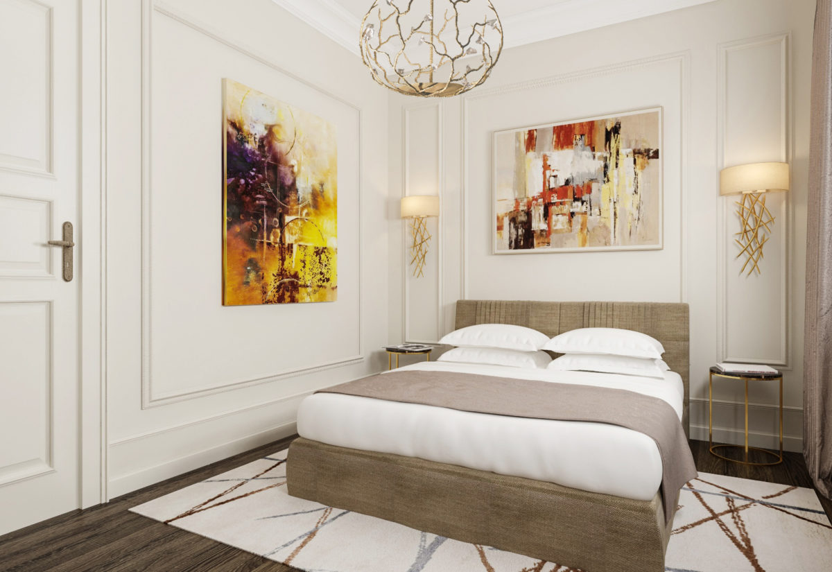
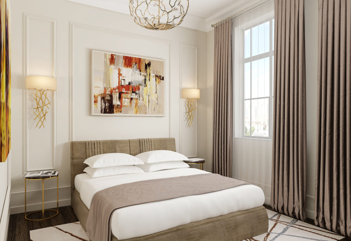
 Alexander Krivov, designer:— As a designer, I use painting in all my projects. The owners of the apartment are quite conservative people, so they preferred a more traditional and calm style of paintings for the living room and their bedroom. In the guest bedroom, at my suggestion, they decided to experiment.
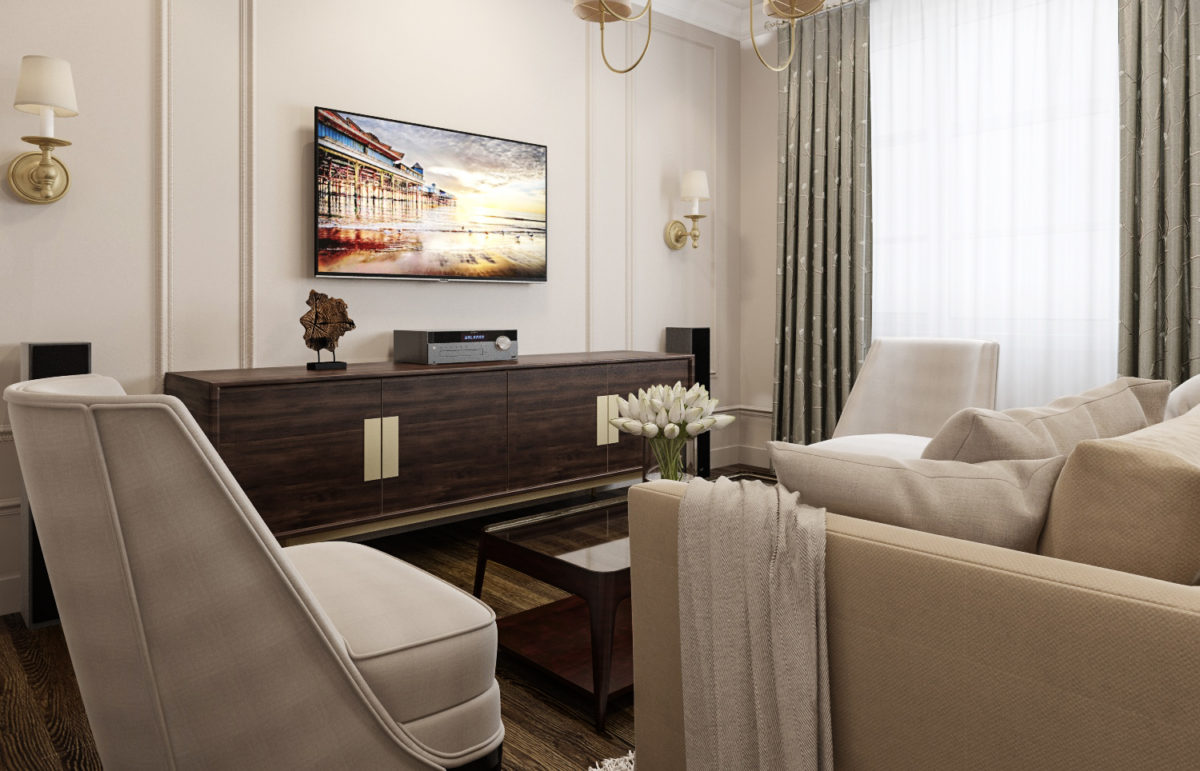
 The public area is effectively divided into twoparts: kitchen-dining room and the living room itself with a sofa and TV group. In order not to weigh down the space, it was decided not to resort to strict zoning and to get by with a competent arrangement that would separate the two parts of the room.
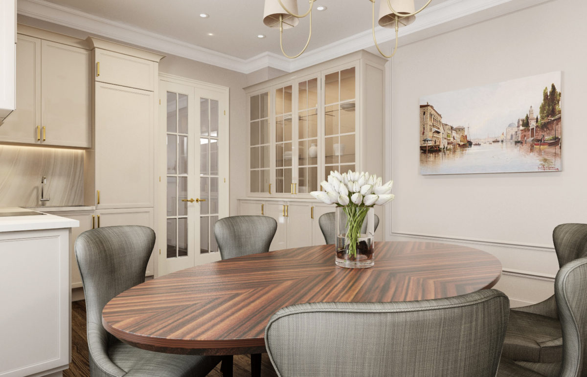
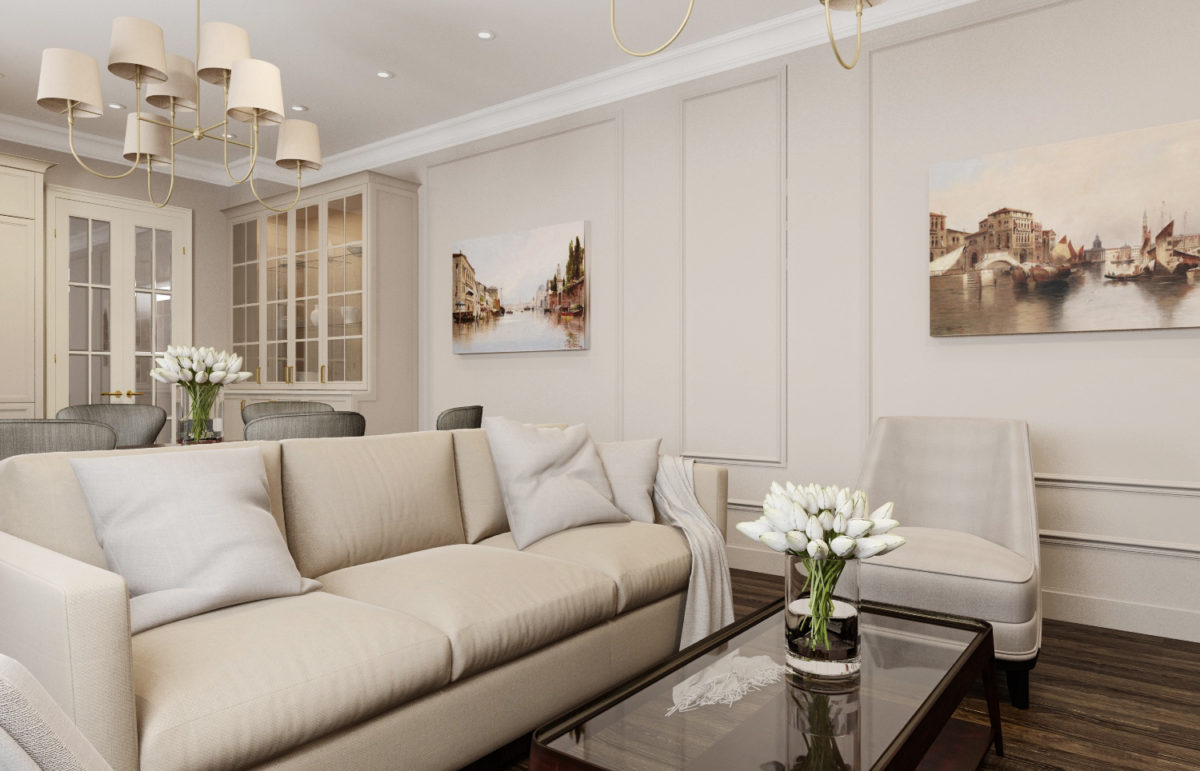 The kitchen area turned out to be a real chameleon: due to the color scheme and simple shapes of the furniture from the Italian factory Aster Avenue, it practically merges with the wall and “dissolves” in the air, without drawing attention to itself. Built-in appliances also help to achieve this effect and also save a lot of space.
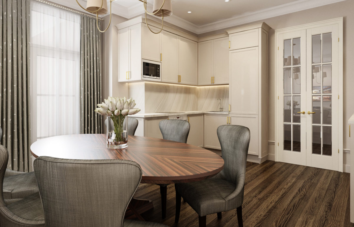 In addition to the paintings, the warm, light palette of the living-dining room is diluted with gray, shades of which we find on the curtains and elegant Marie's Corner dining chairs.
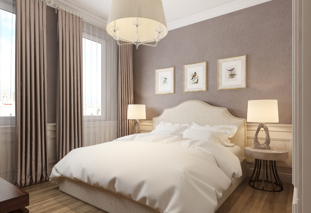
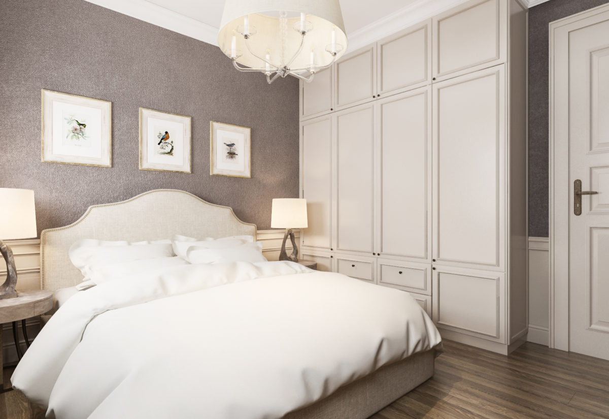
 The decor in the master bedroom is quitecalm and minimalist: only the necessary furniture (bed, console with TV, closet and bedside tables) and discreet decor. Although the apartment has a separate dressing room, a custom-made spacious closet from floor to ceiling is provided for storing clothes in the bedroom.
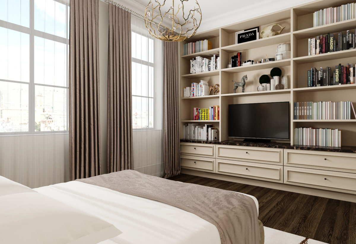
 As already mentioned, the guest bedroom has becomea place of experimentation: here we see bolder paintings, unusual sconces, a lamp from Porta Romana, and various art objects. The guest room also houses a home library, the shelving for which, like the bedside tables with a bronze base and stone top, was custom-made according to the designer's sketches.
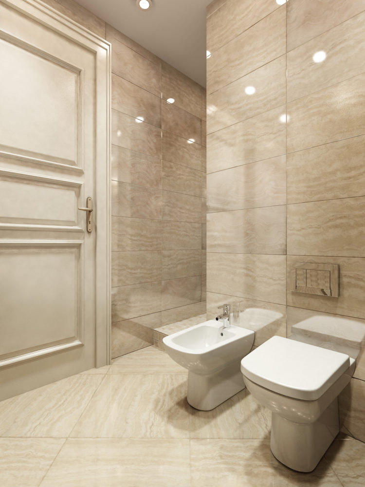
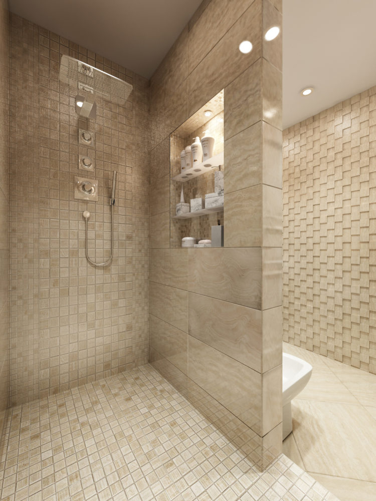
 Despite the characteristic features of this apartment,neutral palette, thanks to the variety of textures the bathroom looks elegant and expensive. The walls and floor are finished with Atlas Concorde tiles and mosaics, the plumbing and faucets are from German manufacturers, Villeroy & Boch and Hansgrohe, respectively.
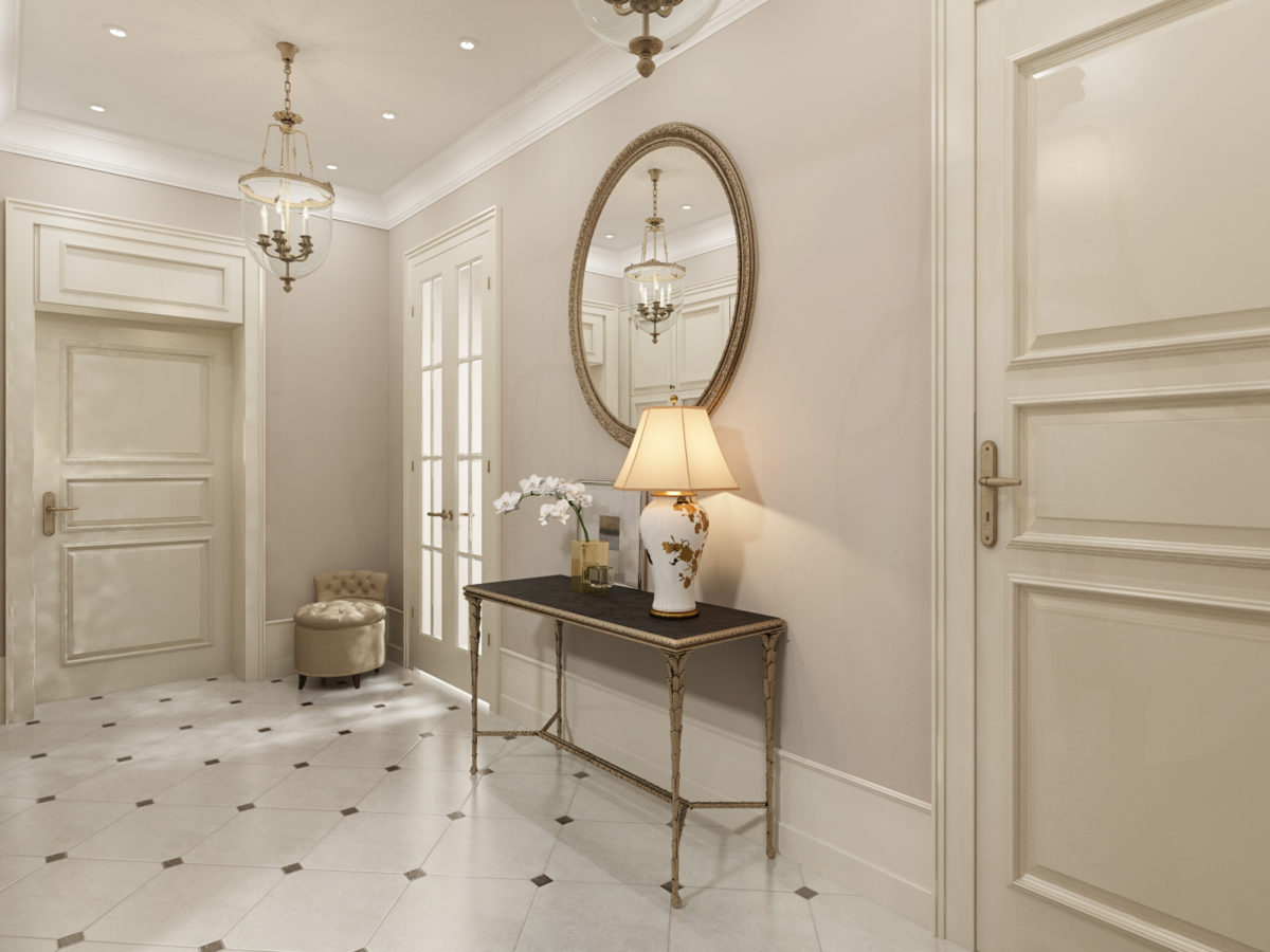
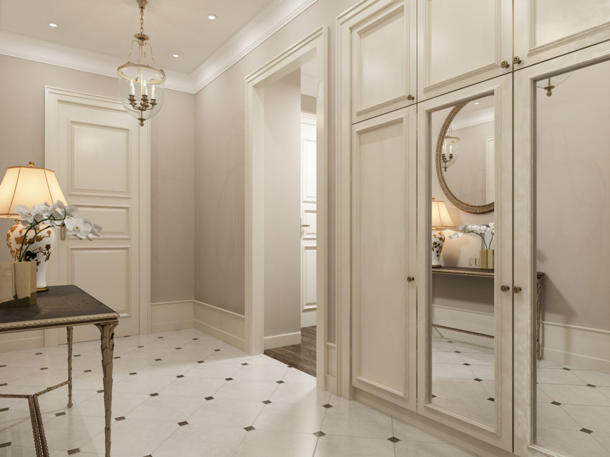
 All interior doors are 250 cm high, as well as the internal overlay on the entrance door, were made to order specifically for this project.
 This interior featured: Living room-dining room:
- sofa — Meridiani (Italy);
- armchairs - Marie's Corner (Belgium);
- coffee table — Barbara Barry (USA);
- dining chairs - Marie's Corner (Belgium);
- dining table — Ensemble London (USA);
- walls - paint Dulux Diamond (UK);
- moldings, plinths, ceiling cornices - Orac Decor (Belgium);
- flooring - engineering board Finex Floors (Russia), the Vincinatta collection;
- stand for audio and video equipment — Philipp Selva (Italy);
- lamps, chandeliers, sconces — Visual Comfort (USA).
Kitchen:
- furniture - Aster Avenue (Italy);
- cooker and hob - Kuppersbusch (Germany);
- refrigerator and wine cabinet - Liebherr (Germany).
Master Bedroom:
- The bed is made to order according to the sketches of the designer;
- flooring - engineering board Finex Floors (Russia), the Vincinatta collection;
- the cabinet is made to order according to the sketches of the designer;
- wallpaper — Arte (Belgium), Flamant collection;
- chest of drawers - Ginger & Jagger (Portugal);
- Lighting fixtures — Visual Comfort (USA).
Bathroom:
- tiles and mosaics - Atlas Concorde (Italy);
- plumbing - Villeroy & Boch (Germany);
- mixers - Hansgrohe (Germany).
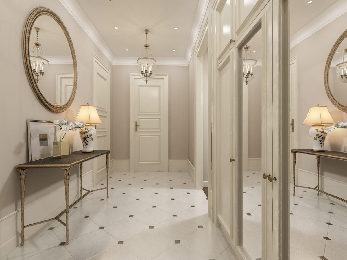
Hallway:
- walls - paint Dulux Diamond (UK);
- flooring - granite;
- built-in wardrobe is made to order according to designer's sketches;
- Lighting fixtures — Visual Comfort (USA).
