If you still doubt the appropriateness of brightshades in the interior, this project is simply bound to dissuade you. It is magnificent and turned out exactly like this thanks to the courage of the owner, who constantly pushed the designers to experiment
In working on this project, designers are primarilywere guided by the character and wishes of the customer. Her large family never sits still, loves new impressions, including visual ones. Therefore, the authors boldly used color and combinations of prints and patterns in textile design, combined modern and classic furniture. Maria Cherkasova, project designer
She graduated from postgraduate studies at Moscow State University.
Worked in major international companies.
Graduated from the Details School of Design.
Since 2011, he has been running a private practice in the field of interior design.
Designs and decorates public and private spaces.
Among the completed projects are the office of the insurance company AIG, client areas of the Toyota Center Kashirsky, Lexus Center Astrakhan, country houses in the Moscow region, apartments in Moscow.
Conducts his own lecture course at the Design & Decoration Center.
Member of the International Art Foundation, holder of an MBA degree. Anna Pronskaya, textile designer
She graduated from the interior design courses at the Moscow State Academic Art University in Memory of 1905.
The designer’s portfolio includes dozens of completed projects, both his own and as a business partner of the company “Arte Domo” (www.artedomo.ru).
Collaborates with many famous architects and decorators as a consultant and designer of the textile part of the project.
For over ten years, he has been teaching his own lecture courses, “Textile Interior Design” and “Basics of Composition for Decorators,” at the Details School of Design and the British Higher School of Design.
Regular lecturer at Design & Decoration Center in various cities of Russia and neighboring countries (www.dd-center.ru).
Prepared and conducted courses for textile designers of the companies Arte Domo, Ampir Decor, Artik, KADO, and Art Chalet.
Member of the Creative Union of Artists of Russia and the International Federation of Artists.
— The guest wing to the country house wasdesigned by architects, but the client turned to us for the interior design because she wanted a colorful, slightly eclectic interior with a bold mix of prints and colors. Often during the work she pushed us to bolder decisions, saying - "we are capable of more."
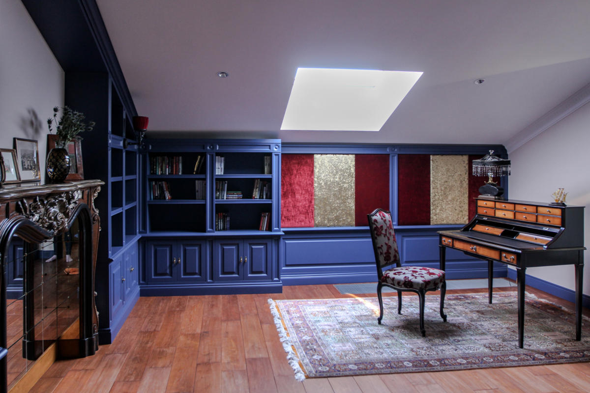
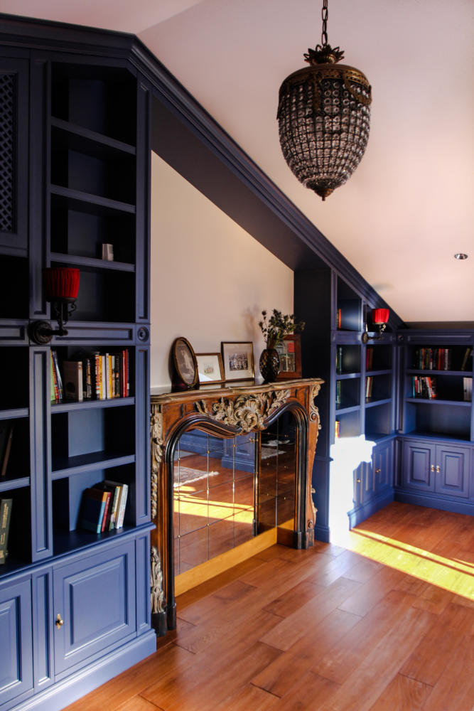
In the process of work we combined one smalla guest room in the attic with a library. The result was a full-fledged large room with a ceiling at the highest point of 3.8 m. In order to beautifully play up such a ceiling height, it was necessary to work hard, consider several options, as a result it was decided to build cabinets right up to the ceiling, leaving space for paintings above the fireplace. The library cabinets of a deep ultramarine color were made to order according to the designer's sketches. Production dragged on for more than one month, but the customers waited patiently.
Even with such a height and recessed windows in the ceilingthe light was not enough. We commissioned a lighting project from lighting manufacturers Martini to calculate the illumination to guarantee good light. This was very important for the customer. With the right technical light, it was possible to afford beautiful decorative light.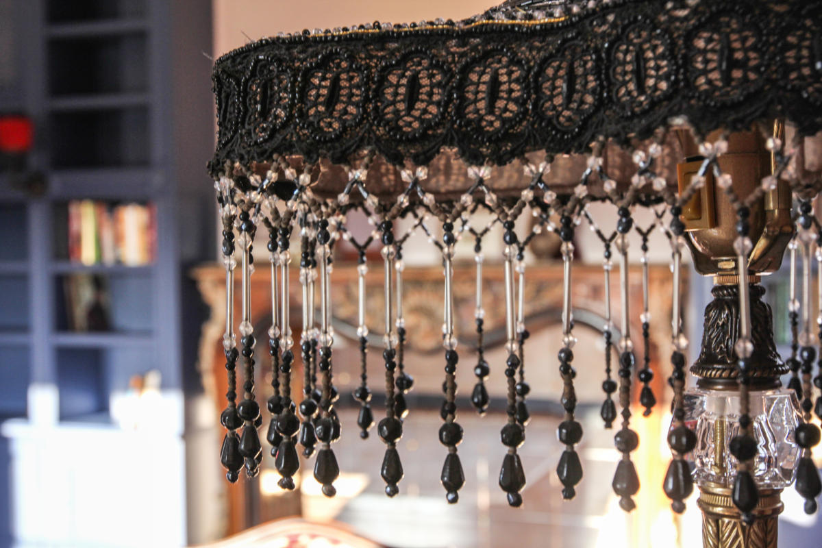
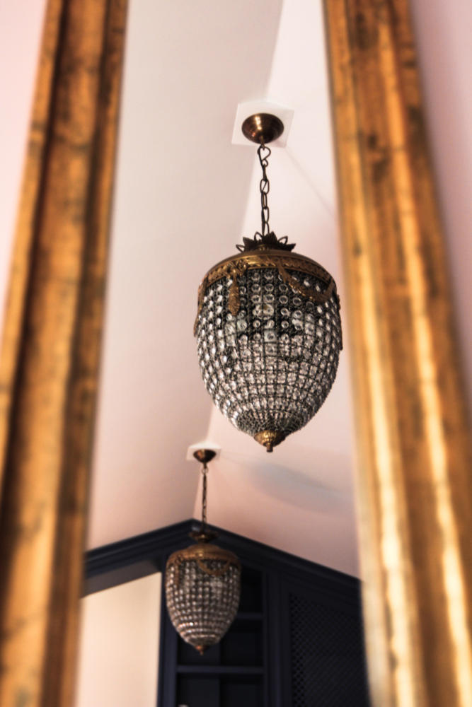
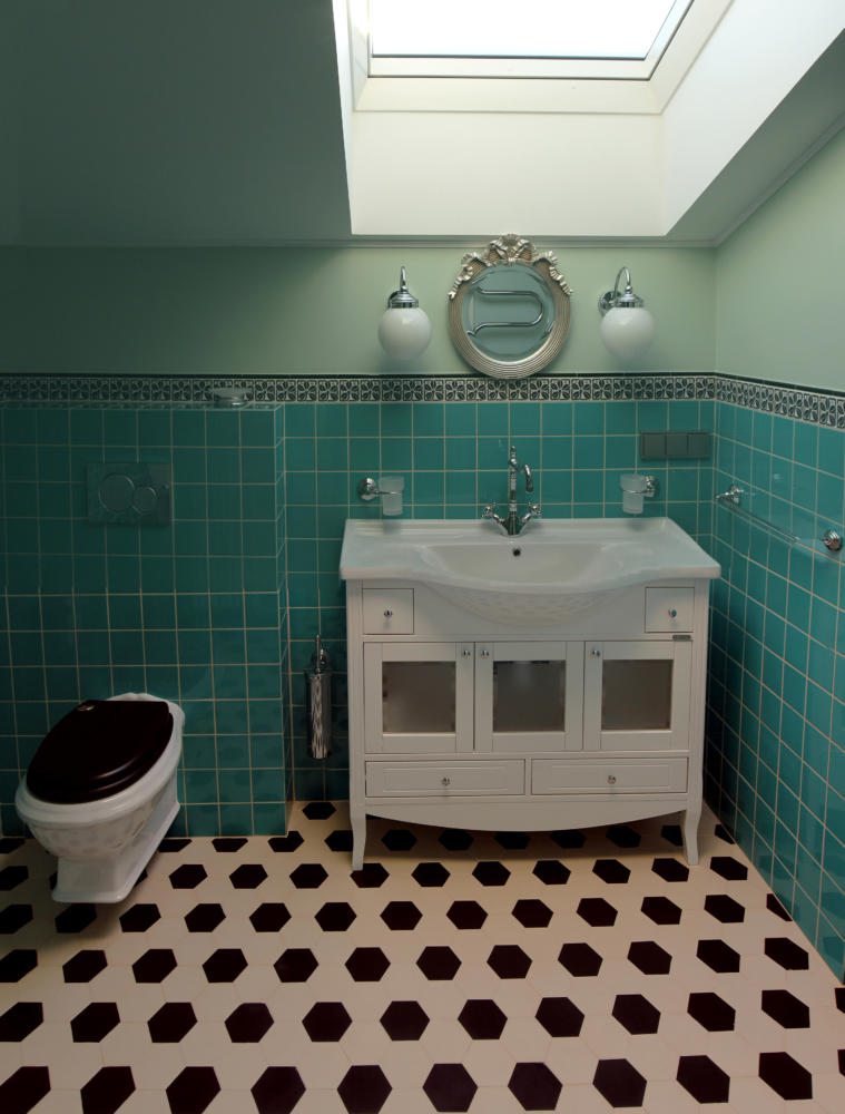
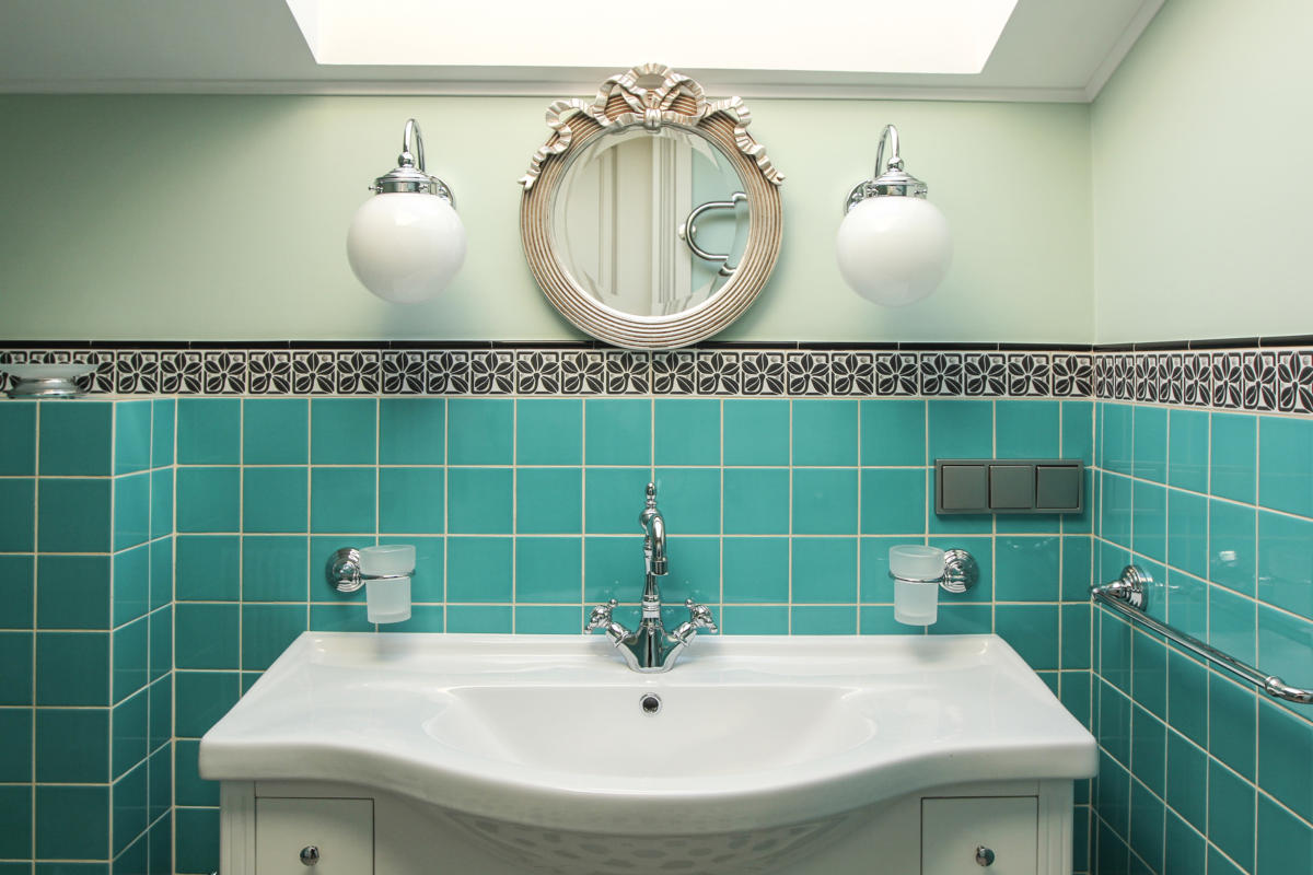
The bathrooms required special attention, whereThe ceilings were quite low — it was necessary to fit the mirrors in so that you could look into them. In one case, we took a small round mirror, in the other — a hinged mirror. Both rooms are equal in status, so it was decided to make them according to the same principle: a black and white floor and colored walls. One of the bathrooms was painted in a wonderful yellow shade of Little Green, and now it is a room where it is always sunny. The other one is in a marine mood. In the bathrooms, we used Mettlach tiles (on the floor) and plain ceramic tiles on the walls — from the Greta Wolf salon.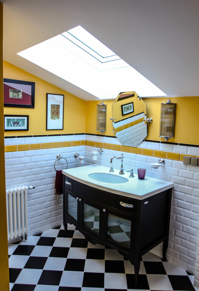
The most difficult thing was to design the interior so that, despite such high ceilings, the rather intimate room – the bedroom – would not look empty.
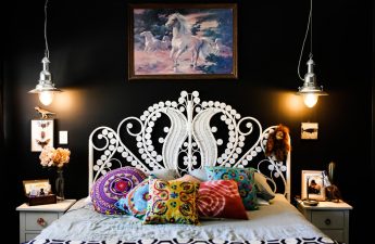
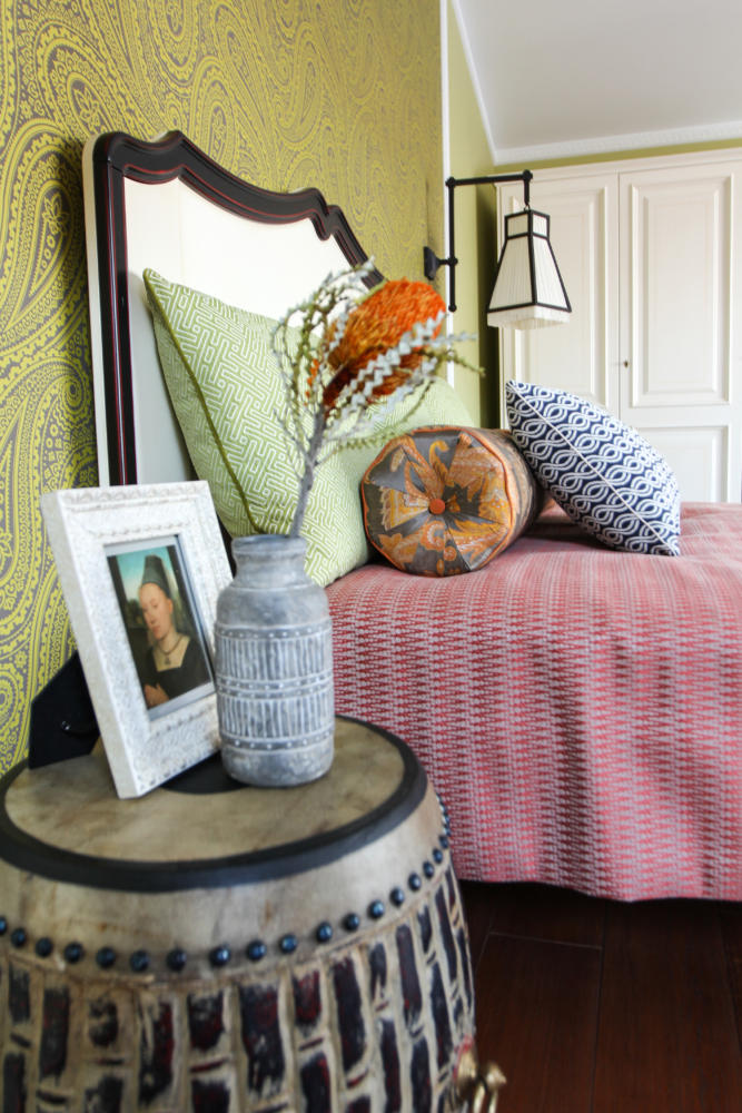
We chose a French bed from Siguier withwooden headboard and Judeco sconces. They were chosen because something large had to be chosen for the ceilings of such height, and the dark metal edging framing the white fabric lampshade rhymes perfectly with the headboard. Behind the bed is a decorative panel of Villa Nova wallpaper, which sets the desired vertical.
Andrew Martin bedside tables have made a differenceethnic note in the interior, and we supported it in the textile design: the Aldeco Incognito bedspread, the Cassaro Andalusite pillows, added geometry to the Twisted Rope from Robert Allen. In general, it was important for us not to get too carried away with the ethnic theme. The hyper-large lampshade brought a modern sound.
All the cabinets in the library are custom made.
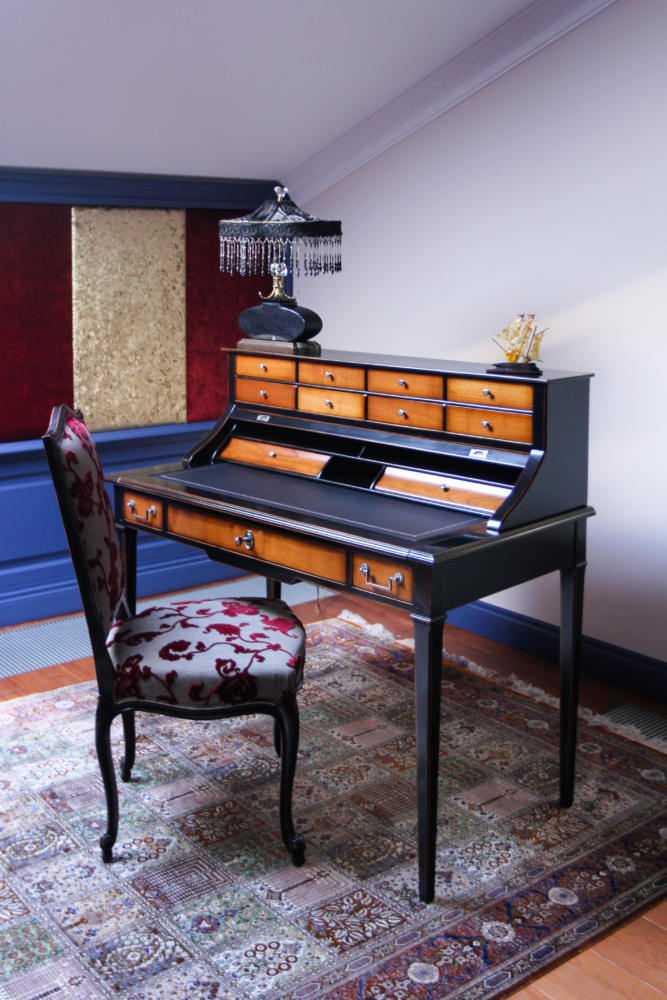
Writing desk — Moissonnier.The search for a sofa was incredibly long, we went through many options, but in the end we settled on the comfortable Marie’s Corner, choosing upholstery from Robert Allen for it. The fireplace is antique, from France.
On the fireplace are framed photographs brought fromour order from the famous Belgian brocants. The carpets are Iranian, the sconces by the sofa are Vaughan. The sconces on the Jacques Garcia cabinets were also not chosen right away - it is not so easy to find red lampshades. There was another funny story with these sconces - the Serbian workers showed creativity and installed them upside down.