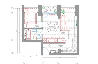
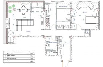
Designer furniture, rainbow lighting and living mosson the wall. In just 50 square meters, designer Victoria Pashinskaya and her team managed to create an extraordinary interior of a club apartment for a successful businessman. And the most interesting thing is that you can not only throw parties in it, but also live comfortably. The project that we will show you today is unusual. When turning to designers, customers - be it a large family or a confirmed bachelor - almost always ask to create a practical and cozy interior in which you can relax after work, spend time with each other and just gain strength. A striking example of this is the project of designer Victoria Pashinskaya, which we wrote about in . Victoria also decorated the interior of this apartment, but the wishes of the customer - a young, but already very successful businessman of 27 years old - turned out to be far from traditional. He owns more than one property, so he decided to turn this small one-room apartment into a real mini-club. Victoria and her team were given complete freedom of action with one wish: to create a bright, emotional and exciting interior that is ideal for parties with friends. Victoria Pashinskaya, designer Victoria is the founder and head of PV Design Studio. In 2011, she graduated from the interior design department of the Moscow State Stroganov University of Art and Industry, and since 2012 she has been a member of the Moscow Union of Designers. Victoria's works are exhibited at art exhibitions in Russia and published in various Russian and foreign publications. She has participated in projects on TNT, MIR, and other TV channels. Professional credo: "The success of any project consists of the ability to hear and understand the customer, a well-thought-out volumetric-planning solution, compliance with the budget and an interesting plastic and coloristic solution for the space." www.art-design-victoria.ru Layout The main changes in the layout of the apartment affected the entrance area: having slightly transformed the area of the living room, a large built-in closet was placed in the hallway. Also, since the owner plans to receive a large number of guests here, the room was combined with , turning it, together with the kitchen and dining room, into a single space with zones smoothly flowing into each other.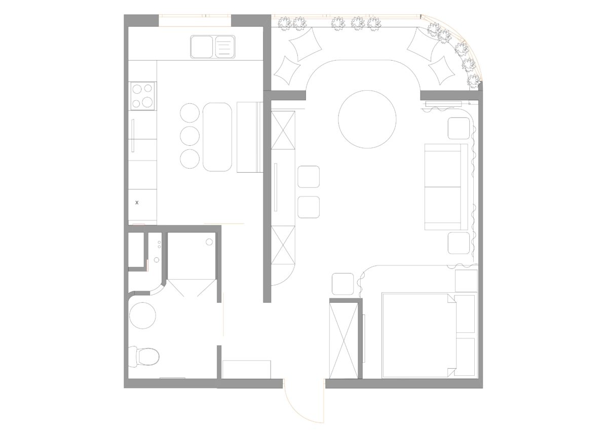 Victoria Pashinskaya, designer:— We managed to place everything we needed in an area of 50 sq. m. Despite the club concept and extravagant solutions in this interior, I know from experience that the premises can be used as a residential area in the future. That is why we took care of comfort, providing space for a full-size double bed and organizing a spacious storage system in the apartment. Living room The living room is, in fact, a club chillout, in which quite a large number of people can comfortably accommodate and communicate. Thanks to the combination with the balcony, we were able to place two sofas in the room at once: one — a white modular one, upholstered in wear-resistant Alcantara fabric — by the window, the other, emerald — opposite the TV. Under the TV area, we allocated space for indigo-colored poufs, which can be taken out if necessary to create additional seats. To visually make the small room more spacious, tall mirrors were hung opposite the emerald sofa, and the wall behind the TV was decorated with mirror mosaics. The furniture facades above the TV area were decorated with easy-to-care-for living moss.
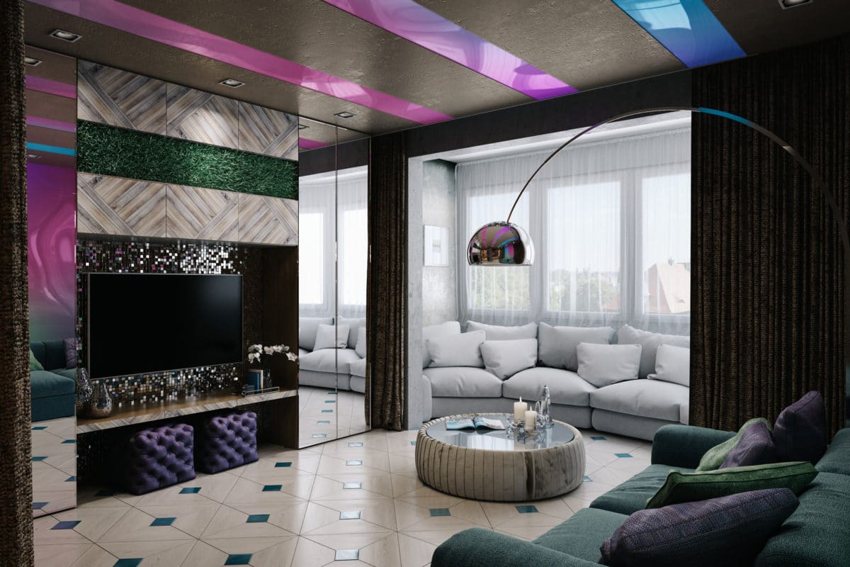 The undeniable advantage of this apartment islarge windows, so additional lighting is not required during the day. Built-in lamps and a floor lamp are provided for the dark time of day. The sleeping area is separated with thick curtains, and a TV is located opposite the bed. When decorating the interior of this room, Victoria used several of her favorite techniques at once. Firstly, the effect of rounded corners, which significantly changes the proportions of the room and also softens the transition from the walls to the ceiling. Secondly, high hidden doors, which also correct the proportions of the room and help to visually stretch the room with low ceilings upward.
 Victoria Pashinskaya, designer:— Over the years of work, we have developed a number of characteristic techniques and original developments: the absence of baseboards, the play of textures, volumetric-spatial structures that we use in our projects and thanks to which the interiors become recognizable. At the same time, for each room we try to design and bring something new, individual, special, something that has not been used before — and in this interior there are many such elements. Kitchen-dining room Initially, the ceiling in the kitchen had a small difference in level, which Victoria decided to play with using one of the original developments of her studio — an art structure that not only forms a comfortable and unusual sofa area, but also perfectly disguises the ceiling defect and complicates the plasticity of the room. To make the structure even more accentuated, it was decorated to look like wood and used LED backlighting, softly emphasizing its shape. It was decided to use built-in lamps as additional lighting. The ends of the structure are also illuminated in all the colors of the rainbow: this emphasizes the atmosphere of the club zone and simply lifts the mood. On the other side of the dining table, instead of classic chairs, three round metal stools were placed.
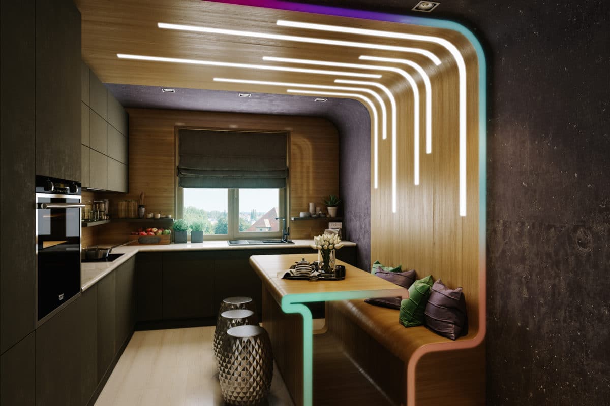 To arrange an L-shaped kitchen unitas planned, the lower part of the window had to be bricked up and a transom installed. The worktop is made of marble, and a fairly new, but already well-proven material, Ceramic, was chosen for finishing the facades. It is wear-resistant, completely hygienic, heat-resistant, easy to care for and environmentally friendly - such a combination of characteristics is not available to most materials used in modern kitchens.
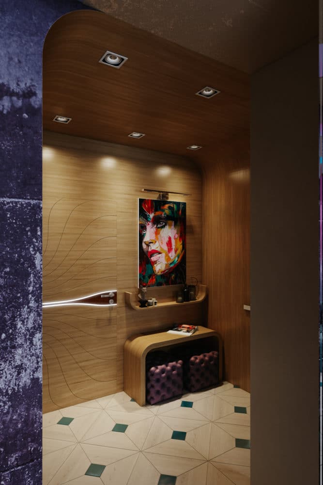
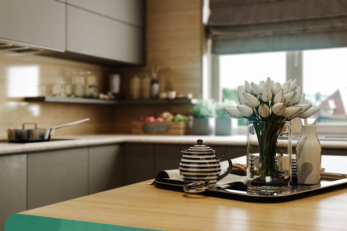 Victoria Pashinskaya, designer:— For the kitchen-dining room we chose rather dark colours of the warm spectrum: reddish-brown, grey-brown, ginger, dark purple. To create a balance of colours in the right proportions, we used ginger and grey-brown, which together look very noble, sophisticated and masculine. Hallway The walls in the hallway are finished with wood-effect panels. Along one wall there is a console of a smooth shape, made to order according to the designers’ sketches, two poufs, a small shelf for small items and a colourful painting by the contemporary artist Françoise Nielly. Opposite there is a spacious built-in wardrobe with .
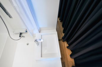
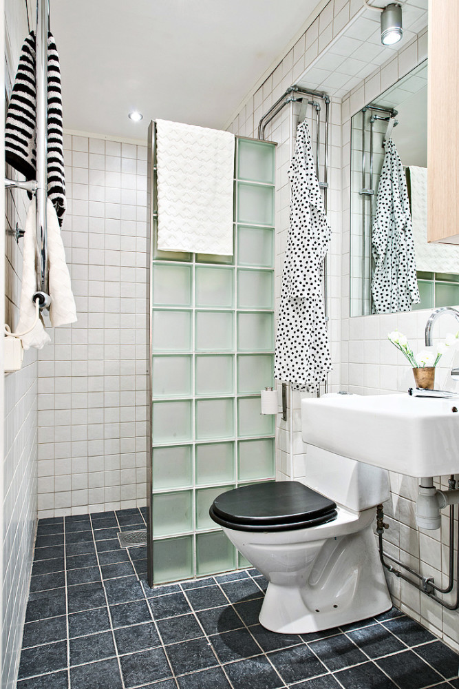
 Bathroom For the bathroom we chosea more intimate mood. The decoration uses wide slabs of onyx - an elegant translucent stone with a variety of shades and an amazing ability to transmit light and transform in its natural form or with backlighting. In addition to its expressive natural pattern, onyx has high strength properties and low water absorption, so it is well suited for finishing "wet areas". Aquacement was used to finish the floor, and Baldini decorative coating was used for the walls. A bright accent in the bathroom is an unusual mirror, made according to the sketches of the studio designers.
 Victoria Pashinskaya, designer:— Our team had a lot of fun working on this interior, as the task was extraordinary: to create a bright, ambitious and at the same time slightly brutal and very personal space. The interior uses many natural materials: onyx, marble, solid wood, linen, and the furniture was almost entirely designed by us for this project, which once again emphasizes its individuality. This interior used:
- Emerald sofa in the living room - Forma (Russia);
- Coffee table - Tonin Casa (Italy);
- Kitchen set - Giulia Novars (Russia);
- All other furniture is made to order according to the sketches of designers;
- A washbasin combined with a pedestal, and a hanging toilet bowl - Laufen (Switzerland);
- Lighting in the hallway - SLV (Germany);
- Picture - Françoise Nielly;
- Slabs of onyx in the bathroom - Antolini (Italy), model Alabastro Egiziano;
- decorative coating in the bathroom - Baldini (Russia);
- Floors in the room - EWF Officine Parquet (Italy).
