Among the fans of the classical style there are many whowho prefers good old England to all directions. Today, using a Moscow apartment as an example, we will consider how you can create an interior for Sherlock Holmes right in a new building. At the request of the customers, a married couple with a girl child, the developer had to create a variety of interiors, while maintaining a single style of classical severity and restraint. Architect Nadezhda Malykh decided to implement each of the volumes in its own color scheme. The project was developed for a new building, before the finishing work stage. All internal partitions were installed according to the developed and agreed plan. There are several unifying motifs - similar colors with a predominance of some one tone, the same light, popular today "bleached oak" parquet, a single execution of ceilings with an upper powerful plinth. In the hallway, bathroom and kitchen, the floors are covered with tiles of contrasting colors. But the main thing is that this is a calm classic, without shocking and revolutionary interior solutions. The clients asked not to show the office and children's room to a wide audience, so these photos are not included in the publication.
Good old England
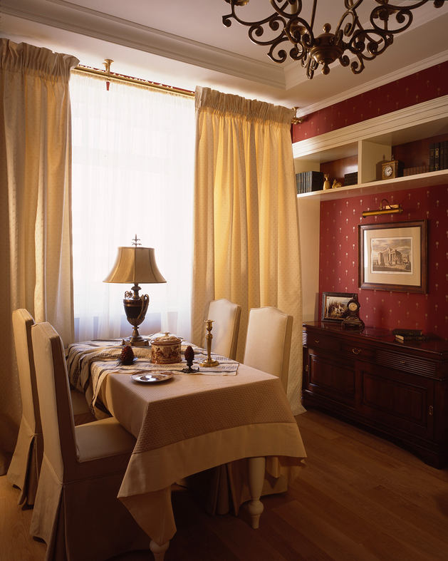
Looking at the interior photos, we understand thatthe task of obtaining diversity within one style was solved quite successfully. The brightest, literally and figuratively, was the living room, very reminiscent of the classic Victorian style. True, instead of heavy panels - a thick burgundy (red-brown terracotta color) matte silk wallpaper. And the cabinet furniture is "not according to the rules" white (as are the doors), but soft, not leather, and there are no blankets. But the general atmosphere of "good old England" is present. By the way, in the open shelves we still see the classic wooden cladding of the vertical surfaces. The proposed option was very much to the taste of the customers, who happily agreed to burgundy in combination with white and yellow-gold, these turned out to be their colors.

Cream, custard and chocolate glaze
Light, tiled work surface— not by the window. Comfortable, of course — that was the hostess’s wish. That’s how the kitchen turned out — the lightest in the entire interior. And with Scottish motifs — thanks to the colors and patterns of the island’s cladding and floor tiles. The mood is added by the layout of the glass cabinet doors and the bright, expressive soft chairs. The delicate cream apron made of small tiles extends along the other walls and continues the cellular motif of the room. The soft color of the wall tiles “reflects” the terracotta of the island cabinet, floor, and chair upholstery. The result is a classic color transition from white through pink-cream to dark terracotta. Even in the more “rigid” living room in terms of contrasting color combinations, there is no heaviness, and the kitchen is simply airy, filled with light.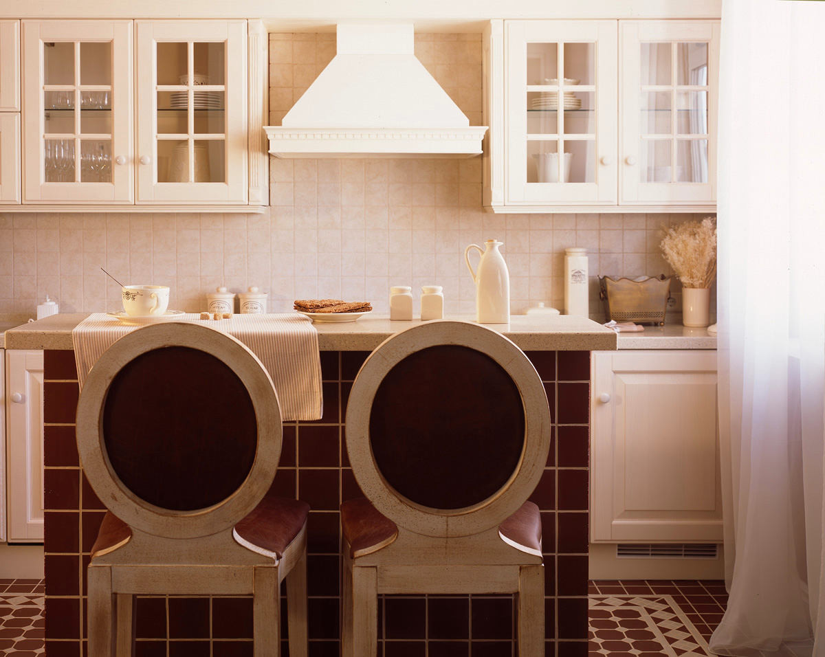
Chintz bedroom
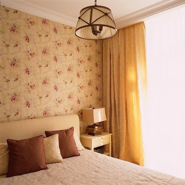
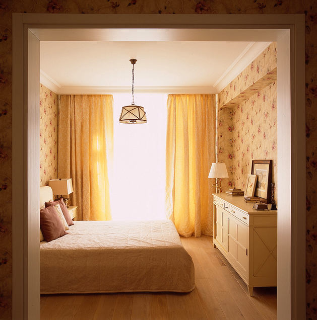
Nadezhda Malikh's bedroom turned out to be frankly "not"masculine" and very calm, which was specifically stipulated by the customers. The owner dictated her vision - no shocks or anything complicated, everything should be classic and even conservative. "I have enough shocks at work, as does my husband, here we only want to relax. We don't need a TV in the bedroom, here we plan to relax exclusively. And let nothing distract us at all." Almost no decor, everything is very laconic and without architectural excesses. Stylish furniture, a stylish chandelier and lamps (floor lamp and table lamps on bedside tables) - everything is designed in a soft creamy-cream range, which is the absolute "mistress" here. The snow-white portal of strict geometry unites the bedroom with the rest of the interiors, where white is also present, but in different quantities.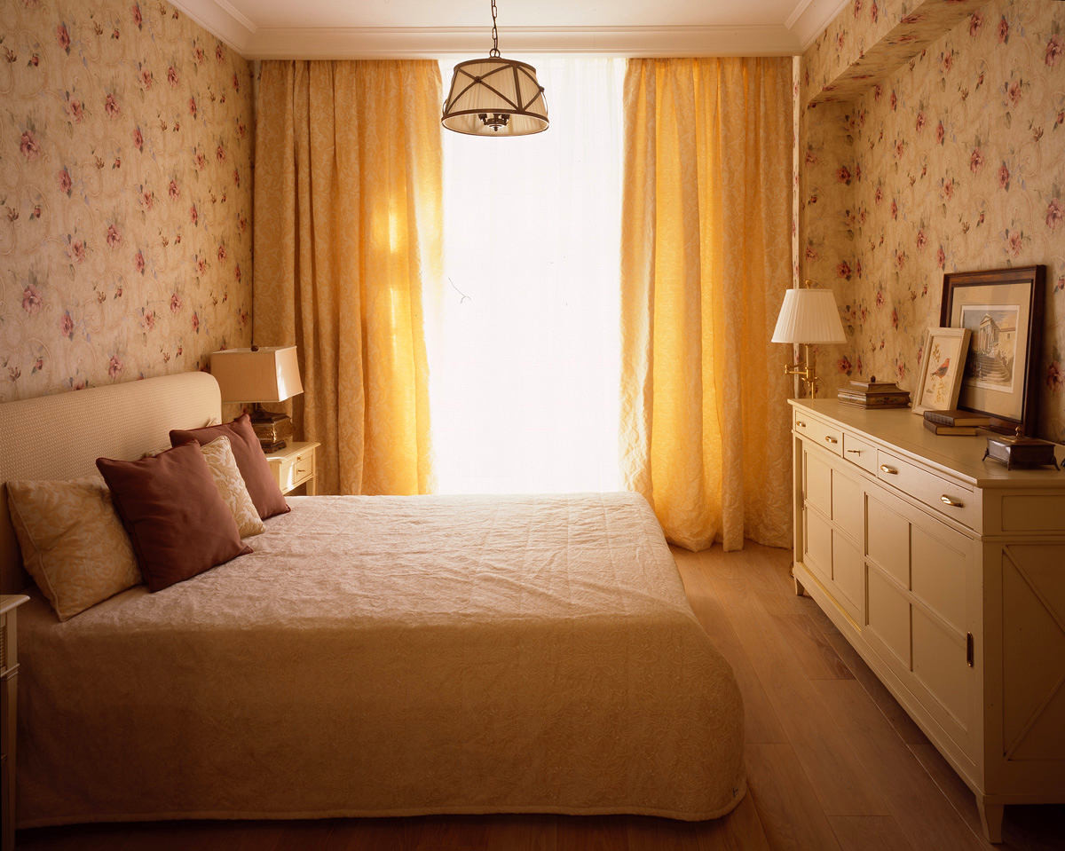
A separate world of the bathroom
The only place in the apartment where they are presentother color combinations — this is the bathroom. Once again, the designer managed to effectively move from a dark, thick, grassy-green tiled floor through a vertical pattern of tiled wall panels with a border to creamy yellow and to snow-white on the ceiling — these transitions are pleasing to the eye. Stylistically, if you look at the furniture and plumbing fixtures, the room is made in a predominantly geometrically strict classic style. The geometry gives rigor, its deliberate rectangularity — it turned out very neat and “tasty”! Accents: gold fittings, echoing the medallions of the border. The ovals depict dog muzzles of different breeds — this is also a step towards customers who have a dog and generally love animals and nature. And there was another condition — a large mirror. Fulfilled — the room became visually larger, additional volume appeared.
 Nadezhda Malykh, architect Graduated from MoscowArchitectural Institute (MARCHI). Is a member of the International Art Fund, section "Design". Designs unique residential and public interiors, private houses and apartments. Works in various styles - from classical to modern, taking into account the wishes and suggestions of the customer. In his work, he focuses on new and progressive world trends in interior design. nm-arch.ru
First person
My goal is to make people's lives comfortable, which means happy, using my creativity and knowledge.
For me, design is, first of all, creationconditions for a comfortable life. I am inspired by the personalities of the people for whom I design, the desire to see something new and progressive, inherent in each customer. Taking into account the wishes of customers, my knowledge and experience are able to turn a routine process into a creative one and get results that exceed all expectations.
Nadezhda Malikh
When selecting decorative materials, it is oftenit is impossible to avoid plot images - on wallpaper, tiles, friezes. It turns out that the interior is filled with some images, pictures in the form of ornaments and this gets out of control. However, for us this does not play a significant role, the main thing is that everything is collected by color, textures, proportions and many other, perhaps not immediately noticeable parameters.
Nadezhda Malikh
Furniture and interior items, decoration
Floor:
- bathroom - tile Petracer,
- entrance hall, kitchen - tile Topcer,
- rooms, corridor - parquet "whitewashed oak".
Walls:
- hallway - York wallpaper,
- corridor - painting, Beckers,
- kitchen - painting, Beckers,
- living room - Thibaut wallpaper,
- bedroom - Effinger wallpaper,
- bathroom - tile Petracer.
Light:
- bedroom - chandelier Christopher Hyde; lamps Charales; floor lamp Ralph Lauren,
- living room - chandelier Chapman; lamp Fine Art Lamps.
Furniture:
- kitchen - Scavolini; barstools Cabiate; technique built-in Kuppersbuch,
- living room - Bushnelli sofa; sofa Duresta; dining table Minacchiolo; desk journal Busatto; bookcases Busatto; Cabiate chairs,
- bedroom - Lorigine cupboards; Bushnelli bed; chest of Lorigine; wardrobe Benedetti,
- bathroom — plumbing Villeroy & Boch; composition under the sink Skavolini; tiles Petracer,
- hall - high Lorigine chest of drawers; doors SJB.
Techniques used
- Zoning. The delineation of functional areas is most clearly expressed in the transition from the hallway to the rest of the apartment. Firstly, it is a tiled floor and, secondly, a different wallpaper.
- Expansion of space, addition of volume,an association. The most obvious example is the entrance portal without doors leading to the bedroom. He simultaneously sharply differentiates the zone of the corridor and the sleeping area, but at the same time leaves space common, uniting. The union function is performed by the same parquet floor. No less interesting is the expansion of the volume - traditionally through a mirror in the bathroom.
- Accent. "Golden" sanitary fittings in the bathroom, the pattern and color of kitchen tiles on the island's curbstone and on the floor. Imagine that this would be either a tree or something monochrome - the room would become flatter, sluggish.
- Contrast. This reception is most vividly expressed in the living room - white furniture and a white door against a background of dense walls. Stylistic contrast - the "gold" sanitary fittings in the bathroom.
- Stylistic support. In the living room pieces of furniture - free-standing tables, chairs, sofas - are made of dark walnut. This color is mainly in English style. The furniture in the hallway, the mirror frame in the bathroom - the same, look like "things with a story."
A conservative interior can become irresistible
— — What were the main requirements?the customer? — The most important thing is a categorical absence of innovation, excess of decor, unjustified embellishment. Conservative calm classics, as it was formulated. — What is the main idea of the entire project, and what did you put into each of the rooms? — The idea turned out to be one and only: to ensure that the customer's requirements are met, but at the same time to create something interesting. My opinion is this: the bedroom interior is the "simplest", but it is "saved" by excellent furniture and a selection of lamps. The most interesting rooms for me are the living room and bathroom, where I still "frisked" a little, but carefully. When the burgundy of the living room was being agreed upon, the customers were very surprised that such an intense and rich tone helps to embody their idea of the classics. The bathroom, with all the laconicism of the solutions, perfectly demonstrates how even the most conservative interior can become irresistible thanks to high-quality finishing materials. Well, and a bit of eclecticism - I'm talking about the faucet, shower mixer. - How did you come to the choice of colors? - I can't answer. Just sorting through the options for near-classical solutions for each room, I realized that a cold range would not suit categorically. It turns out that I didn't really have much of a choice. But burgundy and dark grassy are, of course, very interesting. However, these are my favorite colors. - How long did the renovation last? - Quite a long time, about a year. When I first saw the scope of work, the room had no partitions at all, only concrete load-bearing structures and monolithic walls. This was essential for my clients - they wanted to build a "nest" from scratch, at their own discretion. We spent a long time choosing the layout, taking into account the location of window openings, doors to the balcony and loggia, utility networks (risers). The final version can be assessed on the plan. The result turned out well, the customer gave the go-ahead to implement the project. - Where did you buy finishing materials, furniture, accessories? - As always - from catalogs, of which we, like any studio, have many. The order was made through our regular supplier, with whom we have long established a trusting relationship. - What is the approximate budget for such a serious design of a large apartment from scratch and turnkey? - For obvious reasons, I will not name the exact figure. But this is the middle price segment, closer to the highest.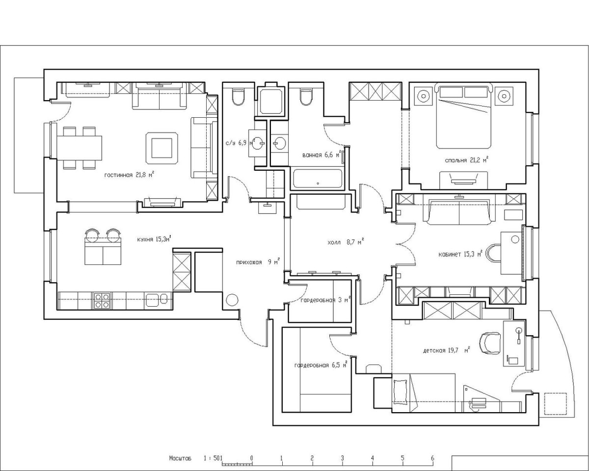 nm-arch.ru

