When buying a large apartment, few peoplewondering what to do with the "extra" square meters. After all, there won't be many living rooms anyway, based on the number of windows. And there's still tons of meters left. Read our article on what to do with them. Much has been written about how to make a convenient layout in a small apartment, but little is known about how to correct the mistakes of developers in large apartments. In pursuit of square meters, no one seems to notice that they end up with unimaginable "three-room" apartments with an area of 150 square meters. That's when the work of architects comes in demand, who have to not look for hidden opportunities, but, on the contrary, successfully fit in the "extra" meters. Today's article is dedicated to the achievements of the Tor-Ard bureau on the battlefield with a monstrous layout from a developer. Mikhail Egiyan, architect and engineer Graduated from Moscow State University of Civil Engineering (MISI). In 2004, he founded a construction company, in 2006, a design studio, and in 2012, the Tor-Ard architectural bureau. He heads a team of specialists who create high-quality interiors. This apartment in a prestigious building in the west of Moscow was bought by newlyweds a couple of years ago. At that time, they assumed that there would be several living rooms on 140 meters and still some space left. At the time of the apartment's delivery, when they were able to see it together with an architect from the Tor-Ard bureau, it became obvious that the depth of the rooms (the distance from the wall of the common hall to the windows) was almost 10 meters, while there were only four windows. Thus, it was possible to distinguish four rooms with natural light: a bedroom, an office (future children's room), a living room, a dining room-kitchen. The customers decided to combine the kitchen with the living room and dining room, resulting in a three-room apartment with two spacious dressing rooms, two bathrooms, a home laundry room and a pantry with wine cabinets, and the ratio of living and utility space was 50/50 percent. At first, the owners thought this ratio was unreasonable, but after carefully examining the resulting layout, they realized that it would be very convenient to live like this. You can place all your things, including those that often have to be stored in the garage or at the dacha due to lack of space, and there is even room for bicycles.
Layout
All utility rooms and bathrooms are lined upaway from the windows, and the bedroom, study and spacious living-dining room, which is also the kitchen, are located along the front wall. Despite the logic of such a layout, a considerable area (23.8 square meters) was allocated for the hallway and corridor, which was planned in this way due to the insistent desire of the owners to make the premises isolated.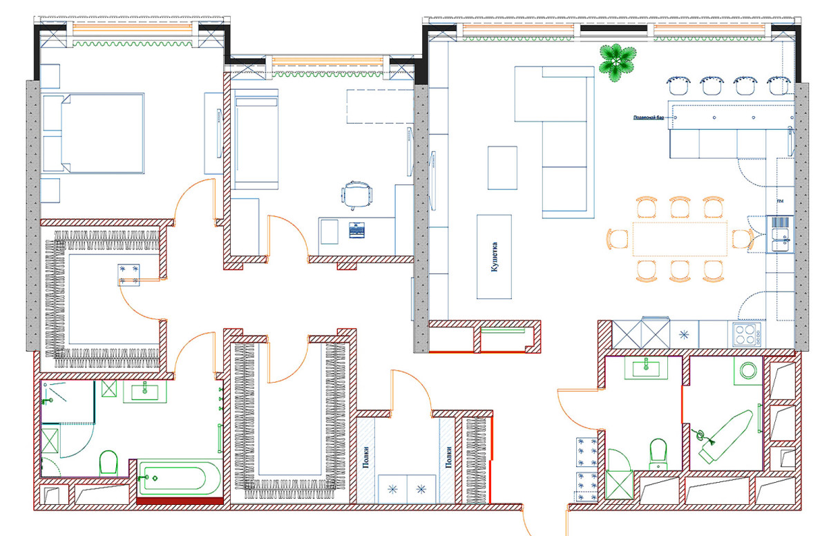
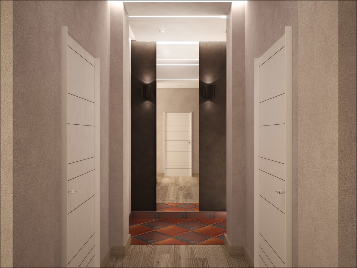
Hallway
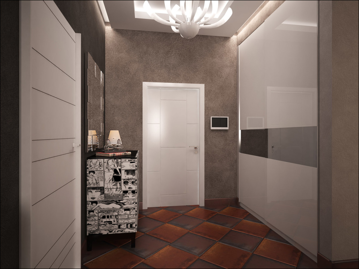
The hallway sets the tone for the entire interior from the threshold.It immediately becomes clear that the interior will be dynamic, contrasting, expensive. This is "spoken" by the white glossy panels of the cabinets and doors, dark walls, interesting tiles on the floor. A special chic is created by a lamp made of Murano glass.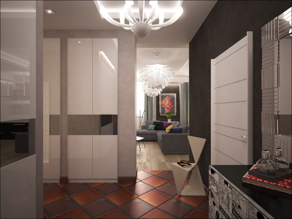
Living room
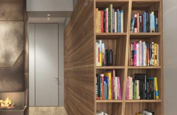
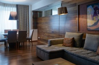
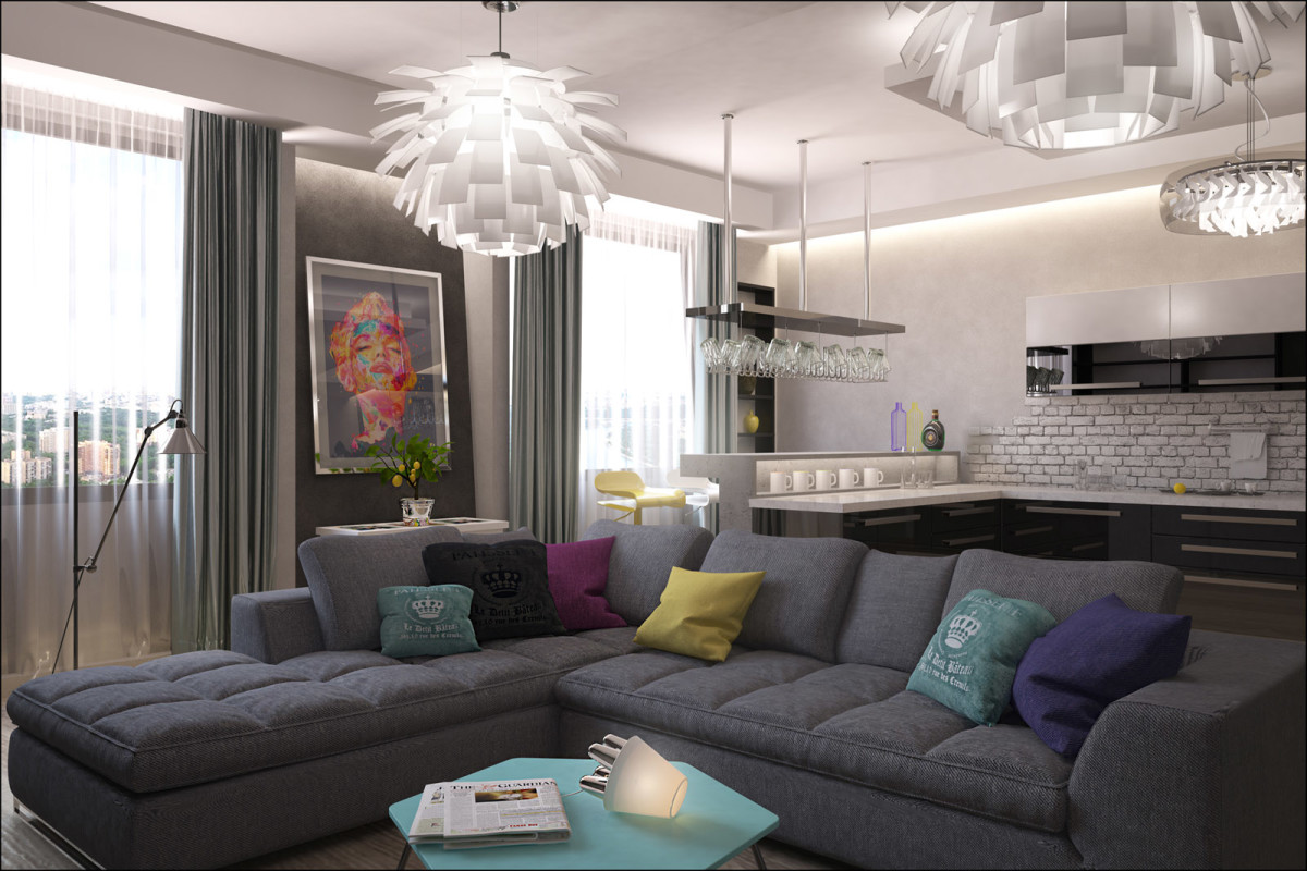
In the center of the living room there is a large cornersofa. There was also room for books in this room. And although the shelves are not designed to hold thousands of volumes, they can accommodate a fairly decent library.
Kitchen
The kitchen is equipped with built-in appliances "to the last detail"maximum". For this purpose, a niche was designed, where tall and deep cabinets fit. There was also room for a small bar counter. The long countertop allows you to cook "on a grand scale", and many cabinets will accommodate all the supplies and dishes. The only possible downside to such a combined layout is the smells, but a powerful hood above the stove will deal with them.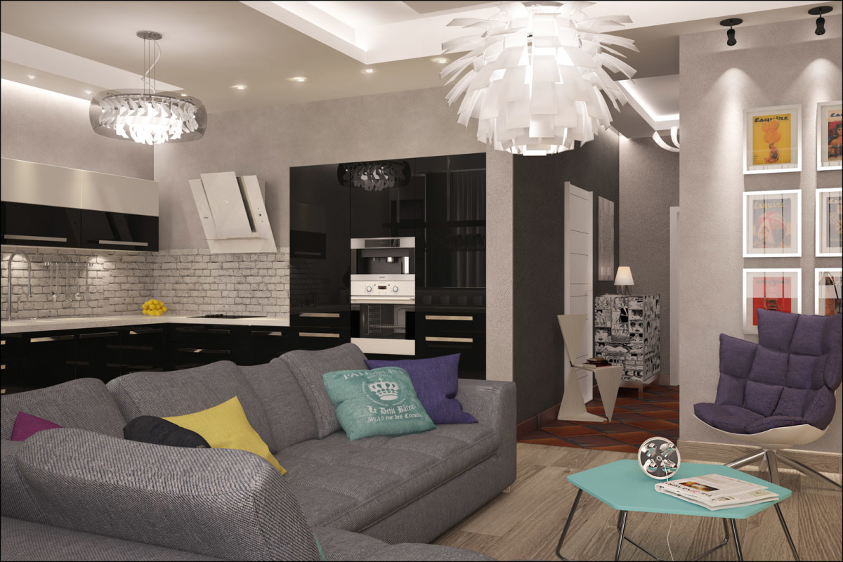
Bedroom
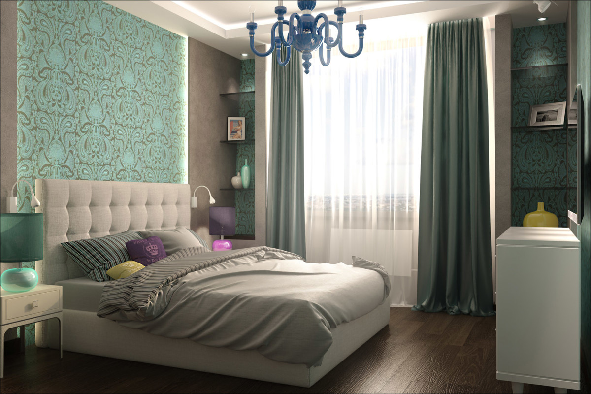
The most remote room is allocated for the bedroom.You can't hear the noise of the TV in the living room or the sounds of cooking. But there are spacious dressing rooms and a bathroom nearby. In the design, the designers of Tor-Ard adhered to a neoclassical approach, when modern objects are combined with classic stylizations. The headboard of the bed is an interpretation of capitonné upholstery. Turquoise wallpaper with an ornate pattern is supported by a ceiling lamp.
Cabinet
In the future there will be a nursery here, soThe interior is made as neutral as possible. Later the walls will be covered with cheerful wallpaper or painted in a joyful color. Now the room looks more like a bachelor's haven: boards on the wall, a computer with a large monitor, a soft sofa and a TV with a game console.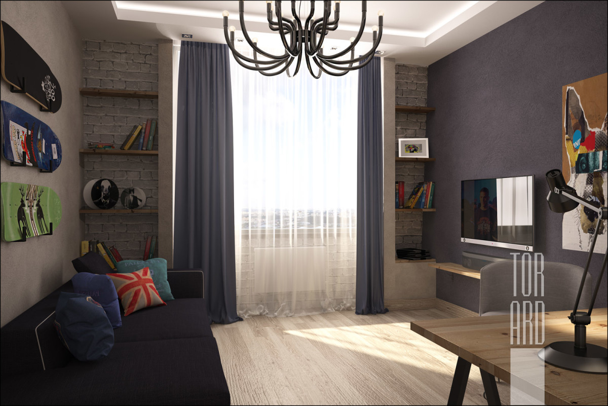

Bathroom
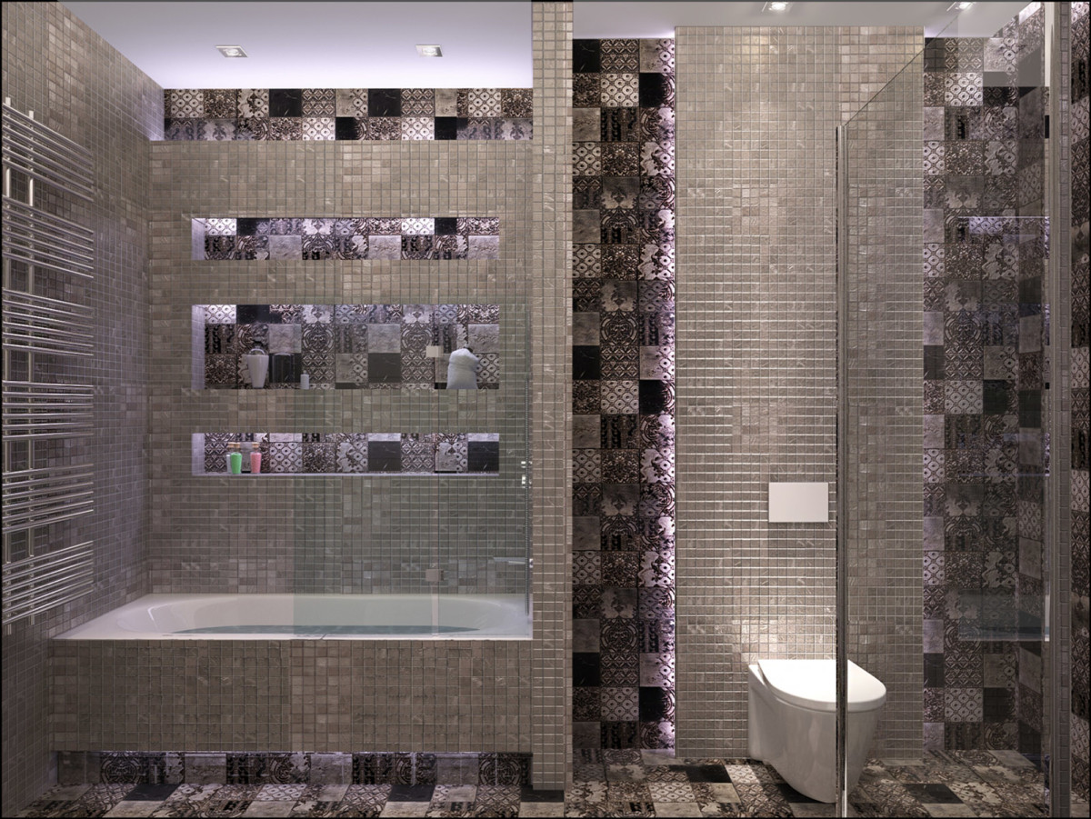
Mosaics and small decorative tiles have transformedsanitary unit into a luxurious room for water procedures. Built-in lighting and an abundance of modern sanitary equipment gave it the character of an advanced spa. Pay attention to the bathtub and shower cabin. These are now installed in most such bathrooms.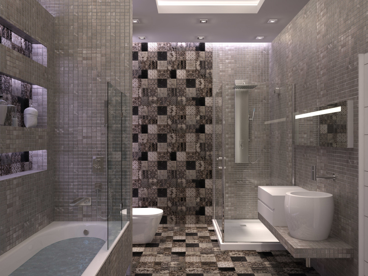
Guest bathroom
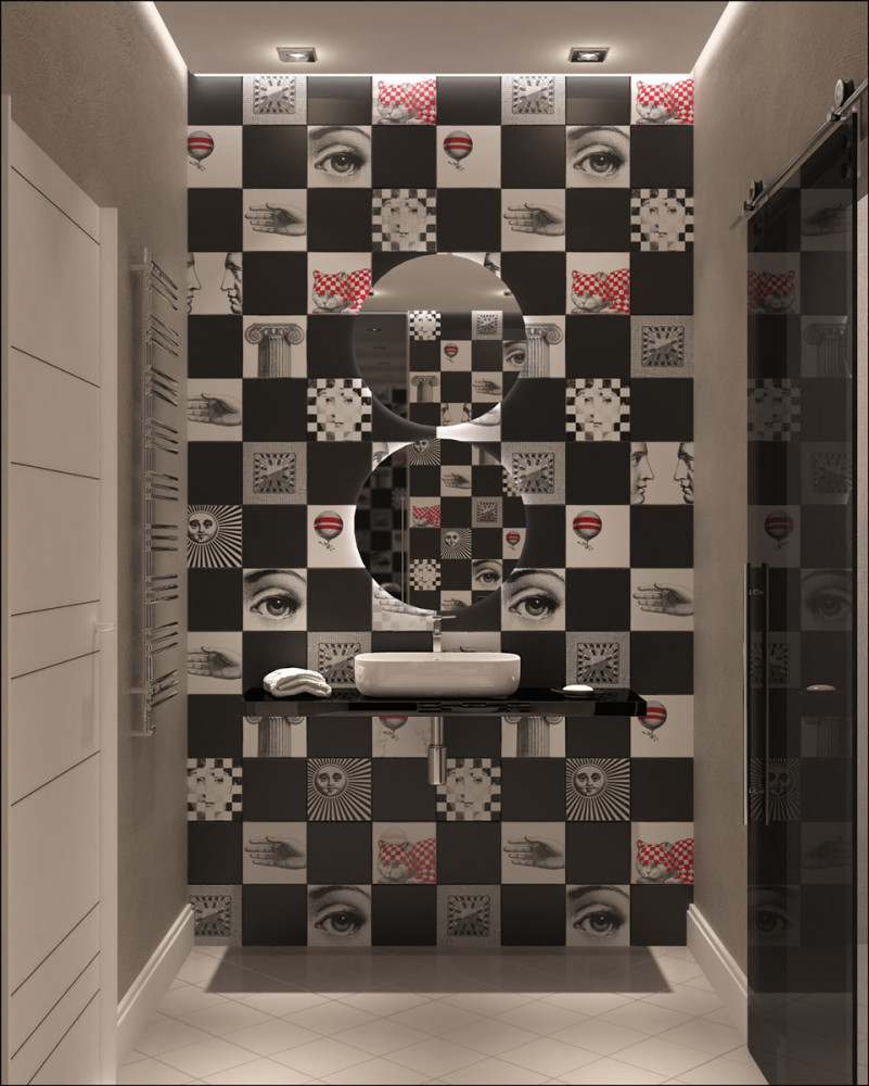
The guest toilet turned out to be the most decorative,thanks to the square tiles Bardelli. This collection not only brings an element of play into a utilitarian space, but also, according to the idea of the authors of the project, creates a wow-effect for guests who see it for the first time.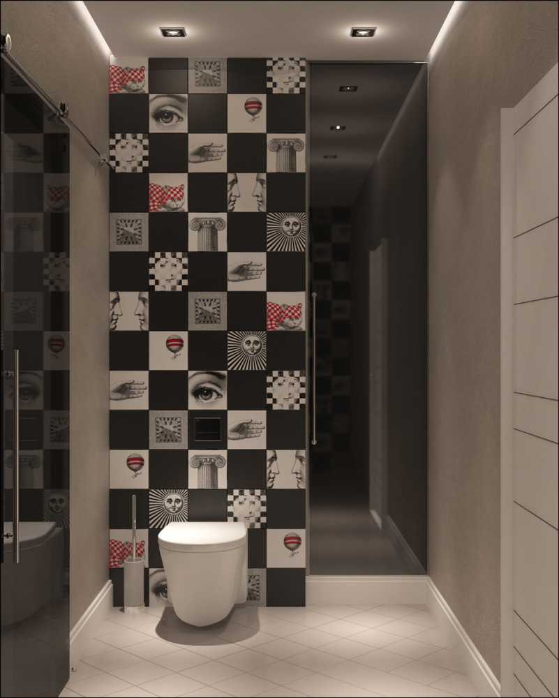
Corridor
The corridor has a zigzag shape; to visually enlarge it, the designers used a mirror, which they glued directly to the wall in one of the bends.