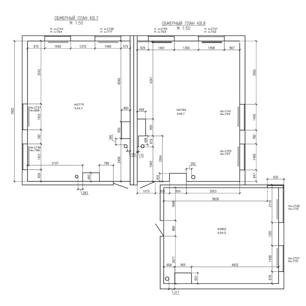
How to unite three under one roofapartments, zone them correctly and make a non-standard layout as functional as possible, and the interior - bright and unusual? Let's figure it out using the example of a five-room apartment from the Zi-Design studio Today, you have a very unusual project in front of you: we are not talking about one apartment, but about three! And all three customers - a young, active and very positive family - wanted to "collect" into a single home. Maria Zarodova took on this extraordinary, sometimes complex, but ambitious and definitely interesting project. Maria Zarodova, designer Graduate of the architecture and construction faculty of the Yaroslavl State Technical University. Believes that beauty in modern housing and the pace of life is not justified if there is no functionality in it. In her work, she prefers a large amount of light and air, combining the customer's needs with her vision and design solutions. www.zi-design.ru The unification of three different apartments into one determined the non-trivial nature of the layout: for example, it was impossible to avoid a large number of narrow corridors. Maria played up this feature with the help of built-in furniture and various visual divisions. They also helped to divide the housing into several functional zones: work, "adult", children's and common.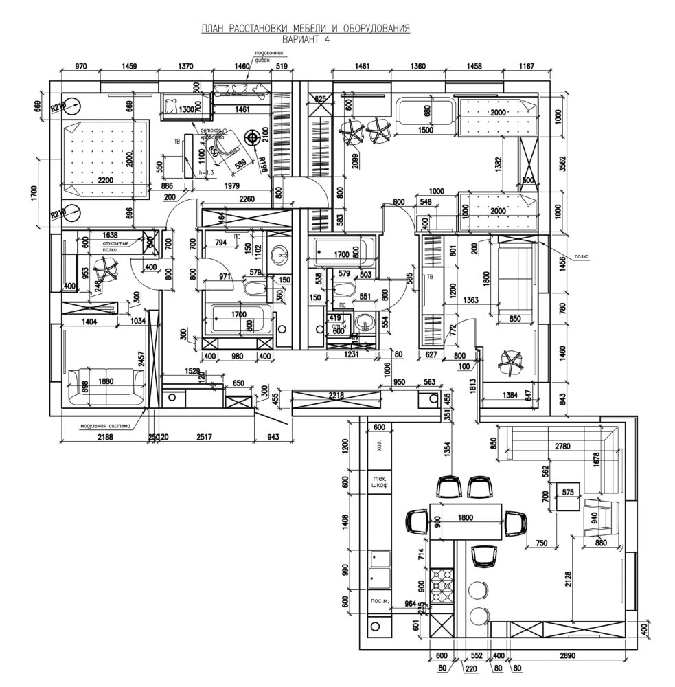
 Maria Zarodova, designer:— The idea was very complex: to make the rooms as diverse as possible under the general concept and mood. So that when moving from one to another, the mood would change, but at the same time the apartment would still have one rhythm and atmosphere. The inspiration for me was primarily the customers themselves, as well as the huge number of different textures, prints and shades that we looked at during the period of defining the concept. As we have already said, quite a lot of corridors were formed in this apartment. One of them leads to the “adult” area, where the customer’s office, the combined bathroom of the apartment owners and their bedroom are located. The office serves as a kind of “den”, where everything looks exactly the way the owner wants.
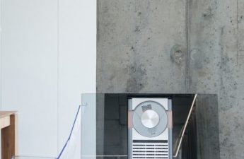
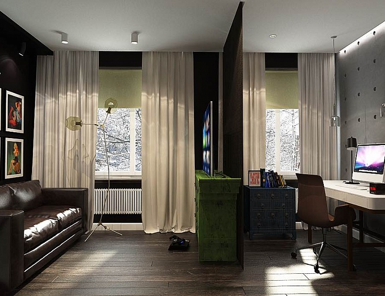 This room turned out to be very brutal, withworn, as if already "lived" surfaces. It perfectly reflects the real male spirit and mood of a bar or garage. At the same time, accents in the form of modern lamps, posters and other decorative items add the necessary share of style to the interior.
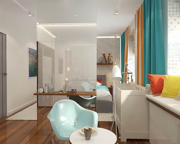
 The bedroom had to convey all the lovecustomers to the Scandinavian style, not necessarily directly. In this interior, it is referred to by light walls as a background, light furniture, warm shades of wood and bright decorative accents.
 In the center of the room there was a column, whichalso needed to be played up somehow. It was decided to use it as a zoning tool, separating the space for parents to sleep and the TV area from the crib-cradle of the baby, who was born during the period of work on the project, and the rest area. This side of the column was given over to a mirror and a console shelf, replacing the owner's dressing table.
 Since the parents' bedroom is adjacent to the younger children's room, Maria came up with an interesting idea: to hide a secret door from the bedroom to the children's room under one of the room's facades.
 In the “younger” children’s room, the designer faced another difficult task: not only to organize a secret door to the parents’ bedroom, but also to create a comfortable and harmonious space for a boy and a girl.
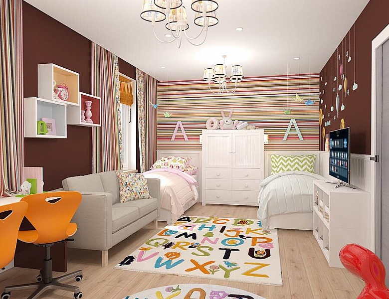 For now, the newborn will remain in the bedroom.parents, and only their daughter will live in the room. However, when the baby grows up, he will keep her company, so there should be two of everything in the nursery: two beds, two nightstands, two chests of drawers, two work places and, in general, two independent, but compatible worlds.
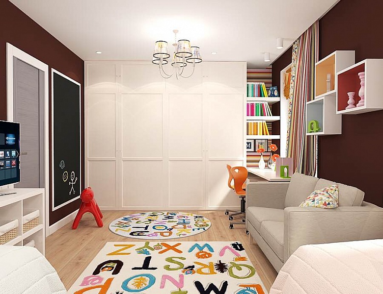
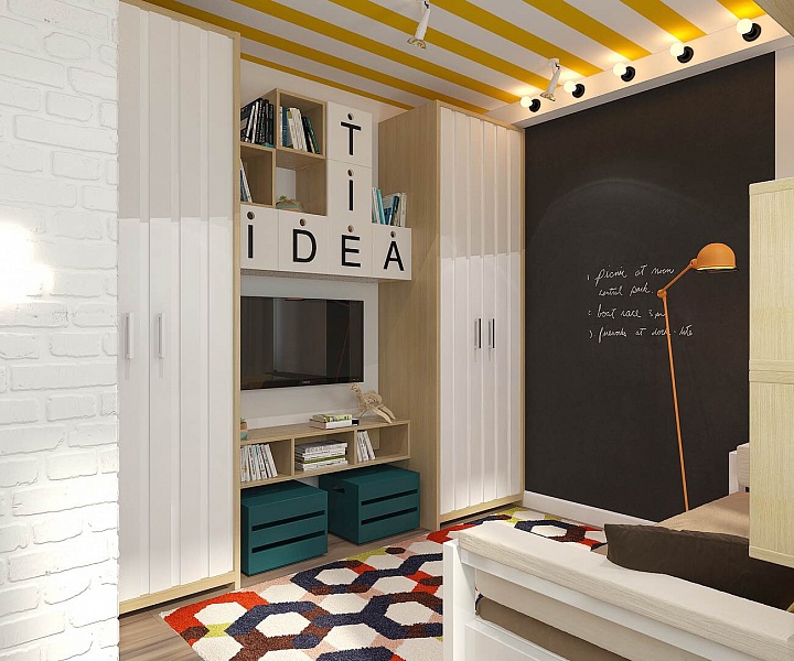
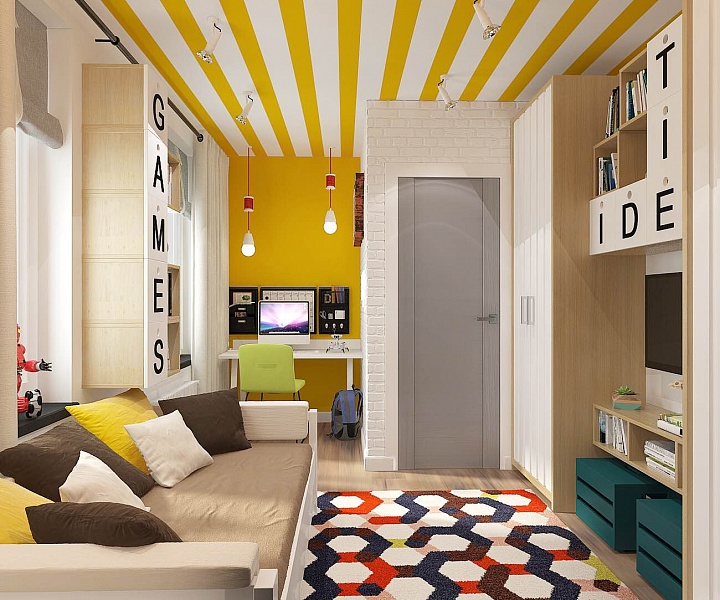
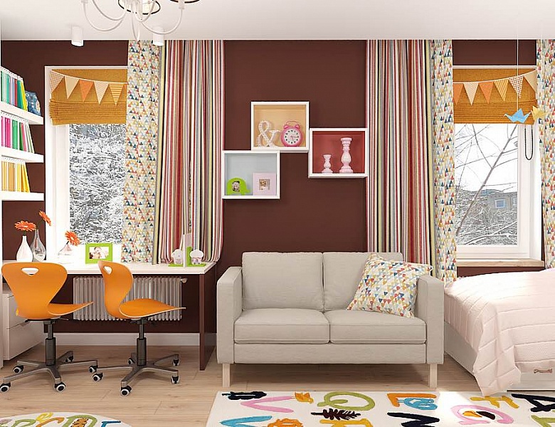 In addition, the children's room had toturned out to be so diverse in its functions and so interesting to its owners in terms of games and development of creative abilities that solutions for this room were the most difficult to find. In the process, a chalk board for drawing, open storage systems, a comfortable sofa with a TV area and two soft carpets for playing on the floor appeared in the children's room.
 Another children's room - the eldest son's -already, rather, teenage. The wishes were as follows: it should reflect a boyish character, a youthful mood, this maximalist view on many things, be interesting, multifaceted and contribute to solving creative problems.
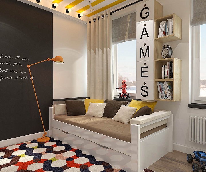 While planning the interior of this room, Mariatried to give it character, to make it reflect the boy's inner world and become his favorite room in the house. To do this, the designer used bright colors, various textures and prints, interesting shapes of furniture, decor and lamps.
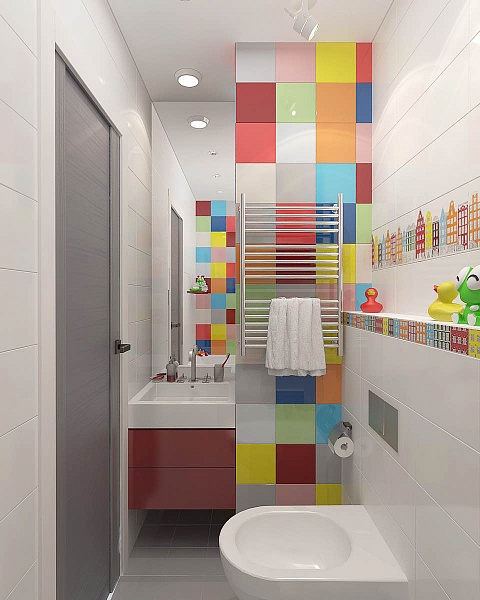
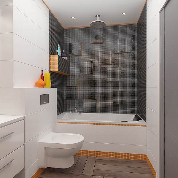
 At the end of the “children’s” corridor there is a second bathroom.It turned out simple, but very cheerful, bright and colorful, charging with vivacity and positive energy. This was achieved by mixing multi-colored tiles, the overall variegation of which is diluted with white.
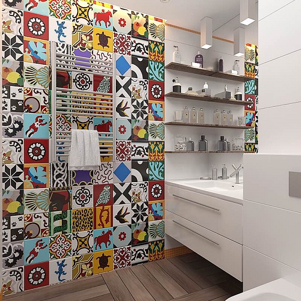
 In the second we also see tiles of the most variedflowers and patterns against a background of simple shapes. Despite the apparent abundance of textures and colors, the cheerful patchwork on the accent wall, the abundance of white, the black and white and orange mosaics combine beautifully with each other.

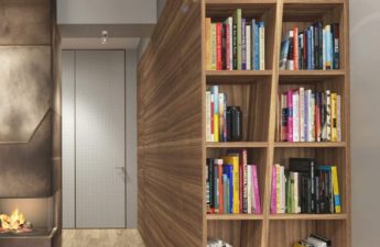
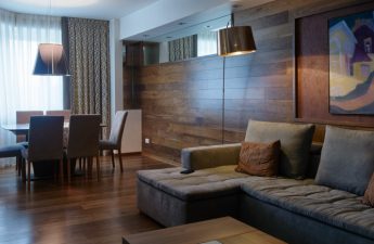
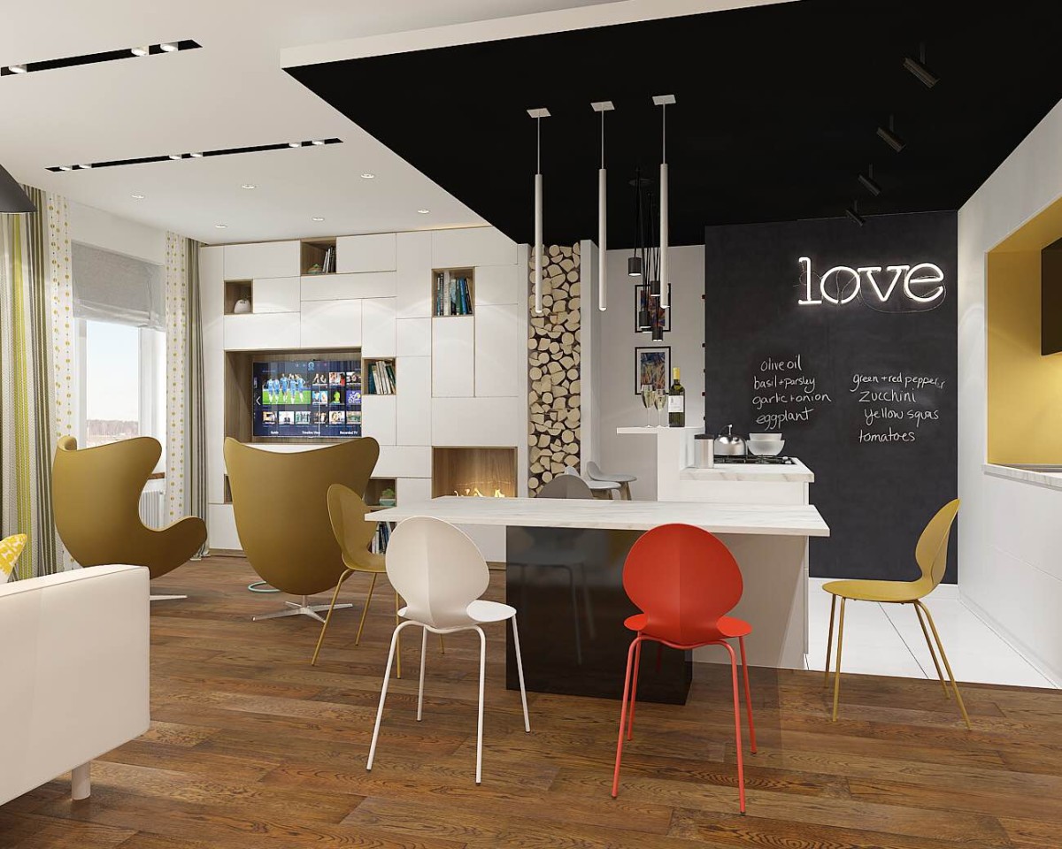
 Finally, we find ourselves in a commonmultifunctional area, which includes the classic trio: living room, dining room, kitchen. Here the designer has provided everything for comfortable rest and pastime of all family members: TV area, soft sofa, modern fireplace, cozy armchairs, comfortable kitchen area, large dining table and bar counter.
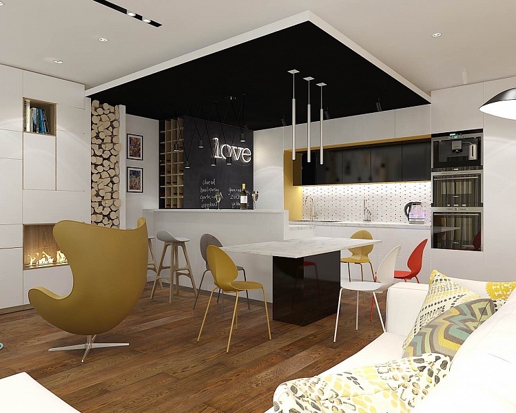 In this room everything has come together as onean eclectic space with a variety of textures, materials and shapes, and the variety of colors typical of this apartment. Nevertheless, the room turned out to be very harmonious, with a unified atmosphere and references to the Scandinavian style beloved by the owners.
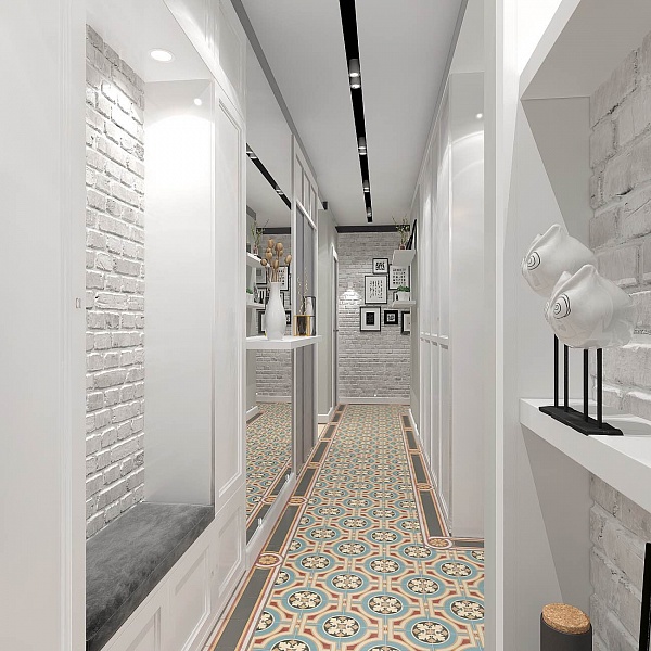
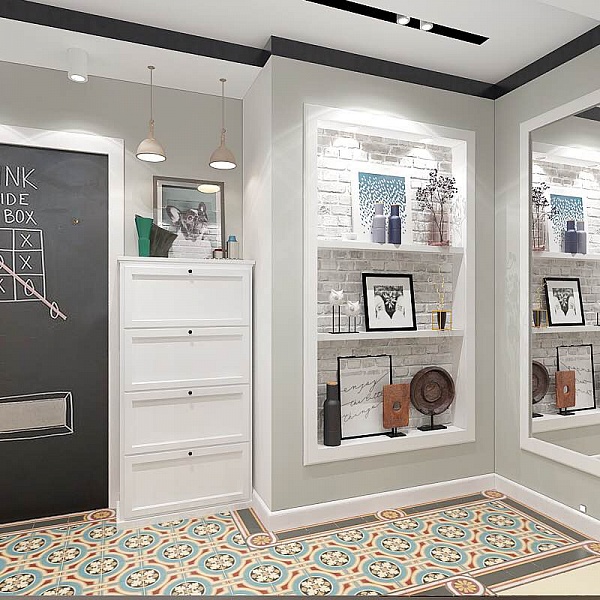
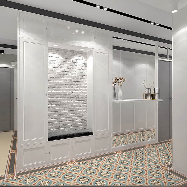
 Maria Zarodova, designer:— This is a very special space for me and, perhaps, my favorite space in the entire apartment. The project is still being implemented, and I want to believe that this room and the entire apartment will ultimately turn out exactly as they are shown in the visualization. The color scheme in the hallways is the calmest in the entire apartment: the main colors are white and shades of gray. Patterned is used as an accent, and we also see a traditional combination of different finishing materials and textures. And due to the light walls, mirrors and spotlights, the space looks wider and more spacious.

How to combine apartments correctly: an example from the Moscow region – etk-fashion.com
