Minimalism and coziness, lots of wood and subtle calculation, a drop of irony and attention to the feelings of children - that's what this interior is about.
This time in the company of our permanent expertarchitect we decided to discuss an apartment from the Polish city of Poznan. The interior, designed by the efforts of the Lina Architekci studio, attracted us with unusual design solutions, implemented, it would seem, with completely elementary techniques. However, as it turned out, we were looking in the wrong place. Our expert will tell you about everything in order.
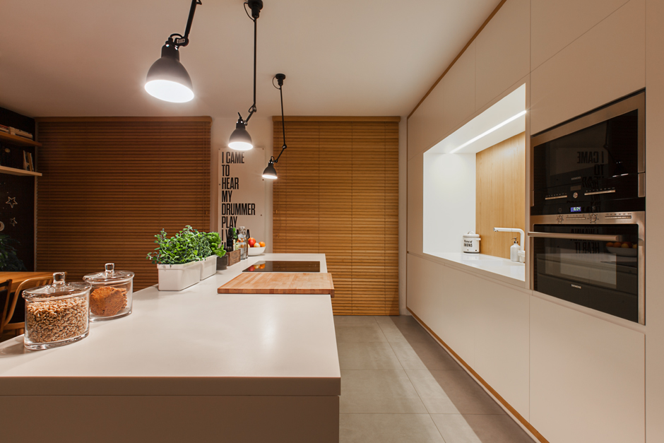
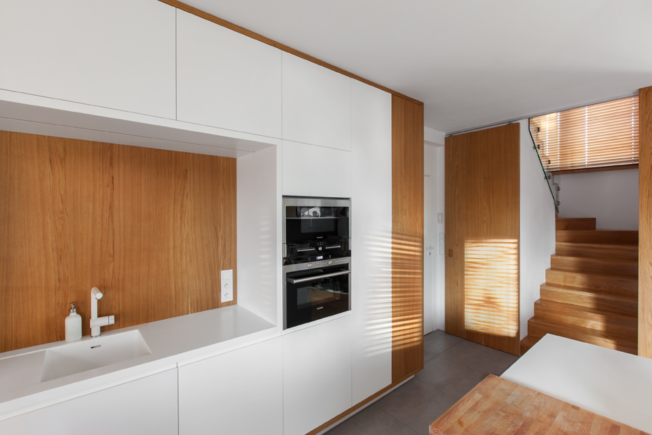
— Stylish space, for the most partwell-designed. Floor-to-ceiling cabinets, panels without baseboards. Two main colors - natural wood shade and pure, unadulterated white. Everything is very stylish, minimalistic. These are the advantages.
 Related articles
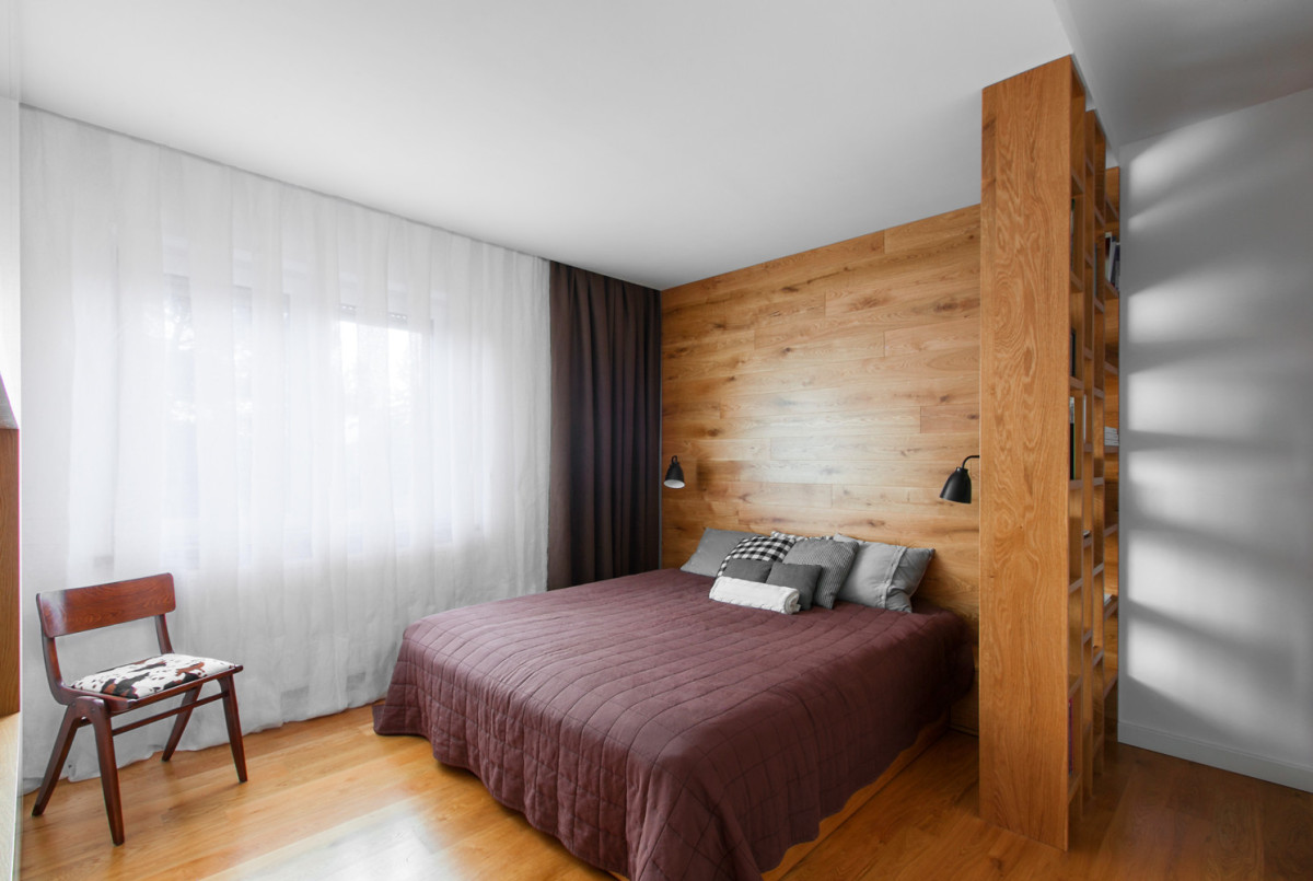
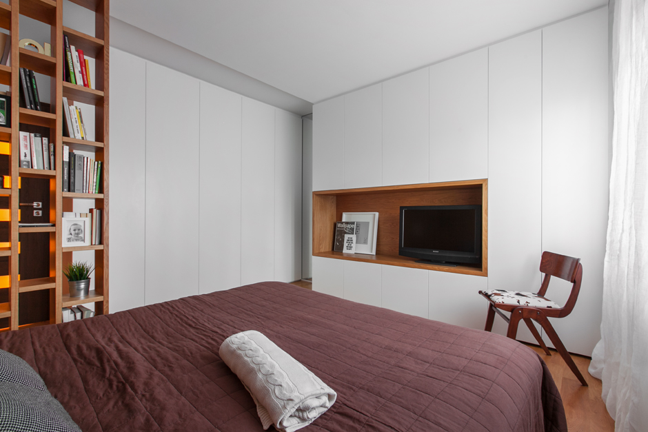
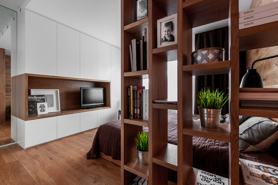
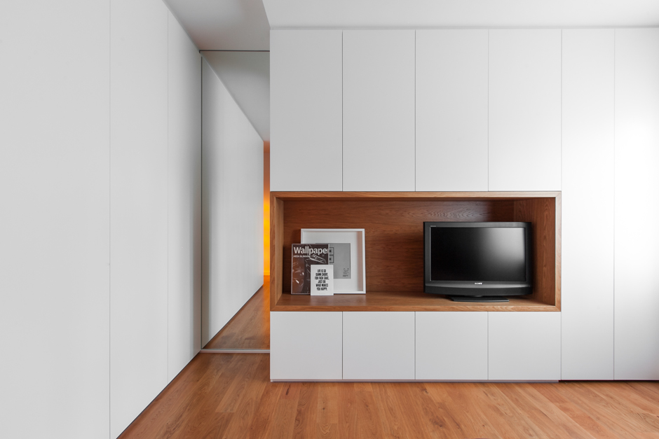
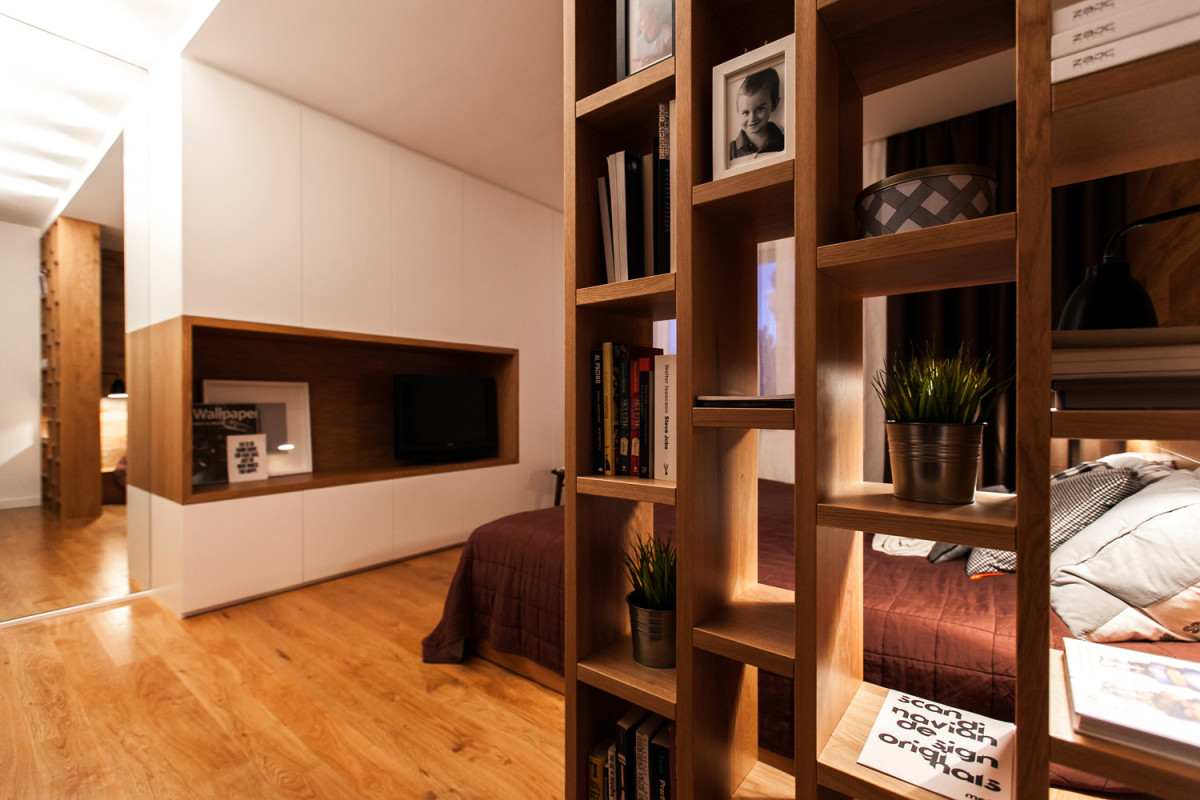
I don't really like the shelving unit next to the bed.bedroom, and I didn't understand the textile solution at all. The bedspread doesn't match anything. The brown curtain is thick, textured, you can feel the weight in it. But the tulle is out of place again. I admit that the customer made the decision here. The idea with the niche for the TV in the bedroom is great.
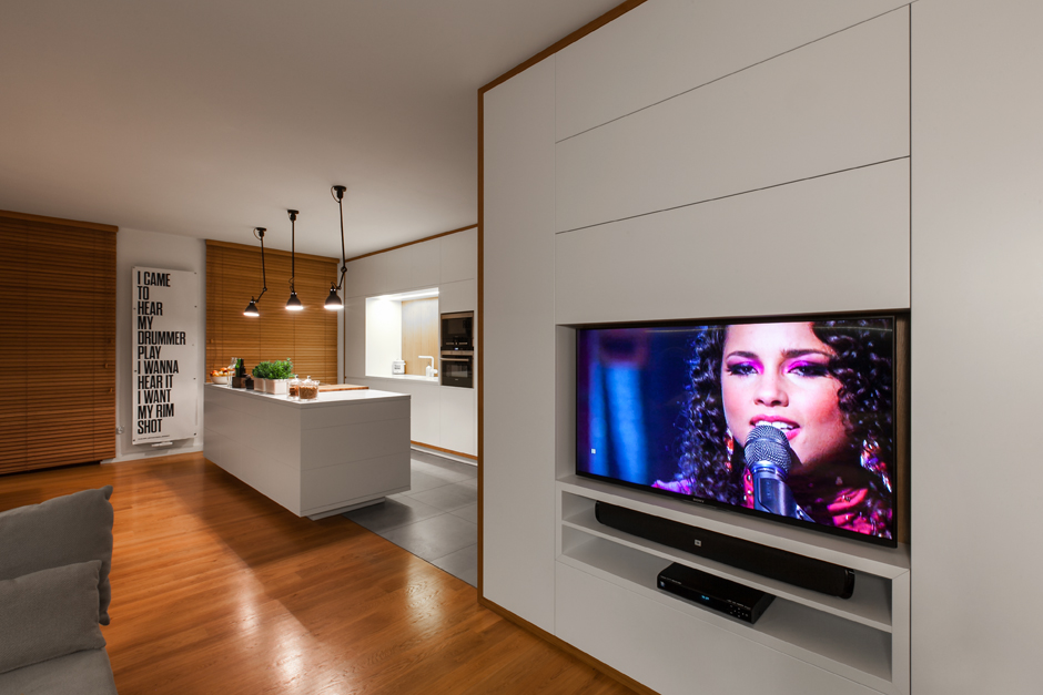
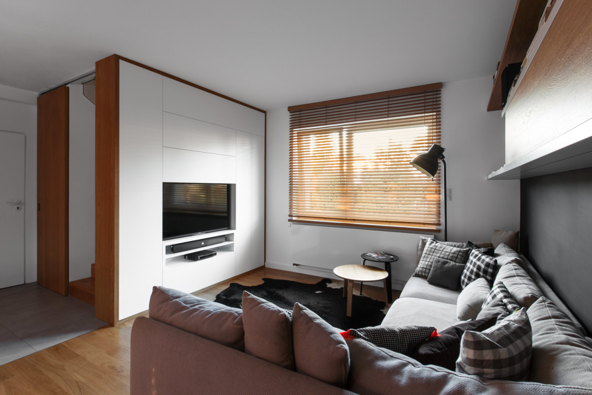
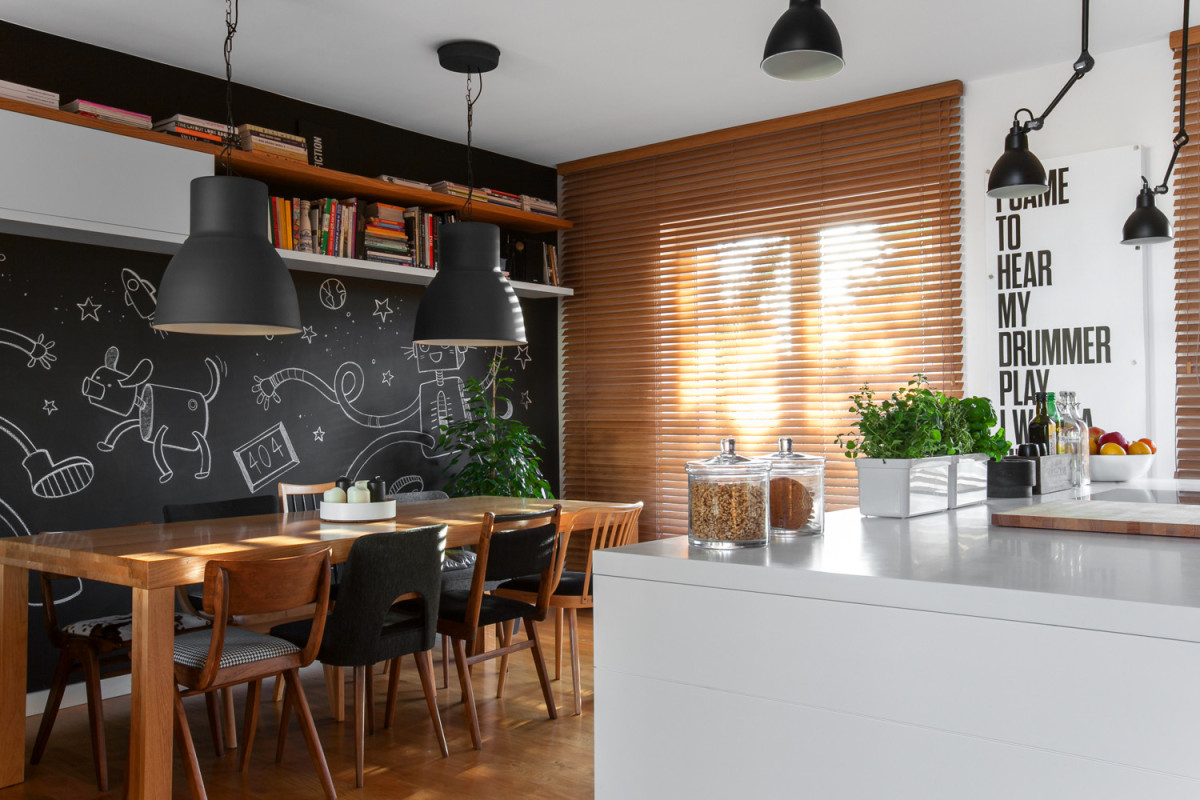
 Everything is good in the living room except the window.Perfectly fitted white panels with wooden edging. Very good floor, small but cozy sofa area. But I don't like these blinds at all. I don't know how I would do it. But this option, again, in my opinion, is a miss.
Another omission is the sliding door by the stairs. The width was not calculated, and the doors overlap the joint. In my opinion, it would be more logical to mount the guide into the ceiling, but it's up to the owner.
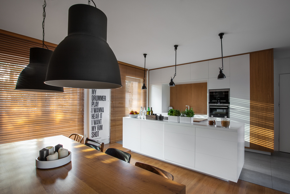
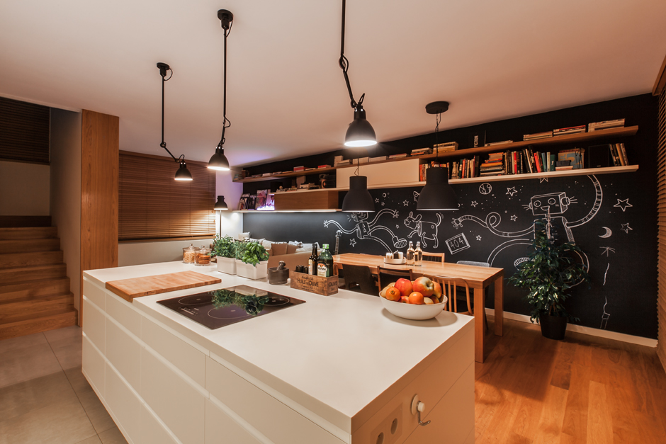
Overall, everything is very balanced:hot and cold, white and black, minimalism and dynamics. The kitchen is really cool. But the blinds... This decision confuses me. But the radiator, which from the side resembles a panel and the lyrics of Erykah Badu - a shot on target.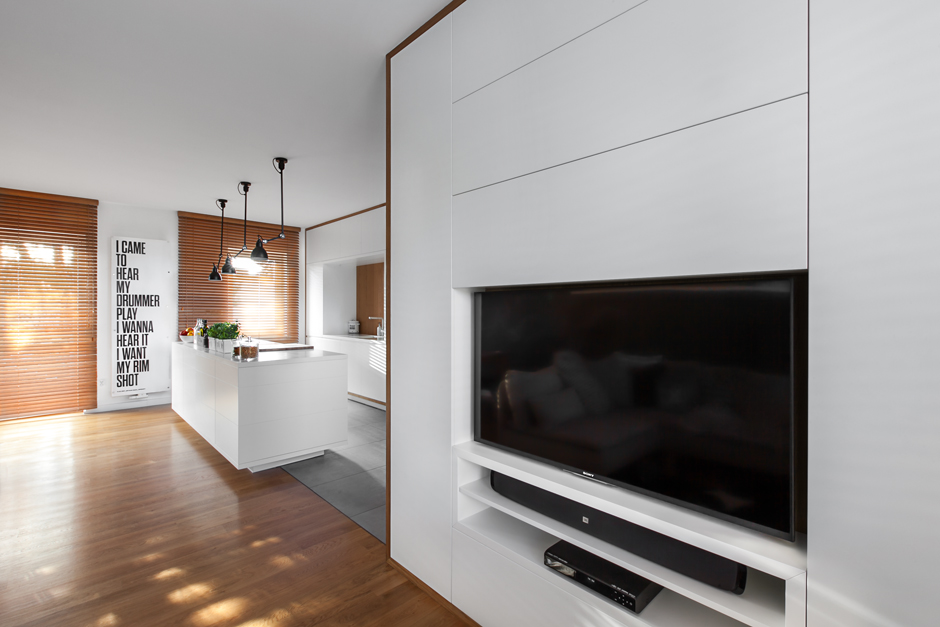
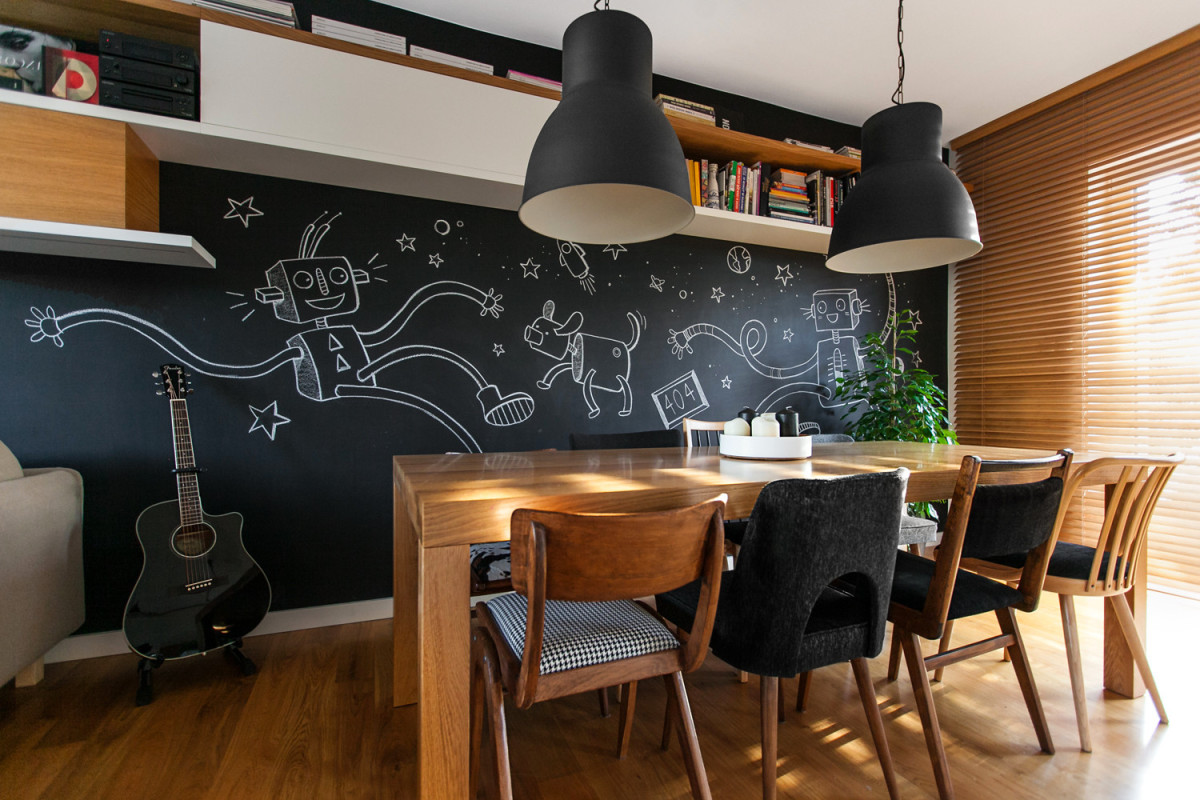
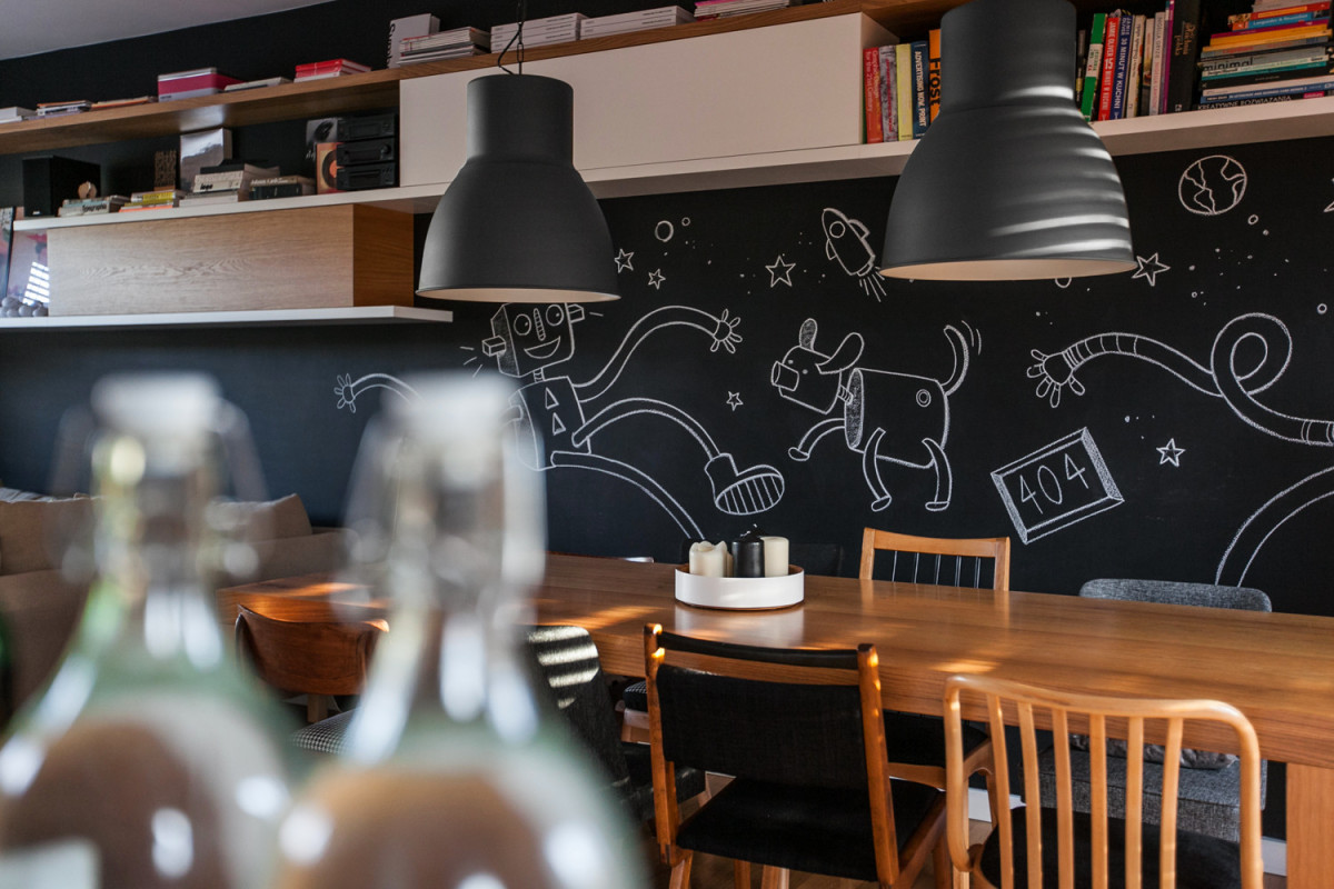
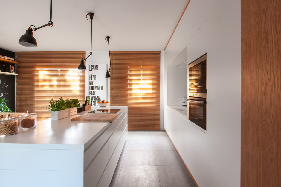 Articles on the topic I was pleased with the dining area.The chairs are completely different, but well chosen. The chalk wall is a great way to keep kids busy during feasts. By the way, it is a very smart move - not to send children to their room, but to keep them busy with something and allow them to be part of the company.