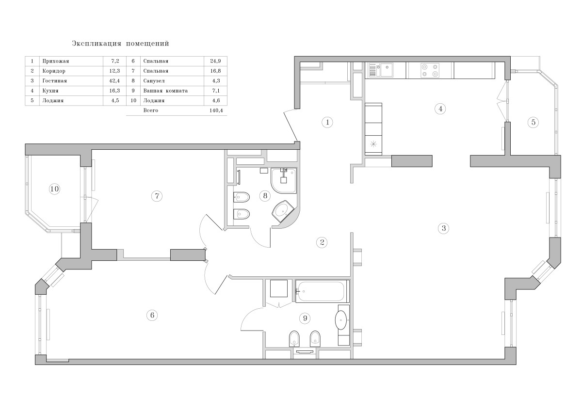
What should a classic interior be like so that itdidn't seem boring and old-fashioned? Today we will consider an example of the interior created in a three-room apartment in Moscow. Here you will find classics, oriental flavor, and fashionable purple shades. And also many interesting ideas - a style that is quite difficult to implement. Strict canons are not suitable for every room, and too careful adherence to them can result in a prim, outdated interior without a soul. We continue to give examples of successful experiments with this style, and today the focus is on the project of a three-room apartment on Lomonosovsky Prospekt by designer Margarita Mustafina. Margarita Mustafina, designer-decorator: Graduate of the Moscow State Academy of Art and Design named after S. G. Stroganov, specializing in "Interior Design". She has experience working in various architectural and design bureaus, and currently works as a private designer. She describes her professional task as “creating harmonious and comfortable interiors, the hallmark of which is the subtle interaction of modern technologies and design, delicate luxury and elaboration in details.” mm-interiordesign.ru Clients and wishes The client is a 50-year-old businessman from Azerbaijan, with his wife and children. The family does not visit Moscow very often, so the apartment was made so as not to stay in a hotel. The designer was given a very specific task: an apartment in a classic style, built on a combination of beige, white and gold colors. Without excess and frills, in the average price range, but at the same time looking decent. The only expensive materials allowed were plumbing. Layout Despite the fact that the apartment is in a new building, the previous owners had already managed to erect partitions according to their design. This layout suited the clients quite well and was therefore taken as a basis. Only a few minor changes were needed: for example, one room was eliminated in order to increase the living room at its expense. The bathroom was expanded and an entrance was made to it from the bedroom, but the passage to the kitchen from the hallway was blocked up and combined with the living room, creating an arch between them.
 Features of style As already mentioned,The customer wanted to get a classic interior in the best traditions of this style, which is why the leitmotif of the entire design is graceful curved lines reminiscent of Baroque and Rococo. They start right from the threshold and continue to be found in all other rooms. In the main room, smooth lines run along the edge of the sofa backs, freeze in the curls and palmettes of the tables, outline the contour of the shell and C-shaped scallops on the fireplace, flow into the curved legs of chairs and nightstands, a dressing table and a wardrobe - already in the private area. Leather headboards of the beds in the master bedroom and the guest room, expressive carving of the cabinet furniture - the presence of a curved line, its excitement and dynamics are felt everywhere.
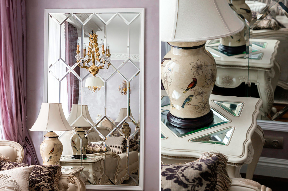

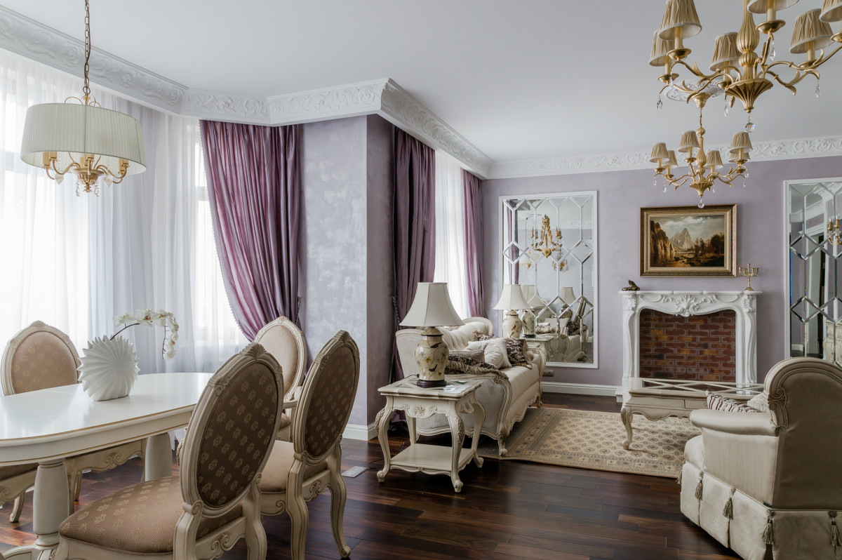
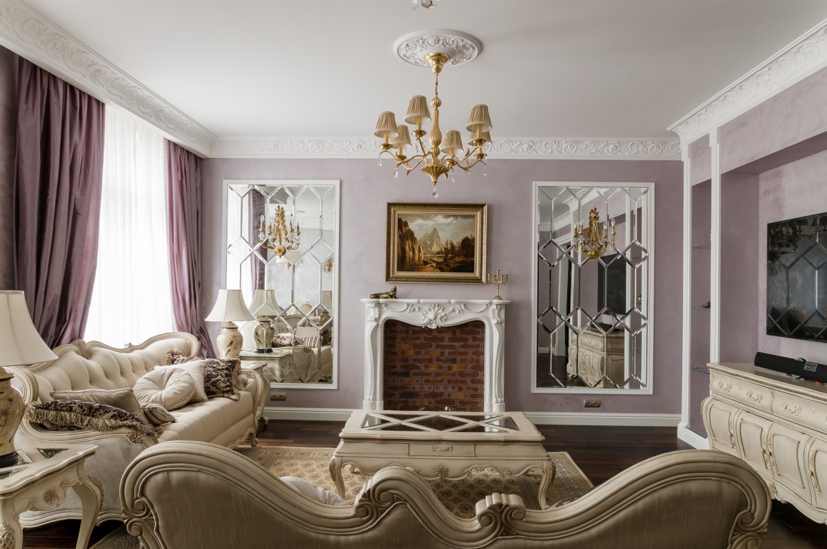
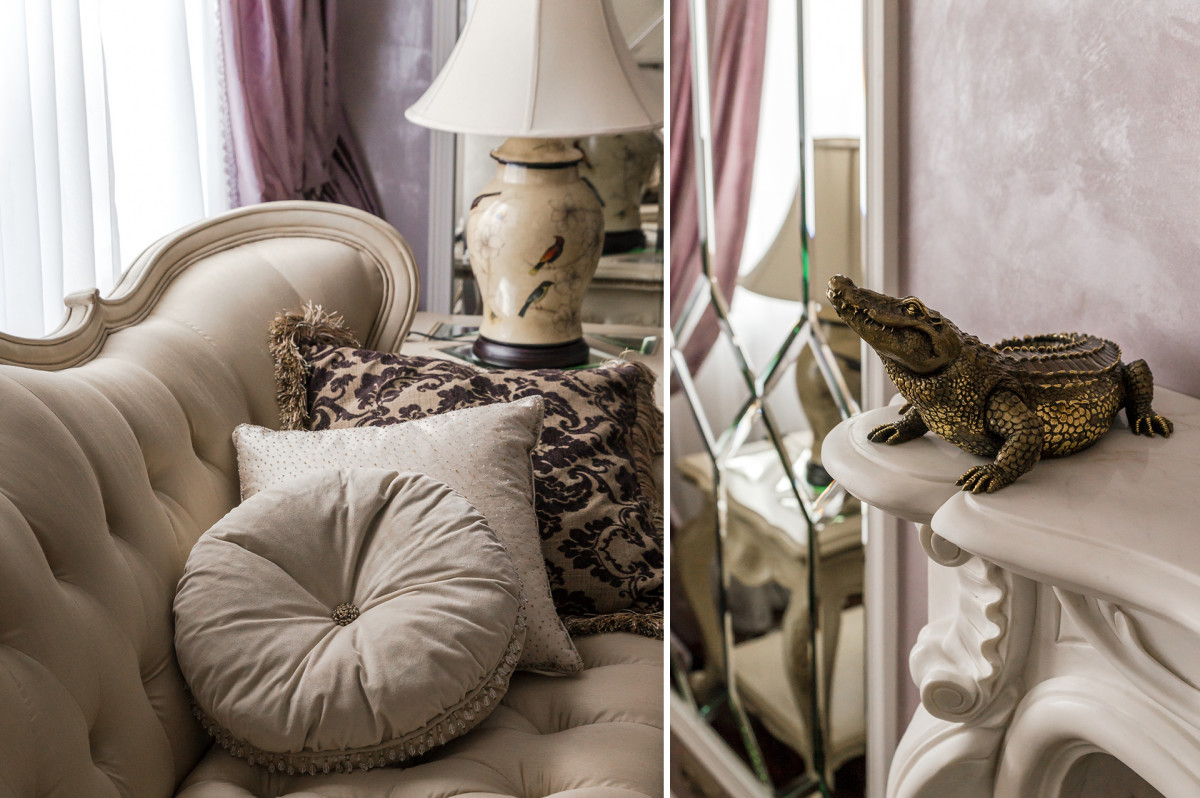
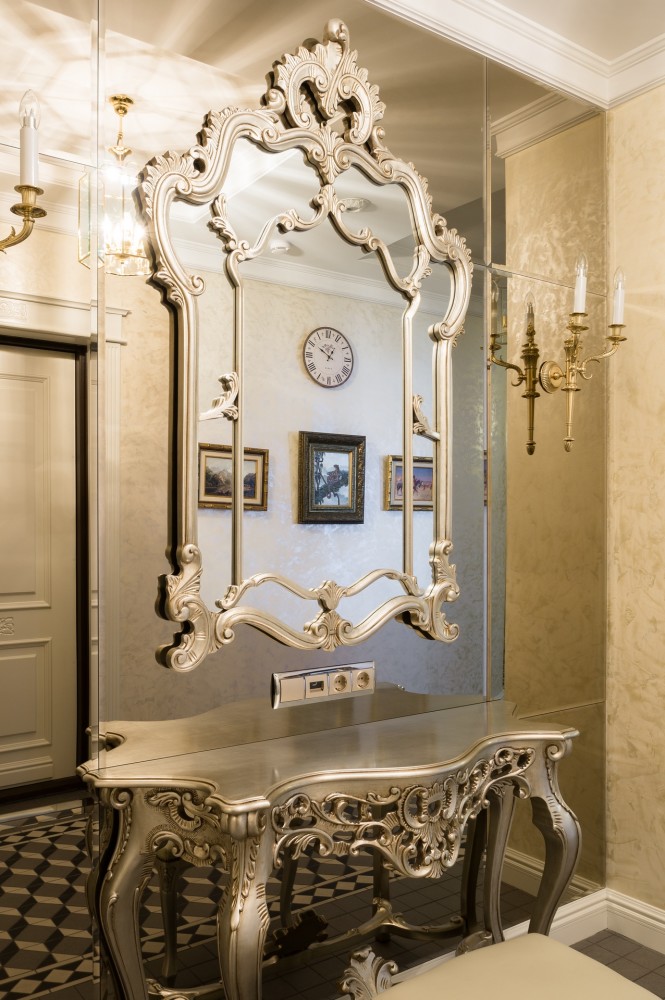 Living room The living room embodies all the canonsclassical style: it is luxurious, symmetrical and executed in noble tones. There are especially many smooth lines here: in addition to tables and a fireplace, they draw the outlines of furniture, appear in relief in the plaster ornaments of the stucco decor, and in themselves become a three-dimensional sculptural part of the marble or tapestry pattern on the sofa cushion.
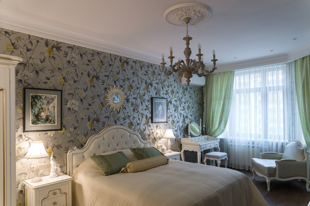
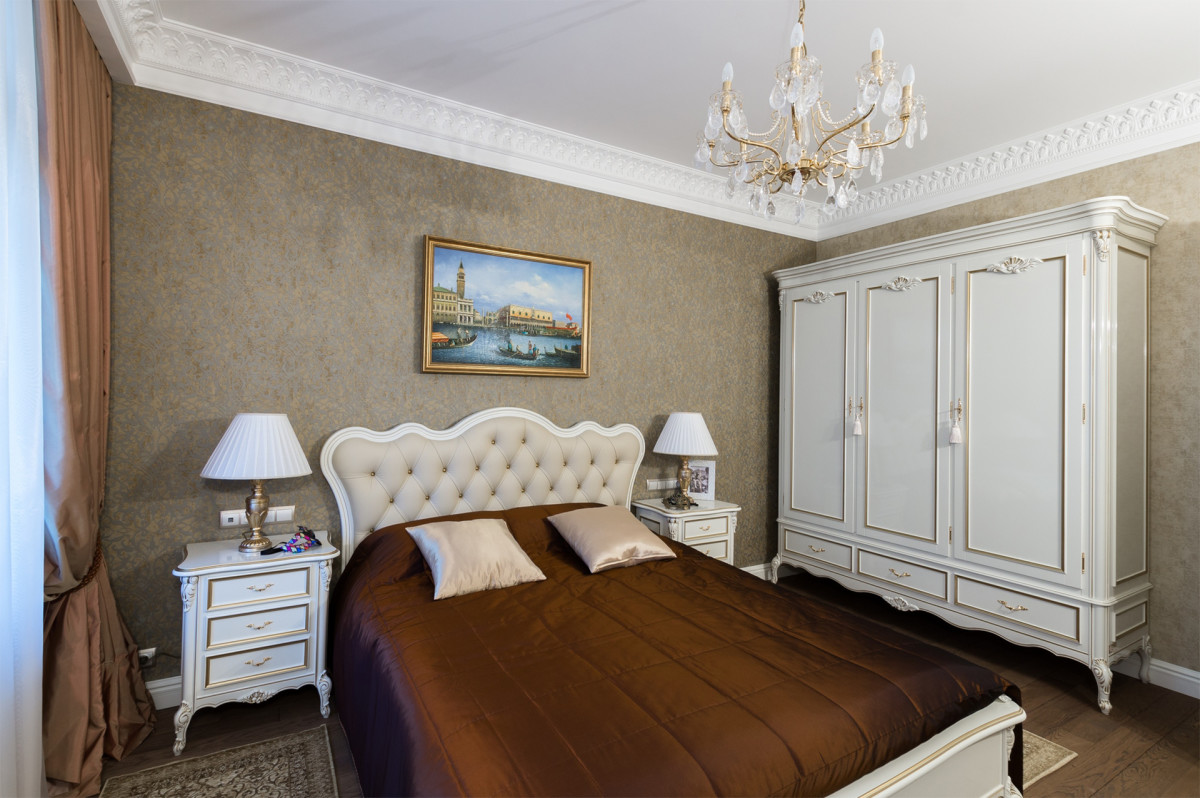
 Bedrooms The journey of the main character of thisinterior - a smooth line - continues. In the master bedroom it turns into gray-brown stems and branches of a flower tree on paper wallpaper, and in the guest room - into ornamental interweaving on a noble background in the color of aged gold.
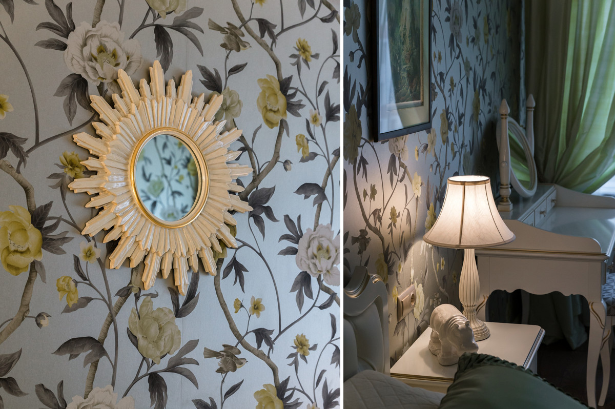
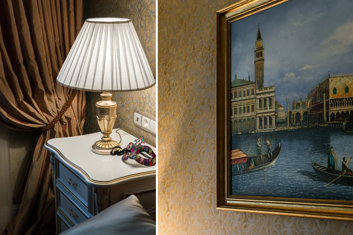 Both rooms turned out to be different in mood,but very gentle and conducive to relaxation. Other similarities include the similarity of the color scheme, slightly darker in the guest room and slightly fresher and lighter in the master bedroom. Both rooms are like two museum halls: Italian painting with carnival motifs and light, airy impressionism. The connecting link is elegant white with gilding.

 Kitchen The kitchen is strikingly different from the living roomand the dining room: the obligatory beige palette is complemented not by soothing pastel tones, but by a rich green color. The kitchen area as a whole looks more collected and strict, but it also failed to escape the influence of the ubiquitous curved line: it manifested itself in the plant ornament of the pediment in the center of the cabinets and curled up in the patterned ribbons of porcelain stoneware. The shapes of the glass pendants above the bar counter are also curvilinear and rounded.
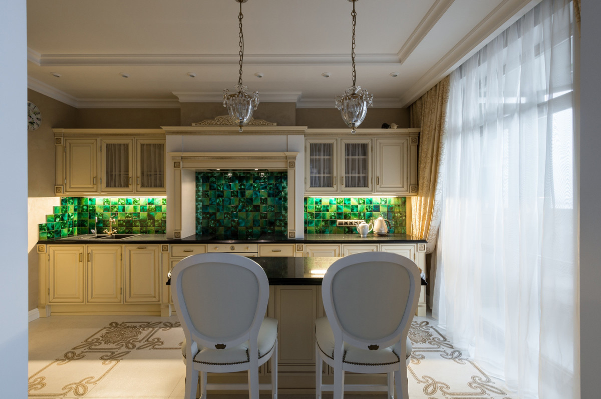
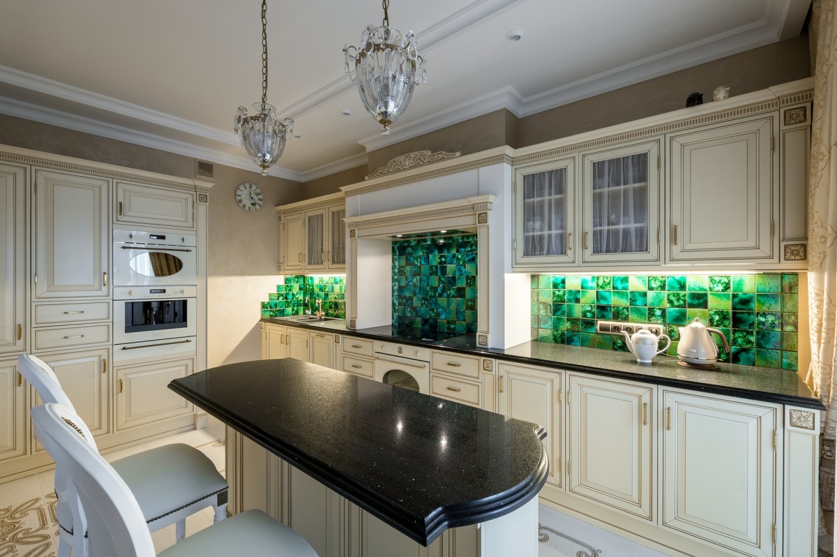 Bathrooms Perhaps only bathroomsavoided the direct "influence" of Baroque and Rococo. However, this is not accidental, but done intentionally: for a small area, which could only be increased slightly, the choice of compact modern furniture of simple shapes was optimal. However, in the bathroom with a font, the influence of the general style is still felt: it is manifested in the color scheme with interspersed gold details and in the use of ceramic tiles with imitation onyx.
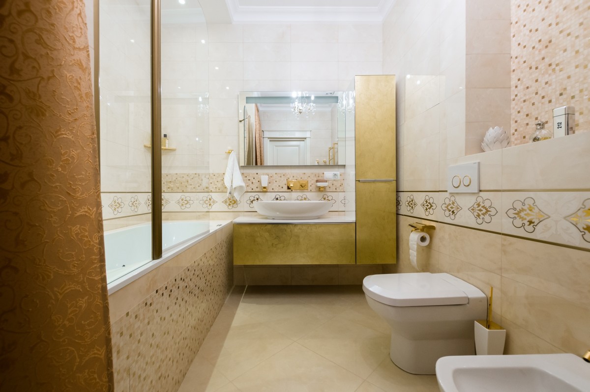
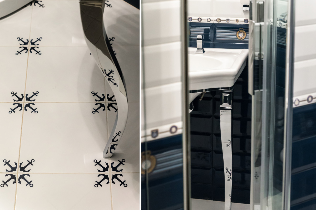
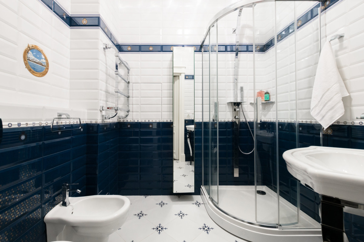
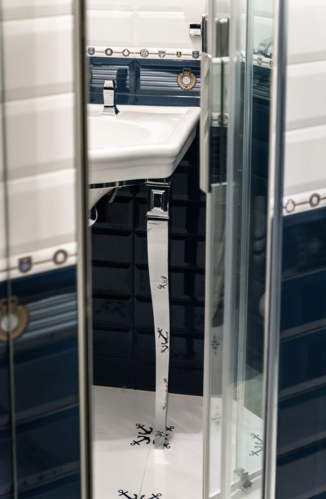
 The guest bathroom is of primary interesta color scheme that is completely different from the rest of the apartment. Marine motifs reign here, but a smooth line is also found: for example, in the sink base on curved legs, made in a modern classic style. Such a choice, uncharacteristic for the overall style, is easily explained: the owner of the house chose the tiles, and this was his wish on the list of the most important ones.
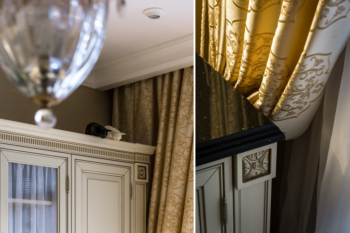
 Decorative elements Classic is notonly strictness, it has room for interesting accessories and unusual decorative elements. Porcelain figurines of various animals and a charismatic bronze crocodile add cheerful spontaneity and lightness to the interior of this apartment - competent decorative accents that create the right mood.
 Margarita Mustafina, designer:— The fireplace was my idea. I love fireplaces and often use them in my interiors. Moreover, now there are all kinds of bio-fireplaces, and you can make a real home hearth in your apartment. It is always difficult to find a beautiful portal, especially if the budget is limited. Colors and materials The use of decorative plaster for finishing the walls in the living room, kitchen and hallway, solid rosewood as a floor covering (in the living room) and hand-made tiles with a play of shades of green on the kitchen "apron" is dictated by several motives. Firstly, these materials create an outwardly advantageous and texture-rich interior design, and secondly, they are optimal in terms of performance. For the most part, the choice of color scheme was influenced by the customers and their wishes. At the same time, the designer wanted to play with colors a little, so she tried to add some of her own color to each room, in addition to the general white and beige range. For example, lilac was chosen for the walls of the living room, green dominates in the kitchen, despite the fact that it is only on the apron. The master bedroom has yellow, silver and light green shades, and the guest bathroom is designed in a radical blue and white palette.
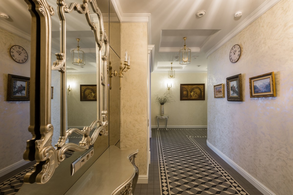 Margarita Mustafina, designer:— The main goal and idea of the project was to create a calm classic interior: simple, but not too boring. When creating it, I was inspired by looking at Italian and French interiors of past centuries. The renovation lasted 8 months. The following were used in this interior: Living room
- Furniture — Michael Amini (USA), Lavelle collection. Solid birch, painting, patination.
- Gypsum stucco molding - "Peterhof" (Russia).
Kitchen
- The furniture is Atlas-Lux (Russia), the Britannica collection.
- Floor - granite Tagina (Italy), collection Minera Liqua.
- Apron - tiles handmade by the factory Pecchioli (Italy).
Master Bedroom
- Furniture - factory Brunello (Italy), collection AiX.
- Wallpaper - Zoffany (United Kingdom).
- Doors - "New Interior" (Russia).
Guest bedroom
- Furniture - factory Cavio (Italy), collection Benedetta.
- Wallpaper — Studio 465 (USA), Prague collection.
Bathroom
- Plumbing - Rifra (Italy).
- Tile - Gardenia Orchidea (Italy), collection Onice.
- Bath, mixers and accessories - Gessi (Italy).
Bathroom
- Tiles - factory Maritima (Spain), collection Maritima.
- Plumbing - Devon & Devon (Italy).
- Mixers and accessories — Gessi (Italy).
Photos by Victor Chernyshov.
